9 Advanced Topics in Weighting
The chapters we are reading from Bailey give us additional insight into how nonresponse and weighting can, and cannot, address the problem of bias in polls. In this chapter we are going to first take a deeper dive into Bailey’s work, and in particular, think through a new equation for understanding where bias might come from in a poll. We should think of this as an amendment to, not a replacement of, the work on bias that we have done up to this point.
9.1 Non-Ignorable Non-Response and Survey Error
There are lots of reasons that people do not respond to surveys. Some of these are totally random – people who are busy on a particular day are less likely to respond to surveys than people with more free time that day. We do not care about this form of non-response at all because it is non-systematic.
We care about non-response when that non-response is non-systematic. Where particular groups in the electorate are more or less likely to respond to our surveys.
Within this non-response we can think of two situations.
The first is ignorable non-response. This occurs when the non-response happens in a way that we can fix with weighting. If less educated people are less likely to respond to our poll we can fix this with weighting. We can measure education in our sample, and we know the population totals for education. The lack of low-educated people in our sample can be corrected, rendering this non-response un-problematic.
The second is non-ignorable non-response. This occurs when the non-response happens in a way that we cannot fix via weighting. If more conservative people are less likely to respond to our poll we cannot fix this via weighting. While we can measure ideology in our sample, we do not know the population totals for ideology.
Bailey gives several examples of how NINR (non-ignorable non-response) can bias polls.
Studies of election turnout find implausibly high numbers of people turned out to vote. While some of this is social desirability, some chunk comes from the fact that there is an unmeasurable variable (enthusiasm?) that drives both turnout and willingness to respond to a survey. We cannot weight to enthusiasm.
As we saw in the 2020 AAPOR report, election polling has NINR because MAGA voters have a political motivation to not respond to polls. Low trust in institutions (?) drives both voting for Trump and willingness to respond to polls. We cannot weight to low trust in institutions. (We can wait to previous Trump support, which as I discuss below, probably does enough to keep election polls on track).
Health surveys have way too many healthy people in them. Being someone who lives life hard (getting difficult to describe these) drives both smokin’/drinkin’/eatin’ and makes you less likely to respond to polls. We cannot weight to “Lives life like Keith Richards”.
And so on and so on.
This is a big problem! Helpfully, Bailey gives us way to unpack and understand it.
To give some intuition to the problem, he proposes the following thought experiment. Suppose we want to estimate how many points on average people will score in NBA. Not just how many points NBA players will score, but how many you or I would score.
However, the only data that we get on “points scored in the NBA” is among people who play in the NBA. Selection into the sample is being driven by two key variables: height and athleticism.
The following chart shows what that might look like:
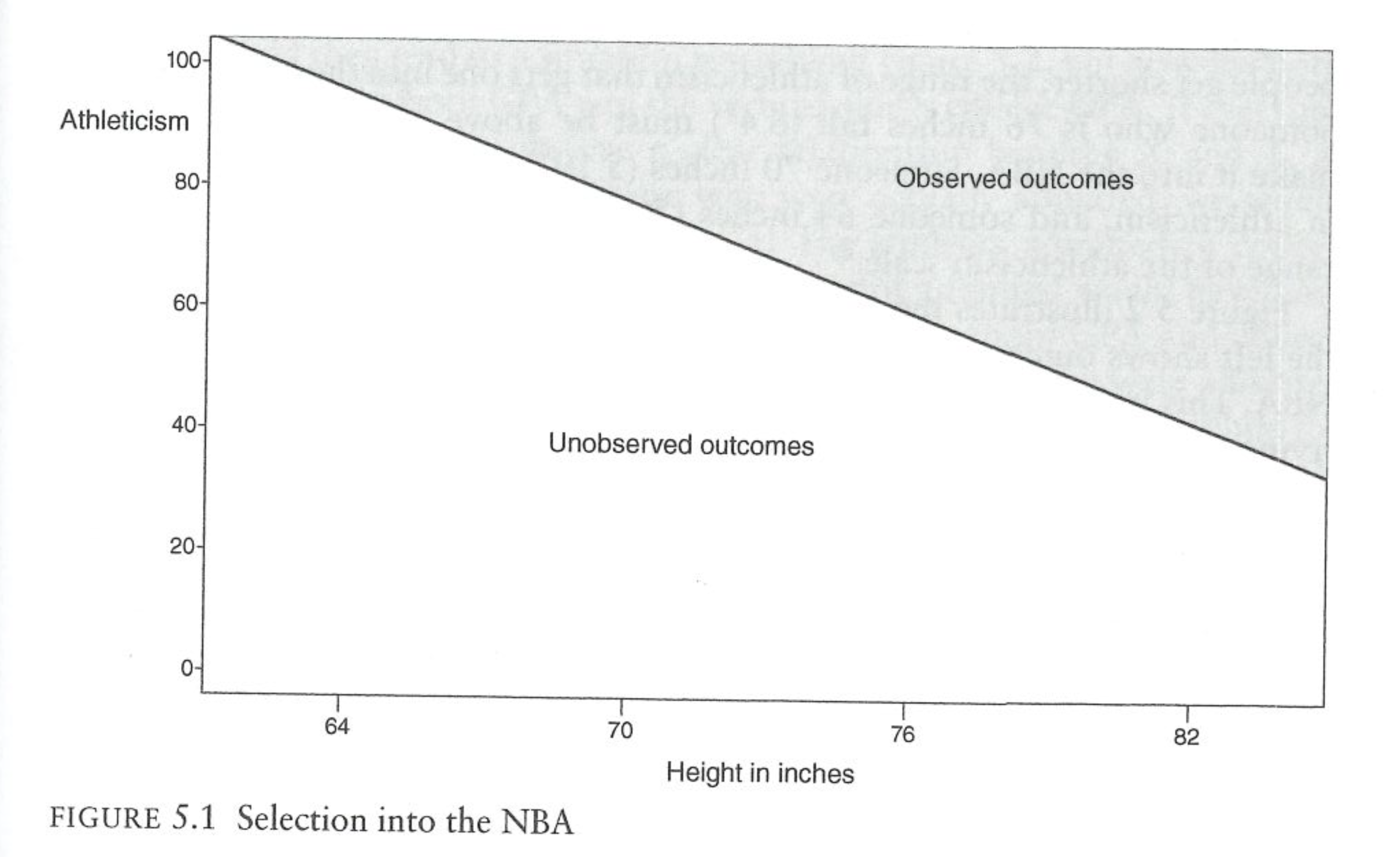
The only people who make into the NBA are those that are either very tall and at least moderately athletic (Shaq), or are not that tall and are extremely athletic (Allen Iverson). We don’t observe short people in the NBA and we don’t observe non-athletic people in the NBA.
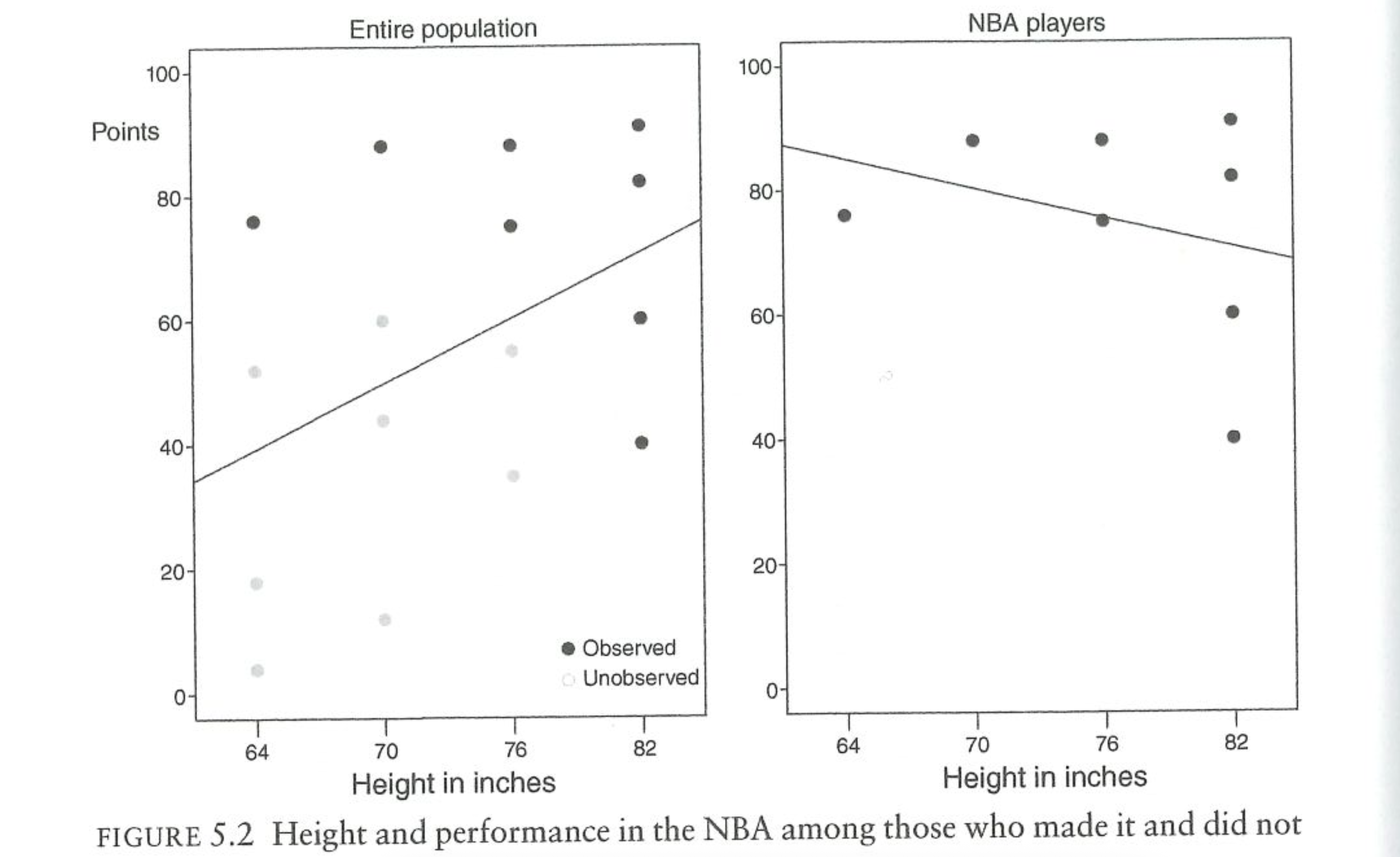
The next figure shows the outcome of this process. Each point in the diagram is a person in the population. The black dots are the NBA players and the grey dots are the non-NBA players. In reality the average person will score 55 points in the NBA (I’m going to email Michael about this. We would all score zero.) But among NBA players the average amount of points scored is 75. Because selection into the NBA is non-random, we get a biased picture of points scored.
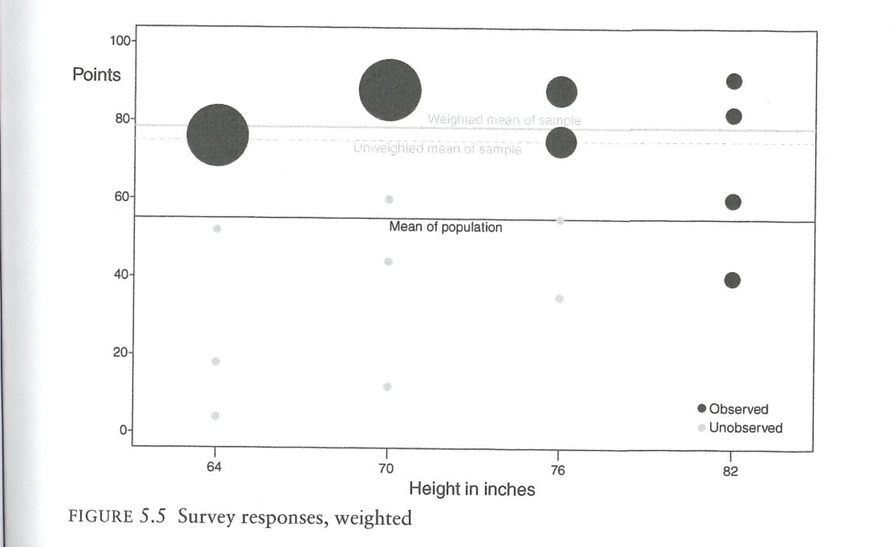
What about weighting? We know the truth about height in the population, so can’t we weight to that variable? The next figure does just that, giving more weight to height groups that are under-represented and less weight to height groups that are over-represented.
Unfortunately, this does nothing to fix the problem. Because we cannot weight to athleticism, we are not actually correcting for the fact that we have a non-representative sample. Indeed, only weighting on height here actually makes things worse! The tall players are actually fairly representative of all tall people, so that’s not a problem. But the short people we have in the sample are the extremely athletic people. By weighting to height we are saying: there are too few short people in this survey, give those people more weight. But then we are up weighting a very athletic group of short people to be representative of the non-athletic short people (me).
We can generalize this to other situations as well. Let’s say we want to study how much people like the Democratic party. In the first figure we might imagine changing the x-label to education and the y-label to social trust as the features that make people select into getting sampled. Then when we look at the outcome, the people that we actually surveyed all have high social trust and are relatively high in education. We can correct for having an unrepresentative sample in terms of education, but that will do nothing for the fact that we have an unrepresentative sample in terms of social trust. This would lead to a biased estimate of feeling towards the Democratic party that would only be made worse by weighting to education.
9.1.1 Generalized Model of NINR
We can think about a more general model of what is happening here by focusing in on the correlation of the probability of responding and the outcome of interest. This is something we have already discussed – though Bailey does a good job of discussing where and how this correlation could lead to trouble.
Bailey considers a latent variable \(R^*\), which is each individual’s response propensity. This is “latent” in the sense that we cannot directly observe or measure it. It is something innate in people that make them more likely to be responders. In the classroom we can think of people who will immediately shoot up their hands and want to answer a question as people with a high \(R^*\). On the other hand people with a low \(R^*\) are those not making eye contact, looking at their phone, and trying to do anything possible to not answer a question.
What makes nonresponse non-ignorable is when \(R^*\) is related to Y. Bailey visualizes the problem like this:
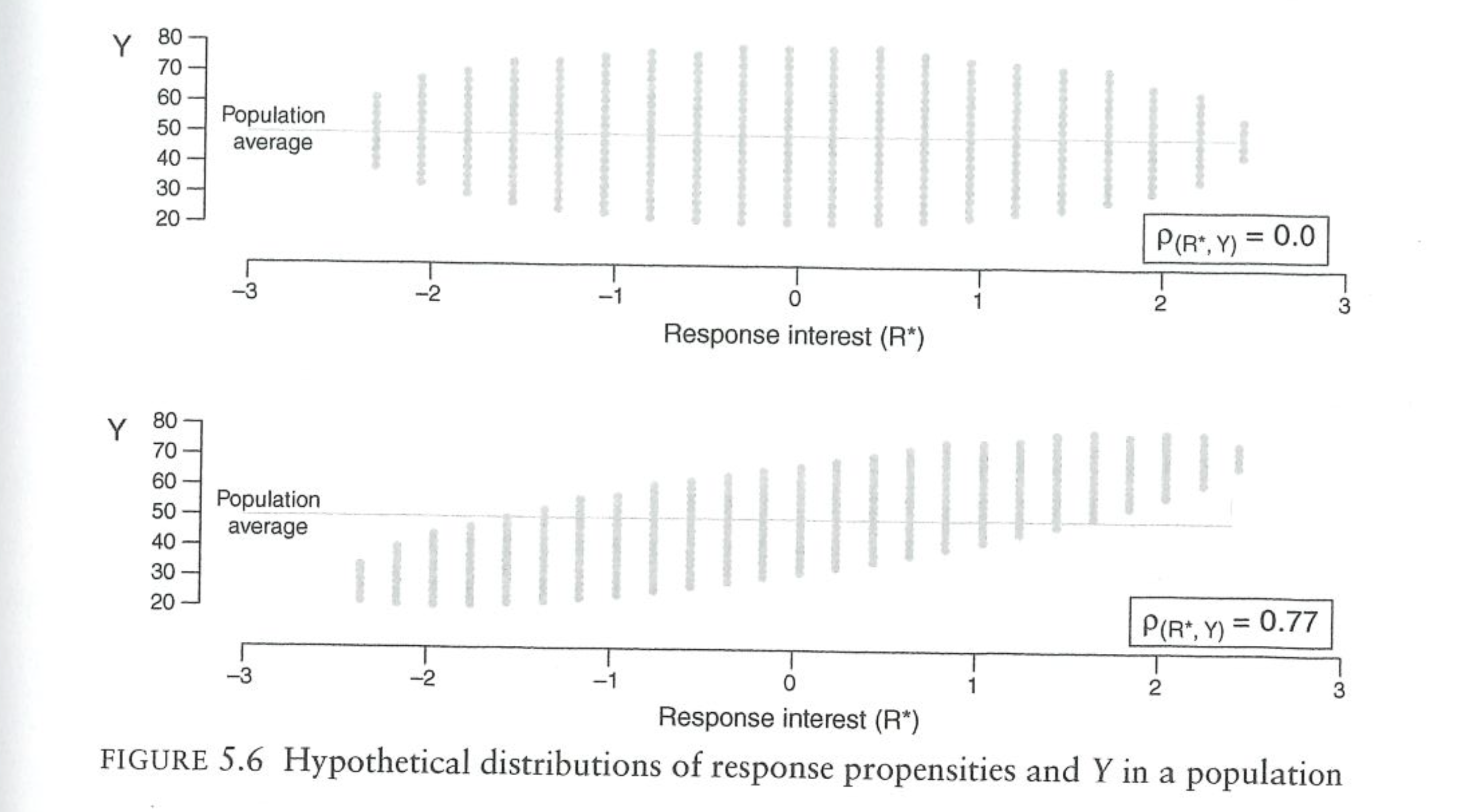
First consider the top panel. On the x axis are people’s latent interest in responding. The scale of this doesn’t matter, but we can think of very keen responders on the right side of the graph, and very reticent respondents on the left part of the graph. On the y-axis is the respondent’s values for whatever we are measuring.
In this top panel the “fish” (Bailey loves calling these fish diagrams) is flat. There is no correlation between the response probability and the outcome of interest, \(Y\). If we thought about sampling any verticle cross section randomly, we would get an unbiased picture of the outcome of interest because values for \(Y\) are evenly distributed across all levels of \(R^*\).
The bottom panel is where we get into trouble. Here the fish is tilted. People with lower response probabilities also have lower values on the outcome of interest. When we go to sample people, we are more likely to get in our sample people on the right side of the scale. Because those people have higher values of \(Y\), it means that we will get a biased picture of \(Y\) in our sample.
One thing that I wish Bailey made more clear, is that we are talking here about correlation between these two things based on variables that we cannot measure (as we just discussed above). Education affects response probability and many outcomes of interest, so we can correct for the “tilted fish” that would be caused by education. In these graphs and the discussion that follows about error, we are talking exclusively about a correlation response probabilities and outcomes based on variables that we cannot weight on.
The preconditions for their to be bias in a survey is that the correlation of \(Y\) and \(R^*\) has to be non-zero (\(\rho_{R^*Y}\)). To get to our measure of bias in the survey, however, we are not going to consider \(R^*\), but instead consider \(R\), which is a binary variable that indicates whether someone actually responds to the survey. We therefore focus on the correlation \(\rho_{RY}\), the correlation between actually responding to the survey and the outcome of interest. Simply having a non-zero \(\rho_{RY}\) is a pre-condition for survey bias, but not a sufficient condition. To understand when we will have survey bias, we can evaluate this equation:
\[ \bar{Y_n} - \bar{Y_N} = \rho_{RY} * \sqrt{\frac{N-n}{n}}*\sigma_Y \]
The difference between the observed and actual value for the average of Y, is a function of the correlation of responding and the value of Y (what Bailey calls “data quality”), the quantity of data that we have relative to the population size (“data quantity”), and then the variance of \(Y\) (“data difficulty”).
I’m going to explain each of these in more detail and talk about the implications of each, but before we get there I want to make a quick pause. This equation is an identity, which means it is not an average of an expectation, but gives an exact accounting of the error that will occur in a given sample from a given population.
We can prove this by doing a sampling procedure and calculating the actual error and the error predicted from that equation.
set.seed(456)  # for reproducibility

n <- 10000

# Define correlation matrix
rho <- 0.2
Sigma <- matrix(c(1, rho, rho, 1), ncol = 2)

# Generate bivariate normal data
data <- MASS::mvrnorm(n = n, mu = c(0, 0), Sigma = Sigma)

# Convert to uniform(0,1) via the normal CDF
data_uniform <- pnorm(data)

# Extract vectors
p <- data_uniform[,1]
y <- data_uniform[,2]

sim.dat <- cbind.data.frame(p,y)
sim.dat <- sim.dat |>
  mutate(y = if_else(y>=.5,1,0))


## ---------------------------------------------------------
head(sim.dat)
#>            p y
#> 1 0.05995092 0
#> 2 0.83330529 0
#> 3 0.67859678 1
#> 4 0.25289022 0
#> 5 0.60124855 0
#> 6 0.32204709 0
cor(sim.dat$p, sim.dat$y)
#> [1] 0.1473274

#Select people to respond based on probability of response

select <- sample(1:nrow(sim.dat), 1000, prob=sim.dat$p)
sim.dat |>
  mutate(r = if_else(row_number() %in% select, T, F)) -> sim.dat


#Actual Error
mean(sim.dat$y[sim.dat$r]) - mean(sim.dat$y)
#> [1] 0.0308

#Meng Equation
cor(sim.dat$r, sim.dat$y)*sqrt((10000-1000)/1000)*sd(sim.dat$y)
#> [1] 0.03080154
The two numbers are identical.
I bring this up because this is the second equation we have seen that describes non-response error. In Chapter 8 we learned this equation:
\[ \bar{Y_r} - \bar{Y_N} = \frac{\sigma_{yp}}{\bar{p}} \]
Average survey error is a function of the covariance of y and the probability of responding, divided by the average probability of responding.
The Groves equation describes the average amount of error you can expect in a sample of any size given the covariance of y and the response probability and the response rate. This equation works regardless of the sample size that you actually use.
The Meng equation (what’s in Bailey) is the description of the actual error you will get in a particular survey based on the correlation of response and the outcome, as well as the relative sample size.
Here is a figure that shows survey errors across 5 different sample sizes from a population of 1000. The red dotted line is what we calculate from the Groves equation:
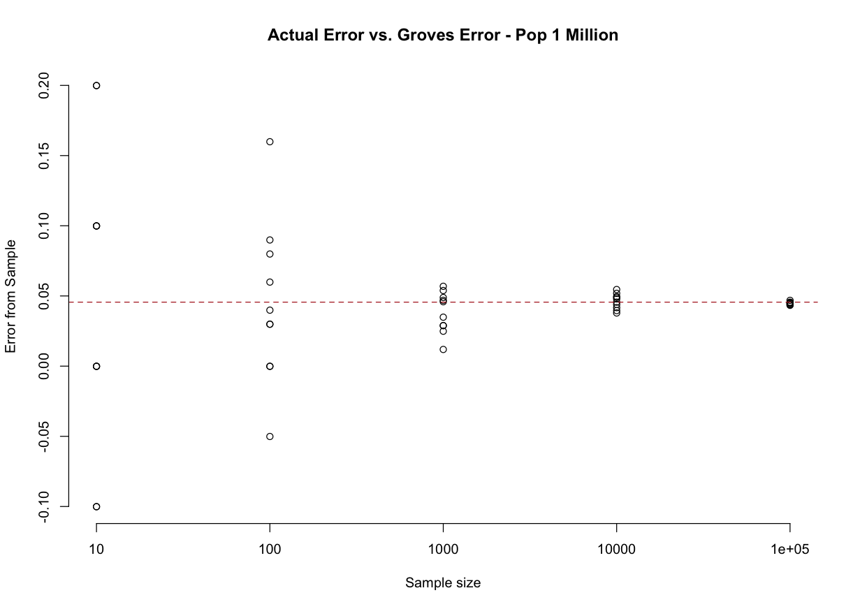
We make potentially really big errors in small sample sizes, but all of the “errors” are centered on the red dotted line, which comes from the Groves equation and describes what is likely to happen in any sample size, regardless of what happens in a particular survey of a particular sample size. The Meng equation would, for each of those dots, be exactly equal to what we calculate by just differencing the result from what is true in the population.
Trying to think about the differences and similarities of these two approaches has completely derailed a full day. The Groves equation will be the same for any population size, because both covariance and mean will not change as the population size increases. I think the best thing to do is to think of the Groves equation as a rough guideline for the possibility of error, and the Meng equation as a very particular equation that gives the actual error for a particular survey given a particular set of inputs.
Let’s go through the inputs of the Meng equation one-by-on to see where non-response bias will influence our results.
The first input that generates error is what we’ve discussed already, the “data quality”, which is simply the correlation between the who responds \(R\) and the outcome of interest \(Y\). This is the tilted fish in the diagrams above.
Jumping to the last term is “data difficulty” \(\sigma_y\). This is simply the standard deviation of the variable of interest at the population level. This one is very easy to understand. If everyone in the population has the same attitude (very low \(\sigma_y\)) it doesn’t matter how many people you ask or how much correlation there is between response and \(Y\), you are going to get the right answer. There needs to be variance in opinions in order for NINR to affect your survey.
The middle term is the most important in actually generating bias, and operates in a way that is counter-intuitive to what we learned in the sampling chapter. We previously discussed how, for a random sample, the population size is irrelevant when calculating the amount of error. What this term tells us is that when there is NINR then the size of the error that we make is in part a function of the relative size of the sample and the population. The smaller the sample is relative to the population, the more NINR will create bias.
For all levels of \(\rho_{RY}\) increasing the population size while holding constant the sample size while increasing the population size will result in more errors being made.
This is, in some ways, the Wario to the “small sample correction’s” Mario. The small sample correction to the standard error is: \(\sqrt{\frac{N-n}{N-1}}\) In that case, we saw that as the sample size and population get closer together the standard error for simple random sampling goes down. When the sample size is very small relative to the population the correction stops applying and we just collapse to the (non-corrected) standard error. What we are seeing here with NINR is different. It is still the case that having a large population relative to the sample size makes less error (here, systematic error based on non-response), but in contrast, when the sample size diverges from the population size the problem just gets worse and worse and worse.
We can evaluate the size of these two terms to see what I mean:
pop <- 10^seq(3,7,0.1)

small.sample.correction <- sqrt((pop-1000)/(pop-1))
NINR.correction <- sqrt((pop-1000)/(1000))

par(mfrow=c(1,2))
plot(log10(pop), small.sample.correction, axes=F, pch=16,
     xlab="Population Size",
     ylab="Finite Population Correction")
axis(side=1, at = 3:7, labels = 10^(3:7), )
axis(side=2, las=2)
abline(h=1, lty=2, col="firebrick")

plot(log10(pop), NINR.correction, axes=F, pch=16,
     xlab="Population Size",
     ylab="Finite Population Correction")
axis(side=1, at = 3:7, labels = 10^(3:7), )
axis(side=2, las=2)
That’s bad!
Bailey also gives a visual of why this “large population” problem exists. Imagine taking a sample of 20 people from a large population or a small population. In both cases the most eager participants (like students straining their arms raising their hands) will be the ones who end up in our sample. Even when the correlation between response and the outcome is the same, the “20 most eager people” in a big population are proportionally much weirder than the “20 most eager people” in a small sample.
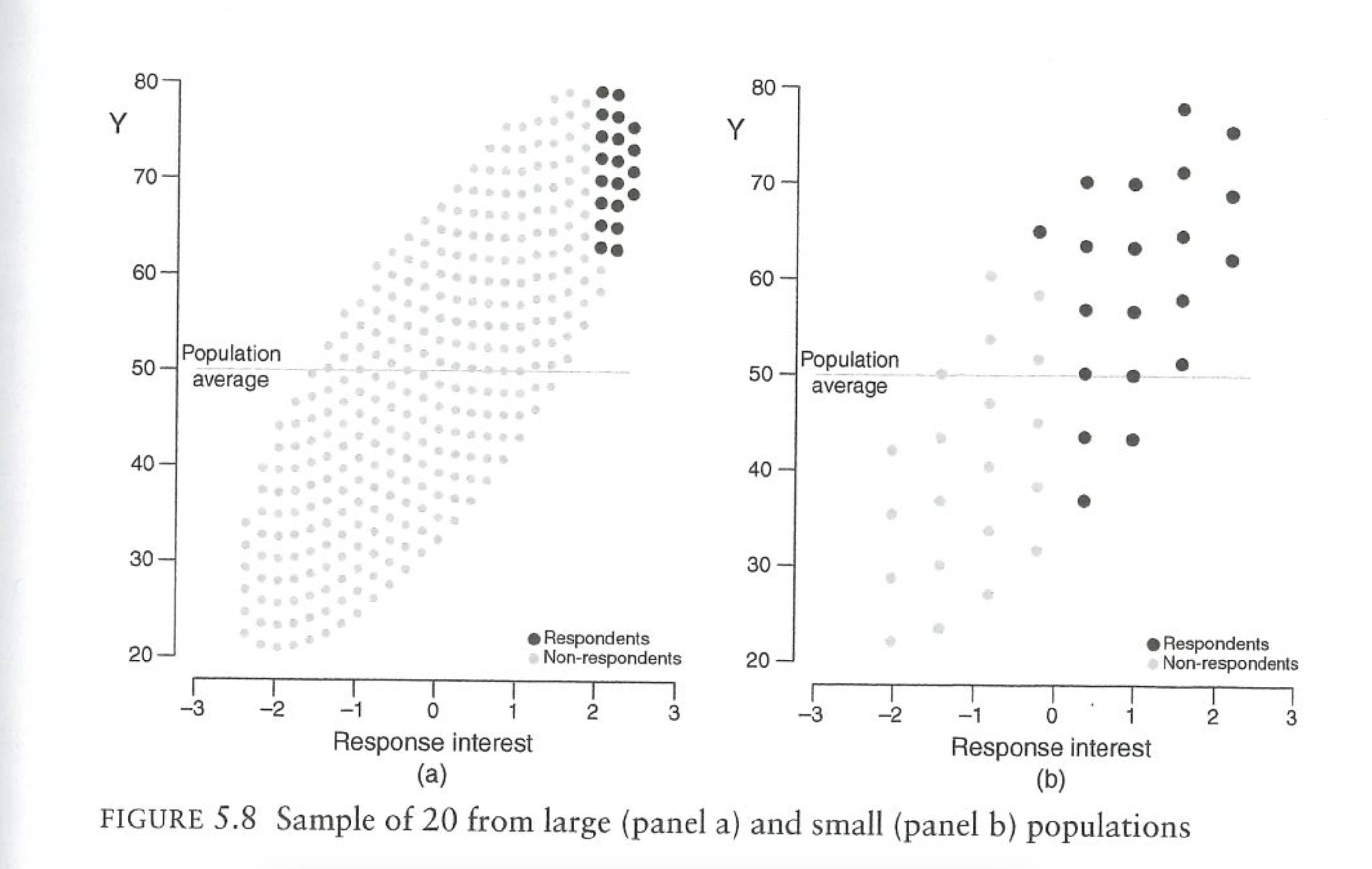
Think about a concrete example of going to a classroom to ask if people like homework. The people most likely to answer you are the people who like homework the most. If you ask 10 people in a classroom of 20 people if they like homework you will get the 10 keenest people in that classroom. That’s unrepresentative, but not awful. Now imagine asking 10 people in a school assembly of 1000 people if they like homework. Now you are going to get the 10 keenest people in the school. That’s a very weird group of people. (And they all went to Penn).
So it is with asking people about voting turnout. When we ask Americans if they’ve turned out to vote, we are getting the Americans who are straining to raise their hands to tell use that they have voted. This problem is much worse when we are asking 1500 out of all Americans than if we were to ask 1500 people in Philadelphia. We are going to get a proportionally “less weird” group with the smaller population size.
This is ultimately the big lesson from this chapter of Bailey. The epigraph from this chapter reads, “Usually we assume the problem is that group X is too amsll, but the actual problem may be that group X is too weird.” That’s pretty much the issue: when we are doing surveys we know we have miniscule response rates. The very act of responding to a survey makes someone weird. The big question (which is unknowable!) is if the people are weird in a way that relates to the outcome of interest, or not.
9.1.2 Heterogeneity in \(\rho\)
This problem might be group-wide, but we can also think about it occuring within groups. Our survey might be mostly fine, with response that is not related to outcome. However, there may be a particular sub-group that has NINR within it. The problem with this is that if we are weighting on that group then we are going to be shoving around an unrepresentative group of people. I’ve investigated this some in my own work, and we will see some examples of this occuring on Wednesday.
9.1.3 Applying this to Survey Mode
Where the Bailey/Meng stuff get’s particularly interesting is in thinking of the implications when thinking about the differences between “probability” and “non-probability” samples. We have not used this terminology to this point, but you can broadly think about these as “random” and “non-random” samples. Things like RBS and RDD are classic probability samples. Non-probability are non-random and might be thought of as “convenience” sampling, whereby the researchers simply try to get as many people as possible to respond to the survey.
The argument for non-probability sampling is that – while just getting the most convenient people to respond will inevitably lead you with a weird group of people – this weirdness can be mitigated through survey weighting. We may end up with too few high school educated people, or too few old people (in an online survey), but we can apply weights to fix that weirdness.
But what if the non-response (as in, the people who do not take an online survey) is non-ignorable? In that case there is nothing that can be done via weighting to fix the problem. However, that’s also true of probability (random) samples…. the people who decide to respond are going to be systematically different than the people who did in ways that might be nonignorable. So are nonprobability samples so bad?
The answer is yes. (Well, in theory, see the next section). Bailey walks us through this figure:
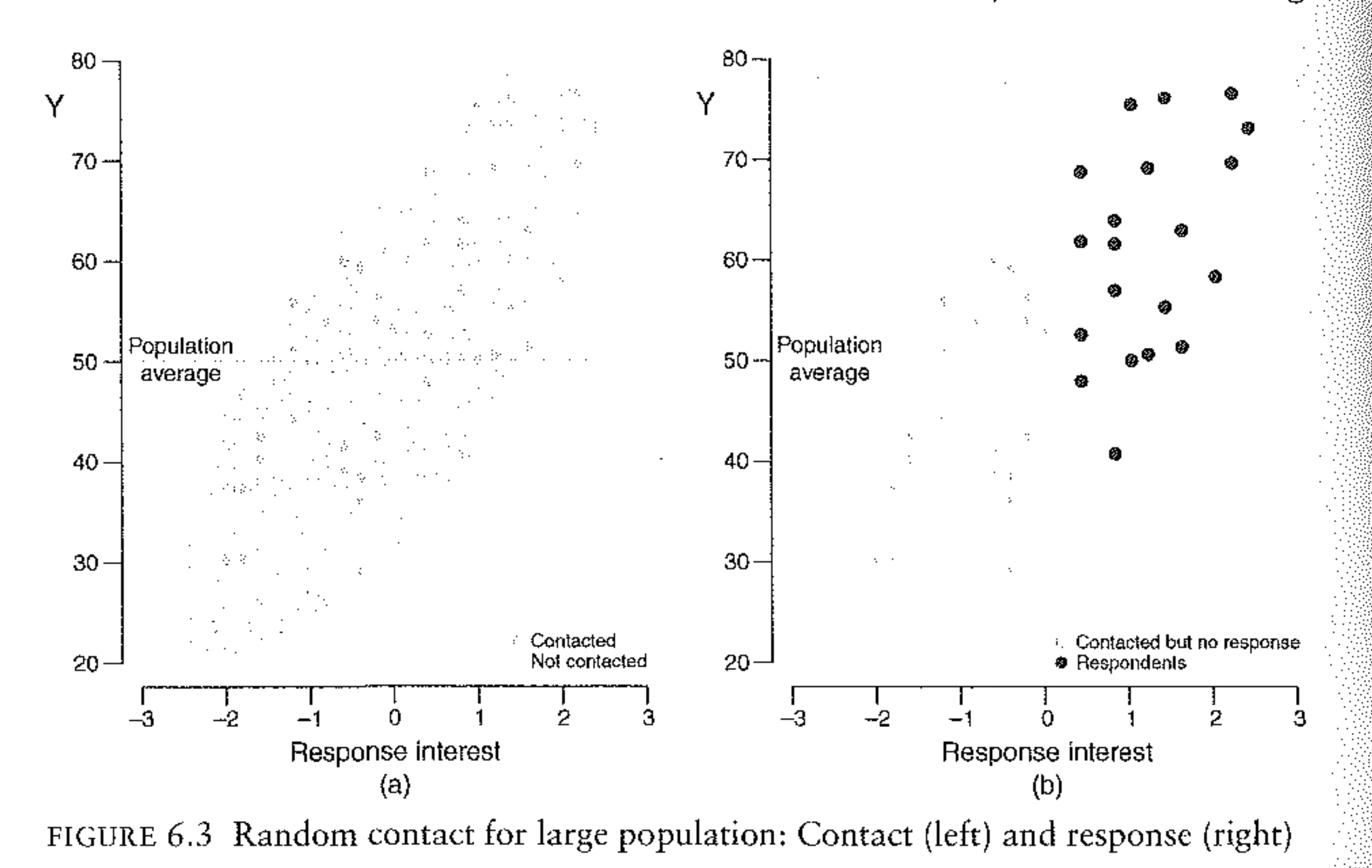
The left side of figure tells shows us the whole population, arrayed on both their latent likelihood of responding and the outcome of interest. This is a “tilted fish”, in that the people most likely to respond are systematically different than the people who are less likely to respond.
In a probability survey we don’t reach out to everyone, but instead make a sub-selection of people to contact. This is what is in the right side of the graph. Because of this step, Bailey dubs these “random contact” surveys. The survey researchers will contact all the people in the right graph and get 20 people to respond, which are the black dots in that figure.
Now, those 20 black dots are weird relative to the distribution of those contacted, but they are not nearly as weird as the right-most 20 dots in the popualtion. This should seem familiar. This is the same logic we discussed above when it came to small and large populations. And this is exactly what is happening here: by randomly contacting a subset of the population we have turned a large population problem into a small population problem.
If we continue the school example from above: we definitely do not want to ask attitudes about homework to the first 10 students who raise their hands in a school-wide assembly. That’s a weird group of people. But if we can randomly select 20 students to ask, getting the 10 students we can coax an answer out of in that group will be proportionally less weird.
For this reason, we can consider a variation on the Meng equation when we have a random contact survey:
\[ \bar{Y_n} - \bar{Y_N} = \rho_{RY} * \sqrt{\frac{1-p_r}{p_r}}*\sigma_Y \]
When calculating the nonresponse error from a sample where random contact was the first we can change the data-quantity term to one that relies on the response rate, rather than the relative size of the sample and the population.
We can simulate these two different approaches with this code. We will do one survey where we simply randomly contact 1000 people in the population (non-probability) and a second where we first generate a random sampling frame of 5000 people and randomly contact 1000 people from there:
set.seed(124)  # for reproducibility

n <- 1000000

# Define correlation matrix
rho <- 0.2
Sigma <- matrix(c(1, rho, rho, 1), ncol = 2)

# Generate bivariate normal data
data <- MASS::mvrnorm(n = n, mu = c(0, 0), Sigma = Sigma)

# Convert to uniform(0,1) via the normal CDF
data_uniform <- pnorm(data)

# Extract vectors
p <- data_uniform[,1]
y <- data_uniform[,2]

sim.dat <- cbind.data.frame(p,y)
sim.dat <- sim.dat |>
  mutate(y = if_else(y>=.5,1,0))


## ---------------------------------------------------------
head(sim.dat)
#>            p y
#> 1 0.03313594 0
#> 2 0.29415702 1
#> 3 0.22600217 0
#> 4 0.65746547 0
#> 5 0.86674901 1
#> 6 0.35699366 1
cor(sim.dat$p, sim.dat$y)
#> [1] 0.1563111

#####
#Nonprobability sample: randomly select 1000 peopel to contact
select <- sample(1:nrow(sim.dat), 1000, prob=sim.dat$p)
sim.dat |>
  mutate(r = if_else(row_number() %in% select, T, F)) -> sim.dat
#Actual Error
mean(sim.dat$y[sim.dat$r]) - mean(sim.dat$y)
#> [1] 0.041308
#Meng Equation for nonprob sample
cor(sim.dat$r, sim.dat$y)*sqrt((1000000-1000)/1000)*sd(sim.dat$y)
#> [1] 0.04130802

#####
#Probability sample: randomly select 5000 people to contact
select <- sample(1:nrow(sim.dat), 5000)
sim.dat |>
  mutate(c = if_else(row_number() %in% select, T, F)) |>
  filter(c) ->contact.dat
#Now simulate 1000 of these people responding based on p
select <- sample(1:nrow(contact.dat), 1000, prob=contact.dat$p)
contact.dat |>
  mutate(r = if_else(row_number() %in% select, T, F)) -> contact.dat
#Actual Error
mean(contact.dat$y[contact.dat$r]) - mean(contact.dat$y)
#> [1] 0.0314
#Meng Equation for nonprob sample
p <- 1000/5000
cor(contact.dat$r, contact.dat$y)*sqrt((1-p)/p)*sd(contact.dat$y)
#> [1] 0.03140314
Because of this feature – where random contact surveys effectively shrink the population size that we are sampling from – we can ask the question: how big of a non-random sample do we need to equal the possible error that we get from a random sample?
We can calculate an approximate effective sample size of a non-random sample using the following equation:
\[ n_{eff} ~ \frac{n}{\rho^2_{RY} (N-n)+1} \]
This tells us what sized random sample with 100% response rate we would need in order to get the same level of precision.
Note that this “Effective n” is unrelated to the effective n we calculate using the design effect. There we were considering the relative increase in variance that occurred because we were using weights. Here we are considering the relative increase in variance that occurs due to having non-ignorable non-response and getting the first 1000 weirdos in a gigantic population.
If the correlation between response and Y is .05, and we are sampling 1500 people from a sample of 1 million, then a non-random sample will have the same effective sample size as a random sample of:
denom <- ((.005^2)*(1e+06 - 1500))+1
1500/denom
#> [1] 57.77564
This survey would have the same precision as a true random sample of around 58 people.
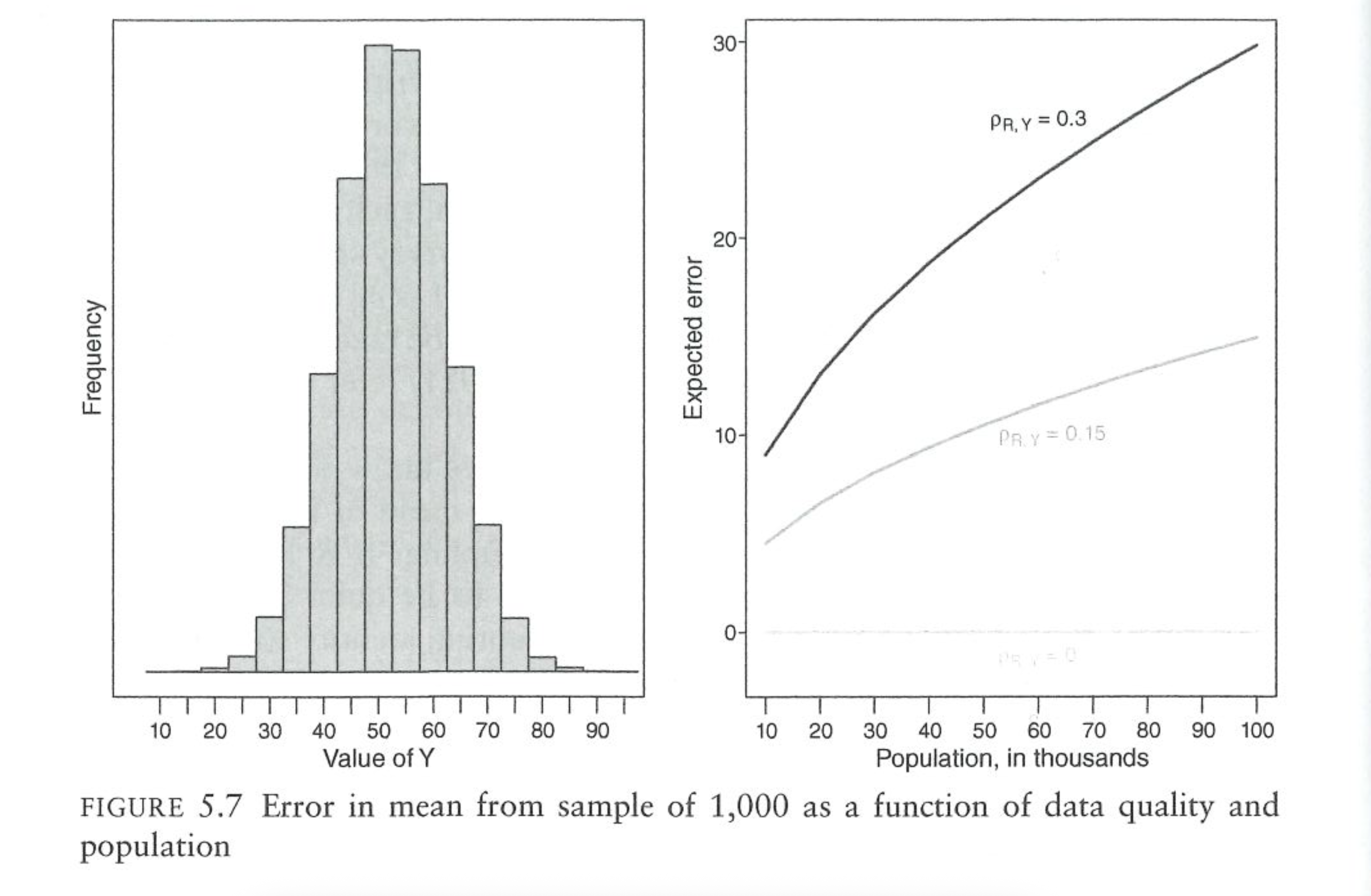
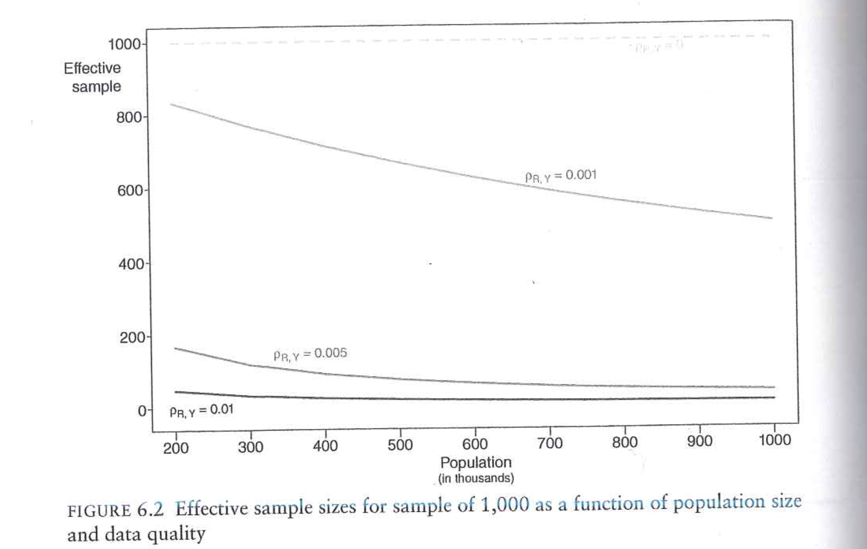
This figure from Bailey shows the effective sample sizes for different combinations of NINR correlations and population sizes for a sample size of 1000:
9.1.4 Is it really this bad?
Bailey’s chapters here make it seem like polling – and particularly non-probability – polling are hopeless. Even for probability polling, even a relatively modest NINR correlation will lead to runaway polling error of 10, 20, 30 percentage points. The problem is even worse if we are doing non-probability polling where instead of the “small population” of the random people we contacted, we are going to get the first 1500 weirdos in the population.
I think this chapter is really helpful in determining (mathematically!) how bad things can really get with nonignorable nonresponse and low response rates.
But…. we know that polling (at least election polling) simply isn’t that bad. We saw last week in the AAPOR report that error rates (while large) are smaller than in elections in the distant past. And what’s more: nonprobability online samples don’t seem to do markedly worse than high-quality RBS probability samples.
So the question, for me, is why polling is so good given the dramatic errors that can easily be created via the Meng equation. To me, I think that after controlling for reasonable covariates (including a measure of partisanship or past vote) \(\rho_{RY}\) has to be incredibly small. That is: once we have corrected our sample for demographics and political covariates that are related to both response and the outcome, the remaining “weirdness” of our sample is relatively minimized.
Indeed, this just simply has to be the case because we know that election polls are not 30 percent wrong.
9.2 Partisan Non-Response
One particularly pernicious form of NINR is when the latent variable affecting the probability of response is the outcome of interest itself. This is, probably, the case in contemporary election polling where President Trump has repeatedly assailed “fake polls” from the “fake news media”. People who support the President – hearing his words – very well may be less likely to respond to polls.
To help investigate this we are going to look at some of the research I have done with colleagues in this area.
The problem – and this is the practical problem with all of this – is that we cannot measure the opinions of people who don’t respond to our polls . To get around that I’ve had to take several creative approaches to try to understand the degree to which our polls are systematically missing more Republican respondents.
First we are going to take a broad look at this polling using the RBS surveys from the 2020 exit poll. With those we can directly measure the degree to which political views impact the decision to participate in polls – at least to the degree that party registration proxies for political views. In these data we also get some clues that partisan non-response is occuring even with “parties”.
Second, we are going to use a big mass of data to look at the degree to which there is partisan non-response across time and across surveys. These data allow us to see that there a large percentage in the variance in polls is from different groups of partisans opting in and out of surveys. Additionally, this partisan non-response is occurring within weighting cells (things like age, race, education) in a way that renders those things useless in weighting our way out of the problem.
9.2.1 Partisan Non-Response in the 2020 Exit Polls: POQ Paper
The goal of this paper is to try to understand if certain partisan groups are less likely to respond to polls compared to others. As just discussed, the fundamental problem here is that we do not observe the opinions of the people we do not interview. So we need some way to measure charecteristics of the people that we did not interview.
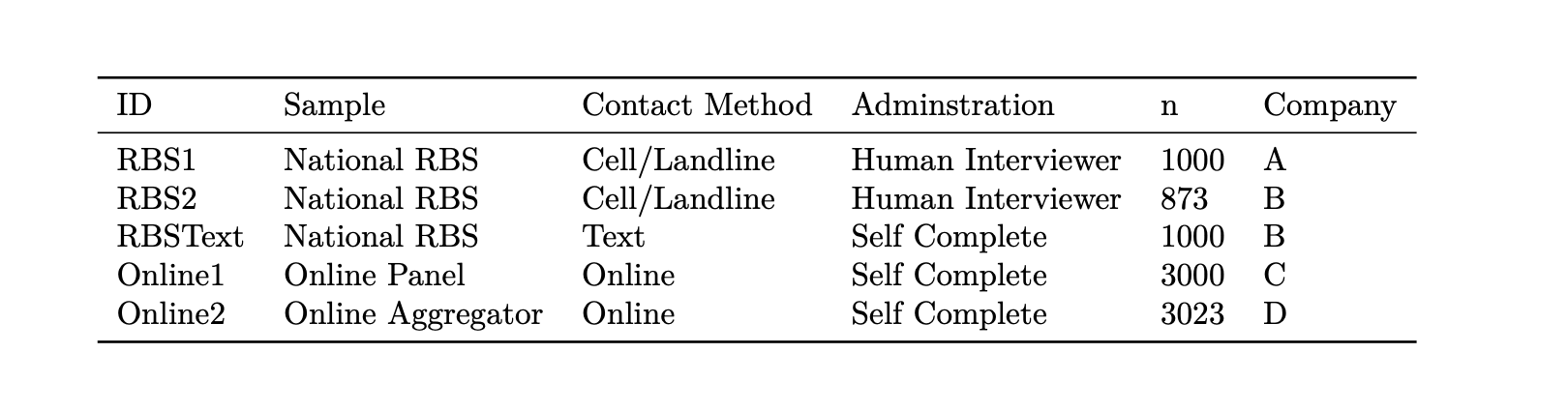
This, helpfully, can be done in an RBS survey. Because we are sampling off of the voter file, we know – for the people that we do not interview – whatever information is contained in the voter file. This will not give us attitudinal information: we cannot know their ideologies, issue positions, or even partisan identification. But we do get basic information about their age, gender, race, and location.
Additionally, we get information about their likely partisanship. This is the terminology we settled on in the paper because to measure partisanship in the voter file we have to rely on two different measures depending on state. The first is party registration. In states like Pennsylvania when you register to vote you register with a particular party (or as an independent). Because of this, we know for everyone in the sampling frame if they are registered democrats, republicans, or something else. In other states you do not register with a party. In those states L2 (the voter file company) will impute someone’s partisanship. They do this with modeling, and largely rely on the primaries people voted in, as well as their demographic charecteristics and location.
Neither of these measures are perfect. Party registration is, at least, something done by the respondent, but lots of people never update their party registration and it may no longer match their partisan identification. (This is particularly true in the south, which still has “too many” democrats relative to voting behavior). Imputed party is more sensitive to changing context (you are voting in Republican primaries, you are now a Republican), but as a model based approach it is prone to errors. (It’s rare for a 30 year old white women with an advanced degree living in Graduate Hospital to be a Republican, but it can happen).
But it’s the best we can do.
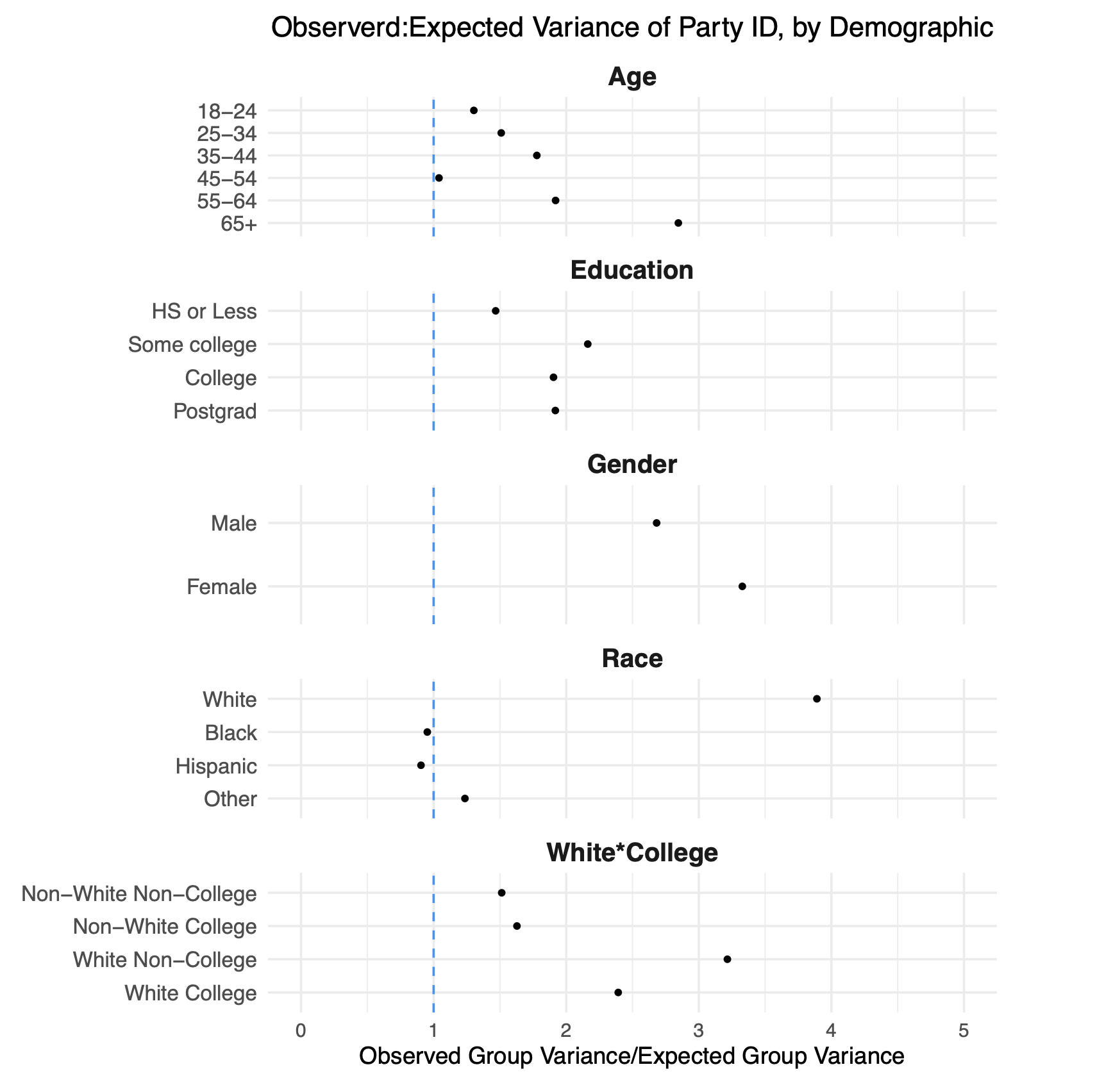
We have the information from the telephone component of the 2020 exit poll:
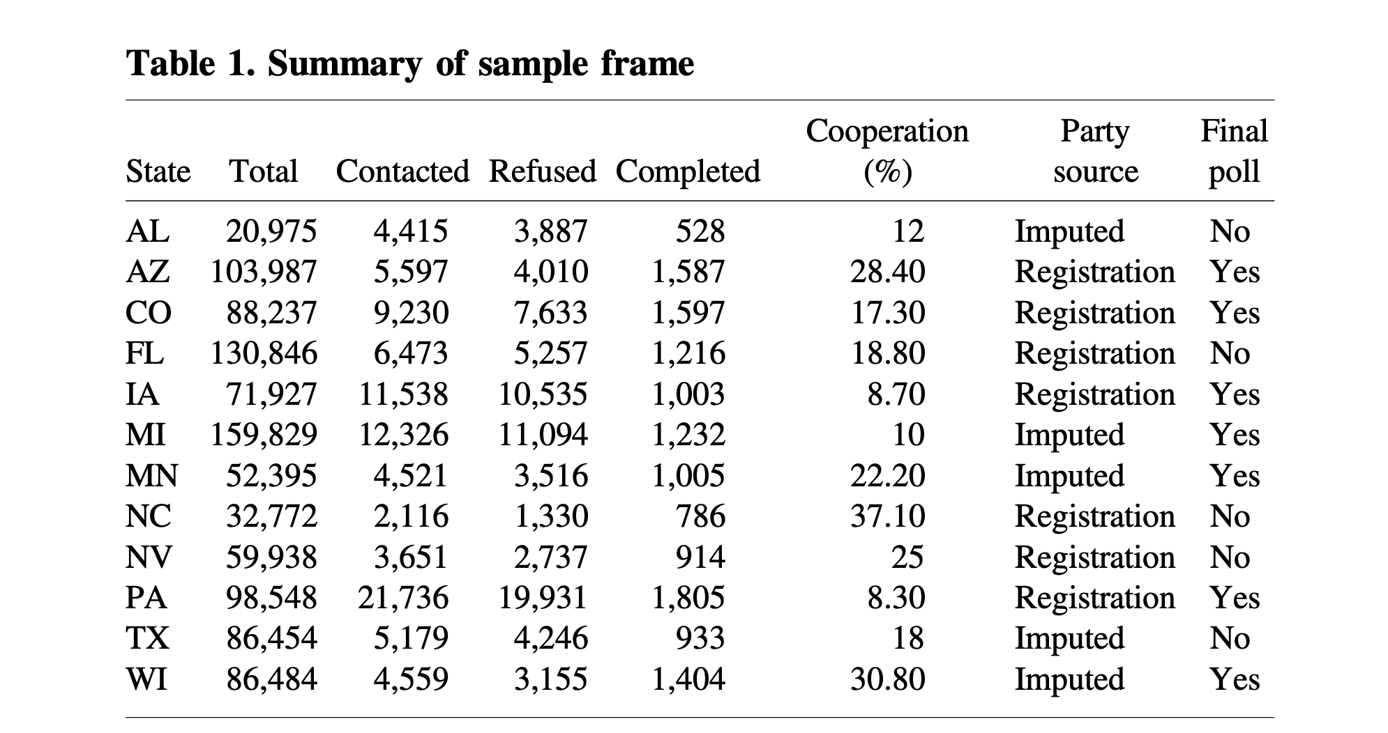
In this paper we are looking at the cooperation rate, which as a reminder, is \(\frac{Completed}{Contacted}\). This is preferable to the response rate (\(\frac{Completed}{Total}\)) or contact rate (\(\frac{Contacted}{Total}\)) because it is the quantity that is the most clearly impacted by personal/political decisions. We have this person on the phone, do they want to participate? It’s at that point that “politics” may enter the process.
So across all of these states we have all of the people who were contacted, and then code a variable to indicate whether that person cooperated or not. Of interest is whether different demographic characteristics correlate with cooperation.
We specifically estimate this regression:
\[ P(Coop) = \alpha_s + \beta_RR + \beta_I I + \beta X + \gamma G + \epsilon_i \]
We are predicting the probability of cooperation based on indicator variables for Republicans and Independents (Democrats will be the “base” category here). \(X\) represents a matrix of individual level charecteristics that will be controlled for (we will see them in the figure below), and \(G\) represents a matrix of geographic control variables. Inclusion of these control variables are important because if, for example, young people are less likely to participate then older people, and young people are more likely to be democrats, it might appear that there is a relationship between party and cooperation that is really just a function of age. Additionally, this regression is estimated with “state fixed effects”. The math behind this is not important, but the intuition is that the regression is only going to look at the effect of partisanship (and all other variables) within states. So the results below cannot be explained by a more Republican state having a lower cooperation rate than a Democratic state.
Here are the results in graphical format:
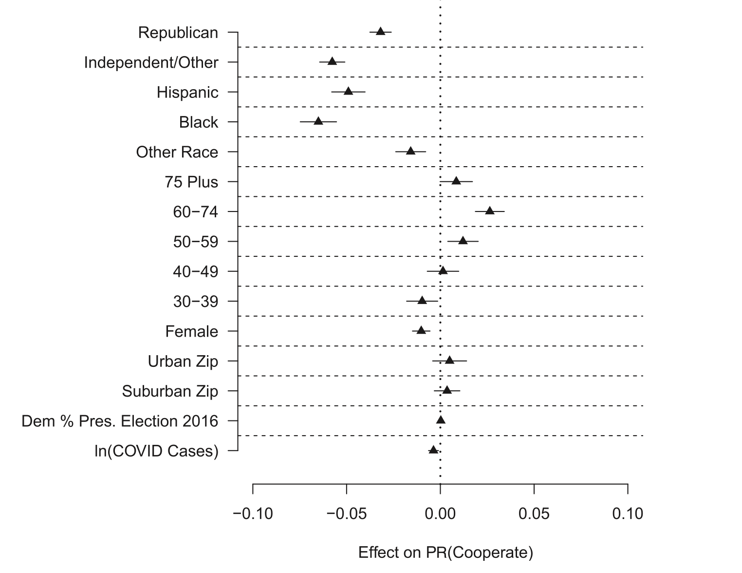
These coefficients tell us the effect of these various categories on the probability of responding compared to the omitted base demographic for most categories.
The top two rows tell us the effect of being a Republican and Independent relative to being a Democrat on the probability of cooperation. We see that Republicans are about 3 percentage points less likely to cooperate with polls compared to Democrats. This is “big headline” of this study. This was not something that was supposed to happen, and if you read literature from before 2016 the overwhelming consensus was that Democrats and Republicans were about equally likely to participate in polls because what mattered was political interest, which both had.
It’s not surprising, for that reason, that Independents have lower cooperation rates than either Democrats or Republicans. Independents are known to have lower interest in politics than registered partisans, so them having less interest in participating in this poll is not surprising.
One thing that these results cannot determine, however, is why Republicans were less likely to participate. In particular, we just know that Democrats participate more. The likely explanation is that Republicans were disincentivized to participate based on their politics (“fake polls”). But these results are totally consistent with Democrats being particularly gee’ed up to participate!
The other coefficients in this model are also interesting to look at, though they are things that much more easily be weighted to (and were weighted to).
Compared to white individuals, hispanic, black, and those whose race was “other” are less likely to participate.
Compared to 18-29 year-olds, older Americans were slightly more likely to participate.
Compared to men, women were slightly less likely to participate.
Geographic features had little effect on participation. It didn’t really matter if you you were in a rural, suburban, or urban area; nor did the politics of your area (measured by 2016 vote) matter in influencing individual participation.
There is a small, statistically significant, negative impact of cumulative COVID cases (remember, this is October 2020) on participation. This was a prominent theory at the time: people are not going to answer frivilous polls when dealing with health issues and human tragedy. But this small effect is relatively insignificant in the grand scheme of things. I also think that this theory – that COVID would dampen political interest – was proven definitively wrong when 2020 had they highest electoral turnout in 100 years.
We further break this result down by running the same regression separately in each state.
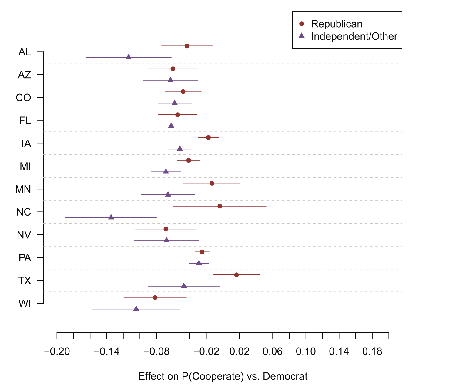
There is a remarkable consistency to this result, where Republicans in each state (except Texas, Minnesota and North Carolina) are less likely to participate than Democrats, and Independents are universally less likely to participate.
This is some insight into writing papers for lazy anonymous reviewers. You just keep hitting them over the head with the same result again and again until they give up.
It’s helpful to know that there was partisan non-response, but it’s hard from the figure above to decide how much it mattered. In particular, because partisanship is correlated to age, race, education etc, once we weight for those things maybe it corrects for partisanship.
To understand that we make a simple adjustment to the weights in the survey, dividing the weights by the cooperation rate of each group so that Republicans and Independents are weighted relatively higher than Democrats in a way proportional to their likelihood of cooperating.
The results of applying those weights are here, where the original survey estimate is in yellow and the adjusted survey estimate is in green.
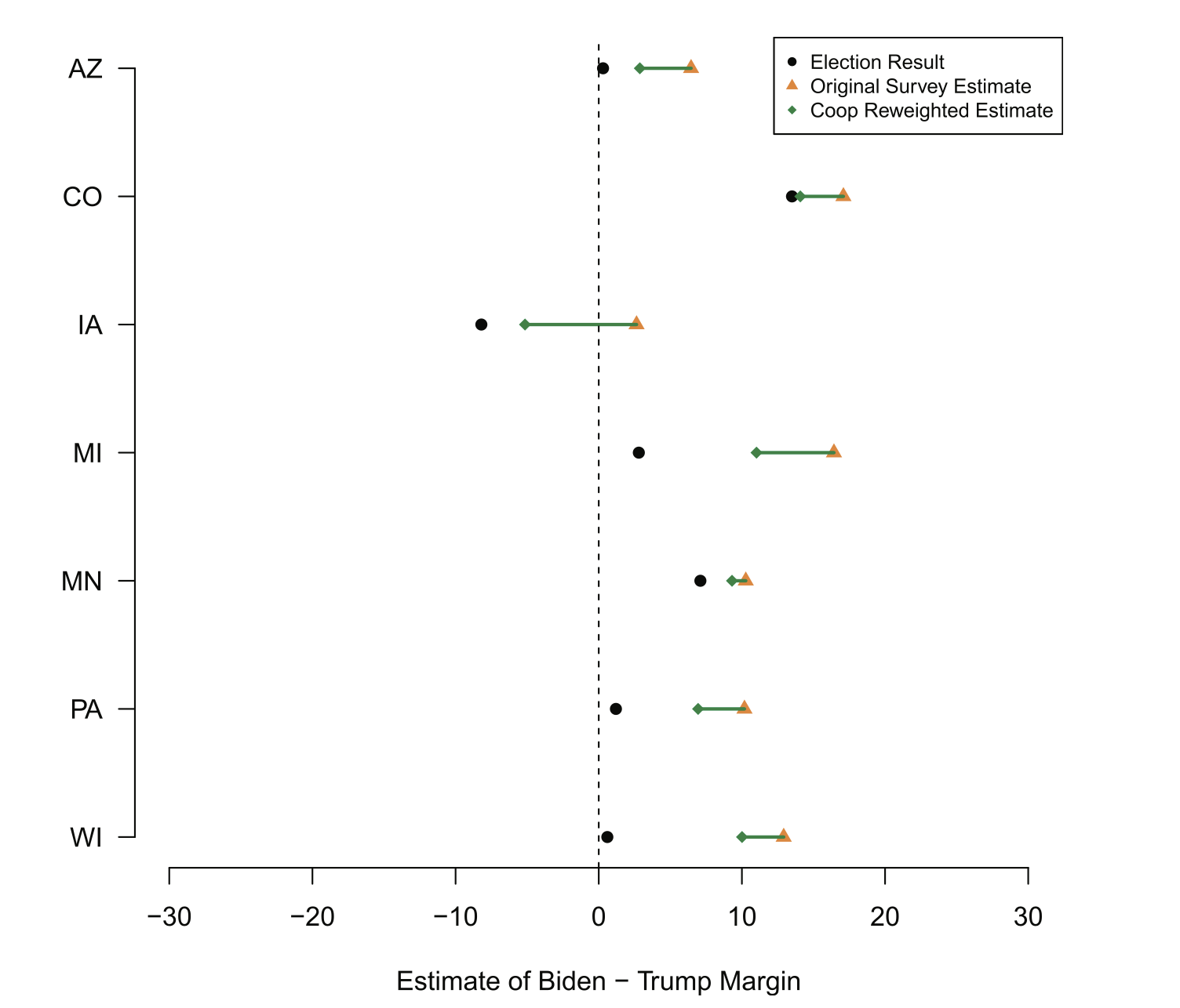
In all cases adjusting the weight to take into account differential partisan non-response makes the estimate better. All of these polls were biased in the Democratic direction, and bumping up the effective number of Republicans via this correction obviously drags them back towards the true answer.
But why doesn’t this correction fall short? Particularly in the key states of Michigan, Pennsylvania, and Wisconsin, this correction makes things better but still results in polls that are far too Democratic.
There are two possibilities.
First, is that this correction relies on the original sampling frame having the correct number of Democrats, Republicans, and Independents compared to the actual electorate. The sampling frame for this was the registered voters the data vendor felt were likely voters. Particularly with the number of new voters in 2020, it is very possible that this frame contained too few infrequent Republican voters. As such, simply correcting things to pretend that the Republicans we called responded at a higher rate would not be enough to overcome the original bias in the sampling frame.
The second problem is a bit more subtle. We could have the wrong group of Democrats and Republicans in the poll.
Now, again (and I keep saying this because it’s really important), we don’t know the attidues of the people not in our poll. However, we do know things about the people who took the poll and we can use that information to try to determine if these groups look reasonble.
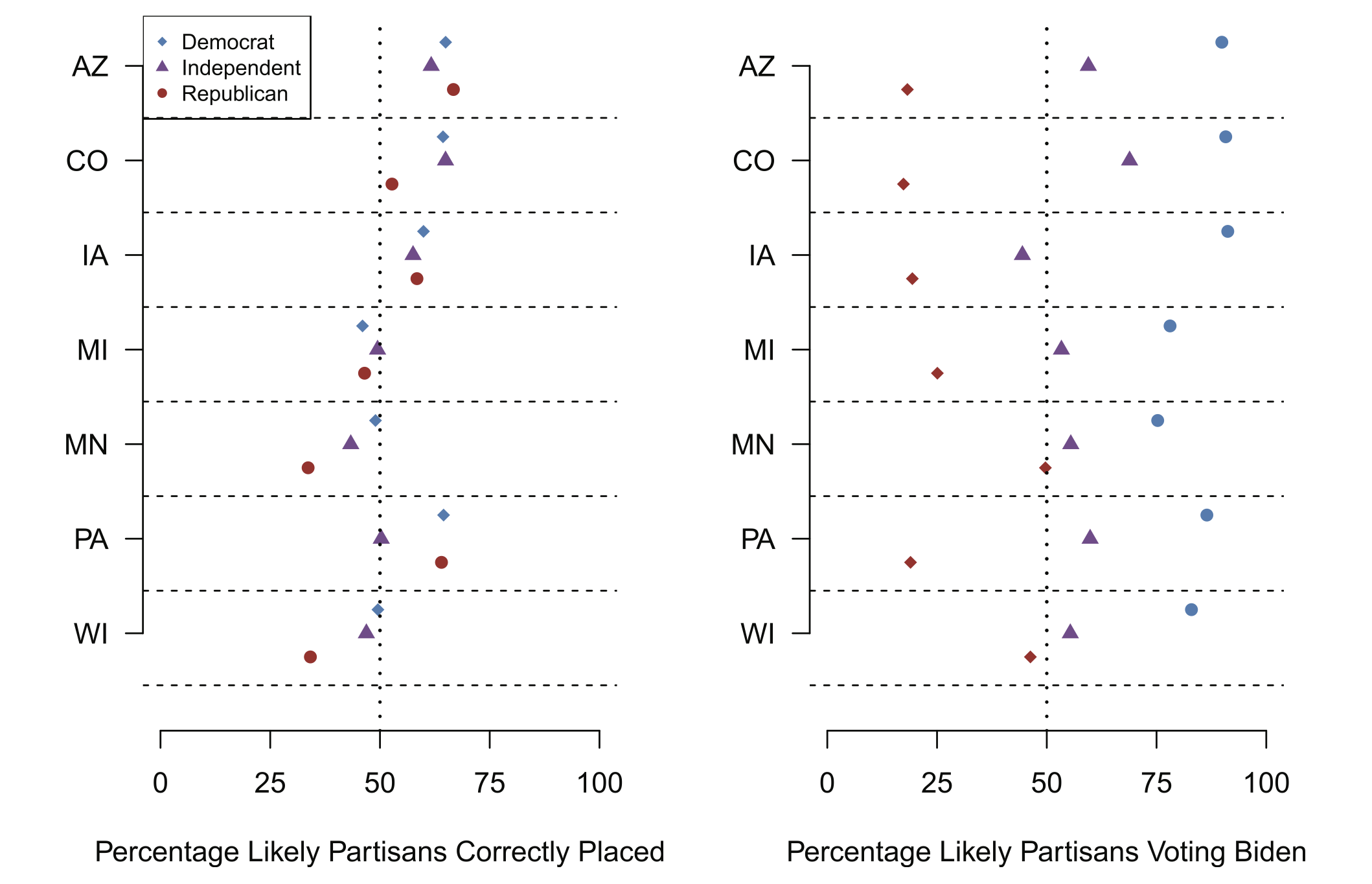
The way that we get at that is to compare the respondents likely partisanship (their party registration or imputed partisanship) to their actual partisanship and their vote choice.
In the left panel we measure the degree to which likely partisanship matches up with self reported partisan ID. Do people with Democratic party registration report being Democrats? Do independents report themselves as Independents. The results tell us “kind of”, with significant variation. Arizona, for example, has really good match rates. Around 60-70 percent of likely Democrats say they are Democrats, etc.
The matches are particularly bad in Minnesota and Wisconsin. Looking at the Republican dots, just around 30% of people on the voter file as Republicans actually say that they are Republicans when asked.
Now, maybe that’s true of every registered Republican in these places and the Republicans we have in our poll are a representative sample. That conclusion would be hard to square with the right panel, which looks at the percentage of each group who reported they would vote for Biden. Again looking at Minnesota and Wisconsin, nearly 50% of likely Republicans report that they are going to vote for Biden. That absolutely cannot be true of all likely Republicans in these two places, otherwise Biden would have won those states by double digits.
So what is happening here. They most reasonable explanation is that there is differential partisan non-response within these categories. The Republicans we have are not like the Republicans we don’t have. If we relate this to the Bailey work above, within the Republican category (particularly in the midwest) there is a correlation between response probability and the outcome. This is a group of weirdos, relative to all Republicans in these two places.
This all means that simply weighting to party registration (even if you get the party registration of the likely electorate correct!) will only be marginally effective in fixing the polls! You actually have to weight to some sort of revealed preference like having previously voted for Trump or to actual partisan identification.
9.2.2 Partisan Non-Response Across Time and Across Samples
The POQ paper tells us that partisan non-response is a potential problem. But those results were limited to a particular poll in a particular time period. The paper also did a just-ok job of describing the degree to which normal weighting can fix this problem. We just rely on the exit poll weights in that paper and you can quibble that maybe if we just did a better job choosing those weights (including a better likely voter screen) the polls would have been fine.
Which leads us to the next set of findings. These are what I am currently working on (when I have time), so this is still a bit of a work in progress.
What I wanted to determine is the degree to which partisan non-response causes variance in polls, and the degree to which traditional weighting (i.e. weighting that doesn’t include partisan or political targets) can fix that variance.
I use two sources of data to understand this. First, I use results from NBCs collaboration with Survey Monkey. In election years we have had pretty constant week-to-week surveys of the electorate which provides a rolling cross-section of Americans leading up to an election. This data is helpful because we are holding constant survey mode and sampling frame and just seeing variance over time.
The second source of data is a unique data collection excerise we undertook last year, where we contracted with 4 survey firms at identical times to field an identical survey with an identical sampling frame. These data hold constant time and instead vary the survey mode to create variance.
9.2.2.1 Constant Survey Over Time
First let’s look at the results for holding constant the survey and allowing variation over time.
This Survey Monkey poll was in the field for the 16 weeks leading into the election, and collected results for nearly a million people. What this allows us to do is to bin people into weeks and imagine that each week is it’s own “poll”. That way we can determine how much variation is happening in the poll, and what the source of that variation is.
Looking at the top left of this panel we can see the variance in the poll week to week. The y-axis is the percent of the people who say they are going to vote for Joe Biden for President, and the x-axis is time. We can see that there is substantial variation week-to-week in the results of the poll.
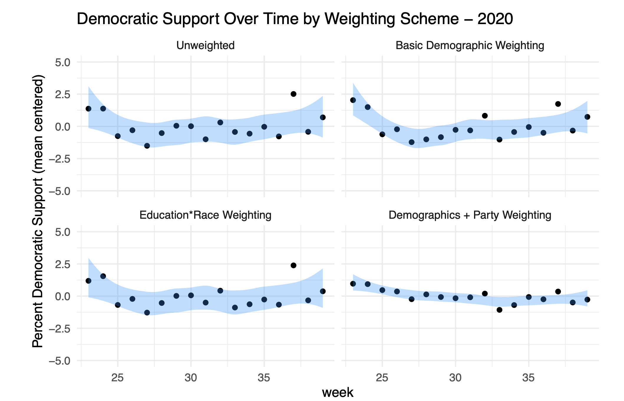
Some of this variation is due to basic sampling error, and some might be due to variations in who responds to the poll week-to-week. To try to understand the next three panels apply different weighting schemes to see the degree to which the variation is reduced.
The top right panel applies basic demographic weighting (age, race, sex, education, census region) and we see that this doesn’t really do much to reduce the variance.
A really important conclusion out of the 2016 election was that we needed to weight to the cross-over of education and race. We can’t just upweight low education people when we actually need to upweight white low education people. The lower right panel applies this variable in weighting, but that also doesn’t reduce the variance.
What does reduce the variance is weighting to party. (Here all I’m doing is just choosing one week’s partisan totals as the target and weighting all the weeks to be the same. I can do this because I just care about comparing week to week, not getting the number “right”.)
In the lower right panel we see that there is practically no week to week variance once we hold constant the percentage of Democrats, Republicans, and Independents.
Put another way: nearly all of the “variance” in this poll from week to week was simply a change in the partisan composition of who is responding to this poll.
This result is really a replication of an earlier study that used X-Box (yes) data to predict the 2012 election. Those authors found that changes in their poll topline was really just Democrats and Republicans changing the degree to which they were responding to the poll. We talked above about how the decision to actually participate in a poll makes you a weirdo. The degree to which we are weirdos is likely pretty dependent on the context in which you ask a question. If it’s an exciting week to be a Democrat then Democrats are likely excited to take a poll. If it’s an exciting week to be a Republican then Republicans are likely to be excited to take a poll.
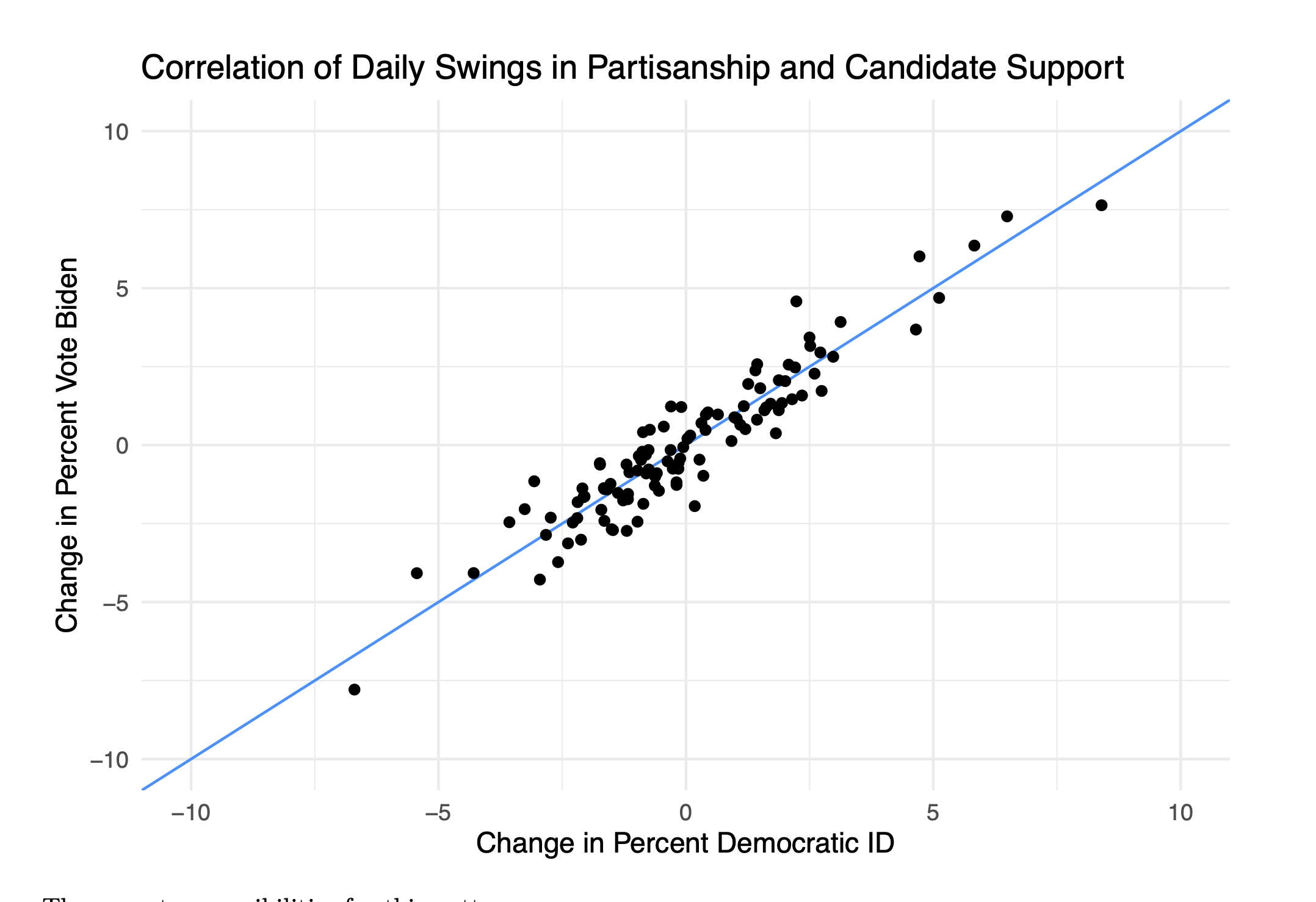
This dynamic is summed up in the above figure, which looks at the change from one day of the survey to the next in the percent of people who say they are Democrats versus the day-to-day change in the percent of people who say they are voting for Biden. We see that there is nearly a 1:1 correlation between these things.
So, in short, nearly all the variation in this poll (and probably, across polls) are just changes in partisan non-response.
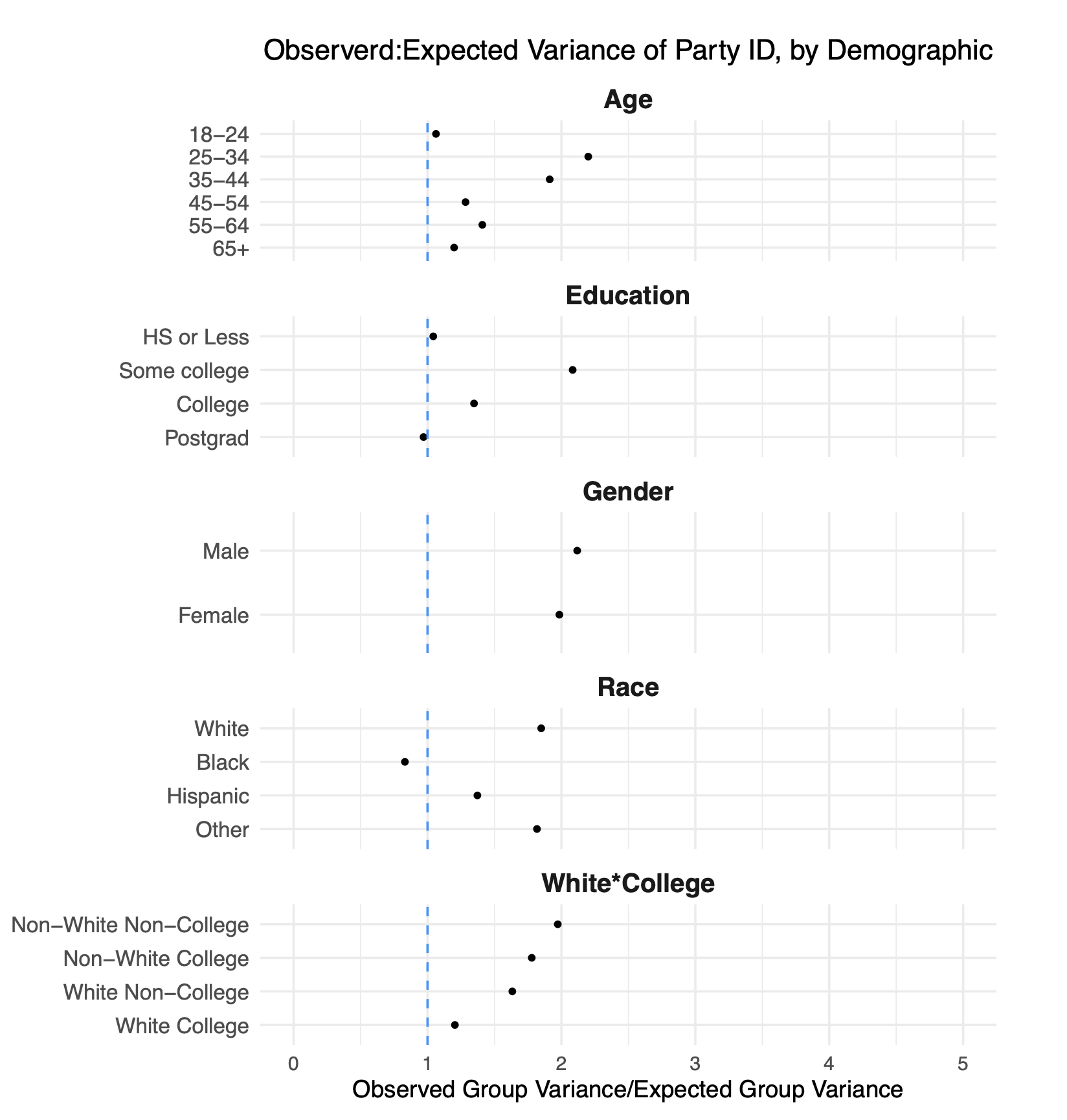
But this poll allows us to go a bit deeper into why traditional weighting does such a bad job of picking up this dynamic. We know partianship is correlated with age, education, sex, all the things we are weighting to in traditional weighting. So why doesn’t holding constant the number of low education voters (or whatever) fix this problem?
I get at this in this figure:
There’s a lot going on here so bear with me as aI walk through this.
In each line of this figure I am looking at the within-cell variation in the percent of people who say they are Democrats. So in the top line, I am looking only at 18-24 year olds. For that group, I calculate what the week-to-week variance in the percentage of democrats. However, due to random sampling we know that there is going to be some normal week-to-week variance in this number as well, but we can calculate that exactly by looking at the sample sizes in each week.
What is represented on each line is the ratio of these two numbers. Numbers above 1 tells us that there is within-cell variation in partisanship that is above and beyond what we would expect due to simple random sampling error.
Nearly all the points are above 1, which tells us that within weighting cells there is substantial partisan non-response. This varies by group. Looking at race: black and hispanic respondents have relatively similar partisanship week-to-week. But among white respondents there is substantial difference in the partisanship of who responds. If one week we say “whoops to few white people” and give them more weight, in some weeks that will be up-weighting a Democratic group of white people, and in other weeks that will mean upweighting a Republican group of white people.
In other words: the partisan non-response we see overall is replicated within groups that we are weighting to. That makes those traditional demographic categories useless in fixing this problem because we are just up and down weighting groups that are varying in the same way that the overall sample is varying.
9.2.2.2 Constant Time Across Surveys
In the above we were able to hold constant the survey source and look at the variation over time to show that our surveys are infected with partisan non-response.
One objection to the above might be that, by holding constant partisanship over time we were cancelling out real changes in the electorate that were occurring. That is: maybe swings in partisanship are not a function of who is responding, but a change in the actual opinions and attitudes of the people responding.
To help understand that, in this second section we want to hold constant time and instead vary the survey source. If we find the same pattern here (spoiler: we do), then it helps to confirm that what is happening here is that variation in our polls is primarily based on who participates, not their opinion, and that traditional survey weighting cannot fix the problem.
In Spring of 2024 we contracted with 4 firms to deploy the exact same survey instrument at identical times on their platforms. Although we are still going to weight the data, we also set sampling quotas for key demographics for each of these firms to hit. We purposefully chose a range of sampling frames and survey modes to try to capture the real range of surveys we see in real polling.
We are goign to deploy the exact same set of tests to the resutls from these 5 polls.
Again we will begin in the top left by assessing the variance in the unweighted percentage in each poll that support Joe Biden for the Presidency (these polls were in spring of 2024 before Biden dropped out). There is a substantial amount of heterogeneity here, which is at least a little surprising in and of itself. Particularly because we gave these companies sampling quotas to hit you would imagine that they would return similar results, but they do not.
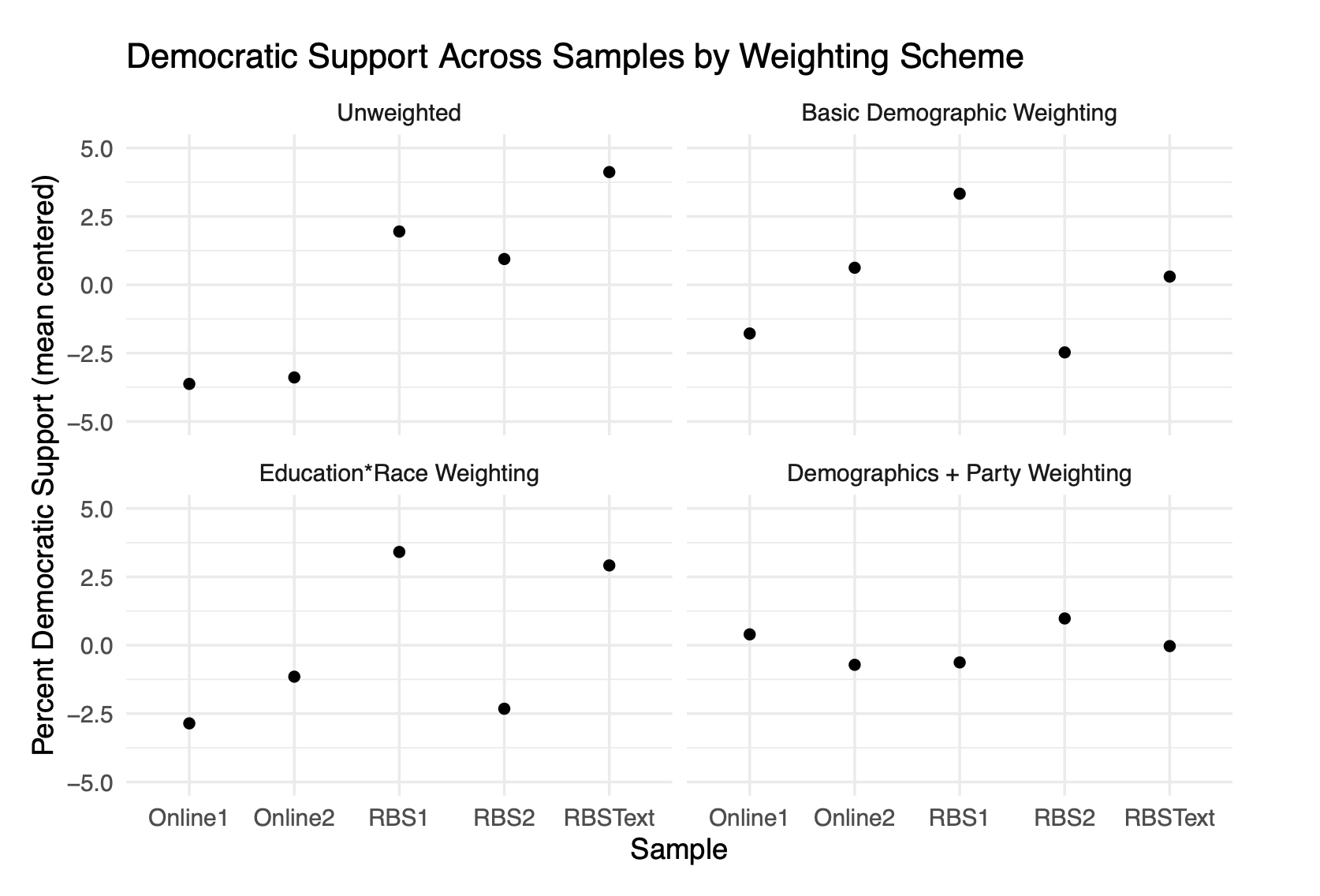
Again, in the top left and the bottom right we apply standard demographic weighting. And like in the over-time study this really does very little to reduce the variance in the estimates. Having identical surveys in terms of age, race, education, gender, census region – and then including the cross between education and race – doesn’t lead to identical survey estimates.
What does lead to identical (nearly) survey estimates is weighting to partisanship, as we do in the bottom right panel. Once we balance the partisanship of each survey we end up getting around the same result.
To be clear: these should all produce the same result. These are all studies performed on the same population (registered voters) all at exactly the same time period. Other than basic sampling error we should get approximately the exact same result in all 5 studies. The only way to do that is to weight to partisanship.
Again digging in to the subgroups, we can see that even holding constant time, when we look across surveys there is substantial variation within groups when it comes to partisanship. This is why weighting to standard demographics does next to nothing in these cases, because the partisan non-response we are seeing is happening a way uncorrelated to these demographics.
 ### What to Do?
Partisan non-response is a substantial problem for election polling, and one that is not easily solved by traditional demographic weighting.
Well this is “Advanced Topics in Weighting”, so I’m confident in saying: I don’t know yet.
My short answer is that – at least until polling becomes depoliticized – weighting to a political target should be thought of as mandatory. This is a controversial practice in polling, and lots of “traditional” pollsters think that it is a cheat code to turn bad data into good data. What the above work shows is that even high quality polls suffer from partisan non-response, so I think these people are fooling themselves that the problem is data quality. And honestly: It’s hard to be impressed with the “data quality” of your RBS poll when the response rate is under 5%….
Previous vote choice is a good option for what to weight to. It’s a helpful target because it never changes. The distribution of how people voted in 2024 is a set quantity.But it’s not without it’s problems. First, there is the concern that people forget or lie about their vote choice. If 2024 Trump voters who no longer support him say that they “voted for Harris” or “Didn’t vote” that’s going to screw up the weighting. Second, when we are talking about election polling, past vote has to be filtered through some sort of likely voter screen that affects things greatly. We can’t just assume that 2026 voters will have an identical distribution of Trump/Harris voters as the 2024 electorate!
Partisanship is another option to weight to. The benefit of this is that we are asking people about their current state. Are they a Democrat or Republican now. There are two problems with it. First, the only way to know the “true” distribution of partisanship is through a survey. People make use of Pew’s NPORS study, which goes through intense ends to reduce nonresponse. Still, weighting a survey to a survey is uncomfortable. Second, by weighting to a distribution of partisanship we are “locking in” the distribution of the electorate and don’t allow it to change. That seems sub-optimal for any over-tiem sort of study.
The last option is party registration. This is a helpful target because if we are doing an RBS study we don’t have to ask people, it’s just on the voter file (at least for states where people register by party, in other states we would have to rely on modeled partisanship). The drawbacks of this we covered in the POQ study. People may take a long time to update their party registration, and there is no guarantee you don’t get partisan non-response within the registration categories.
The whole thing is hard! Sorry!