12 Panel Surveys
This section will not be on the final exam.
Time!
That’s right, Time! Time is so damn complicated in statistics. There are whole courses that untangle statistics that take into account time, and we will really only scratch the surface here.
There are lots of questions where we want to untangle causality over time. What causes what? This is really hard to do and has a great deal of pitfalls – some that are really hard to wrap your head around.
So today I want to dip our toes into this world and give you a basic understanding of how surveys can be used to untangle causality across time.
The primary methodology that allows us to do this are panel surveys, which are surveys that re-interview the same people in multiple time periods.
Panel studies, as we will see, have enormous benefits in untangling webs of causality. They also have one significant drawback: cost. It is enormously difficult to get people to participate in our studies once. It is astronomically more difficult to then track down and get the same people to participate a second time. More on this below, but the biggest threat to inference from panel studies is attrition, whereby a non-random group of people do not take your followup study.
12.1 Panel Example 1: Cancer Prevention Study I (CPS-I)
Few panel studies have had as much impact as the CPS-I, conducted by the American Cancer Society from 1959-1972. During this period, there was a need to build rock-solid evidence of the link between cigarette smoking and cancer. The evidence from this study (as well as some similar earlier studies in the US and Britain) led to the landmark 1964 Surgeon Generals’ report that was the first authoritative source making a link between smoking, cancer, and death. This report prompted the government to enact the modern system of health warnings and education that led to the (slow, eventual) decrease in smoking rates.
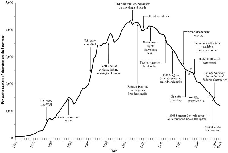
There were enormous financial and societal (people liked smoking) headwinds working against people trying to make the link between smoking and cancer. So what was special about this study?
Let’s first think about why a cross-sectional survey – that is, a survey that takes place in a single point in time – would be insufficient to proving the smoking-cancer link.
Let’s say we did a survey in the early 1960s and measured people’s level of smoking and their incidence of cancer. If we found a significant link (and we probably would!) what would have to be true from a causal inference perspective to claim that the smoking was the cause of cancer. We would have to believe that the non-smokers are just like the smokers except for the smoking. Now, smoking was more widespread in the 1960s, but even then that was not true. Smokers would have had all sorts of additional behaviors (drinking!) and co-morbidities that could explain the link between smoking and cancer.
The other problem with a cross-sectional study is a coverage problem. It would be very difficult and expensive to do a study in which you would recruit very sick people into your study. But without those people you would see a truncated dependent variable and therefore a smaller effect size. And there’s another group of people who you definitely wouldn’t get into your study: dead people!
The way that the link could be more definitively proven was a panel study, where people are recruited into the study and tracks them over time. The American Cancer Society used nearly 70,000 volunteers to administer their survey (mostly housewives!) who recruited just over 1 million people to be tracked in the study. These people were tracked over a 12 year period with repeated follow-ups. Critically, when people died that was also tracked, and authoritative death records were collected.
What was the benefit of this over-time tracking? When you have repeated measures of the same individuals over time, the “control” case for an individual becomes their past selves. You can track how changes in their behavior lead to changes in their health (including dying, in this case). Because we are comparing people to themselves, everything that we could measure about an individual, and anything that we couldn’t measure, is held constant. In other words: critics cannot claim that the link between smoking and cancer is due to certain types of people smoking, because we are comparing within types.
The biggest threat to inference in panel studies is attrition, which is people dropping out of the study. Above, we said that one of the reasons that a cross-sectional study wouldn’t work for this problem would be that it is hard to get sick and dead people into a study. The same thing is potentially true for followup waves of a panel. If little effort was made to followup with sick people (or confirm people are dead), then this panel study would have shown a smaller effect of cancer. The people who smoked a lot would disappear for the data, and the people left would be those that got less sick. This is why it was so important that the volunteers for this survey moved heaven and earth to recontact people and to obtain death certificates for those that died. This story might be apocryphal, but I’ve heard of one volunteer travelling to the arctic to track down a participant. I picture a 50s housewife on a dogsled with her clipboard, getting the job done in the name of statistics and better health.
12.2 Panel Example 2: Margolis on Religion and Politics
The reading for this week gives a really good example of how to use Panel data to untangle a complicated question of causality.
Your friend and mine, Professor Margolis, wanted to understand the interplay between political and religious identities.
We know that Republicans, generally, are more religious than Democrats, but we don’t really understand why that happens.
Up until this article the prevailing hypothesis was one of sorting. As the two political parties became more polarized on religion in the late 20th century, religious people increasingly found a natural home in the Republican party, and non-religious people found a home in the Democratic party. From this perspective, people’s religiosity is a constant identity that drives them to make decisions about politics.
This theory is almost certainly partially true, and there is really good evidence that attitudes about abortion in the 1990s were a significant factor in causing people to change their partisan identities to line up with their religious beliefs.
However, this theory does not really reckon with more recent research on just how strong partisan identification is. We aren’t going to get deep into social identity theory here (you should take Margolis’ class!) but our “party ID” is not just a label we put on our voting decision (“I have conservative beliefs, and therefore I am a Republican”). Instead, party ID is a highly salient, affectively charged, identity that can be enormously powerful in shaping our decision making and perception of the world.
As Margolis sums up:
[Party ID] is a powerful identity is a powerful identity that often lasts a lifetime and influences other attitudes and behavios. Partisanship shapes economic evaluations, trust in fovernment, feelings about the fairness of elections, and even consumption patterns and spending decisions.
From that perspective, it is not crazy to belive that the causal arrow – at least sometimes – could go the other way: ocassionally people’s partisan identification could influence their religiosity.
Margolis does not think this is true for everyone all the time, but instead believes that there are particularly salient moments in people’s live where this reverse causality could occur.
This figure sums up the theory of when partisan identification might influence religious affiliation.

In the top row is a summary of the usual pathway through religion in a person’s life. In childhood we are socialized into a particular religion (or none). When we reach adolescence and young-adulthood most people rebel or question their religious attachments and lower their church attendance. The critical stage is early adulthood when people decide to either return to religion or to permanently remove themselves from it. This process is supercharged by getting married and having children because that forces a reckoning with your personal values and place in the community. (It also makes you think about death a lot, from personal experience. That might just be me.)
On the bottom line is the usual pathway through partisanship in a persons life. In childhood we are innocent of politics and therefore have no party ID or an unstable party ID. Research has found, however, that partisanship largely crystallizes in your teenage years as a function of the global and particular environment that you find yourself in. Once this crystallization happens, party ID is largely unchanging for the rest of your life.
The critical cross-over point is in early adulthood. This is when people are making their decision about whether to return to politics, and are doing so in the context of having a deeply meaningful and crystalillized party attachment. Where better to pick up cues about how to embed yourself in spiritual life then from this partisan attachment that does so much to sum up your worldview and social attachments?
The theory predicts, therefore that there will be a conditional effect of party ID on religiosity for people in this critical life stage.
There are a few key tests here, but I’m going to focus on the panel study from the 2000s. (The earlier panel study is also cool and I return to that below.)
Margolis is using data from the ANES, which ran a panel study in the 2000,2002, and 2004 elections. That is, they repeated interviewed the same people across time for these 3 elections.
Here is what the data looks like:
library(tidyverse)
dat <- rio::import("https://github.com/marctrussler/IIS-Data/raw/refs/heads/main/ANESPanelMargolis.Rds", trust=T)
head(dat)
#>   attend00 attend02 attend04 pid00 pid02 pid04    kids
#> 1      0.6      1.0      0.8   Ind   Ind   Rep   Grown
#> 2      0.2      0.0      0.2   Ind   Ind   Ind At Home
#> 3      0.8      1.0      0.8   Dem   Dem   Dem   Grown
#> 4      0.0      0.0      0.0   Ind   Dem   Dem   Grown
#> 5      0.0      0.0      0.0   Rep   Rep   Rep   Grown
#> 6      0.4      0.4      0.4   Dem   Dem   Dem   Grown
#>     WT04
#> 1 0.8219
#> 2 1.1314
#> 3 0.8329
#> 4 0.4433
#> 5 2.0869
#> 6 3.1180
For these 839 people we have data on their religious attendance (measured from 0 to 1), their partisanship, and whether they have kids at home. For each of these things (except the kids thing, i’m not sure at what point that was measured) we have a measurement for the person in 2000, 2002, and 2004.
First let’s think about this as if it was a cross-sectional study and we only had data from 2004. If we wanted to know if partisanship caused religious affiliation, we might just determine the average religious attendance of people in the three groups.
dat |>
  group_by(pid04) |>
  summarize(weighted.mean(attend04, w=WT04, na.rm=T))
#> # A tibble: 4 × 2
#>   pid04 `weighted.mean(attend04, w = WT04, na.rm = T)`
#>   <chr>                                          <dbl>
#> 1 Dem                                            0.351
#> 2 Ind                                            0.331
#> 3 Rep                                            0.485
#> 4 <NA>                                           0.266
We can see that Republicans have, on average, higher church attendance than Democrats or Independents.
But what can we make of this information? Again, there are two, equally plausible explanations: either religious people are more likely to become Republicans (sorting) or Republicans are more likely to become religious (socialization).
Alright, so let’s make use of the time component of this survey.
Here is the wrong way to do this: what if we look at the change in the average church attendance between Democrats and Republicans between these two years?
dat |>
  group_by(pid02) |>
  summarise(mean(attend02,na.rm=T))
#> # A tibble: 3 × 2
#>   pid02 `mean(attend02, na.rm = T)`
#>   <chr>                       <dbl>
#> 1 Dem                         0.398
#> 2 Ind                         0.382
#> 3 Rep                         0.539

dat |>
  group_by(pid04) |>
  summarise(mean(attend04,na.rm=T))
#> # A tibble: 4 × 2
#>   pid04 `mean(attend04, na.rm = T)`
#>   <chr>                       <dbl>
#> 1 Dem                         0.368
#> 2 Ind                         0.398
#> 3 Rep                         0.537
#> 4 <NA>                        0.297
We see that Republicans held constant in their church attendance between these 2 years, but Democrats dropped in their church attendance. Does this show that Partisanship is driving church attendance. Not really! This setup is totally consistent with less religious people becoming Democrats in these two years, driving the average attendance of Democrats down. This is really critical: because we are allowing both things to change with this setup, we cannot separate out the direction of causality. This is no better than if we just had two survey waves and looked at the difference across those two survey waves.
To untangle this causality we want to look within individuals.
Here’s what we are going to do. First we can determine, how much, on average, did 2002 Republicans and Democrats change their religious affiliation between 2002 and 2004?
dat |>
  mutate(delta.attend = attend04 - attend02) |>
  group_by(pid02) |>
  summarise(difference = weighted.mean(delta.attend,na.rm=T, w=WT04))
#> # A tibble: 3 × 2
#>   pid02 difference
#>   <chr>      <dbl>
#> 1 Dem     -0.0300
#> 2 Ind     -0.0235
#> 3 Rep      0.00210
For each individual we are calculating the change in their church attendance in the 2 years. Critically, when we go to look at average differences, we are grouping only on 2002 partisanship. So we are saying: how much did Democrats in 2002 change their church attendance over the next 2 years? How much did Republicans change their church attendance over the next 2 years? Because we are not looking at how they changed their partisanship, we are now capturing only the effect of partisanship on changing church attendance, not the reverse.
To get the overall estimate we want to take the “difference-in-difference” between the two groups:
dat |>
  mutate(delta.attend = attend04 - attend02) |>
  group_by(pid02) |>
  summarise(difference = weighted.mean(delta.attend,na.rm=T, w=WT04)) |>
  pivot_wider(names_from=pid02, values_from = difference) |>
  summarise(Dem-Rep)
#> # A tibble: 1 × 1
#>   `Dem - Rep`
#>         <dbl>
#> 1     -0.0321
And we get an overall effect of partisanship.
The way Margolis estimate’s this in the paper is a little different, as she uses Regression. The regression method gives us a slightly different (though directionally the same) answer.
The key thing with regression in panel data is to include a lagged measure of the dependent variable in the regression. If we just do:
m <- lm(attend04 ~ attend02, data=dat, w=dat$WT04)
summary(m)
#>
#> Call:
#> lm(formula = attend04 ~ attend02, data = dat, weights = dat$WT04)
#>
#> Weighted Residuals:
#>      Min       1Q   Median       3Q      Max
#> -0.99366 -0.07173  0.00734  0.09639  1.62642
#>
#> Coefficients:
#>             Estimate Std. Error t value Pr(>|t|)
#> (Intercept)  0.05787    0.01065   5.434 7.27e-08 ***
#> attend02     0.81760    0.01960  41.707  < 2e-16 ***
#> ---
#> Signif. codes:
#> 0 '***' 0.001 '**' 0.01 '*' 0.05 '.' 0.1 ' ' 1
#>
#> Residual standard error: 0.2037 on 824 degrees of freedom
#>   (13 observations deleted due to missingness)
#> Multiple R-squared:  0.6786, Adjusted R-squared:  0.6782
#> F-statistic:  1739 on 1 and 824 DF,  p-value: < 2.2e-16
The intercept is the average church attendance in 04 among people who had 0 church attendance in 02 (it’s a bit higher), and the coefficient on attend02 is the effect of previous church attendance on current church attendance, which is (obviously) very positive! In simpler terms: when we include a lagged dependent variable in our model, the remaining variation is the change in this variable over time. When we include other variables, we are going to see their effect on the change in church attendance, just like we did above with averages:
m <- lm(attend04 ~ attend02 + pid02, data=dat, w=dat$WT04)
summary(m)
#>
#> Call:
#> lm(formula = attend04 ~ attend02 + pid02, data = dat, weights = dat$WT04)
#>
#> Weighted Residuals:
#>      Min       1Q   Median       3Q      Max
#> -0.93740 -0.06917 -0.00281  0.09489  1.65349
#>
#> Coefficients:
#>             Estimate Std. Error t value Pr(>|t|)
#> (Intercept)  0.04378    0.01455   3.009 0.002699 **
#> attend02     0.80232    0.01986  40.405  < 2e-16 ***
#> pid02Ind    -0.00159    0.01762  -0.090 0.928132
#> pid02Rep     0.05716    0.01727   3.309 0.000975 ***
#> ---
#> Signif. codes:
#> 0 '***' 0.001 '**' 0.01 '*' 0.05 '.' 0.1 ' ' 1
#>
#> Residual standard error: 0.2021 on 822 degrees of freedom
#>   (13 observations deleted due to missingness)
#> Multiple R-squared:  0.6844, Adjusted R-squared:  0.6832
#> F-statistic: 594.2 on 3 and 822 DF,  p-value: < 2.2e-16
We see that the coefficient on Republicans is 5.7, which indicates that Republicans had a 5.7 percentage point higher change in church attendance in this period compared to Democrats.
The other piece of this puzzle is to consider the role of having children at home. We can subset our data to those people to see the degree to which that heightens this effect:
kid <- dat |> filter(kids=="At Home")
kid$WT04 <- as.numeric(kid$WT04)
m <- lm(attend04 ~ attend02 + pid02, data=kid, w=kid$WT04)
summary(m)
#>
#> Call:
#> lm(formula = attend04 ~ attend02 + pid02, data = kid, weights = kid$WT04)
#>
#> Weighted Residuals:
#>      Min       1Q   Median       3Q      Max
#> -0.79370 -0.10447 -0.00154  0.09879  1.57818
#>
#> Coefficients:
#>             Estimate Std. Error t value Pr(>|t|)
#> (Intercept)  0.00491    0.02641   0.186   0.8527
#> attend02     0.78244    0.03177  24.631  < 2e-16 ***
#> pid02Ind     0.08091    0.03139   2.577   0.0105 *
#> pid02Rep     0.12706    0.02962   4.290 2.48e-05 ***
#> ---
#> Signif. codes:
#> 0 '***' 0.001 '**' 0.01 '*' 0.05 '.' 0.1 ' ' 1
#>
#> Residual standard error: 0.2144 on 274 degrees of freedom
#>   (4 observations deleted due to missingness)
#> Multiple R-squared:  0.7092, Adjusted R-squared:  0.7061
#> F-statistic: 222.8 on 3 and 274 DF,  p-value: < 2.2e-16
The other set of analysis in the article makes use of another famous panel study: The Youth Parent Socialization Panel. This study tracked a cohort of teenagers and their parents across 25 years and repeatedly measured their attitudes. This was a breakthrough panel in the study of how people come to have the attitudes that they have.
Because the youths in the survey were re-interviewed at key stages in their lives, this panel serves as a good test of whether the relationship between partisanship and church attendance is strongest at the “young adult” stage of life.
The models are exactly the same above: church attendance in time 2 is regressed on church attendance in time 1 and partisanship from time 1. That way we get to see how partisanship influences later changes in church attendance.
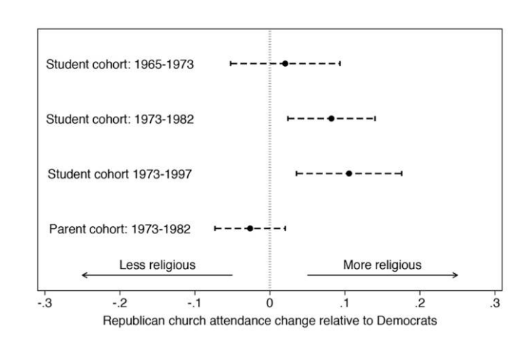
In line with the theory, partisanship in 1965 doesn’t really impact the change in church attendance from 1965-1973 because this is still in the “rebel against church” phase of life.
However, we see that partisanship in 1973 has a significant impact on the change in church attendance from 1973 to 1982, which is the “young adult” stage of life.
12.3 Panel Example 3: Minimum Wage (And more formal DiD)
Simple economic theories of labor markets predict that an increase in minimum wage will lead to a decrease in employment. In short: you are increasing the price of labor so employers will demand less of it.
Unclear, however, if this actually plays out in the real world. But this is a very difficult question to study!
You should already be able to predict what the problem with a cross-sectional study of this would be. If we looked at all states and determined that states with higher minimum wages had higher unemployment, would we trust that number? No, we would not. States that have higher minimum wages are not just like states that have low minimum wages. There are all sorts of confounding differences between the two that would make us not trust that estimate.
What about simple over-time evidence? We could look at an individual state and see what happens to their employment rate after changing their minimum wage. That’s not a great idea because there could be time-confounding effects. For example, unions might lobby for a higher minimum wage when they know the state economy will be good for a few years (or, conversely, hold back on demanding higher wages when they think the economy will be in recession.) The other problem is that lots of things affect state unemployment, including national conditions. We might see unemployment go down after a minimum wage hike, but maybe employment is dropping nationwide at that time.
We can use panel data to untangle this effect. and thats what Card and Krueger did in a famous 1994 study of New Jersey’s wage hike.
New Jersey passed a new minimum wage ($5.05 !) in April of 1992. They focused on surveys measuring wages and employment at fast food restaurants, an industry directly affected by minimum wage increases.
What the authors needed to do was to contruct a counterfactual for what would have happened in New Jersey if they had not passed a minimum wage increase.
To do so they decided to compare New Jersey to Pennsylvania. However, it is not as simple as saying: is the employment lower in New Jersey compared to Pennsylvania now that New Jersey has a higher minimum wage? Pennsylvania is not just like New Jersey except for the minimum wage.
The solution to this problem is a Difference-in-Difference approach.
In a DiD approach you have some units that affected by treatment (NJ) and some units that are not (PA). You then calculate the difference in the outcome (employment) before and after treatment for the treated group \(\Delta_t\), and the difference in the outcome before and after treatment for the control group \(\Delta_c\), the treatment effect estimate is the difference in those differences \(\Delta_t - \Delta_c\).
Here is that that looks like visually (this is a general stylized example, not the results for the NJ minimum wage example.)
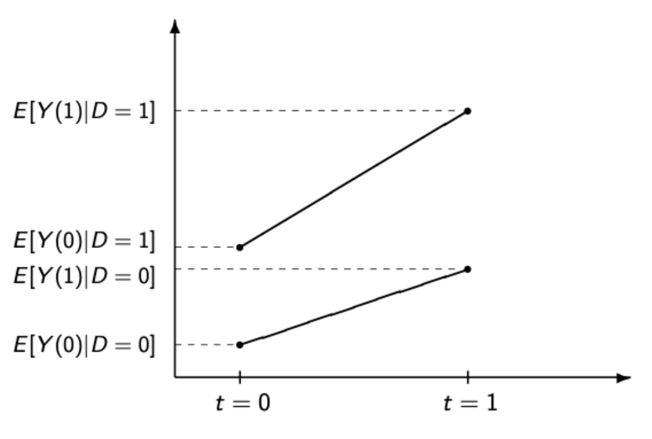
This is what the observed data would look like. The line on the bottom is the control group and the line on the top is the treatment group. We have measures for the outcome for each group in each time period. Obviously, the treatment group is a much different case then the control group. The outcome of interest is always higher in this treatment group compared to the control group, so a “straight” comparison would likely be confounded.

This second image visualizes what we are doing with DiD. The way that we make use of the control group is through the Parallel Trends Assumption. We assume that the trend in the control group is indicative of what would have happened in the treatment group if it had not been treated. The slope of the dotted line is the same as the slope in the control group. In other words, our counterfactual for what would have happened in the treated group absent treatment is just the change in outcome in the control group.
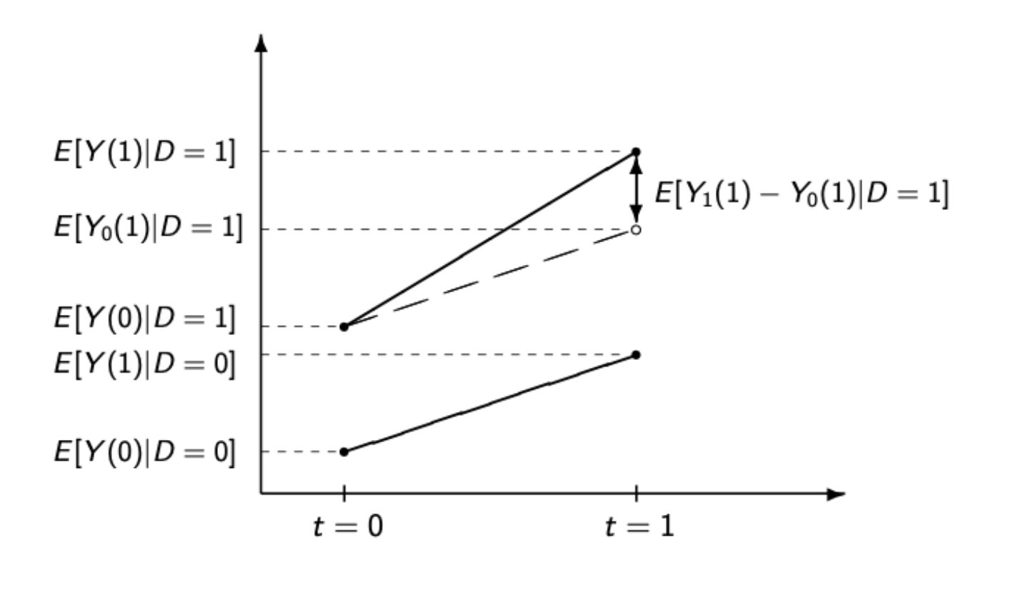
Our estimate of the effect is the real post-treatment value of the outcome for the treated group minus our counterfactual of what would have happened if the treatment group had followed the trajectory of the control group.
Let’s put some real numbers to this from the NJ minimum wage case:
These differences are the right differences but I don’t know the actual starting numbers for employment in these states so I’m just making those up….
| Before | After | |
|---|---|---|
| NJ | 93 | 90.84 |
| PA | 88 | 88.59 |
The employment rate in New Jersey before the minimum wage hike was 93%, and it was 90.84% after. The employment rate in Pennsylvania was 88% before New Jersey’s wage hike, and 88.59% after.
Pennsylvania changed by \(+.59\), so that’s what we are going to assume New Jersey would have changed by if they had not raised their minimum wage: \(93+.59 = 93.59\).
To get the effect we can compare that number to the observed number: \(90.84-93.59 = -2.75.\)
As discussed above, we can get this number more simply by just taking the difference in the differences: \((93-90.84)-(88-88.59)=-2.75\).
The estimated effect of the NJ minimum wage hike was to increase unemployment by about 2.75 points.
What do we have to assume in order to believe this estimate.
The key to this is believing that the trend in Pennsylvania is a good stand in for what would have happened in New Jersey had they not made the policy switch. This is not something that is possible to measure because it relies on counter factual thinking. The best that we can do (and this is what people do) is to examine the degree to which the treated and control groups were trending together in previous periods before the treatment. If the two groups are always in lock step up and and down (not necessarily at the same level, but following the same trends) then we can have more confidence that the trend in one group post-treatment is a good stand in for what the trend in the treatment group absent treatment.