set.seed(19104)
y0 <- rnorm(50,23, 13)
y1 <-  rnorm(50, 28, 6)
y <- c(y0,y1)

x <- c(rep(0,50), rep(1,50))

dat <- cbind.data.frame(x,y)
head(dat)
x y
1 0 17.85445
2 0 25.55715
3 0 29.99189
4 0 28.97014
5 0 22.22095
6 0 10.75801📄 Download the R code from this chapter
📝 Download the class handout for this chapter
So far we have uncovered the sampling properties of only one estimator: the sample mean. The mean is an incredibly important thing (and for things like political polls, often the only thing we care about). But we are obviously interested in much more than that in our samples. In particular, we often care about the relationships between variables. Over the next couple of chapters we will discuss the tools (and the sampling properties) of estimators that let us assess how variables vary together (covariance). We will start with the difference in two means, before moving into covariance, and correlation.
Let’s say we work in a psychology lab and we run an experiment where we give some sort of treatment (say, exposing students to some sort of video prime or not), and then measure some sort of outcome \(y\). The data that we get might look something like this:
set.seed(19104)
y0 <- rnorm(50,23, 13)
y1 <- rnorm(50, 28, 6)
y <- c(y0,y1)
x <- c(rep(0,50), rep(1,50))
dat <- cbind.data.frame(x,y)
head(dat) x y
1 0 17.85445
2 0 25.55715
3 0 29.99189
4 0 28.97014
5 0 22.22095
6 0 10.75801The variable x is what we call the “treatment” variable and indicates if someone received the treatment (1), or not (0). The variable y gives the individuals’ measurement for the outcome variable. We can now think about there being two means that we care about: the mean of y when x is equal to 1 (treatment group), and the mean of y when x is equal to 0 (control group).
table(dat$x)
 0  1
50 50 mean(dat$y[x==1])[1] 27.93583sd(dat$y[x==1])[1] 6.202173mean(dat$y[x==0])[1] 22.44682sd(dat$y[x==0])[1] 10.86982We are particularly interested in the difference between these means. In the context of an experiment what we are primarily interested in is whether being exposed to treatment increased or decreased individuals value on the outcome variable. Because, in an experiment, assignment to the treatment variable x is randomly assigned, any difference between the groups on the outcome variable must be due to treatment.
Like everything we’ve talked about so far here, we think that these data are being drawn from some hypothetical population (or in this case, not hypothetical because we generated these data). Every time we take a new sample of 100 people we will get a different distribution of responses. Our goal, as before, is to determine what is plausible in the population using information only contained in a single sample.
In particular, we want to test the following null and alternative hypotheses:
\[ \begin{aligned} H_o: \bar{X_c} = \bar{X_t}\\ H_a: \bar{X_c} \neq \bar{X_t} \end{aligned} \]
But we could also re-arrange these null and alternative hypotheses into the following:
\[ \begin{aligned} H_o: \bar{X_c} - \bar{X_t} = 0\\ H_a: \bar{X_c} - \bar{X_t} \neq 0 \end{aligned} \]
Before when we set the test statistic it was simply a mean. In this case, however, our test statistic is going to be the difference in the two means. Re-arranging our hypotheses like this means that we reduce this down to a single number that we can test. Translating this hypothesis back into our sample:
#Test statistic
diff.means <- mean(dat$y[dat$x==1]) - mean(dat$y[dat$x==0])
diff.means
[1] 5.489011In this particular sample the difference in means is 5.48.
But just as before, we know that every time we take a sample we are going to get a slightly different difference in means. Our goal is to determine whether it is zero in the population, or not. When we just have one sample, we want to be able to answer the question: if the truth was that the difference in the population is 0, how likely is it to get something more extreme than 5.48?
We need a sampling distribution. We need to understand the plausible range of values that might occur if we were to sample, again, and again, and again. Is that distribution normally distributed? How wide is it? What can we use in our sample to estimate the shape?
In this case we are god and created this sample from a known population. As such, we can literally sample many, many, times to generate a sampling distribution. Here we are creating many similar samples from the same population and calculating the difference in means in each of them. Then we will see the density plot of all those many differences in means.
diff.means <- rep(NA, 10000)

for(i in 1:10000){
y0 <- rnorm(50,23, 13)
y1 <-  rnorm(50, 28, 6)
diff.means[i] <-  mean(y1) - mean(y0)
}

mean(diff.means)
[1] 5.007569sd(diff.means)[1] 2.032258plot(density(diff.means), main="Sampling Distribution of the Difference in Means")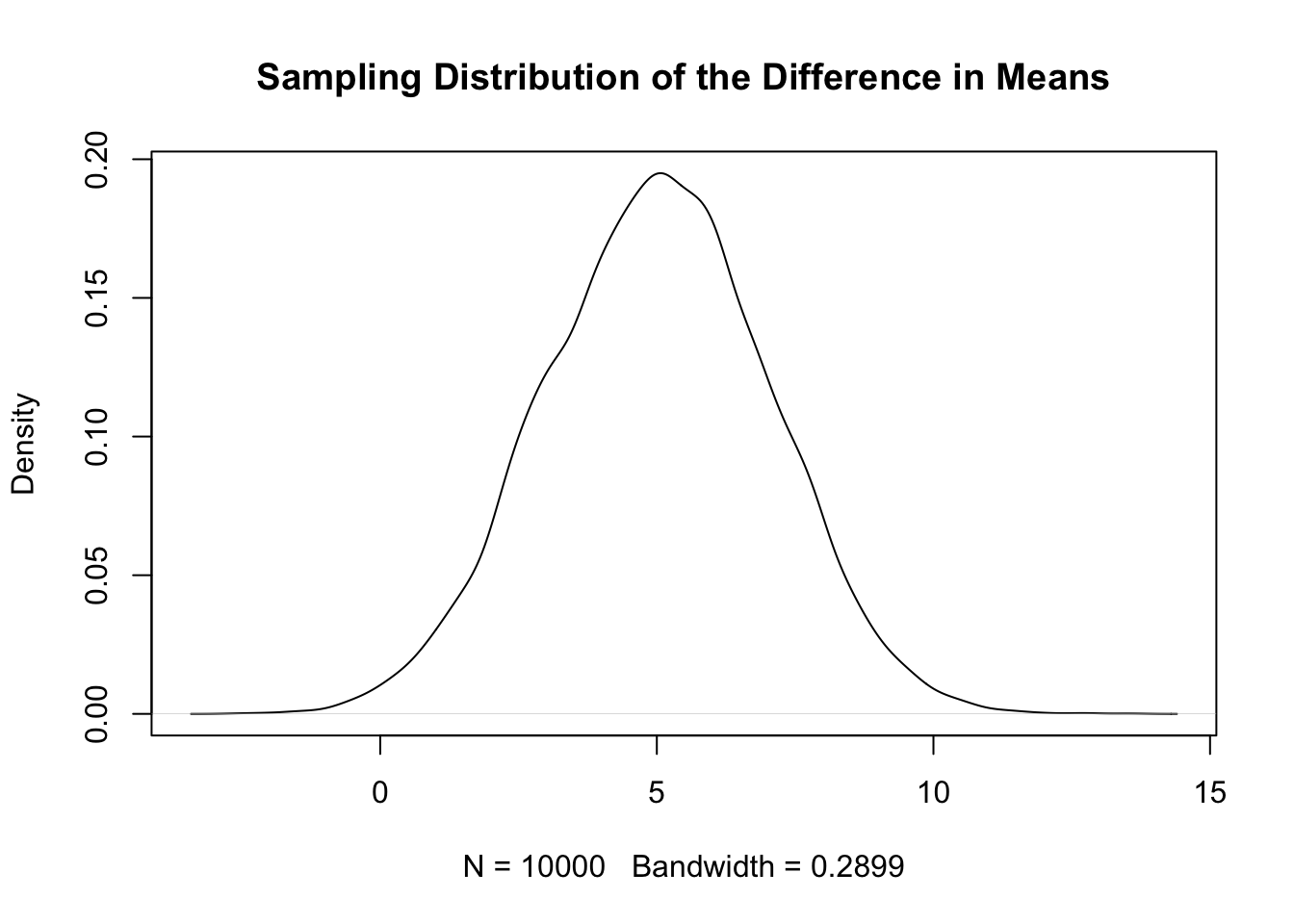
To be clear, this is 10,000 difference in means drawn from the same population from which we drew the first sample. Quite helpfully, this distribution appears to be normally distributed. But just because something is bell shaped and symmetrical doesn’t mean that it is normal. It might have a peak that’s too high or tails that are too thick. But we can check that.
First: What does the standard deviation of these 10,000 means represent? The standard error! The standard deviation of sampling distribution is the standard error.
sd(diff.means)[1] 2.032258Further, we can see that this distribution is centered on 5 (which if we look above is the true difference between the two groups). If we plot a normal distribution with \(\mu=5\) and \(\sigma=2\), is it the same as this simulation?
plot(density(diff.means), main="Sampling Distribution of the Difference in Means")

eval <- seq(0,20,.001)
points(eval, dnorm(eval, mean=5, sd=sd(diff.means)), type="l", col="firebrick")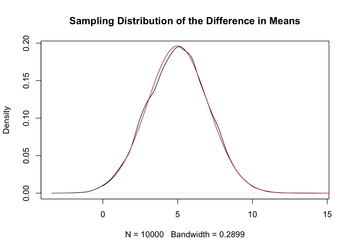
I feel pretty good in saying that, yes, this sampling distribution is normally distributed with a \(\sigma \approx 2\).
So the difference between two means is normally distributed. If that’s the case, all we need to know is the standard error, and we will be able to perform the exact same hypothesis tests that we have been doing already.
For a single mean the Central Limit Theorem gave us a formula for the standard error \(s/\sqrt{n}\). We could go through a similar process here of taking the variance of the difference in means to derive what the standard error would be. I will save you the mathematical exercise. Here it is:
\[ se = \sqrt{\frac{\sigma_0^2}{n_0} + \frac{\sigma_1^2}{n_1} } \]
Just as before, the standard error of the difference in means is a function of both the underlying variance in the population and the sample size. The difference here is that we have two population distributions we are sampling from, and two different \(n\), representing group size.
So if we use the fact that we generated these populations we get:
se <- sqrt( (13^2/50)  + (6^2/50))
se
[1] 2.024846So this formula recovers the same standard error that we calculated from our empirical sampling distributions (i.e. the one we got from literally sampling a large number of times.)
With that information in hand we can perform a hypothesis test on our original result of 5.48.
We have already determined the null and alternative hypothesis (above). And our test statistic of 5.48. We will go with an \(\alpha=.05\).
The sampling distribution we believe to be normally distributed with \(\sigma=2.02\).
To calculate the z-score we want to know how many standard error’s our test statistic is from the null hypothesis of 0.
(5.48-0)/2.02[1] 2.712871And then to find the two-sided p-value we can evaluate this under the standard normal distribution:
pnorm(2.71, lower.tail=F)*2[1] 0.006728321The probability of seeing a result this extreme if the truth was that the difference between the means of the two groups was 0 is a bit less than 1%.
Of course, in setting things up this way we have returned to the ridiculousness of using features of the population to determine the probable location of the population. We would never actually know \(\sigma_0^2\) and \(\sigma_1^2\).
Similar to what we did with one mean, we can sub in the sample standard deviations for the population level standard deviations and calculate that way. So we can calculate the standard error via:
\[ se = \sqrt{\frac{s_0^2}{n_0} + \frac{s_1^2}{n_1} } \]
se <- sqrt((var(dat$y[dat$x==0])/50) + (var(dat$y[dat$x==1])/50) )and similar to the one sample t-test, the sampling distribution when using the sample variance in place of the population variance is t distributed.
Specifically:
\[ \frac{(\bar{X_1} - \bar{X_0}) - (\mu_1 - \mu_0)}{ \sqrt{\frac{s_0^2}{n_0} + \frac{s_1^2}{n_1} }} \sim t_v \]
The distribution of all possible differences in means, subtract the true difference in means (or, more practically, our null hypothesis which we assume is the truth), and divide by the standard error, we are left with a t distribution with \(v\) degrees of freedom.
However, for the t distribution we know that we must supply the degrees of freedom. What is the degrees of freedom for a two-sample t-test? It’s terrible! I will never make you calculate this.
\[ v= \frac{(\frac{s_0^2}{n_0} + \frac{s_1^2}{n_1})^2 }{ \frac{(\frac{s_0^2}{n_0})^2}{n_0-1} +\frac{(\frac{s_1^2}{n_1})^2}{n_1-1}} \]
To calculate it “by-hand” here I even had to split it into several small parts so I could keep track of the parentheses:
num <- ((var(dat$y[dat$x==0])/50) + (var(dat$y[dat$x==1])/50))^2
denom1 <- ((var(dat$y[dat$x==0])/50)^2)/49
denom2 <- ((var(dat$y[dat$x==1])/50)^2)/49
df <- num/(denom1 +denom2)
df
[1] 77.84799OK: that gives us the ingredients we need to perform a hypothesis test. Just as above we can determine how many standard errors our test statistic (5.48) is from the null hypothesis:
#For completeness I am subtracting off the null of 0
(5.48-0)/se
[1] 3.096292#But for a difference in means the null is almost always 0 so i'd usually shortcut to
5.48/se[1] 3.096292And then determine the probability more extreme than that in both directions under the t distribution with \(v\) degrees of freedom:
pt(3.1, df=df, lower.tail=F)*2[1] 0.002693752Very low, less than 1% probability.
I wanted to do this “by hand” once to show you that we are taking the same steps as we took with an individual mean. Once we have a test statistic, a standard error, and a degrees of freedom, all of the steps are identical. Really try to internalize that all we are doing is comparing our estimate (wherever it comes from) to a hypothetical sampling distribution given the null hypothesis and seeing how rare it is.
But here is where I’m going to give up on doing this math myself and lean on R. R knows all of the equations, and has all the qt tools built in, and so simply using the t.test function is a much more straight-forward way of assessing things for a two-sample t.test.
We briefly saw last week that the t.test function can easily do a one-sample t-test. We can feed it a vector and a null hypothesis and it will do the appropriate test:
t.test(dat$y, mu=25)
    One Sample t-test

data:  dat$y
t = 0.20737, df = 99, p-value = 0.8361
alternative hypothesis: true mean is not equal to 25
95 percent confidence interval:
 23.36060 27.02205
sample estimates:
mean of x
 25.19133
We can easily adapt this for a two-sample t-test by having one continuous variable, and a second variable which splits that variable into exactly two groups. This is what we have here:
head(dat) x y
1 0 17.85445
2 0 25.55715
3 0 29.99189
4 0 28.97014
5 0 22.22095
6 0 10.75801res <- t.test(dat$y ~ dat$x)
res
    Welch Two Sample t-test

data:  dat$y by dat$x
t = -3.1014, df = 77.848, p-value = 0.002683
alternative hypothesis: true difference in means between group 0 and group 1 is not equal to 0
95 percent confidence interval:
 -9.012638 -1.965384
sample estimates:
mean in group 0 mean in group 1
       22.44682        27.93583
Difference in means doesn’t feel like it’s about covariance because we are saying: there are two groups, does y differ for them? But it’s good to remember that we are really looking at the covariance between \(x\) (which splits things into two groups) and \(y\). Thinking about a difference in means in this way will ease the transition into regression.
What has this t-test for a difference in means given us? It has reported back what the mean in group 0 and group 1 is. It has listed what the alternative hypothesis is: that the true difference in means between group 0 and group 1 is not equal to 0. Unstated here is that the null hypothesis is that the true difference between the group means is 0.
It skips some steps and tells us the t score, which we know is the difference in means expressed in standard error units.
If we look into what is inside a saved result of a t function:
names(res) [1] "statistic" "parameter" "p.value" "conf.int" "estimate"
[6] "null.value" "stderr" "alternative" "method" "data.name" res$stderr[1] 1.769859We see that the calculated standard error is the same as we calculated ourselves above. The degrees of freedom is also more or less the same than what we calculated using the ugly math above. As all those things are the same, the p-value calculated by this function is also approximately the same.
So that saves some time!
The more important thing here is this: yes it is slightly more complicated to derive the standard error and degrees of freedom for a difference in means test…. but, once we have those things there is nothing different about the hypothesis testing than when we were doing a simple mean.
In other words: for any statistic I calculate, if you give me the standard error and the shape of the sampling distribution (is it the standard normal? Do I need to know the degrees of freedom for a t distribution?) then I can easily calculate a hypothesis test for any null hypothesis.
This also means that the power calculations we were doing in the last chapter still apply to a difference in means test.
In this case the true difference in means is 5, and the sampling distribution is approximately normal with a \(\sigma=2.02\).
As such, we can determine the false negative rate visually by showing what the true difference in mean generating distribution is:
eval <- seq(-5,15,.001)
plot(eval, dnorm(eval, mean=5, sd=2.02), type="l", col="darkblue", lwd=2, main="Power Analysis")
legend("topleft", c("True Sampling Distribution","Null Sampling Distribution"), lty=c(1,1), col=c("darkblue","firebrick"))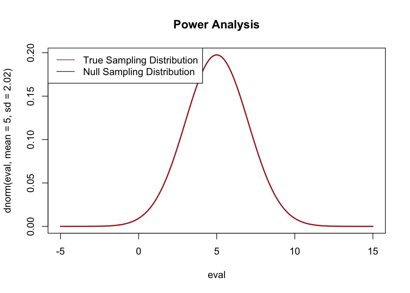
And then look at where the null hypothesis sampling distribution would be, and which means under that distribution would lead us to (falsely) conclude that we should not reject the null hypothesis of no difference between these means:
eval <- seq(-5,15,.001)
plot(eval, dnorm(eval, mean=5, sd=2.02), type="l", col="darkblue", lwd=2, main="Power Analysis")
points(eval, dnorm(eval, mean=0, sd=2.02), type="l", lwd=2, col="firebrick")
abline(v=1.96*2.02, lty=2, col="firebrick")
abline(v=-1.96*2.02, lty=2, col="firebrick")
legend("topleft", c("True Sampling Distribution","Null Sampling Distribution"), lty=c(1,1), col=c("darkblue","firebrick"))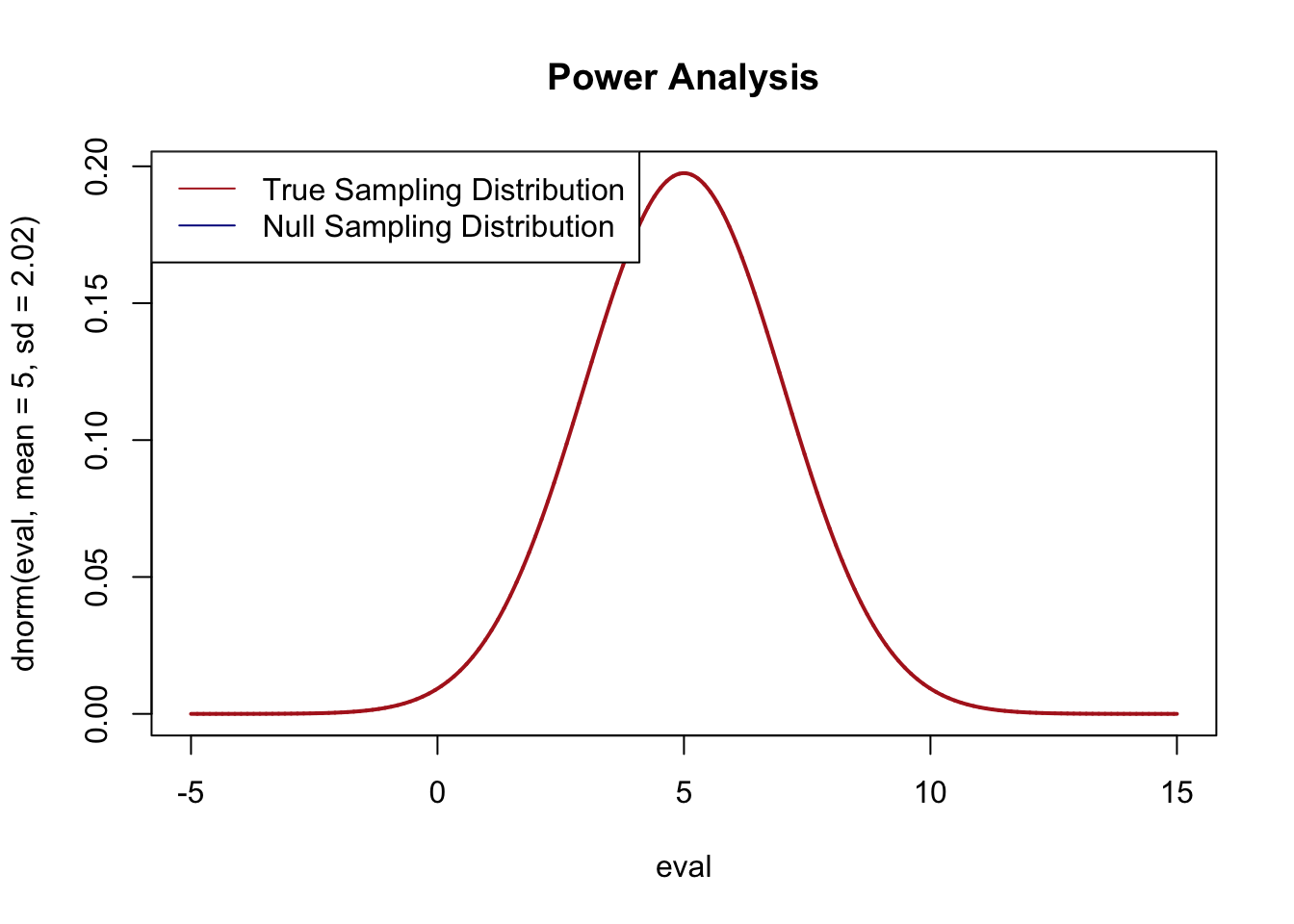
And then determine the area under the blue curve that is between the two red lines:
pnorm(1.96*2.02, mean=5, sd=2.02) - pnorm(-1.96*2.02, mean=5, sd=2.02)[1] 0.3031854Approximately 30% false negative rate with this data generating process.
Let’s simulate that to confirm:
false.negative <- rep(NA, 10000)

for(i in 1:10000){
#Regenerate more samples from the same DGP
y0 <- rnorm(50,23, 13)
y1 <-  rnorm(50, 28, 6)
y <- c(y0,y1)
x <- c(rep(0,50), rep(1,50))
dat.sim <- cbind.data.frame(x,y)
#Perform a t-test
test <- t.test(dat.sim$y ~ dat.sim$x)
#Determine if we fail to reject the null (we should)
false.negative[i] <- test$p.value>.05
}

mean(false.negative)
[1] 0.3205Approximately the same 30% ish false negative rate.
When we think about power in the context of a difference in means test, it really gets to the level of driving research decisions.
Imagine if we were running a psychology lab and we wanted to test to see whether this intervention had an impact on people, and so we recruited 100 undergrads and gave 50 of them the treatment and 50 of them the control. If we had done that and these were the parameters, there is a 30% likelihood we will get a false negative. Those are terrible odds! We are going to waste our money.
That is why doing a power-analysis before an experiment is so critical. What would we need to know before running an experiment to conduct a power analysis?
We need two pieces of information: a guess at the truth (how far away from 0 will this be?), and a guess at the standard error.
Recall that the standard error for a difference in means is:
\[ se = \sqrt{\frac{\sigma_0^2}{n_0} + \frac{\sigma_1^2}{n_1} } \]
So to calculate that before the fact we have to have group sizes \(n\) and group variances \(\sigma^2\). The \(n\) is something that we can control but \(\sigma^2\) is not. That being said: you are usually not the first person to measure anything. If you are doing a study your measure of interest has probably been measured before by someone, and you can use that previous study to determine what the variance of your variable is likely to be. You could also set it as artificially high to give a “worse case scenario”.
Let’s say we look up a previous study that has used our same outcome variable and found that the variance of their measure was 10. We could then make a guess at what our standard error might be:
n <- 50
se <- sqrt( ((10^2)/n) +  ((10^2)/n) )
In a similar way we could make a guess at the likely difference between the two means from previous studies and see what our statistical power would be. Let’s say it’s 3, then we could calculate:
pnorm(1.96*se, mean=3, sd=se) - pnorm(-1*1.96*se, mean=3, sd=se)[1] 0.6769718Terrible statistical power!
Alternatively, we could take what we have right now and say: if we have a sample size of 100 (50 in each group), what is the false negative rate for various true differences between the two means?
true.diff <- seq(0,15,.01)
false.negative <- pnorm(1.96*se, mean=true.diff, sd=se) - pnorm(-1*1.96*se, mean=true.diff, sd=se)

plot(true.diff, false.negative, xlab="True difference between groups", ylab="False negative rate", type="l")
abline(h=0.2, lty=2)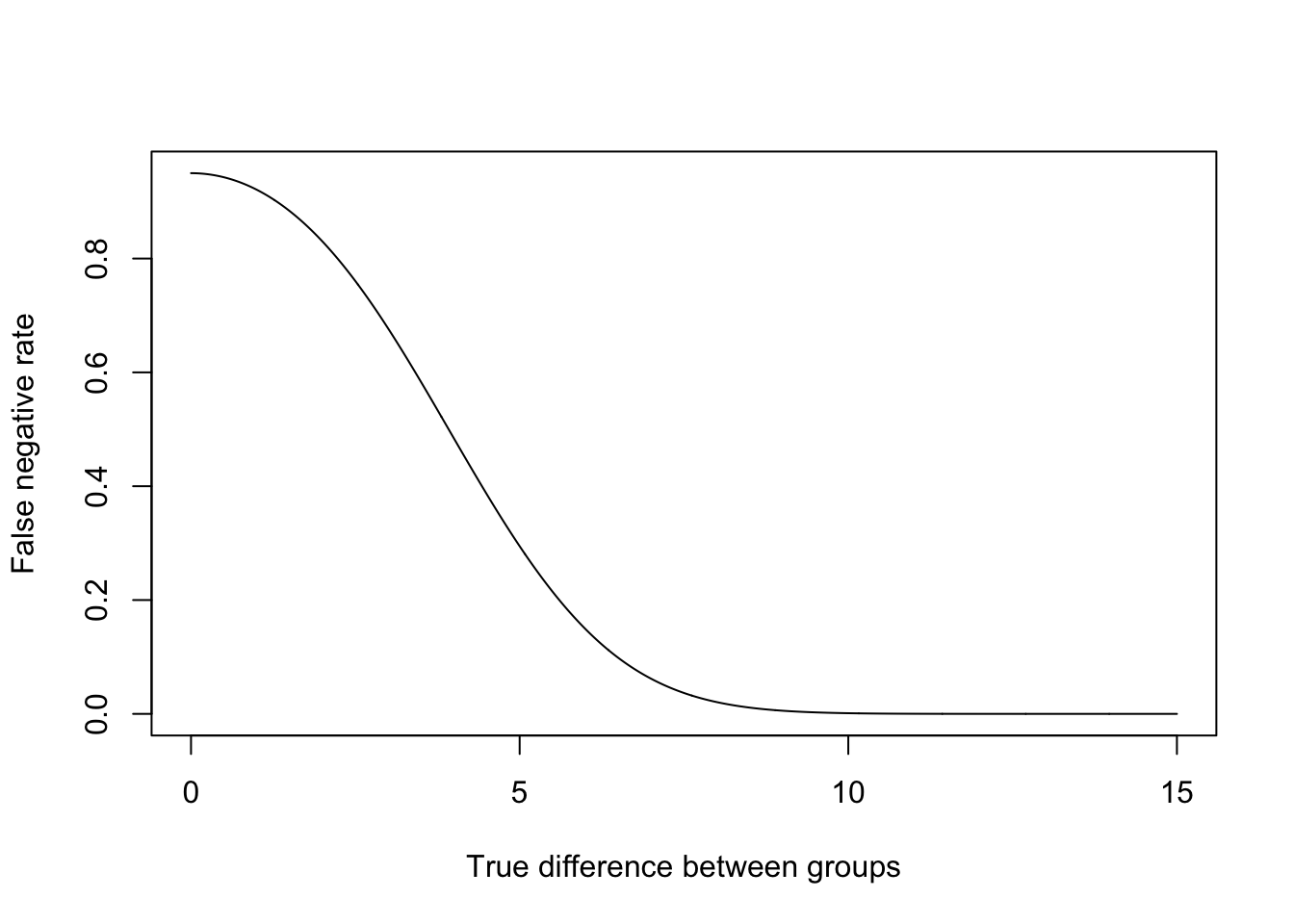
We often set a false negative rate of 20% as a goal (or 80% power). That horizontal line crosses our curve at around 6. We would refer to this as the “minimum detectable effect size”. That’s a pretty big effect!
We could also imagine doing the same thing by holding constant a true difference between the groups and seeing what size \(n\) we would need to reliably detect that effect:
n <- seq(50,500,1)
se <- sqrt( ((10^2)/n) +  ((10^2)/n) )

false.negative <- pnorm(1.96*se, mean=3, sd=se) - pnorm(-1*1.96*se, mean=3, sd=se)
plot(n, false.negative, xlab="Group Size", ylab="False negative rate", type="l")
abline(h=0.2, lty=2)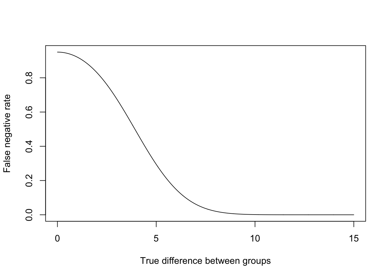
Difference in means tests are super powerful and very helpful for analyzing experiments in particular. But it’s pretty clear where their drawbacks are. If we have just one more group we can’t do a difference in means test. More problematically, this method is completely useless if we have two continuous variables and want to see if they are related to one another. That’s where we will need covariance, correlation, and regression.
Consider our original data, which had two samples of 50. Thinking of these two means separately, let’s put confidence intervals around each of them.
ctrl <- t.test(dat$y[dat$x==0])
treat <- t.test(dat$y[dat$x==1])

plot(ctrl$conf.int, c(0,0), ylim=c(-0.5,1.5), xlim=c(15,35),
     type="n", axes=F, xlab="Y",ylab="")
segments(ctrl$conf.int[1], 0,ctrl$conf.int[2],0)
segments(treat$conf.int[1], 1, treat$conf.int[2],1)
axis(side=2, at=c(0,1), labels=c("Control","Treatment"))
axis(side=1)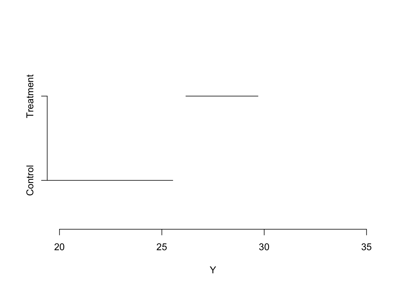
Looking at these two means separately, we would say that for each of these groups, 95% of similarly constructed confidence intervals will contain the true group mean. If our goal here is to say if treatment is significantly different in the treatment and the control group, at this time do you think that we can rule out that y is actually equal in these two groups?
My inclination here is to say yes. If the confidence intervals are giving us plausible ranges that these means will fall in, and those two plausible ranges do not overlap, then I am fairly confident that we will reject the null hypothesis that they are equal (and we did above).
OK, but what about this:
set.seed(19146)
y0 <- rnorm(50,23, 13)
y1 <-  rnorm(50, 28, 6)
y <- c(y0,y1)
x <- c(rep(0,50), rep(1,50))
dat.sim <- cbind.data.frame(x,y)


ctrl <- t.test(dat.sim$y[dat.sim$x==0])
treat <- t.test(dat.sim$y[dat.sim$x==1])

plot(ctrl$conf.int, c(0,0), ylim=c(-0.5,1.5), xlim=c(15,35),
     type="n", axes=F, xlab="Y",ylab="")
segments(ctrl$conf.int[1], 0,ctrl$conf.int[2],0)
segments(treat$conf.int[1], 1, treat$conf.int[2],1)
axis(side=2, at=c(0,1), labels=c("Control","Treatment"))
axis(side=1)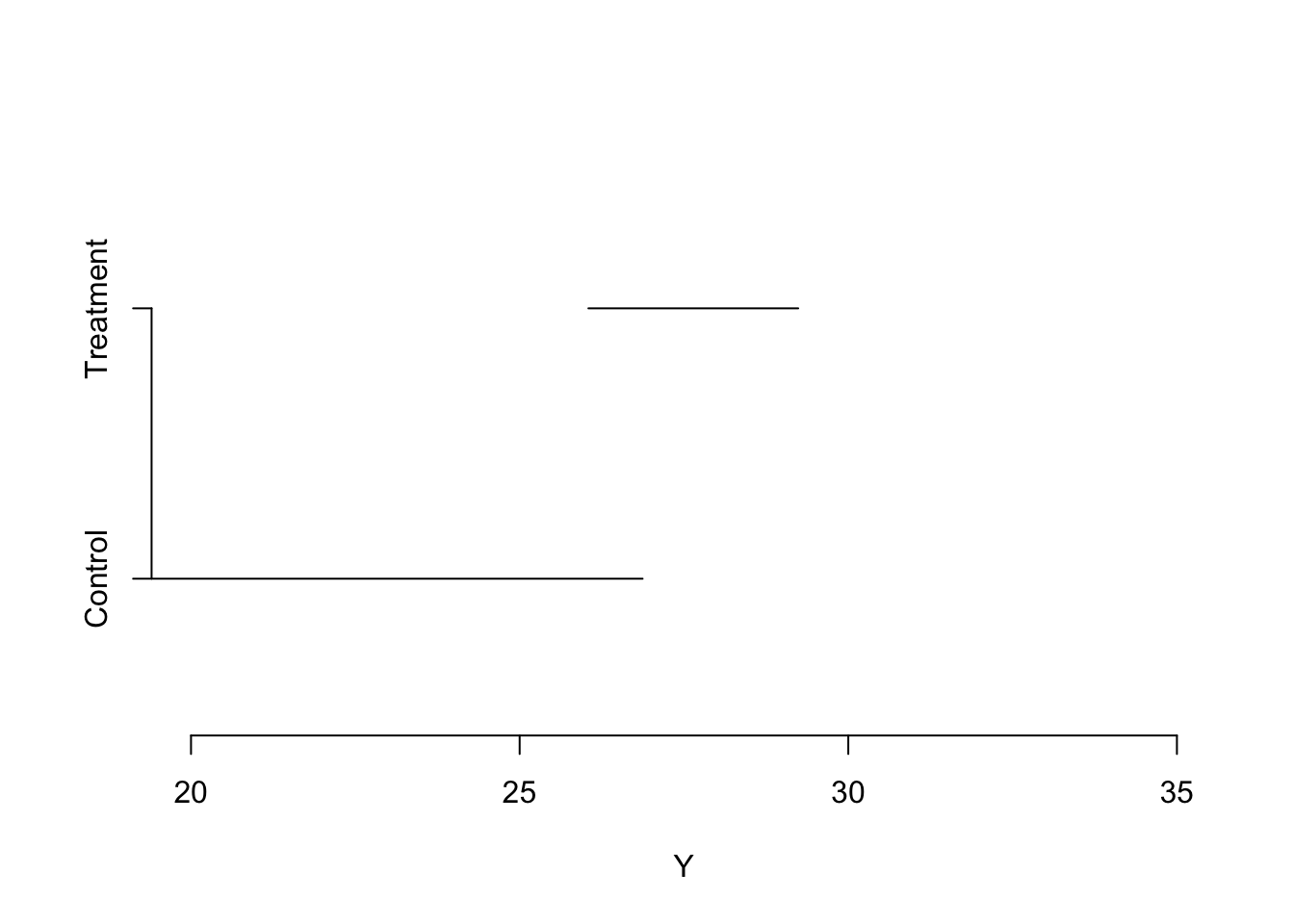
In this case, the plausible ranges where the true means might lie overlap each other. Above, we concluded that if those two lines didn’t overlap it was likely that there was a true difference between the means. Should we do the same here? Should we fail to reject the null hypothesis of no difference between these two means based on the fact that their individual confidence intervals are overlapping?
Let’s run a t.test on these data to find out:
t.test(dat.sim$y ~ dat.sim$x)
    Welch Two Sample t-test

data:  dat.sim$y by dat.sim$x
t = -2.2236, df = 62.89, p-value = 0.02978
alternative hypothesis: true difference in means between group 0 and group 1 is not equal to 0
95 percent confidence interval:
 -9.4306515 -0.5029804
sample estimates:
mean in group 0 mean in group 1
       22.67512        27.64194
Uh oh! The p-value on the difference in means test is less than 5% even though the two 95% confidence intervals overlap. This leads us to a really critical thing: Overlapping confidence intervals is not a valid statistical test. You see this mistake being made all the time. You will see it soon and you will get to feel smug about knowing that people seeing that confidence intervals are overlapping and concluding that the two means are not different is wrong.
Let’s simulate a bunch of times and see if this is always the case!
reject.null.cis <- rep(NA, 10000)
reject.null.p   <- rep(NA, 10000)

set.seed(19104)   #so the counts below are stable
for(i in 1:10000){
#Generate our two y variables
y0 <- rnorm(50,23, 13)
y1 <-  rnorm(50, 28, 6)
y <- c(y0,y1)
x <- c(rep(0,50), rep(1,50))
dat.sim <- cbind.data.frame(x,y)

#Individual t-tests on each to get confidence intervals
ctrl <- t.test(dat.sim$y[dat.sim$x==0])
treat <- t.test(dat.sim$y[dat.sim$x==1])

#CI method: reject only if the intervals DON'T overlap (upper bound of the
#lower group is below the lower bound of the upper group)
reject.null.cis[i] <- ifelse(ctrl$conf.int[2] < treat$conf.int[1], "Reject", "Retain")

#T-test of the difference: reject if p is less than .05
reject.null.p[i]   <- ifelse(t.test(dat.sim$y ~ dat.sim$x)$p.value < .05, "Reject", "Retain")

}

table("CI Method"=reject.null.cis, "T-test method" = reject.null.p)
T-test method
CI Method Reject Retain
Reject 4340 0
Retain 2509 3151The t-test rejected the null in \(4340 + 2509 = 6849\) of the 10,000 simulations (the “Reject” column). The confidence-interval method agreed in 4,340 of those cases (the intervals didn’t overlap), but in 2,509 cases the intervals did overlap even though the difference was significant. So more than a third of the real differences would have been missed by eyeballing whether the CIs overlap.
Now look at the top-right cell: it’s zero. Every time the confidence intervals failed to overlap, the t-test rejected the null. And reading down the “Retain” column, all 3,151 of the t-test’s non-rejections had overlapping intervals.
This leads to the following conclusion: If two 95% confidence intervals on two means are not overlapping, then a hypothesis test on whether the difference can be distinguished from zero will reject the null hypothesis of no difference. If two 95% confidence intervals are overlapping, then it is unknown whether a hypothesis test on the difference will be able to distinguish the result from zero, or not.
Best not to use it at all, to be honest.
It is pretty straightforward to describe the relationship between a continuous variable and an indicator variable with a difference in means test, but what if we have these data instead:
set.seed(19103)
x <- rnorm(10,mean=0, sd=5)
y <- x*6*rnorm(10)
a <- cbind.data.frame(x,y)
plot(a$x, a$y, pch=16)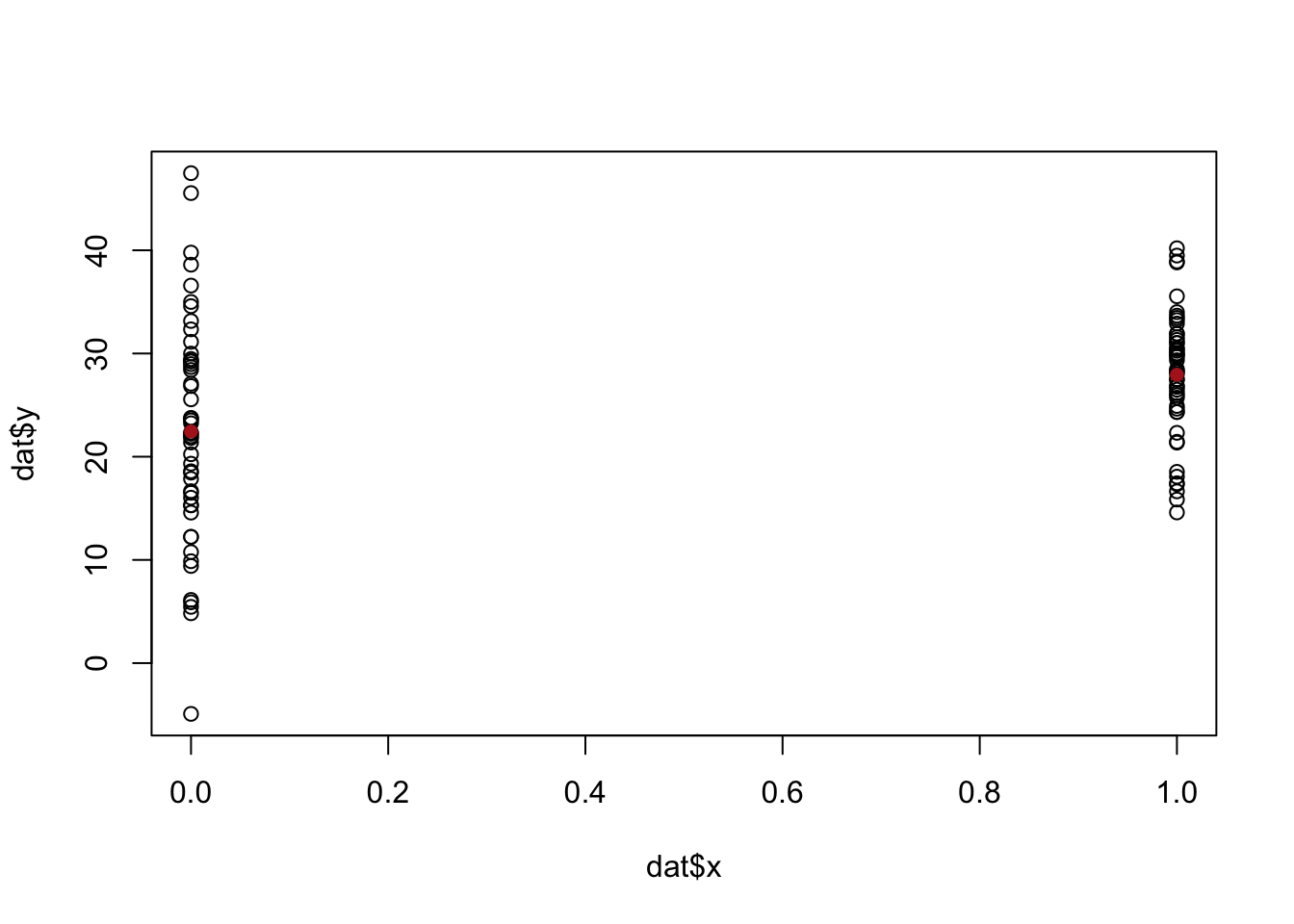
Now we have two continuous variables. There are not two “groups” to look at the two different means. We have to come up with an alternative way to summarize how they co-vary.
Before we get fancy with math, how would we generally describe what we are seeing here? We might say that there is a “positive relationship”, but why? What mechanically is happening here that is causing us to say that? More specifically, it seems that when x increases across its range y increases as well. In the above it was easy to see that x has two levels and when we went from level 0 to level 1, the average value of y increases. Here x has many levels, so it’s harder to say what the right way is to numerically describe what’s happening here. We might for example, think about splitting this x into two groups and calculating the mean level in each group. For example we might consider the points lower than 0 and higher than 0 as two groups and calculating their two means:
plot(a$x[a$x<0], a$y[a$x<0], pch=16, xlim=c(-12,7), col="darkblue")
points(a$x[a$x>0], a$y[a$x>0], pch=16, col="darkgreen")
segments(-20,mean(a$y[a$x<0]),0, mean(a$y[a$x<0]), col="darkblue")
segments(0,mean(a$y[a$x>0]),20, mean(a$y[a$x>0]), col="darkgreen")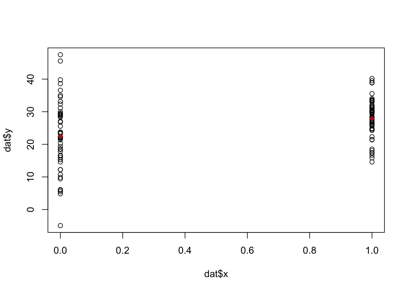
mean(a$y[a$x>0]) - mean(a$y[a$x<0])[1] 7.597175There is a difference of about 7.6 between those two groups, and that does a reasonable job of describing the fact that as x increases y increases. Yet at the same time we are throwing away a lot of information. It would be nice if we took into account that there are many levels to x, not just two.
Furthermore, we also know that this is just a sample of data. In particular, given that there are not many points here, each point is having a high effect on the overall measure. That point at (-11.5, -61.5) is doing a lot of work to give us this relationship. We also want a method that is going to be sensitive to the fact that outliers might create a “false positive” of a relationship. We want to make sure that we are able to test the plausibility of there being a relationship in the population based on the variance we see in our data. In other words, we want a method that sees the above as being different from:
set.seed(19103)
x <- rnorm(10,mean=0, sd=5)
y <- x*1 + rnorm(10, mean=0, sd=1)
b <- cbind.data.frame(x,y)

plot(b$x, b$y, pch=16, xlim=c(-12,7), col="darkblue")
points(b$x[b$x<0], b$y[b$x<0], pch=16, col="darkblue")
points(b$x[b$x>0], b$y[b$x>0], pch=16, col="darkgreen")
segments(-20,mean(b$y[b$x<0]),0, mean(b$y[b$x<0]), col="darkblue")
segments(0,mean(b$y[b$x>0]),20, mean(b$y[b$x>0]), col="darkgreen")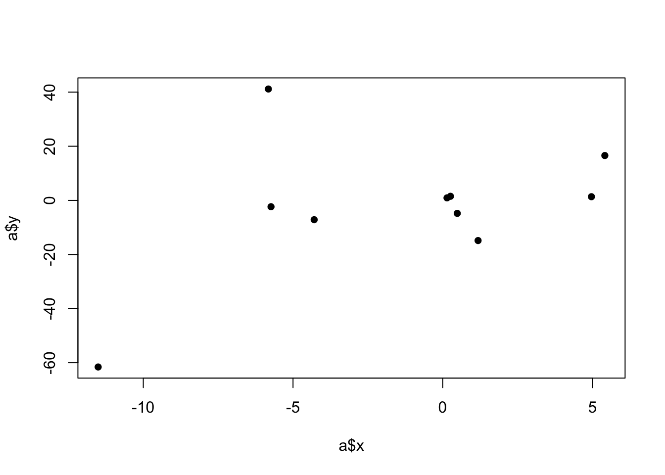
mean(b$y[b$x>0]) - mean(b$y[b$x<0])[1] 8.70795Here the difference between the means is very similar to what is above, and yet we would say that the relationship is much more consistently positive. My feeling is that if we repeatedly re-sampled this second relationship we will see a positive slope more reliably than in the first example. Ideally a method of describing the relationship between two variables would take into account the strength or reliability of that relationship.
The first method we will use to describe a relationship between two variables is their covariance. We represent covariance as: \(\hat{\sigma_{x,y}}\). The “hat” signifies that this is an estimate of the population level covariance. Like everything else we do, each covariance we observe in a sample is a realization of a random variable that is centered on the one true population covariance.
Covariance is defined as:
\[ \hat{\sigma_{x,y}} = \frac{1}{n-1}\sum_{i=1}^n (x_i-\bar{x})(y_i - \bar{y}) \]
Breaking this down, we are effectively taking the deviations of x from their average, and the deviations of the ys from their average, and multiplying them together. We then divide by the sample size to get the average product of the deviations from the average. Note that, crucially, nothing here is squared. We have become very accustomed to variance being squared because variance can only be positive. In this case there is no squares so covariance can be positive or negative. Let’s go through the process a bit at a time with our small datasets to determine the covariance.
a x y
1 -5.7353680 -2.3584497
2 -5.8232989 41.1500563
3 -4.2947444 -7.1439237
4 0.4840690 -4.8086427
5 0.1415545 0.9169479
6 4.9638353 1.3479493
7 0.2564384 1.5103761
8 1.1786314 -14.8501926
9 5.4112385 16.5743911
10 -11.5068133 -61.5758292#Determine deviations from the column averages
a$x.dev <- a$x - mean(a$x)
a$y.dev <- a$y - mean(a$y)
a$product <- a$x.dev*a$y.dev
a x y x.dev y.dev product
1 -5.7353680 -2.3584497 -4.242922 0.565282 -2.398447
2 -5.8232989 41.1500563 -4.330853 44.073788 -190.877105
3 -4.2947444 -7.1439237 -2.802299 -4.220192 11.826238
4 0.4840690 -4.8086427 1.976515 -1.884911 -3.725554
5 0.1415545 0.9169479 1.634000 3.840680 6.275672
6 4.9638353 1.3479493 6.456281 4.271681 27.579173
7 0.2564384 1.5103761 1.748884 4.434108 7.754741
8 1.1786314 -14.8501926 2.671077 -11.926461 -31.856497
9 5.4112385 16.5743911 6.903684 19.498123 134.608884
10 -11.5068133 -61.5758292 -10.014368 -58.652098 587.363663sum(a$product)/9[1] 60.72786We can see that, ultimately, the covariance is 60, but let’s think through how we got there. The covariance is generated by summing up the products and dividing by \(n-1\). So large, positive, products will lead to a higher positive covariance. Large, negative, products will lead to a highly negative covariance. What creates a large positive product? These are rows where the x and y values both vary in the same direction, whether that direction be positive or negative. To think about this visually, we can think about splitting a scatterplot into 4 quadrants based on the mean of x and y:
plot(a$x, a$y, pch=16)
abline(v=mean(a$x), lty=2)
abline(h=mean(a$y), lty=2)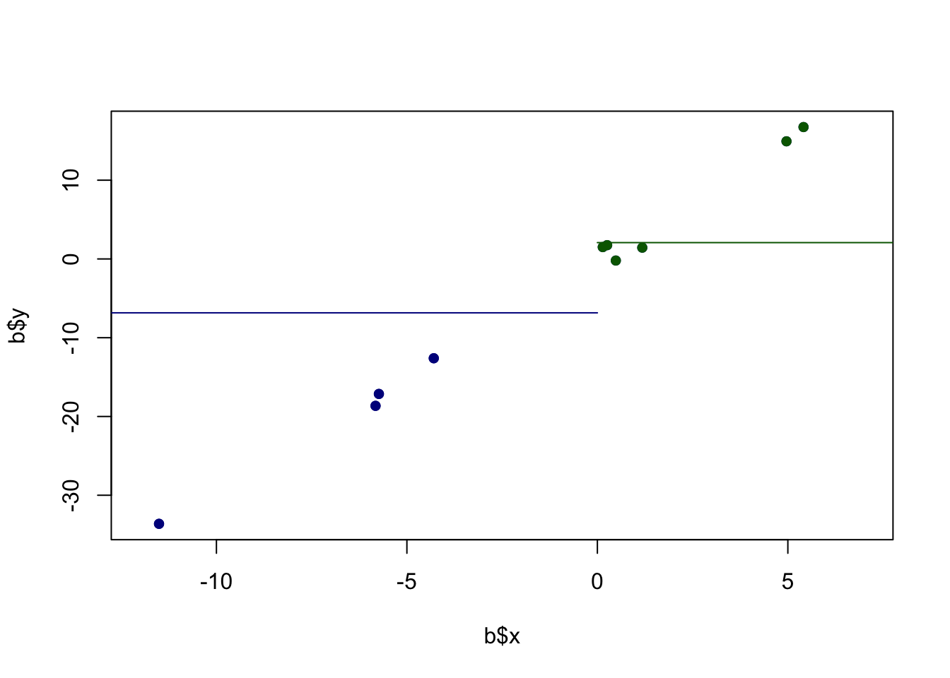
The thing that generates positive products are those data points that are in the lower left and upper right quadrants. The ``deeper’’ into a quadrant (the more the data point varies from both the x and y means), the higher the positive product will be.
Large negative products will be generated when x and y values both vary in opposite directions. That’s the only way to generate a negative product (as a pos times a negative is how you get a negative product). Visually, this means points that are in the upper left, and lower right quadrants.
Ultimately one covariance number describes the relative frequency and size of the products in the 4 different quadrants. This covariance came out to 60 which indicates that there are more data points in the bottom left and top right quadrants.
Consider, this alternative where the scatterplot looks like this:
set.seed(19103)
x <- rnorm(10,mean=0, sd=5)
y <- x*-6*rnorm(10)
c <- cbind.data.frame(x,y)

plot(c$x, c$y, pch=16)
abline(v=mean(c$x), lty=2)
abline(h=mean(c$y), lty=2)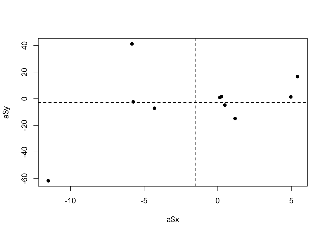
Here we have more of the points in the upper left/bottom right (this is actually just the other graph flipped), and as such we see that:
c$x.dev <- c$x - mean(c$x)
c$y.dev <- c$y - mean(c$y)
c$product <- c$x.dev*c$y.dev
c
x y x.dev y.dev product
1 -5.7353680 2.3584497 -4.242922 -0.565282 2.398447
2 -5.8232989 -41.1500563 -4.330853 -44.073788 190.877105
3 -4.2947444 7.1439237 -2.802299 4.220192 -11.826238
4 0.4840690 4.8086427 1.976515 1.884911 3.725554
5 0.1415545 -0.9169479 1.634000 -3.840680 -6.275672
6 4.9638353 -1.3479493 6.456281 -4.271681 -27.579173
7 0.2564384 -1.5103761 1.748884 -4.434108 -7.754741
8 1.1786314 14.8501926 2.671077 11.926461 31.856497
9 5.4112385 -16.5743911 6.903684 -19.498123 -134.608884
10 -11.5068133 61.5758292 -10.014368 58.652098 -587.363663sum(c$product)/9[1] -60.72786The covariance is negative.
Consider a couple more datasets and what that will mean for the covariance:
One that is incredibly consistent:
plot(b$x, b$y, pch=16)
abline(v=mean(b$x), lty=2)
abline(h=mean(b$y), lty=2)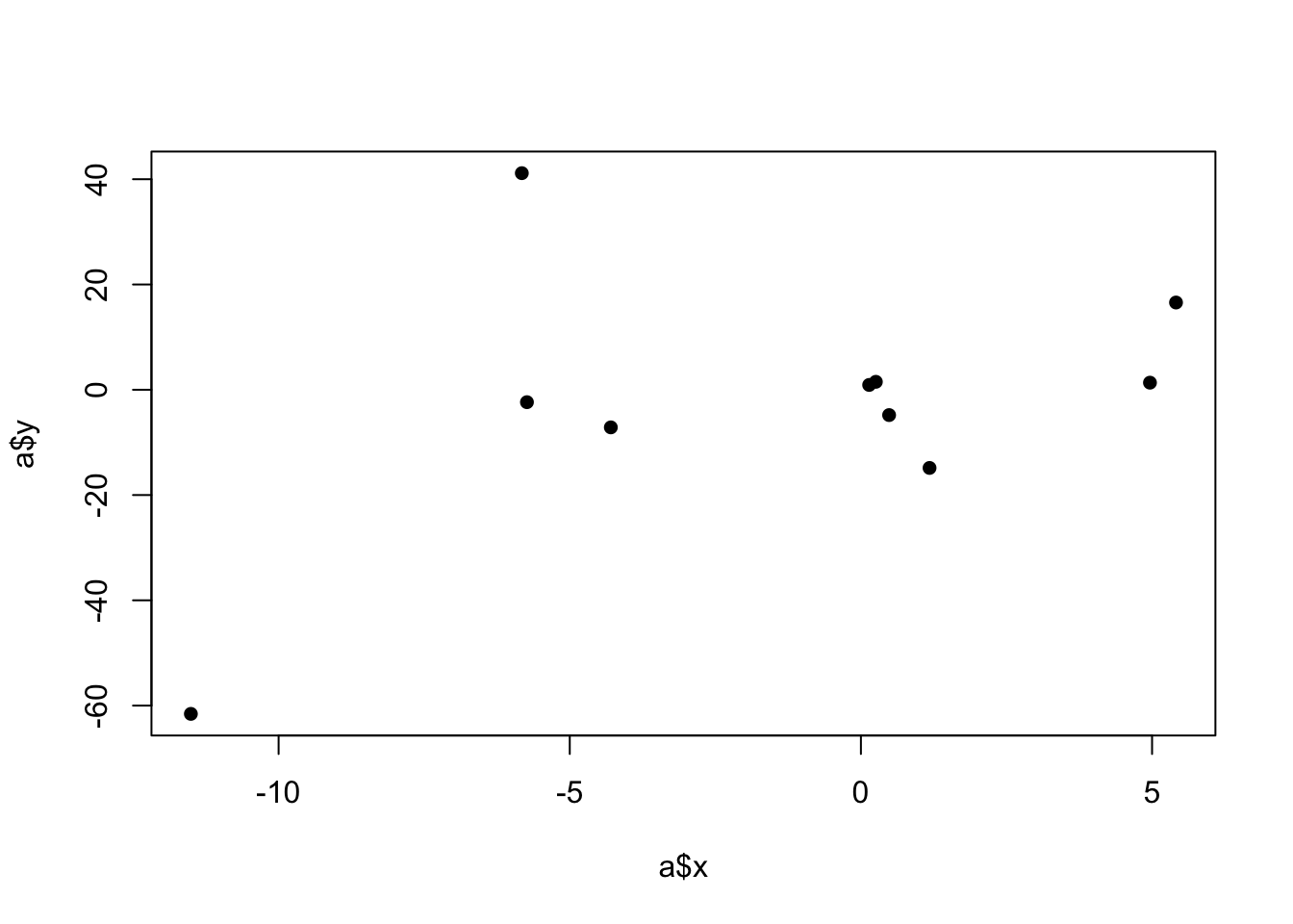
b$x.dev <- b$x - mean(b$x)
b$y.dev <- b$y - mean(b$y)
b$product <- b$x.dev*b$y.dev
b
x y x.dev y.dev product
1 -5.7353680 -5.6668327 -4.242922 -4.0665226 17.2539392
2 -5.8232989 -7.0010408 -4.330853 -5.4007306 23.3897714
3 -4.2947444 -4.0175093 -2.802299 -2.4171991 6.7737138
4 0.4840690 -1.1715636 1.976515 0.4287466 0.8474239
5 0.1415545 1.2211715 1.634000 2.8214816 4.6103017
6 4.9638353 5.0090943 6.456281 6.6094044 42.6721724
7 0.2564384 1.2380751 1.748884 2.8383852 4.9640069
8 1.1786314 -0.9212889 2.671077 0.6790212 1.8137182
9 5.4112385 5.9217314 6.903684 7.5220415 51.9297996
10 -11.5068133 -10.6149384 -10.014368 -9.0146282 90.2758005sum(b$product)/9[1] 27.17007Or where the truth is that there is no relationship between the two variables. Here we see that the positive and negative products roughly cancel each other out, which makes sense!
set.seed(19106)
x <- rnorm(10,mean=0, sd=5)
y <- x*rnorm(10, sd=2)
d <- cbind.data.frame(x,y)


plot(d$x, d$y, pch=16)
abline(v=mean(d$x), lty=2)
abline(h=mean(d$y), lty=2)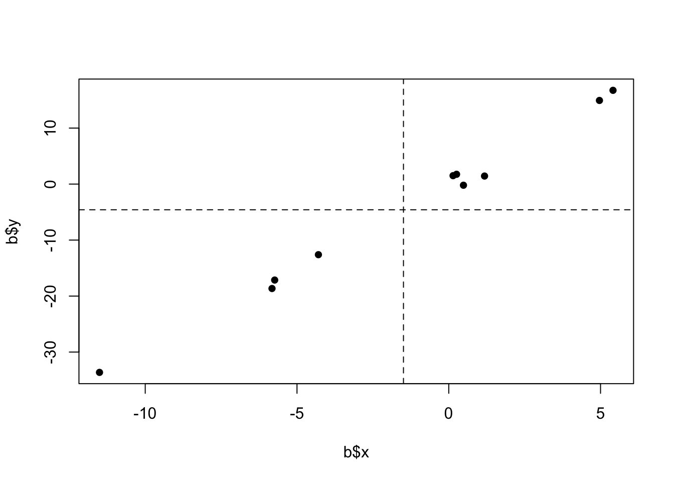
d$x.dev <- d$x - mean(d$x)
d$y.dev <- d$y - mean(d$y)
d$product <- d$x.dev*d$y.dev
d
x y x.dev y.dev product
1 -6.0866587 -0.75613532 -1.0132013 0.3362112 -0.3406496
2 -8.7851369 -9.64523909 -3.7116794 -8.5528926 31.7455954
3 -8.7506052 11.66036276 -3.6771477 12.7527093 -46.8935960
4 -7.4525445 -9.57732363 -2.3790870 -8.4849771 20.1864988
5 -2.8162482 0.06318308 2.2572093 1.1555296 2.6082720
6 -10.6206995 -7.58143868 -5.5472420 -6.4890922 35.9965648
7 -5.2935076 0.48991352 -0.2200501 1.5822600 -0.3481765
8 0.2973094 -0.15902415 5.3707669 0.9333223 5.0126568
9 -3.4008646 5.48742824 1.6725928 6.5797747 11.0052842
10 2.1743811 -0.90519163 7.2478385 0.1871549 1.3564682sum(d$product)/9[1] 6.703213Covariance is a super helpful tool to have in our pockets, but one of the issues with it is that it doesn’t really tell us anything about the relative strength of the relationship.
For example, let’s take our original dataset where we found a covariance of 60:
cov(a$x, a$y)[1] 60.72786#The covariance function does the same thing we did above for us...And let’s multiply each of the columns by 100:
cov(a$x*100, a$y*100)[1] 607278.6The covariance is now 607 thousand! It’s a much bigger relationship??? No, this is the same “strength” of relationship, just scaled up by 100.
plot(a$x*100, a$y*100, pch=16)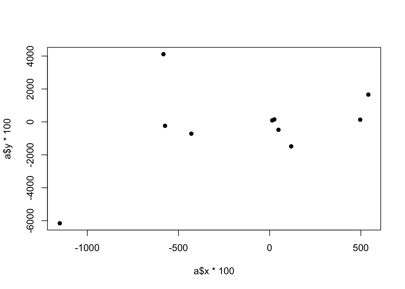
And covariance doesn’t have a really intuitive explanation…. It’s the average product of deviations from the means? Definitely not going to get anyone on-board a policy proposal if you suggest something like that.
Over the next few chapters we will make two different modifications/additions to covariance to address these things: correlation and regression. Each of these is helpful, and each has its own pitfalls.
We can start with correlation.
The idea behind correlation is simply to standardize a covariance by dividing by the standard deviations of the variables that we are measuring. This completely deals with the “scale” problem. Specifically, the correlation equals:
\[ \hat{\rho}_{x,y} = \frac{\hat{\sigma}_{x,y}}{\sqrt{\sigma^2_x*\sigma^2_y}} \]
By dividing away the product of the two variances, we standardize the variables such that all correlations are on the same scale. That way our original correlation:
plot(a$x, a$y)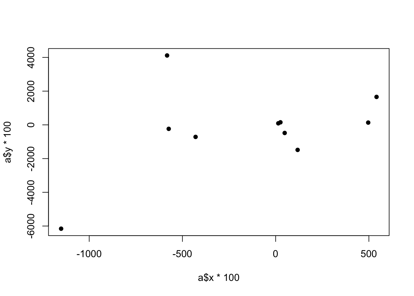
cor(a$x, a$y)[1] 0.4461244stays exactly the same if we scale each variable up by 100:
plot(a$x*100, a$y*100)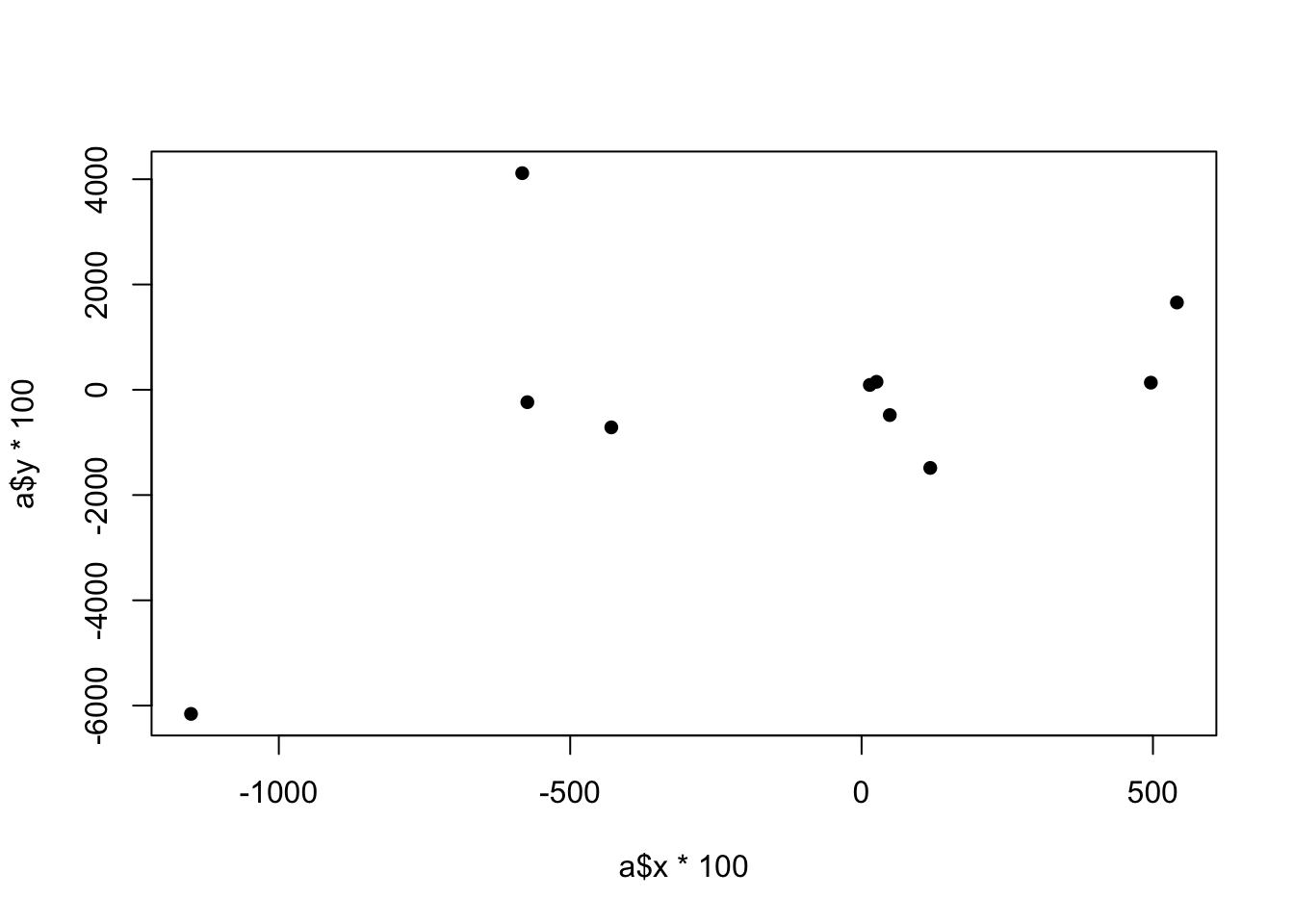
cor(a$x*100, a$y*100)[1] 0.4461244Let’s look at how this looks for two variables that are perfectly correlated:
x <- seq(1,10,1)
y <- seq(1,10,1)
plot(x,y, pch=16)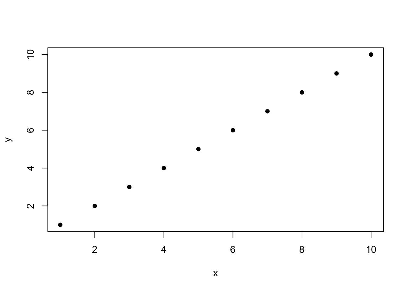
When I say “perfectly correlated”, what I mean here is that every data point has the same value for x and y. If you tell me a data points x coordinate, I can tell you its y coordinate because they are the same.
Let’s look at all the components:
cov(x,y)[1] 9.166667var(x)[1] 9.166667var(y)[1] 9.166667var(x)*var(y)[1] 84.02778sqrt(var(x)*var(y))[1] 9.166667cov(x,y)/sqrt(var(x)*var(y))[1] 1When two variables are perfectly correlated that equals \(\hat{\rho}_{x,y}=1\). That is the case because when two variables are perfectly correlated their covariance is equal to the variance of each of the variables.
Let’s think about why that’s true. The equation for variance is:
\[ \hat{\sigma_x^2} = \frac{1}{n-1}\sum_{i=1}^n (x_i-\bar{x})^2 \]
And equation for covariance is:
\[ \hat{\sigma_{x,y}} = \frac{1}{n-1}\sum_{i=1}^n (x_i-\bar{x})(y_i - \bar{y}) \]
But if two variables are perfectly correlated then it is necessarily the case that \((x_i-\bar{x})=(y_i - \bar{y})\). As such the two equations will result in exactly the same thing.
If any of these points is disturbed from this line it means that this perfect balance between x and y will be disturbed, and the correlation will move below 1.
x[3] <- x[3]+.3
plot(x,y)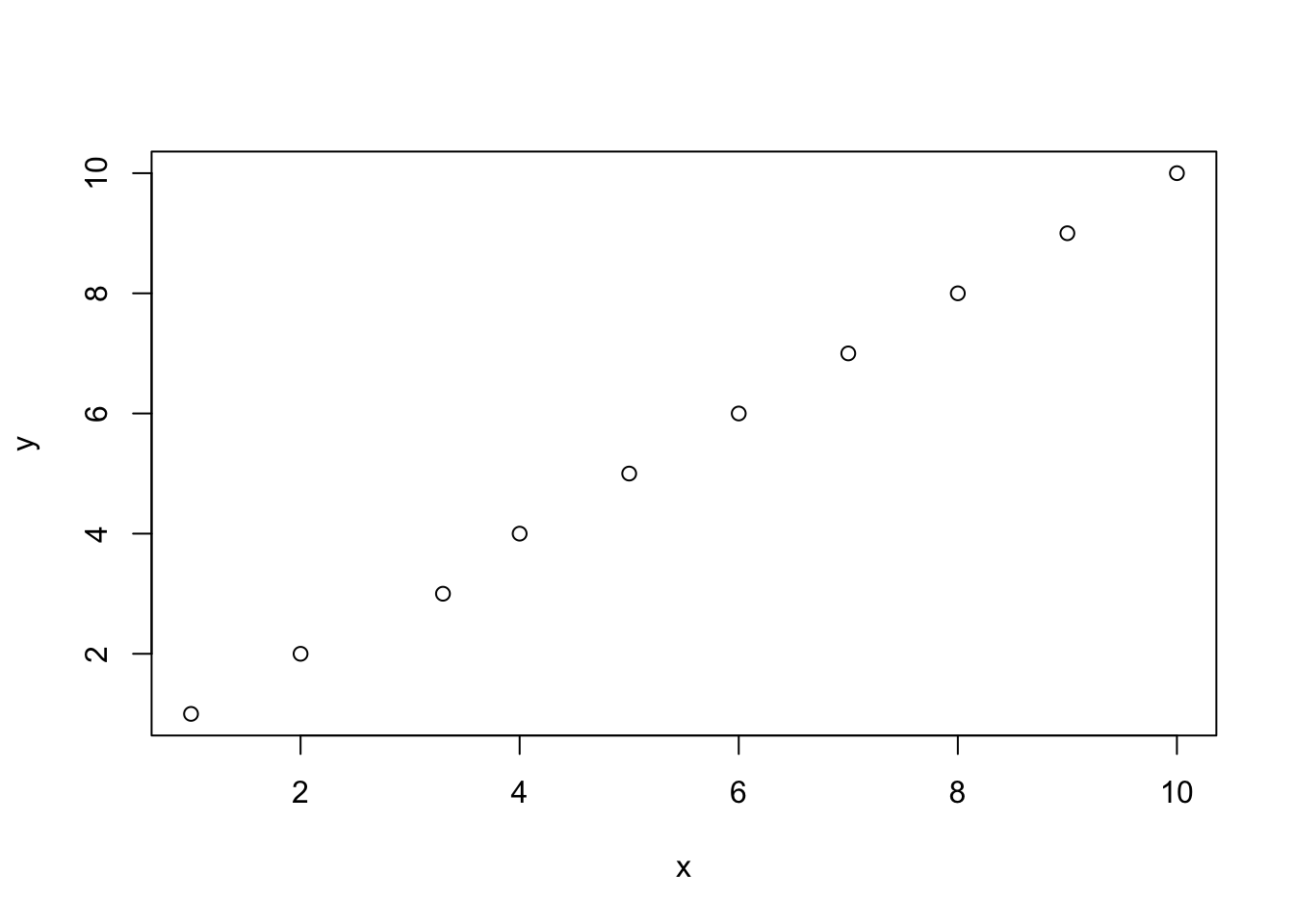
cov(x,y)[1] 9.083333var(x)[1] 9.009var(y)[1] 9.166667var(x)*var(y)[1] 82.5825sqrt(var(x)*var(y))[1] 9.087491cov(x,y)/sqrt(var(x)*var(y))[1] 0.9995424What about two variables that are perfectly negatively correlated?
x <- seq(1,10,1)
y <- seq(10,1,-1)
plot(x,y, pch=16)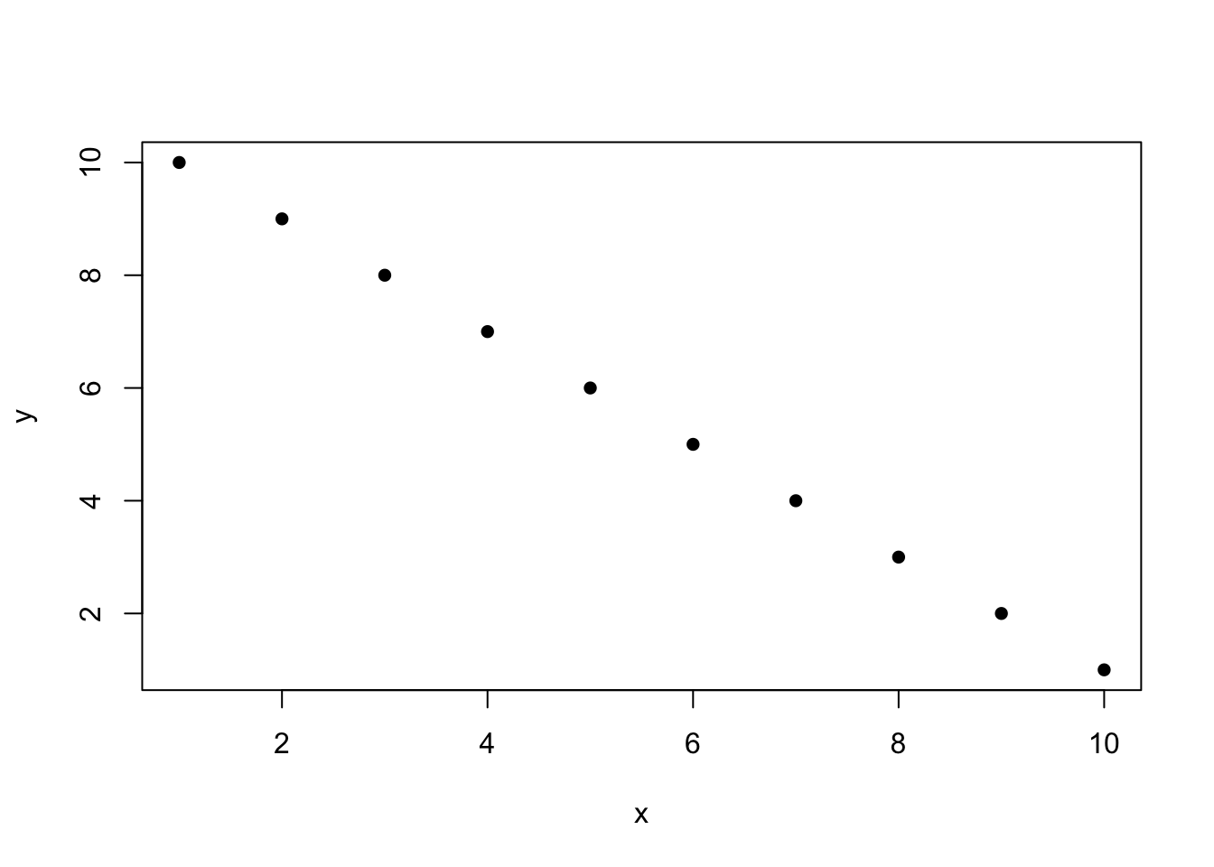
cov(x,y)[1] -9.166667var(x)[1] 9.166667var(y)[1] 9.166667var(x)*var(y)[1] 84.02778sqrt(var(x)*var(y))[1] 9.166667cov(x,y)/sqrt(var(x)*var(y))[1] -1Here the covariance is going to be -1 multiplied by the variance of each of the variables (which is the same).
So a correlation coefficient mathematically lies between -1 and 1, and the closer the coefficient is to those two bounds the more “perfectly” correlated the two variables are.
Here are 9 different relationships moving from a very negative to a very positive correlation:
library(MASS)
cors <- seq(-.9,.7,.2)
cors
[1] -0.9 -0.7 -0.5 -0.3 -0.1 0.1 0.3 0.5 0.7par(mfrow=c(3,3))
for(i in 1:length(cors)){
sigma<-rbind(c(1,cors[i]), c(cors[i],1))
mu <- c(0,0)
d <- mvrnorm(n=100, mu=mu, Sigma=sigma)
plot(d[,1], d[,2], main=paste("Cor =",cors[i] ))
}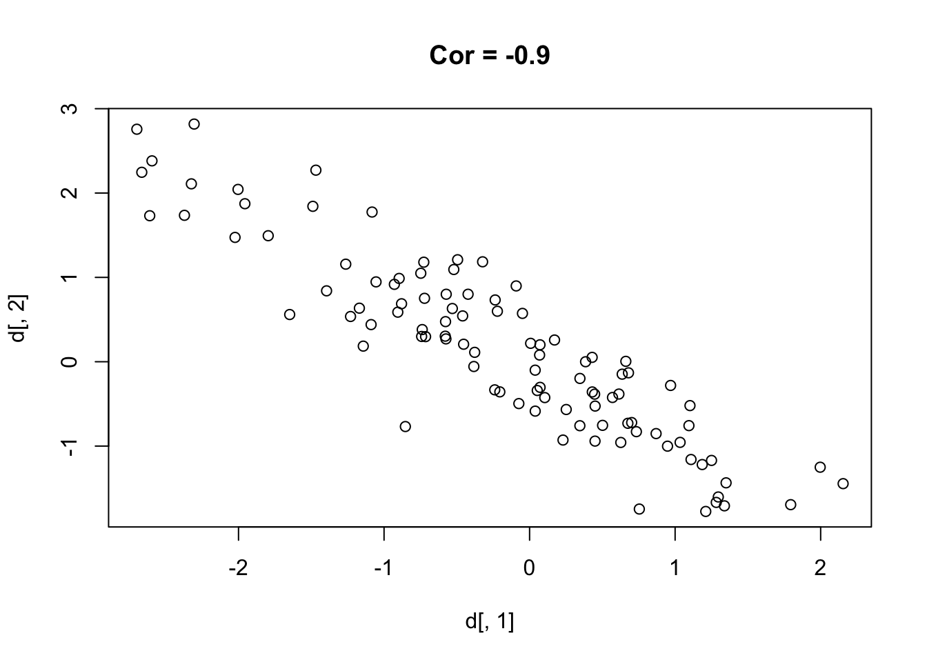
One thing that might be clear from this is that a correlation is hard to “eyeball”.
There is actually a whole online game for this.
Indeed, there is a classic demonstration of four datasets put together by the statistician Francis Anscombe. They are built into R:
anscombe x1 x2 x3 x4 y1 y2 y3 y4
1 10 10 10 8 8.04 9.14 7.46 6.58
2 8 8 8 8 6.95 8.14 6.77 5.76
3 13 13 13 8 7.58 8.74 12.74 7.71
4 9 9 9 8 8.81 8.77 7.11 8.84
5 11 11 11 8 8.33 9.26 7.81 8.47
6 14 14 14 8 9.96 8.10 8.84 7.04
7 6 6 6 8 7.24 6.13 6.08 5.25
8 4 4 4 19 4.26 3.10 5.39 12.50
9 12 12 12 8 10.84 9.13 8.15 5.56
10 7 7 7 8 4.82 7.26 6.42 7.91
11 5 5 5 8 5.68 4.74 5.73 6.89There are four x/y pairs in there (x1 and y1 through x4 and y4). Watch what happens when we take the correlation of each:
cor(anscombe$x1, anscombe$y1)[1] 0.8164205cor(anscombe$x2, anscombe$y2)[1] 0.8162365cor(anscombe$x3, anscombe$y3)[1] 0.8162867cor(anscombe$x4, anscombe$y4)[1] 0.8165214All four are basically identical, a correlation of about 0.82. If that number was all you had, you would assume all four datasets looked about the same. They do not:
par(mfrow=c(2,2))
plot(anscombe$x1, anscombe$y1, pch=16, main="Set 1")
plot(anscombe$x2, anscombe$y2, pch=16, main="Set 2")
plot(anscombe$x3, anscombe$y3, pch=16, main="Set 3")
plot(anscombe$x4, anscombe$y4, pch=16, main="Set 4")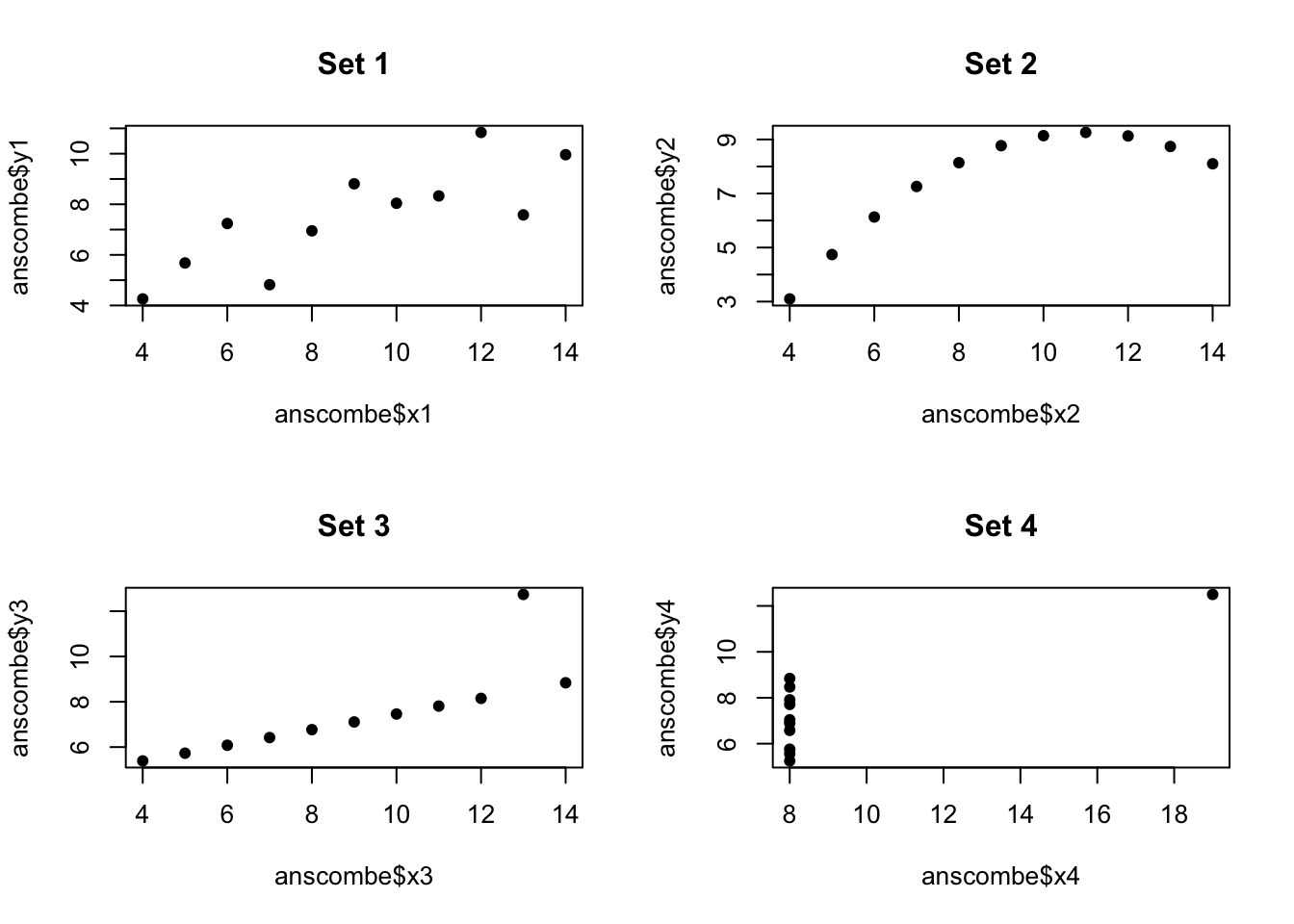
par(mfrow=c(1,1))Only the first one is the loose positive cloud you were probably picturing. The second is a perfect curve, where a straight-line summary like correlation is the wrong tool entirely. The third is a perfect line with one outlier dragging the coefficient down. The fourth is a vertical stack of points where a single point off to the right invents a relationship out of thin air.
The correlation coefficient is a summary, and like any summary it can hide as much as it shows. Always plot your data before you trust one number to describe it.
Let’s look at a correlation we actually care about, and one we are going to pick up again in the next chapter.
Here is data from the ANES. I’m going to pull two variables: a respondent’s age, and how warmly they feel about Black Lives Matter on a “feeling thermometer” that runs from 0 (cold) to 100 (warm).
library(rio)
anes <- import("https://github.com/marctrussler/IIS-Data/raw/main/ANESFinalProjectData.csv")

anes$age <- anes$V201507x
anes$age[anes$age<0] <- NA

anes$blm.therm <- anes$V202174
anes$blm.therm[anes$blm.therm<0 | anes$blm.therm>100] <- NA
Taking our own advice, look at the scatterplot first:
plot(anes$age, anes$blm.therm, xlab="Age", ylab="BLM Feeling Thermometer")
A blob! With 7,000 people stacked onto a 0 to 100 scale there is a huge amount of over-plotting and it’s genuinely hard to see anything at all. This is the situation where a single number summarizing the relationship can help us a lot.
cor(anes$age, anes$blm.therm, use="pairwise.complete")[1] -0.1307171A correlation of -0.13. So there is a slight negative relationship: older people are, on average, a little cooler toward Black Lives Matter. It’s a slight relationship. In no way should we think about it as determinative.
Indeed, we should probably see if this holds up to hypothesis testing. As we discussed in the previous chapter, there is no mathematical way to calculate a standard error for a correlation coefficient. To be clear: there is a sampling distribution and a standard error. There has to be, because we know that every time we sample we will get a different answer and those different answers will form a distribution. But because we have no mathematical solution we must use the bootstrap to see if we can trust this result.
To do the bootstrap I am going to reduce the dataset to just these two variables (not strictly necessary but will make the computation faster) and then re-sample the dataset with replacement a large number of times, calculating the correlation in each:
set.seed(19104)
anes <- anes[c("age","blm.therm")]
cor.bs <- rep(NA, 1000)

for(i in 1:1000){
  bs.dat <- anes[sample(1:nrow(anes), nrow(anes), replace=T),]
  cor.bs[i] <- cor(bs.dat$age, bs.dat$blm.therm, use="pairwise.complete")
}
plot(density(cor.bs))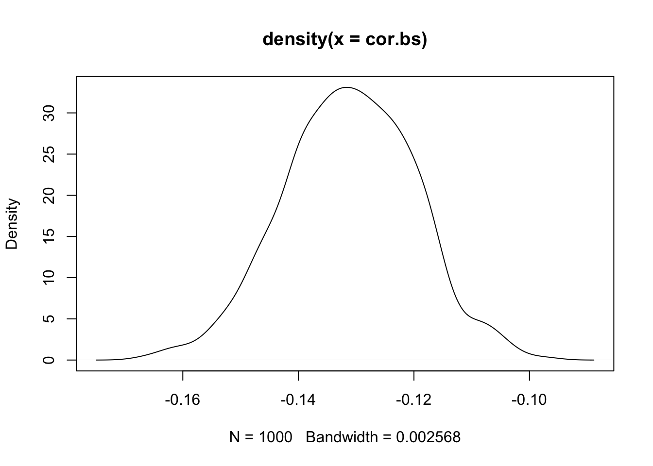
quantile(cor.bs, .025) 2.5%
-0.1539605 quantile(cor.bs,.975) 97.5%
-0.1082205 The bootstrap sampling distribution ranges from -.16 to -.1 or so. The 95% confidence interval does not contain 0. So I am confident that the true correlation between these two things is not 0 in the population.
We will come back to these exact two variables in the next chapter, when we want to say something more concrete than the relationship being “slightly negative”.
Covariance and correlation give us tools for summarizing how two variables move together. But summarizing the relationship isn’t the same as modeling it. The next chapter introduces regression, which builds on correlation to give us a workhorse tool for describing how one variable predicts another — plus the ability to hold other variables constant, quantify effect size in the units of our data, and generate predictions.