In the last chapter we developed correlation, a way to summarize the relationship between two variables. It does fine for what it is, but it has two big drawbacks.
First, the thing that is most helpful about it – that it’s unit-less – is also a bit of a drawback. While “correlation” is definitely a word regular people understand, it’s pretty impossible to form a real human sentence about a correlation. A few chapters ago we found that the correlation between ideology and voting for a centrist candidate is higher among White than Black Americans. That sentence is fine to say but really lacks nuance. How much does ideology matter? What can I practically say about moving from “very liberal” to “moderate” in terms of the probability of voting for a candidate?
The second thing is that our ability to consider a third variable is very blunt. The only way that we could look at the relationship between ideology and voting for a centrist candidate while taking into account race was by splitting the sample into two groups. But what if our third variable had many levels, or was continuous? Or what if we wanted to also consider the effect of education? Correlation doesn’t really allow us to do any of those things.
What is going to solve both of those problems is regression.
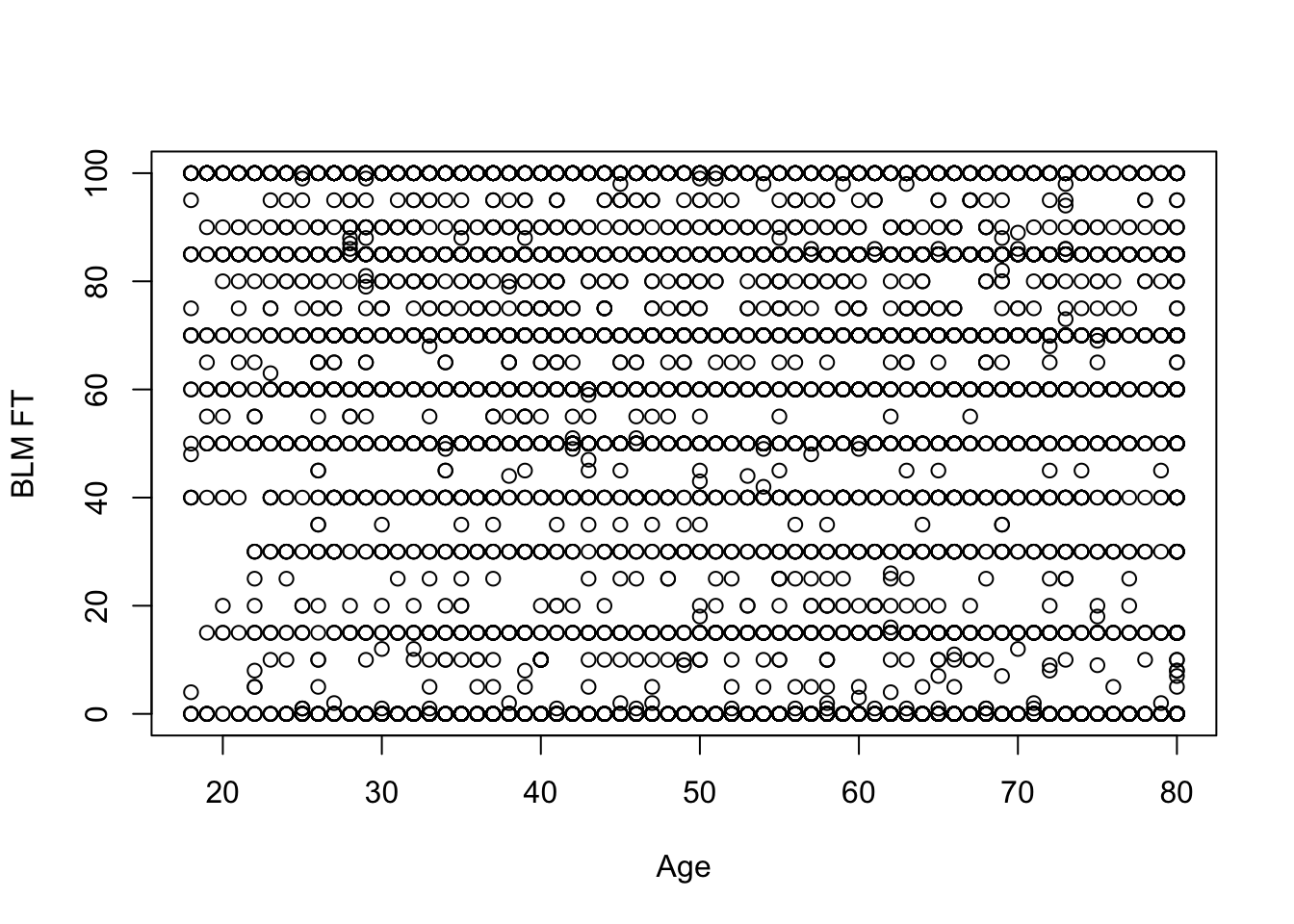
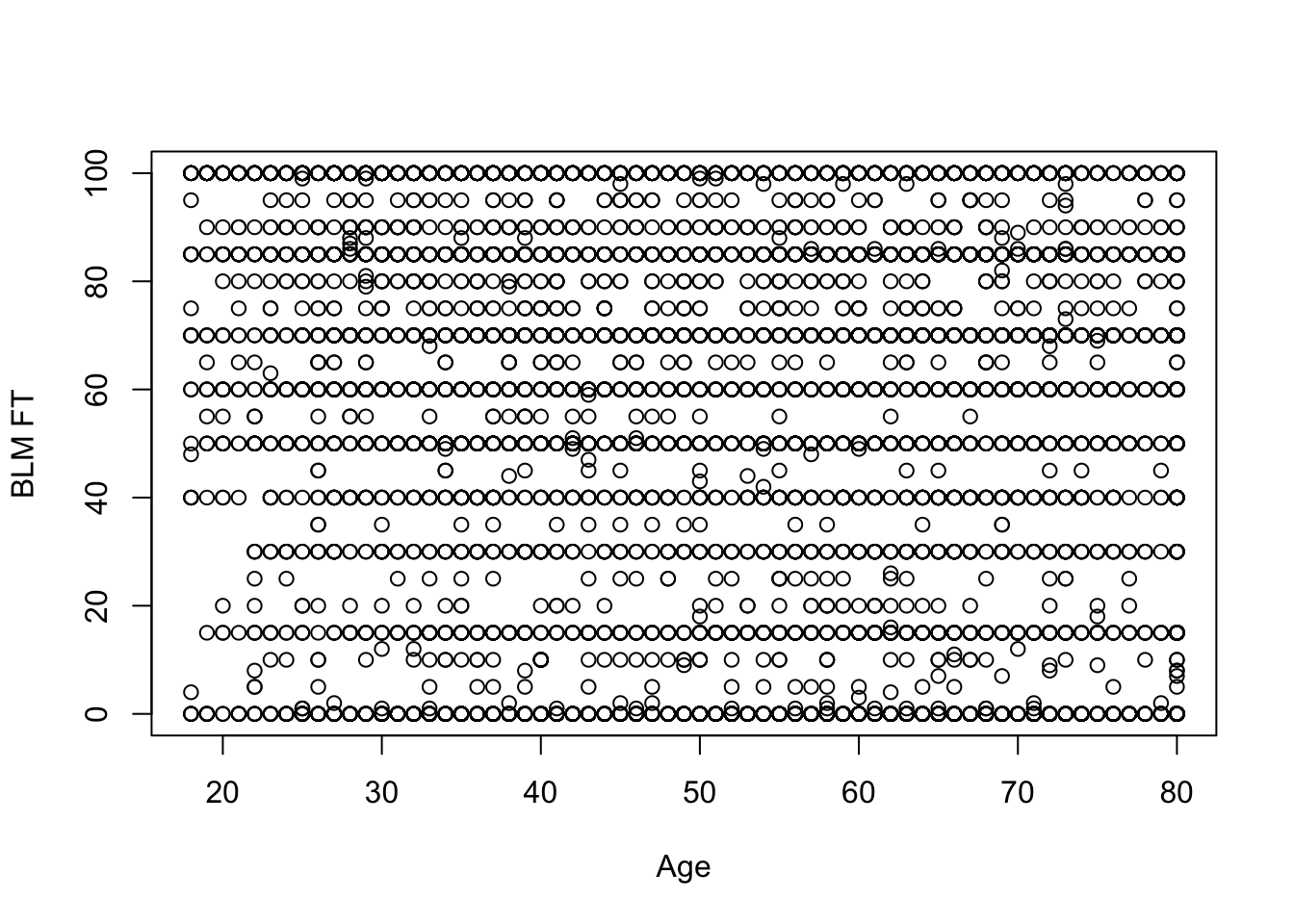
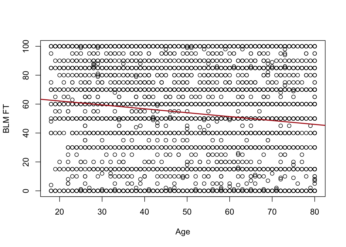
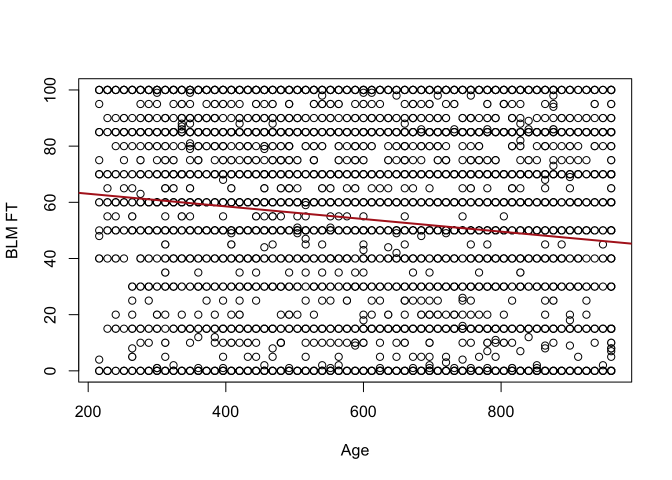
To investigate regression let’s look again at the relationship between the age and the feeling thermometer for Black Lives Matter:
summary(anes$V201507x)
   Min. 1st Qu.  Median    Mean 3rd Qu.    Max.
  -9.00   35.00   51.00   49.04   65.00   80.00
   Min. 1st Qu.  Median    Mean 3rd Qu.    Max.    NA's
    0.0    15.0    60.0    53.3    85.0   100.0     936
#Reduce to only where we have non NAs for those two variables#this is not strictly necessary but helps with our "by hand" calculations#down belowanes <- anes[!is.na(anes$age),]anes <- anes[!is.na(anes$blm.therm),]
As we saw last week this is a bit of a “blob” scatterplot:
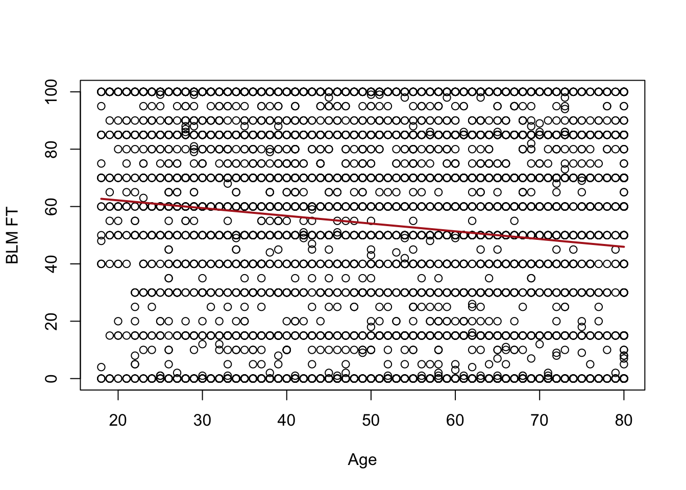
A lot of people give similar answers on the FT so we have points stacked on top of each other. But still we can also conclude this is not a deterministic relationship: there are lots of 20 year olds that have negative views of BLM and lots of 80 year olds with positive views of BLM.
Last time we learned how to use correlation to summarize what’s happening here:
cor(anes$age, anes$blm.therm)
[1] -0.1307171
There is a very weak negative relationship between these two things.
With regression we are going to summarize this relationship by choosing a line to plot through the above data. How might we do that?
Well one way to do this (this is not the right way) would be to look at each value of age and find the average value of the blm feeling thermometer:
So this progression of averages generally slopes downwards, as we would anticipate given the correlation. But, this doesn’t really allow us to give an answer about the relationship between age and feelings towards BLM.
More problematically, let’s not forget the overall goal of this class, which is to form inferences about the population not just to describe the data that we have. Here we are very religiously following the data from age to age. We would absolutely not claim that each and every up and down of this line is something that is present in the population. For example we are not going to conclude that feelings about BLM generally decline to age 40, but then from age 40 to 41 they go up a bunch, and then they go back down. In other words we are “over-fitting” the data that we have here, taking seriously every quirk in the random sample to be true.
Instead, we want to work to summarize this data in a more averaged way, we want to smooth out the random variations caused by sampling to produce a single line which gives us the overall picture of what is happening between these two variables.
Specifically, we are going to estimate the following equation:
\[
\hat{y} = \hat{\alpha} + \hat{\beta}x_i
\]
Where \(\hat{\alpha}\) is the y-intercept, \(\hat{\beta}\) is the slope, and \(x_i\) is each data-points x value.
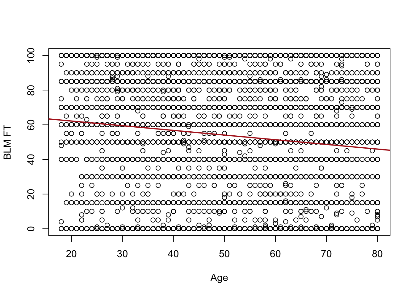
We are going to get to where these numbers come from shortly, but here are the intercept and slope that the method we are about to cover – Ordinary Least Squares (OLS) regression – will choose:
Here \(\hat{\alpha} = 67.55\) and \(\hat{\beta}=-.27\). What those two pieces of information allow us to do is to draw a line through these data. Specifically, you can evaluate this equation for all values of \(x\), and for each value get a value for \(\hat{y}\), which is the line at that point.
First we are going to determine: (1) how did R choose that line? And then we will cover (2) How do we interpret that line?
11.2 How does OLS choose a line?
For each data point that we have we can define the residual. The residual is the vertical distance between each data point and the value for the line at that point. Mathematically, the residual is
\[
\hat{u_i} = y_i - \hat{y}
\]
We would never figure this out one at a time, but for example our first observation is a 46 year old who gave a value of 0 for the blm therm:
anes[1,c("age","blm.therm")]
  age blm.therm
1  46         0
The value of the line at that point would be \(67.55 - .27*46 = 55.13\). As such, the residual for this first individual would be \(0-55.13 = -55.13\).
I mentioned above that the method we use to choose an \(\alpha\) and \(\beta\) is called “Ordinary Least Squares”. It is called this because the method we use to choose these values, is the method which minimizes the sum of the squared residuals.
So specifically, we choose \(\alpha\) and \(\beta\) such that we minimize:
We want to specifically choose the \(\alpha\) and \(\beta\) values so that this equation generates as small a number as possible.
Now I’ve claimed that the alpha and beta chosen by OLS are the alpha and beta that does that. I will prove that to you in two ways. First through simulation and second through calculus.
Let’s first calculate what the sum of squared residuals is for the chosen alpha and beta
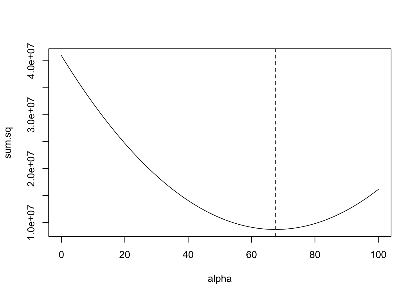
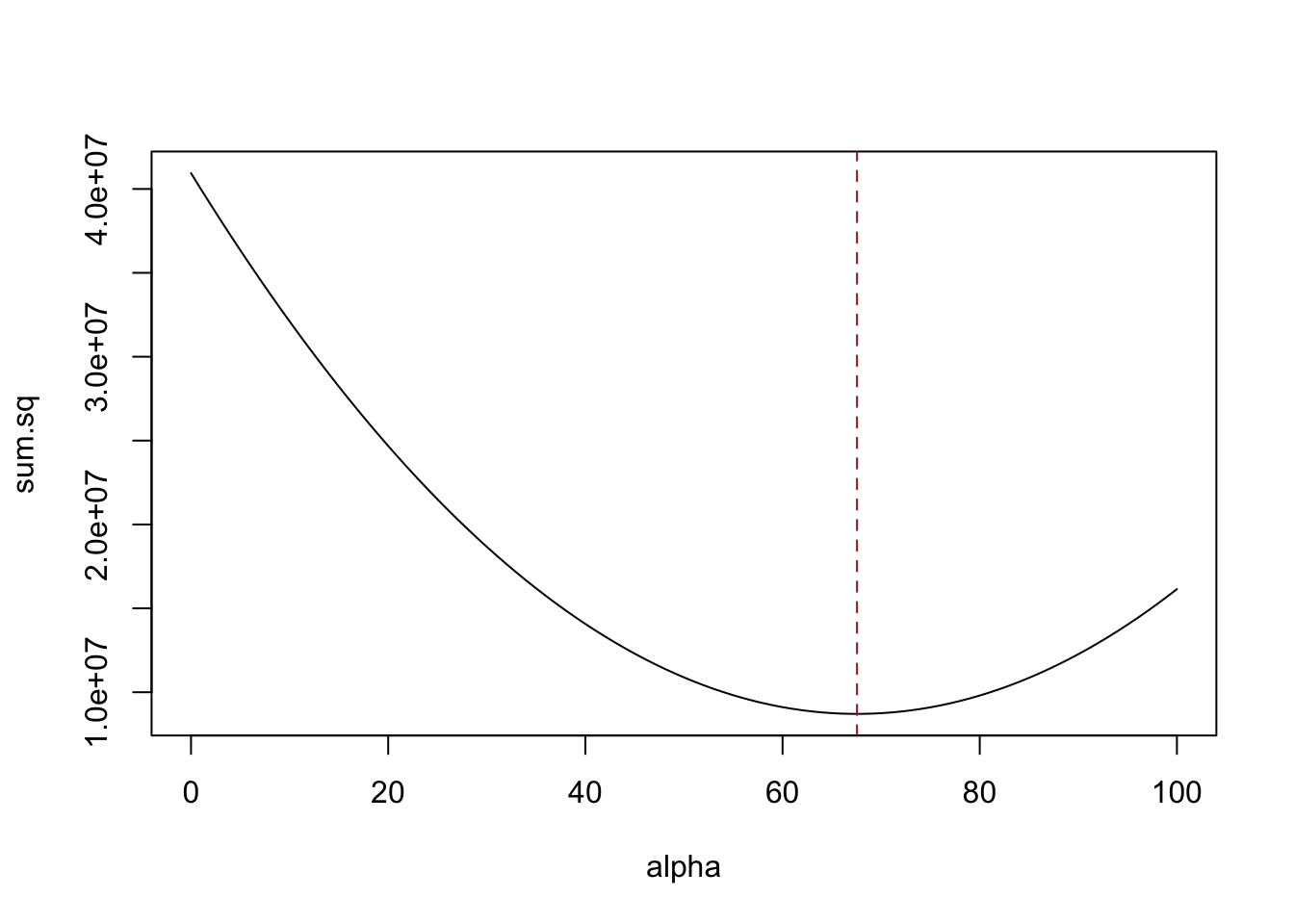
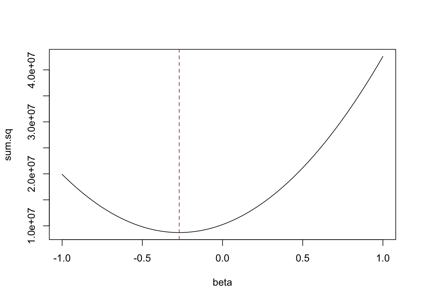
Let’s use that sum of the squared residual equation above and first hold constant beta and run through many possibilities for alpha. We should see that the result is the smallest when alpha is equal to 67.55:
In both cases the sum of the squared residuals is at its minimum point at the values for alpha and beta that were chosen by OLS.
We can also show the same thing via calculus. If calculus is not your thing, don’t worry too much about this. But this helps me to mechanically understand what’s happening in OLS regression:
We want to take the partial derivative of the sum of squares equation with respect to both alpha and beta. This will tell us the equations to determine the slope at any point on the above graphs.
For alpha, we can take the first derivative via the power and chain rule:
If you are rusty on your calculus, the steps we took generate the equation which, for the graphs above, gives the slope of the line at any point.
What we are particularly interested in is when the slope is equal to zero. Why zero? Because we want the combination of alpha and beta that leads us to the smallest sum of squared residuals, and that happens precisely when the slope of that curve is zero (a flat line).
So to find this minimum we will set this equation equal to 0 and isolate both \(\hat{\alpha}\) and \(\hat{\beta}\), the two things we need to estimate:
Now we can use that information to isolate beta and minimize.
First do some re-arranging of the sum of squared residuals equation: \[
\begin{aligned}
\hat{u_i}^2 = \sum_{i=1}^n (y_i - \hat{\alpha} - \hat{\beta}x_i)^2
\end{aligned}
\]
Sub in the (now) known definition of \(\hat{\alpha}\)
Set equal to 0 and divide by -2: \[
\begin{aligned}
0 = \sum_{i=1}^n (y_i - \bar{y})(x_i - \bar{x}) -\hat{\beta}(x_i -\bar{x})^2
\end{aligned}
\] Move the last term to the other side, and remove the constant \(\beta\) from the summation
\[
\begin{aligned}
\hat{\beta} \sum_{i=1}^n(x_i -\bar{x})^2 = \sum_{i=1}^n (y_i - \bar{y})(x_i - \bar{x})
\end{aligned}
\] Divide both sides by \(\sum_{i=1}^n(x_i -\bar{x})^2\):
So a little bit of calculus produces the equations for the two parameters of the line that produce the line which minimizes the sum of the squared residuals.
Looking at the equation for \(\hat{\beta}\) should look familiar.
If we think about the equation for covariance and for variance they are:
And a regression coefficient is just covariance divided by the variance of the independent (x) variable:
\[
\hat{\beta} = \frac{\hat{\sigma_{x,y}}}{\hat{\sigma_x^2}}
\] They are just different scalings. That means that you aren’t going to get a situation where correlation tells you a relationship is in one direction and regression tells you it’s in the other. That’s actually impossible. Instead, they give you different scales to consider the relationship on. As it turns out, the scale given to you by regression is very intuitive, as we turn to next.
11.3 Interpreting Regression Output
We have uncovered the equations used to generate an alpha and beta to draw the line we see above. Now that we have that line, how do we interpret the main regression we have been discussing?
   Min. 1st Qu.  Median    Mean 3rd Qu.    Max.
-62.690 -33.381   4.049   0.000  32.202  54.049
The two numbers for alpha and beta are present in the “Estimate” column. These are generated using the equations we’ve derived.
The remaining columns give a hypothesis test. How could we determine which hypothesis is being tested? Well a t value is “how many standard errors the estimate is from the null. So:
So we are getting hypothesis tests that these coefficients are equal to 0, or not.
This makes a lot of sense for the regression coefficient on age. We care a lot about whether a coefficient is 0, or not, because 0 is a flat line! This has a very high t-value and a very low p-score, so we would reject the null hypothesis that the slope in the population is 0. More next week on this hypothesis test!
Do we care if alpha is 0 or not? Well… in real terms what is alpha?
It is the value of \(\hat{y}\) where the line crosses the y axis. We can see that mathematically:
So it is the predicted value of y when x is 0. What does an x of 0 mean here? A newborn? This is how newborns feel about BLM? Do we care about that at all?
No! Of course not. Having an \(\alpha\) is a pre-requisite to drawing a line. Like mechanically, the two ingredients to a line are its intercept and its slope. So we need to define this value, but that does not mean that it is a meaningful number.
What’s more, the hypothesis test is definitely not a meaningful hypothesis test. Do we care if the predicted level of support of BLM of newborns is 0, or not? No! Definitely not. I actually don’t even like that they give you a statistical test for this value.
Let’s move on to beta, which is the estimate for age. We have seen that it is -.27, what does that mean?
You have seen a slope before being defined as rise over run, and this is just what this number is. For every 1 unit increase in X, Y goes down by .27.
When we say 1 unit in a regression, we mean 1 unit in our number system. As in the difference between 1 and 2, and 100 and 101, and 567 and 568. This will be true for absolutely every OLS regression we ever run and you should really internalize it right now. The beta coefficient is how a 1 unit change in x relates to a \(\beta\) change in y.
The best thing about this is how it allows us to form normal human sentences about this relationship. As a person gets 1 year older their feelings about BLM drop .27 points on average.
Note also that we can scale this up or down: If a one unit change in x is -.27, what is a 10 unit change in x? 2.7! So we might also say that as a person gets 10 years older, their feelings about BLM drop 2.7 points on average. Also good!
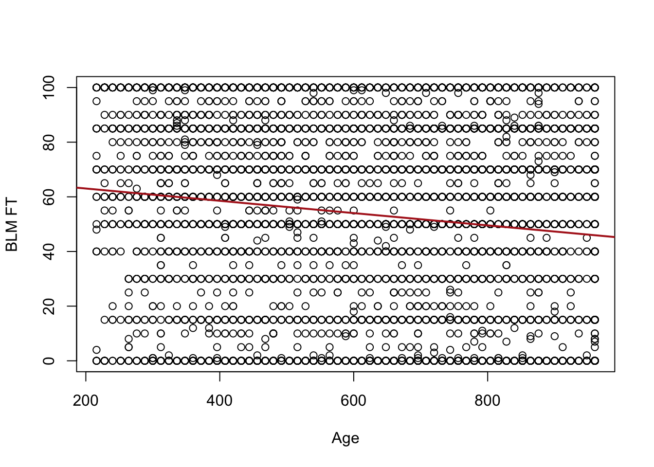
What this means, however, is that if we re-scale our x variable then \(\beta\) will change, even if the underlying relationship does not.
Call:
lm(formula = blm.therm ~ age.months, data = anes)

Residuals:
    Min      1Q  Median      3Q     Max
-62.690 -33.381   4.049  32.202  54.049

Coefficients:
             Estimate Std. Error t value Pr(>|t|)
(Intercept) 67.549664   1.328699   50.84   <2e-16 ***
age.months  -0.022498   0.002031  -11.08   <2e-16 ***
---
Signif. codes:  0 '***' 0.001 '**' 0.01 '*' 0.05 '.' 0.1 ' ' 1

Residual standard error: 35.12 on 7062 degrees of freedom
Multiple R-squared:  0.01709,   Adjusted R-squared:  0.01695
F-statistic: 122.8 on 1 and 7062 DF,  p-value: < 2.2e-16
Visually we can see that the relationship looks the same, we have just re-scaled the x-axis of the graph. Age explains no more or less than it did when it was measured in years.
Looking at the coefficient on age.months we see that it is smaller than it was before. Because we know that this is how a 1-unit change in x relates to a change in y, we know that this does not mean that age is “less important” in this second regression. Instead, we are now measuring the impact of a change in 1 month on BLM feelings instead of 1 year.
Indeed if we multiply that coefficient by 12:
m2$coefficients["age.months"]*12
age.months
-0.2699798
We return the original coefficient.
Think this through in relation to what we discovered last time that the regression coefficient is simply the covariance of x and y divided by the variance of x. When we were discussing covariance we found that it is completely sensitive to the scale of the variables. Correlation divided by the product of the variance of x and y which standardized the variable to 0,1. Regression, on the other hand, only divides by the variance of the explanatory variable. This means that regression coefficients are standardized based on whatever x is scaled to be at the current moment.
How does this interpretation of the beta coefficient relate to other types of variables?
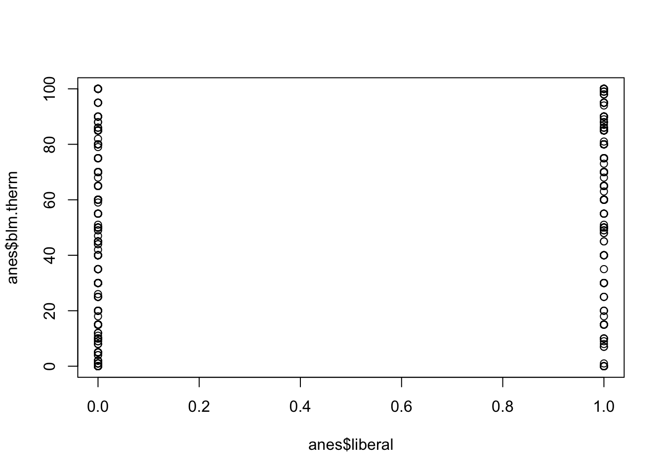
Let’s look at how being a liberal vs being a conservative or moderate influences your opinions of BLM:
Call:
lm(formula = blm.therm ~ liberal, data = anes)
Residuals:
Min 1Q Median 3Q Max
-78.439 -23.054 1.946 21.561 61.946
Coefficients:
Estimate Std. Error t value Pr(>|t|)
(Intercept) 38.0544 0.4774 79.71 <2e-16 ***
liberal 40.3844 0.7898 51.13 <2e-16 ***
---
Signif. codes: 0 '***' 0.001 '**' 0.01 '*' 0.05 '.' 0.1 ' ' 1
Residual standard error: 29.66 on 6080 degrees of freedom
(982 observations deleted due to missingness)
Multiple R-squared: 0.3007, Adjusted R-squared: 0.3006
F-statistic: 2614 on 1 and 6080 DF, p-value: < 2.2e-16
Here we have an intercept of 38.05, and a beta of 40.38.
Let’s start with the intercept, what does this intercept represent? Remember, the intercept is the average value of y when x=0, as shown mechanically by the regression equation.
This is the average value of the BLM thermometer among non-liberals. That is what it means to be 0 on this variable.
What does the slope on liberal mean? This is the effect of a 1 unit change in x on y, so moving one unit on x increases the average person’s blm thermometer by 40.38 points. Ok but what does this mean in real human terms? A one unit change in this variable indicates us moving from one group to another. We have specifically set up this variable in a way that works extremely well with regression, because changing “1-unit” brings us from one group to another. So the difference in blm feelings between liberals and non-liberals is 40.38 points.
What is the average level of feeling towards BLM among liberals?
We can answer this via the regression equation. Our predicted y is equal to
\[
\hat{y} = 38.05 + 40.38*Liberal_i
\]
So we can turn liberal on and off to get that answer:
Let’s compare that to the t.test of the difference in means between these two groups on this variable, which we have already learned about:
t.test(anes$blm.therm ~ anes$liberal)
Welch Two Sample t-test
data: anes$blm.therm by anes$liberal
t = -57.181, df = 6005.6, p-value < 2.2e-16
alternative hypothesis: true difference in means between group 0 and group 1 is not equal to 0
95 percent confidence interval:
-41.76891 -38.99987
sample estimates:
mean in group 0 mean in group 1
38.05440 78.43879
The two means are 38.05 and 78.43. So OLS regression with a binary x variable exactly uncovers the means of the two groups, with beta representing the difference between those two means.
This is super helpful, and one of the reasons why I’ve made such a big deal about indicator variables throughout the semester. Indicator variables are great because they work extremely well with the math of OLS. OLS uncovers the effect of 1 unit shifts, and a 1 unit shift in an indicator indicates group membership.
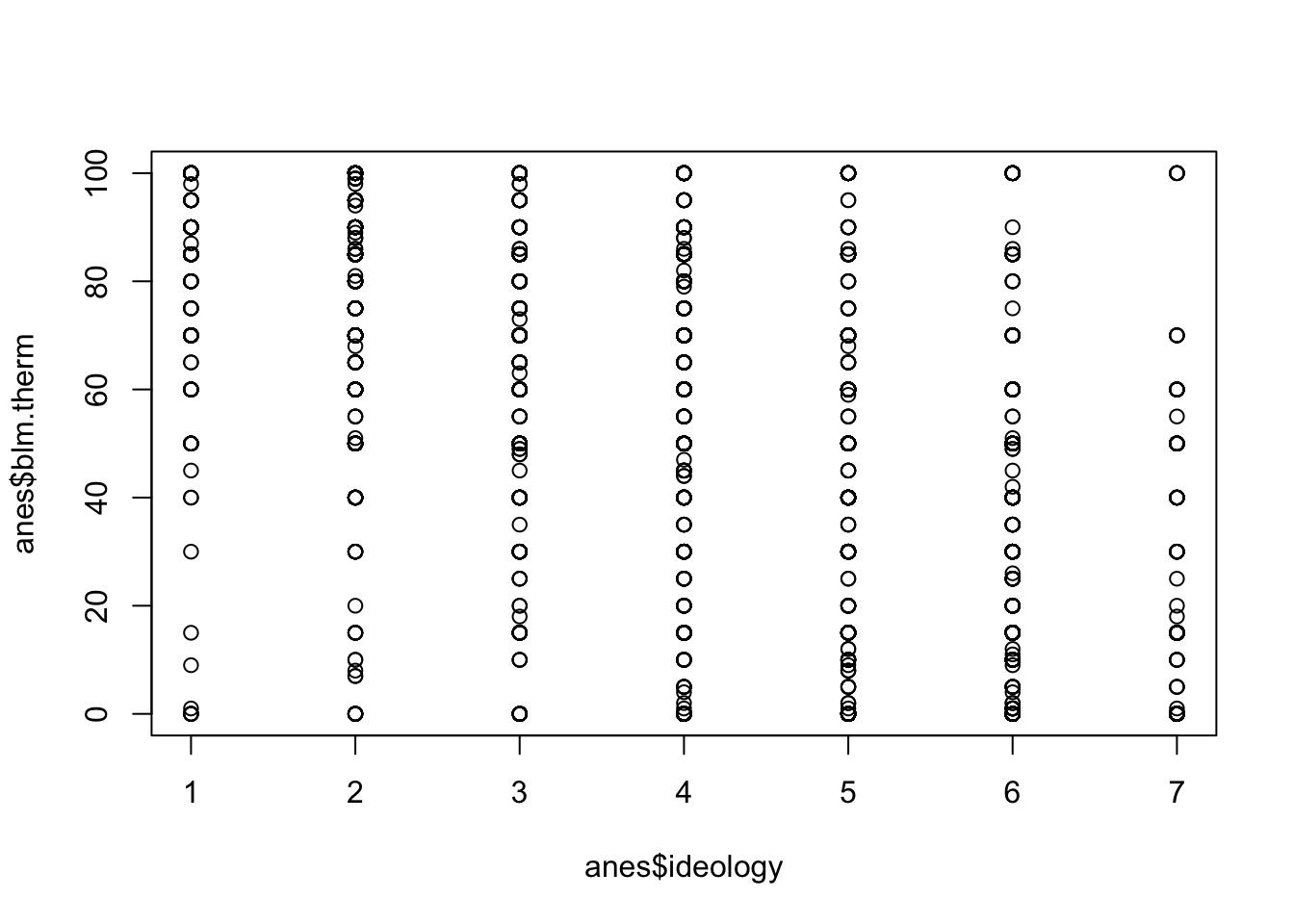
What about if we use the un-altered ideology variable as our dependent variable? Remember that ideology is a 7-point scale where 1 is “very liberal” and 7 is “very conservative”.
table(anes$ideology)
   1    2    3    4    5    6    7
 327 1091  804 1537  696 1267  360
plot(anes$ideology, anes$blm.therm)
m4 <-lm(blm.therm ~ ideology, data=anes)
What does the intercept mean in this case? This is the average value of y when x is 0. Can x be zero? No! Definitely not, so this is a completely meaningless number.
What does beta mean in this case? For every 1 unit change in x your feelings about BLM drop 14.5 points. What does that mean in terms of this variable? Every 1 step more conservative you get you drop 14.5 points in terms of your feelings about BLM.
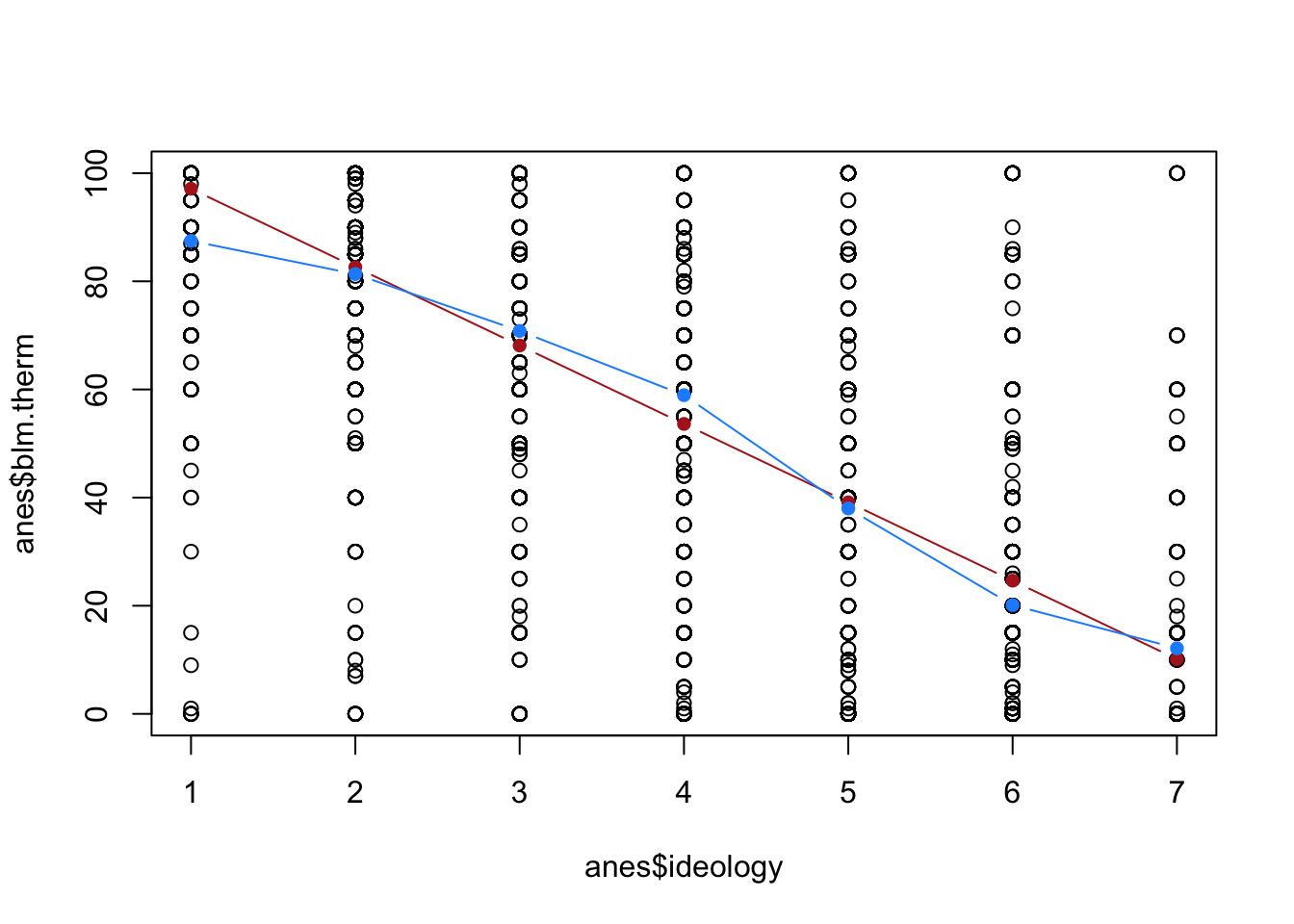
Now here’s a question, if we use our regression equation to determine the predicted y at 1, 2, 3…7, will that also recover the mean blm thermometer at each of those points?
They are definitely not the same! The red line, the regression line, is constrained to being a straight line. the blue line, the connected means, is not. Which of these, in this case, better represents this data?
Regression assumes that everything you put into it is a continuous variable. That means it thinks that the variable ranges from negative to positive infinity, and that each number is evenly spaced. We are necessarily treating, with the red line, the jump from very liberal to liberal the same as the jump from somewhat liberal to moderate. Looking at the blue line, it’s somewhat clear that each of these jumps is not uniformly important. The jump from 1 to 2 and from 6 to 7 is smaller than the jumps in between. Regression returns none of that nuance, it just gives us a straight line that averages across these values.
Neither of these are right or wrong, they just present two different perspectives. But it’s important to know what’s going on under the hood in regression so you understand the assumptions you are making about your variables.
11.4 Regression with a binary dependent variable
So far all of the regressions that we have run have had a continuous dependent variable. Is that our only option? What happens if we want to use regression on a binary dependent variable?
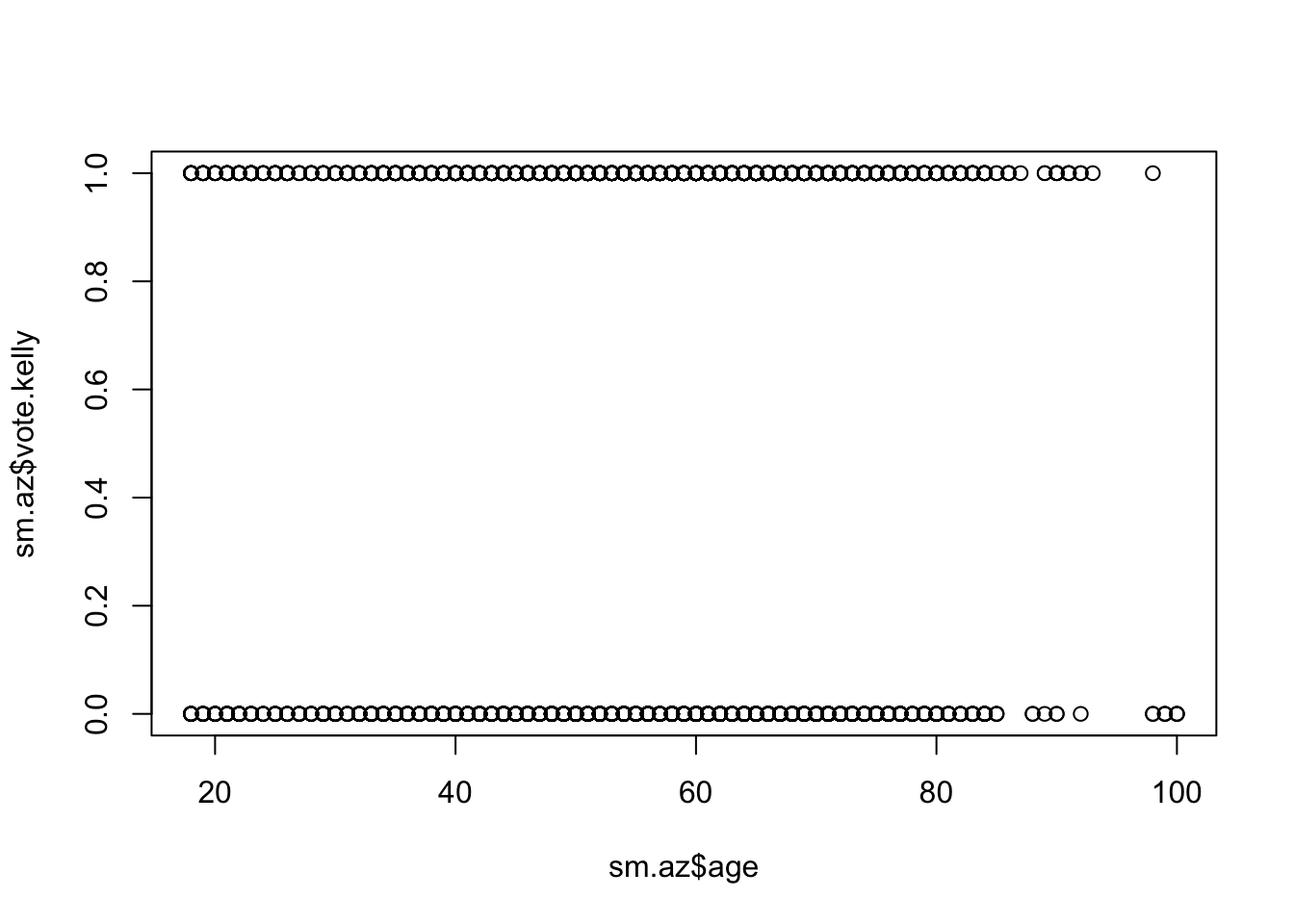
Let’s make a 0,1 variable of whether someone plans to vote for Mark Kelly (the Democrat) or Blake Masters (the Republican) on some data from the Arizona primary in 2022.
That doesn’t even touch any of the data-points! Is that helpful at all?
Let’s think about what the regression output says:
m4 <-lm(vote.kelly~age, data=sm.az)summary(m4)
Call:
lm(formula = vote.kelly ~ age, data = sm.az)

Residuals:
    Min      1Q  Median      3Q     Max
-0.5482 -0.5241  0.4627  0.4753  0.4989

Coefficients:
             Estimate Std. Error t value Pr(>|t|)
(Intercept) 0.4907882  0.0357856  13.715   <2e-16 ***
age         0.0005743  0.0006037   0.951    0.342
---
Signif. codes:  0 '***' 0.001 '**' 0.01 '*' 0.05 '.' 0.1 ' ' 1

Residual standard error: 0.4996 on 2611 degrees of freedom
  (434 observations deleted due to missingness)
Multiple R-squared:  0.0003465, Adjusted R-squared:  -3.64e-05
F-statistic: 0.9049 on 1 and 2611 DF,  p-value: 0.3416
What is the mathematical interpretation of the intercept?
Remember, that alpha is the average value of y when x is equal to 0. What does it mean when we take the average of a binary/indicator variable? That gives us the probability of that variable being equal to 1. It’s something we have seen repeatedly in this course. So the practical interpretation of this intercept is that the probability of voting for Kelly among a newborn (I know) is approximately 49%.
If that’s what the intercept is giving us, what does the age coefficient mean? For each additional 1 unit change in x, y goes up .0005, on average. This means that every additional year someone ages their probability of voting for Kelly increases by about one twentieth of a percentage point.
In other words, when we have a binary dependent variable, it converts all of our explanations into probability.
Let’s do another example (with a variable that actually affects Kelly vote prob…)
Let’s look at how the Biden approval variable above relates to voting for Kelly:
Call:
lm(formula = vote.kelly ~ biden.approval.num, data = sm.az)

Residuals:
    Min      1Q  Median      3Q     Max
-1.1296 -0.1267 -0.1267  0.2047  0.8733

Coefficients:
                   Estimate Std. Error t value Pr(>|t|)
(Intercept)        0.126699   0.007313   17.33   <2e-16 ***
biden.approval.num 0.334291   0.004225   79.13   <2e-16 ***
---
Signif. codes:  0 '***' 0.001 '**' 0.01 '*' 0.05 '.' 0.1 ' ' 1

Residual standard error: 0.2704 on 2595 degrees of freedom
  (450 observations deleted due to missingness)
Multiple R-squared:  0.707, Adjusted R-squared:  0.7069
F-statistic:  6261 on 1 and 2595 DF,  p-value: < 2.2e-16
What is the interpretation of the intercept now? Well we set this variable to be equal to strongly disapprove of Biden at 0, so this is the probability of voting for Kelly when you strongly disapprove of Biden. What is the interpretation of the coefficient on biden.approval.num now? This is now the effect of going from strongly to somewhat disapprove, from somewhat disapprove to somewhat approve, etc. That effect is .33. For every step up the approval chain the probability of voting for Kelly increases by 33%. That makes sense!
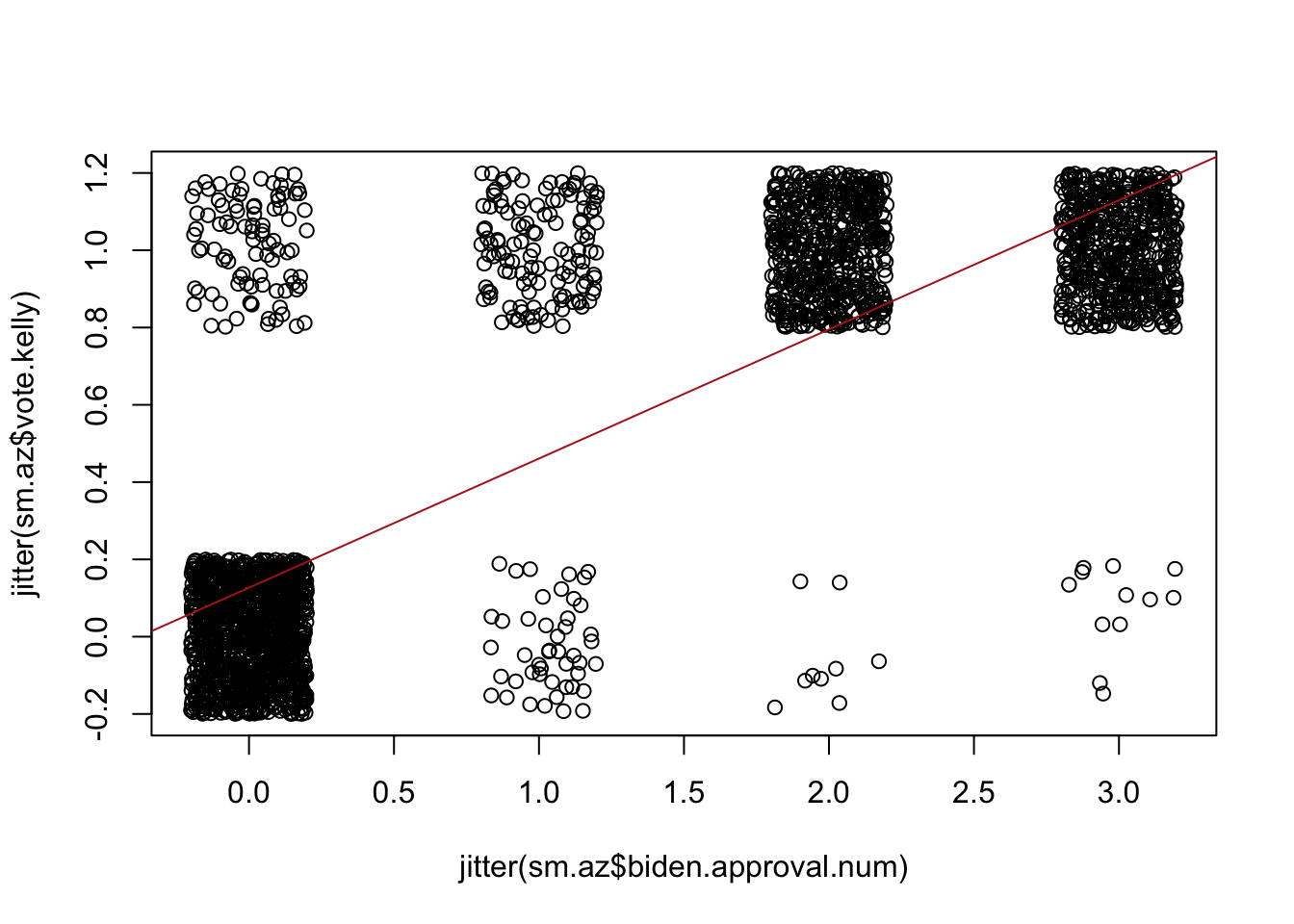
Now if we try to visualize this it’s going to look terrible:
We can somewhat improve this graph by using the jitter feature, which adds a bit of noise to our data so that we can see that each of these dots is actually a fair number of people:
But this graph also reveals another problem here. What is the predicted probability of voting for Kelly at all the levels of Biden approval? How can we mathematically determine that?
How would we interpret this last value? If you strongly approve of Biden you have a 112% chance of voting for him! Uh oh! Broken laws of probability!
When we run an OLS regression with a binary dependent variable, it transforms what we are doing into a “Linear Probability Model” or LPM. As we’ve seen, it allows us to interpret our coefficients in terms of the probability of the dependent variable being 1. LPMs are great, and most of the time they work fantastically. I’ve use them throughout my career with no problems.
The major downside to using an LPM is that OLS regression doesn’t know or care what scale your variable are on. It treats every variable like it is a continuous variable that ranges from negative infinity to infinity. There is nothing constraining OLS, in other words, to draw a line that leads to us making a prediction that is outside the interval of \([0,1]\). This is legitimately a big problem if you are specifically using regression to make a prediction, but less of a problem if you are using regression to search for an explanation. Here I’m not super bothered that this prediction falls outside of 0,1 because I am mostly interested in saying that Biden approval has a strong, positive impact on the probability that you are going to vote for Kelly.
If you are interested in using regression for prediction and your outcome variable is binary it is often the case that using an LPM is not appropriate. An example of this would be generating a likely voter model, which definitely needs to range between 0 and 1. In those cases we use a logit or probit model, which are beyond the scope of this course, but are specifically designed to work with binary outcome variables and will not generate predictions outside of the 0,1 interval.
Ultimately any numerical variable can be put into either side of a regression. That being said, you really really have to think about what is happening each and every time. You really have to understand the scale of the variables that you are using in order to correctly interpret what is going on. Every single time.
11.5 The standard error of a regression coefficient
Of course, our primary interest in this course is hypothesis testing. We know that each and every time we generate an estimate from our data, we have to think about it as one estimate of an infinite number of estimates we could have generated if we repeatedly resampled. For all of our estimates, therefore, there is a sampling distribution which describes what sort of range of estimates we will get if we repeatedly sample.
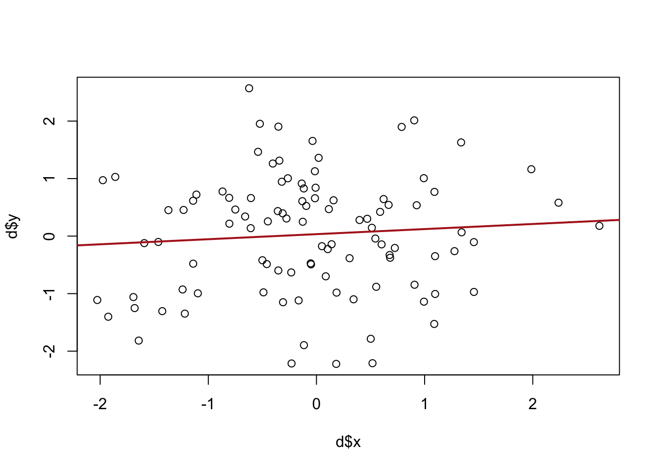
Let’s go back to our old standby of playing god and knowing a population to look at what the sampling distribution for a regression will look like. The mvrnorm() function from the MASS package allows us to draw from the “multivariate normal” we don’t need to know what this is, but just know that we can control the covariance between the two variables, as well as the variance of each variable. In this case we are setting the variance of each of x and y to 1, and the covariance between the two variables as 0.2. Here’s one draw:
Call:
lm(formula = d$y ~ d$x)

Residuals:
    Min      1Q  Median      3Q     Max
-2.2904 -0.7694  0.1109  0.6806  2.5906

Coefficients:
            Estimate Std. Error t value Pr(>|t|)
(Intercept)  0.03485    0.10287   0.339    0.736
d$x          0.08855    0.10909   0.812    0.419

Residual standard error: 1.026 on 98 degrees of freedom
Multiple R-squared:  0.006678,  Adjusted R-squared:  -0.003458
F-statistic: 0.6588 on 1 and 98 DF,  p-value: 0.4189
Focusing just on the slope, the coefficient here is .08855. The hypothesis test tells us to fail to reject the null hypothesis that there is no relationship between these two variables, even though I set them up with a positive covariance. So this is a false negative.
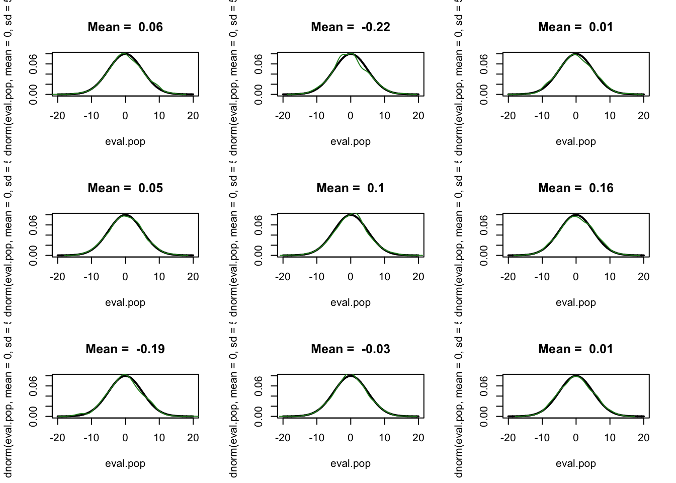
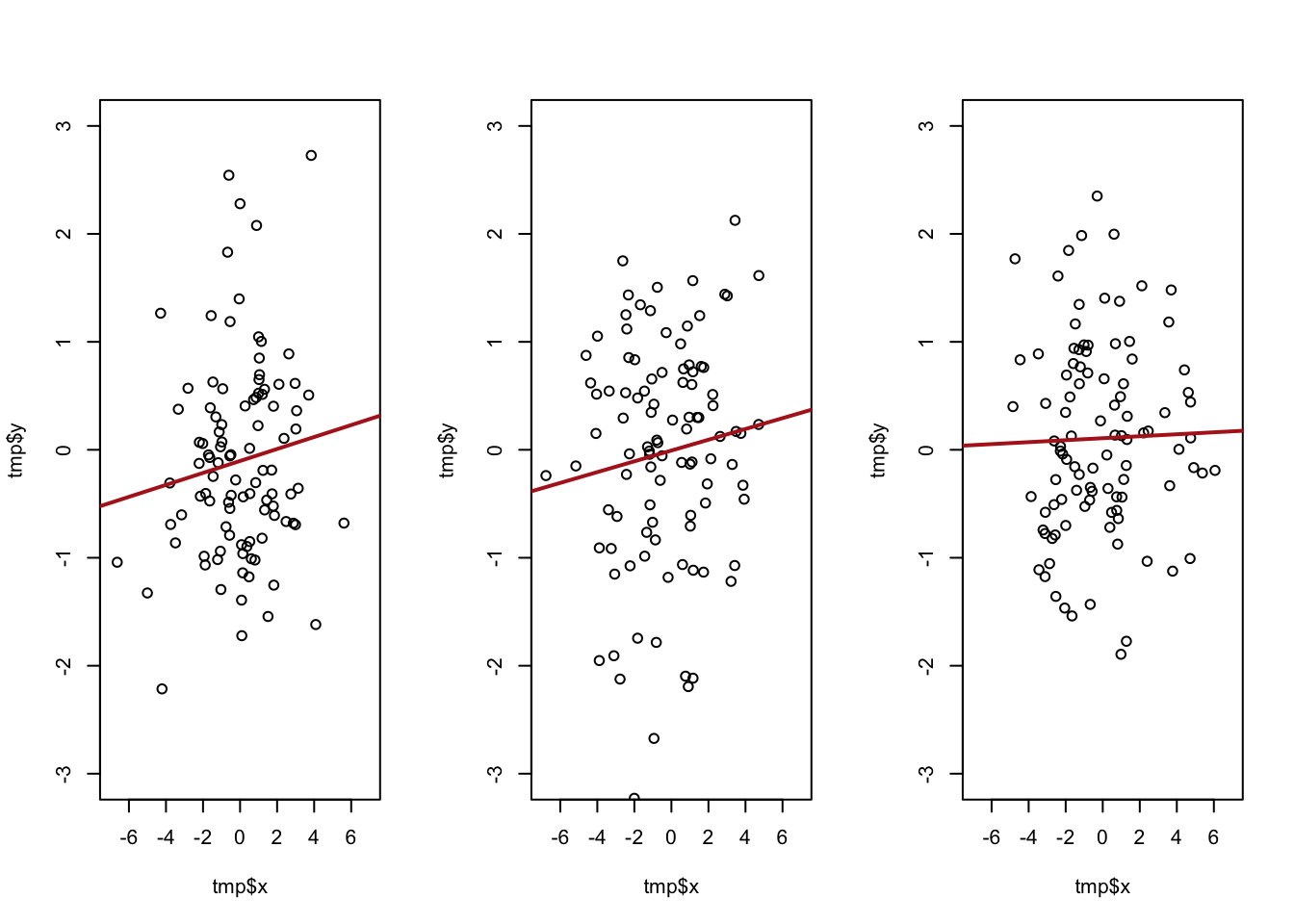
What happens when we repeatedly re-sample from this distribution, capturing the beta coefficient each time? Let’s do 6 times:
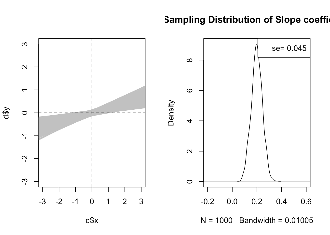
We get a pretty wide variety of outcomes. Now let’s look at doing this 1000 times. I’m going to record the beta each time, and stack on top of each other all of the regression lines.
The graph that has all of the slopes on it is kind of a “double fan” pattern. All the lines seem to converge at 0,0. Note that both of these variables have, in the population, an expected value of 0.
It is actually true that every single regression line passes through the mean of the x variable and the mean of the y variable. This is very simple to show mathematically.
The regression line is:
\[
\hat{y} = \hat{\alpha} + \hat{\beta}x_i
\]
And we want to know the value of \(\hat{y}\) for when \(x_i = \bar{x}\). Subbing in the equation we generated for \(\hat{\alpha}\):
So when x is equal to its mean, \(\hat{y}\) is equal to \(\bar{y}\). The inverse must be true because we are talking about a point on a line.
So every regression line passes through the sample means of the two variables. Looking at the graph to the left then, this makes it clear we will be more certain about the location of the regression line when we are close to the mean of x and y. This will have big ramifications when we start thinking about our ability to use regression for prediction!
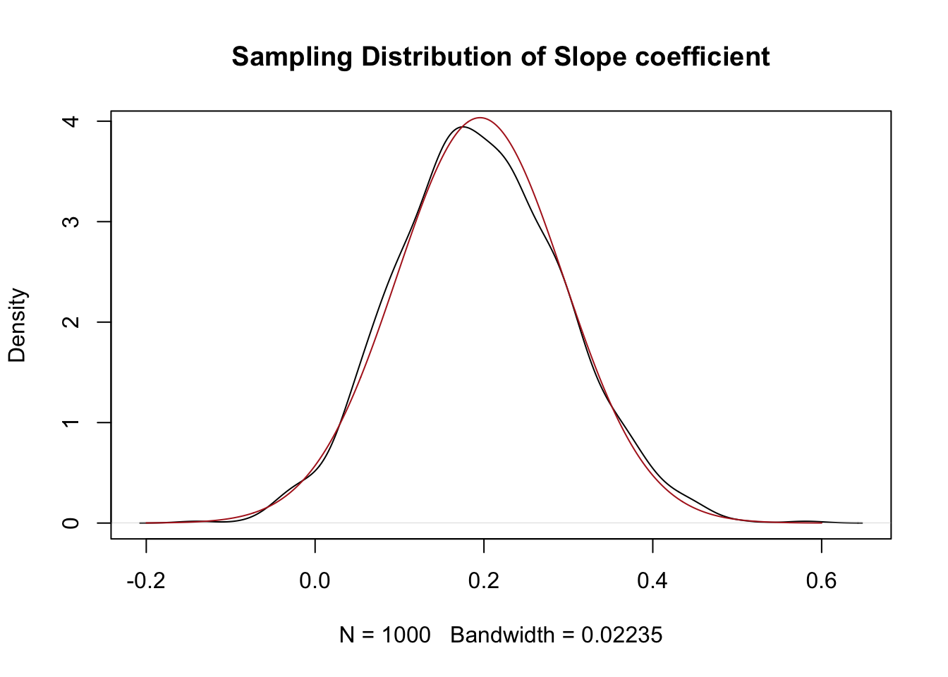
Our main interest right now is the sampling distribution to the right. This appears to be a normal distribution centered around the true population slope coefficient.
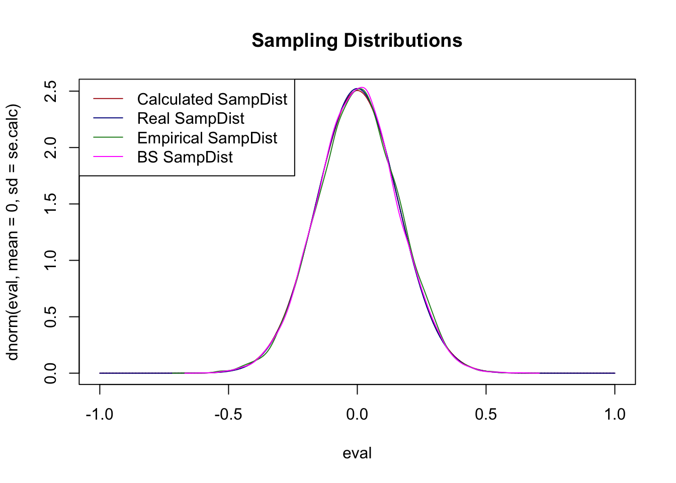
To prove to ourselves that this is a normal distribution:
eval <-seq(-.2, .6, .001)plot(density(betas), main="Sampling Distribution of Slope coefficient")points(eval, dnorm(eval, mean=mean(betas), sd=sd(betas)), type="l", col="firebrick")
Yeah looks about right!
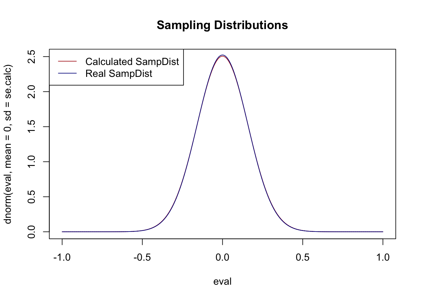
When we derived the standard error of the mean we learned that two components influenced the size of the standard error and thus the width of the sampling distribution: sample size and the randomness of the underlying variables. Is the same thing true here?
Yes for sure! We can see this in both graphs. The regression lines are much tighter around the “true” slope, and the sampling distribution is much smaller.
What about the randomness of the underlying variables? Again, we’ve seen before that if our underlying variables are more random it’s harder to make inferences about our samples. Does that matter here?
Which version of the above will lead to a lower variance in the slope of the regression line? It’s going to be the top. When x has less variation, small, random, changes in y are going to have large ramifications about where the regression line is. The best way to think about it is that more variation in x leads to more leverage in determining where the regression line is.
For the big reveal, here is the equation that generates the standard error of a regression coefficient:
The standard error is determined by the average squared residual, divided by the variance of x.
#Refit on the original single sample d so m and d refer to the same datam <-lm(d$y ~ d$x)summary(m)
Call:
lm(formula = d$y ~ d$x)

Residuals:
    Min      1Q  Median      3Q     Max
-2.2904 -0.7694  0.1109  0.6806  2.5906

Coefficients:
            Estimate Std. Error t value Pr(>|t|)
(Intercept)  0.03485    0.10287   0.339    0.736
d$x          0.08855    0.10909   0.812    0.419

Residual standard error: 1.026 on 98 degrees of freedom
Multiple R-squared:  0.006678,  Adjusted R-squared:  -0.003458
F-statistic: 0.6588 on 1 and 98 DF,  p-value: 0.4189
sqrt(mean(m$residuals^2)/sum((d$x-mean(d$x))^2))
[1] 0.1079938
So what makes for a smaller standard error? As we’ve seen, more variance in x will lead to a smaller standard error, all else equal.
What else? Because of the \(n\) in the average formula, all things being equal more \(n\) will make the standard error smaller, but that’s only true if the \(n\) you add have relatively small residuals. In total the numerator of the equation tells us that more and smaller residuals will lead to a low standard error. What leads to smaller residuals? Less variation in \(y\) around the regression line. In other words if the points show a consistent relationship then there is going to be a smaller standard error, which makes a lot of sense!
I want to re-emphasize that once you have an estimate and a standard error literally everything that we’ve done so far is exactly the same.
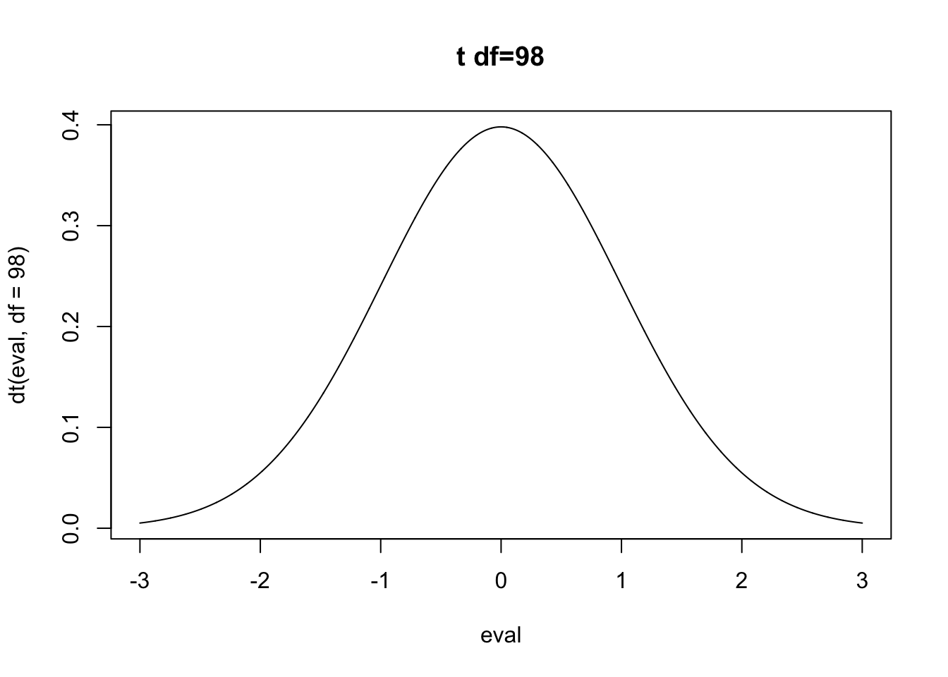
For the regression \(m\) the standard error is about .109, which is the standard deviation of a t distributed sampling distribution with 98 degrees of freedom. Where does 98 come from? The degrees of freedom for a regression is \(n\) minus the number of coefficients you are estimating, including the intercept, which here is 2. So the t distribution looks like:
Same thing would go for a power calculation, or the confidence interval. Once you have the standard error, you are cooking with gas.
11.6 Up Next
This chapter has taught you the basics of bi-variate (two variable) regression. You should now have a good sense of where the \(\alpha\) and \(\beta\) in a regression come from, how to interpret them, and how the hypothesis tests for them work. One of the key features of OLS regression we discussed at the top was that OLS can help us consider multiple variables at the same time. In the next chapter we will learn how to extend our understanding of OLS such that we can add an unlimited number of independent variables.