This chapter picks up two extensions of the inferential logic from the last chapter. First, statistical power — the flip-side of \(\alpha\) that lets us reason about false negatives, understand what a given sample size can and cannot detect, and diagnose when a study “found nothing.” Second, the bootstrap — a computational trick that produces a sampling distribution for essentially any statistic we compute in a sample, even ones for which no analytical standard-error formula exists.
9.1 Power
Let’s think again about the possible outcomes of a hypothesis test.
We could fail to reject the null hypothesis when we shouldn’t (a false negative, \(\beta\)).
We could fail to reject the null hypothesis when we should (a true negative).
We could reject the null when we shouldn’t (a false positive, \(\alpha\)).
We could reject the null when we should (a true positive).
The thing we have control over here is \(\alpha\). It is the one value we set by hand. By convention we set this at 5%, which is…. pretty high! In my other job I work on the NBC news decision desk where our job is to explicitly reject the null hypothesis that the race is tied for the alternative hypothesis that a candidate has won. In 2024 we called around 600 races. If our standard was a 5% false positive rate we would get \(600*.05=30\) races wrong! We would absolutely lose our jobs. We say that we have an \(\alpha=.005\), but that would still be \(600*.005=3\) wrong calls. That would actually still be unacceptable.
\(\beta\), the probability of a false negative, is a bit more of a mystery right now, but we can derive it completely with the tools and the intuitions that we have built.
Last time we ran a simulation to show that if we assume the true level of support for Kelly in Arizona is 52.4%, and have a sample of approximately 2600 people, we get a false negative (\(\beta\)) of 32%:
set.seed(19104)false.negative <-rep(NA,10000)n <-2613alpha <- .05for(i in1:10000){samp <-rbinom(n,1, .524)s <-sd(samp)xbar <-mean(samp)se <- s/sqrt(n)t.val <- (xbar-.5)/se#Two-tailed p-value via the absolute t so this works whether xbar happens#to land above or below .5 (see the abs() explanation in the HypothesisTests#chapter's CI/hypothesis equivalence loop).p <-2*pt(abs(t.val), df=n-1, lower.tail=F)false.negative[i] <- p>=alpha}mean(false.negative)
[1] 0.3215
Where does that number come from? Can we visualize this given what we know about sampling distributions?
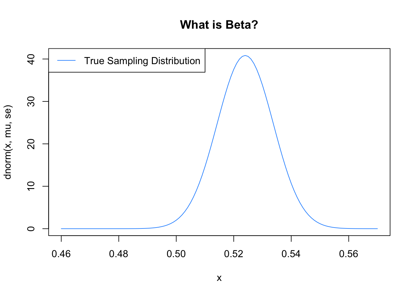
We are positing in the above simulation that the true level of support for Kelly is 52.4%. Given that, here is what the sampling distribution for sample means will look like:
Now, when we get samples in the real world we won’t know that this is the true sampling distribution, and we will perform a null hypothesis test. In most cases for election data like this we will perform the test to determine if the true population mean is 50%, or not.
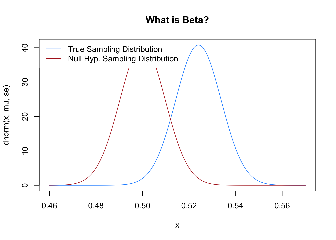
To perform this hypothesis test, we place the sampling distribution on our null hypothesis, 50%:
no <- .5plot(x, dnorm(x, mu, se), type="l", col="dodgerblue", main="What is Beta?")points(x, dnorm(x, no, se), type="l", col="firebrick")legend("topleft", c("True Sampling Distribution", "Null Hyp. Sampling Distribution"), lty=c(1,1), col=c("dodgerblue", "firebrick"))
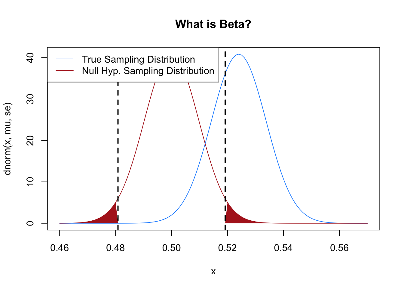
In performing this hypothesis test, one of our steps would be to set up the \(\alpha\) region: the area in the tails of the null hypothesis distribution that contain 5% of the probability mass in total. This is the region where, if a mean falls, we will reject the null hypothesis.
plot(x, dnorm(x, mu, se), type="l", col="dodgerblue", main="What is Beta?")points(x, dnorm(x, no, se), type="l", col="firebrick")normal.shader(.46, .56, no, se, qnorm(alpha/2, no, se, lower.tail=T ), greater=F, col="firebrick")normal.shader(.46, .56, no, se, qnorm(alpha/2, no, se, lower.tail=F ), greater=T, col="firebrick")legend("topleft", c("True Sampling Distribution", "Null Hyp. Sampling Distribution"), lty=c(1,1), col=c("dodgerblue", "firebrick"))
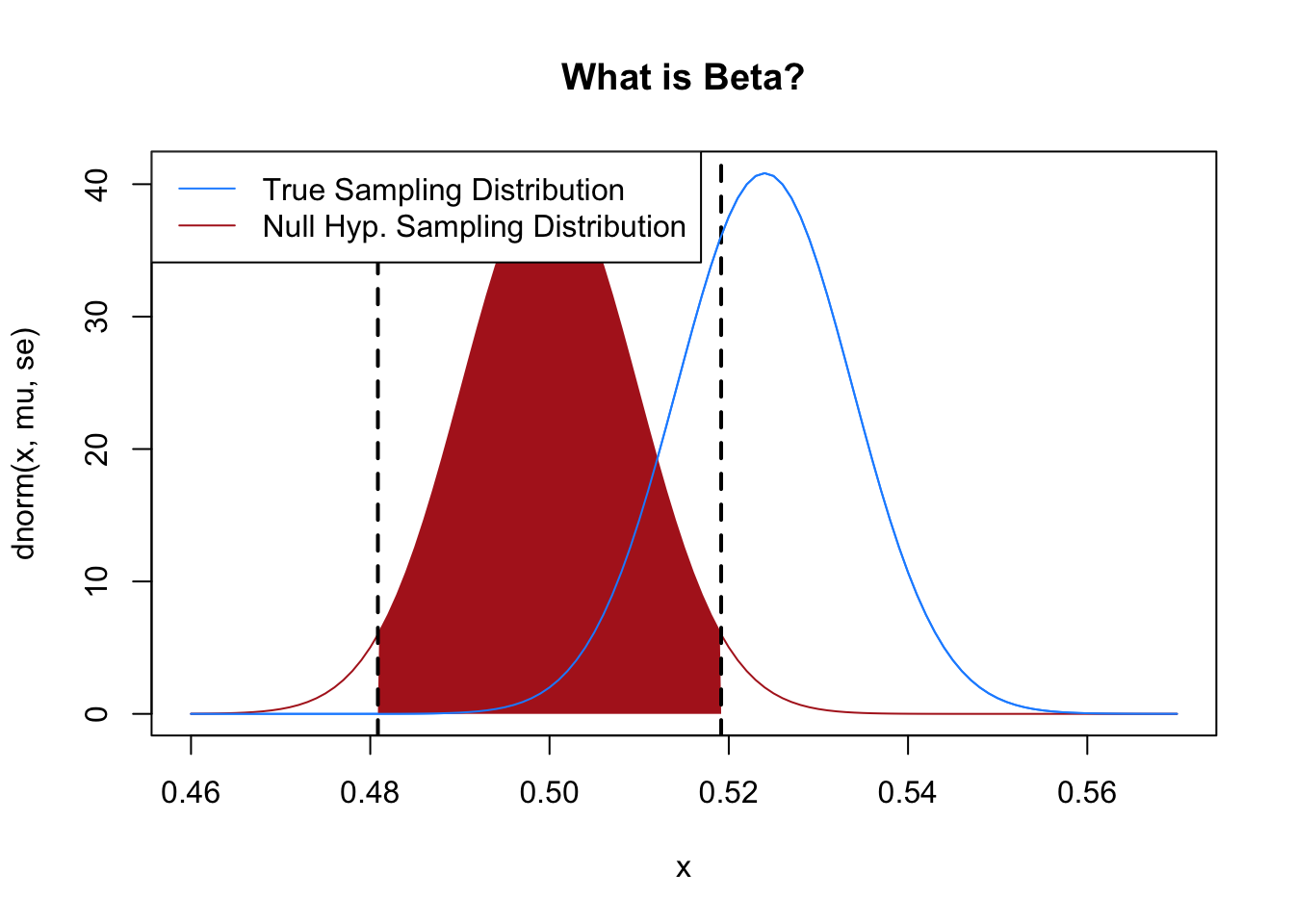
If that’s true, then this is the region where if a mean falls we will fail to reject the null hypothesis:
plot(x, dnorm(x, mu, se), type="l", col="dodgerblue", main="What is Beta?")points(x, dnorm(x, no, se), type="l", col="firebrick")normal.shader(.46, .56, no, se, qnorm(alpha/2, no, se, lower.tail=T ),qnorm(alpha/2, no, se, lower.tail=F ), between=T, col="firebrick")points(x, dnorm(x, mu, se), type="l", col="dodgerblue")legend("topleft", c("True Sampling Distribution", "Null Hyp. Sampling Distribution"), lty=c(1,1), col=c("dodgerblue", "firebrick"))
So: the blue distribution is what is actually producing poll results (here the proportion of people who support Kelly, with the truth being 52.4% do), while the red region is the range where, if a mean is produced there, we will fail to reject the null hypothesis that the race is tied.
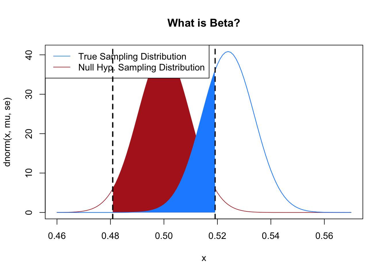
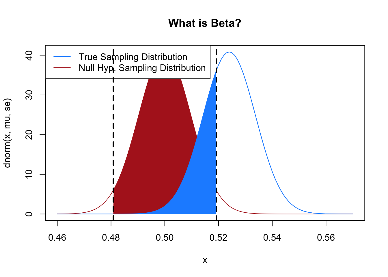
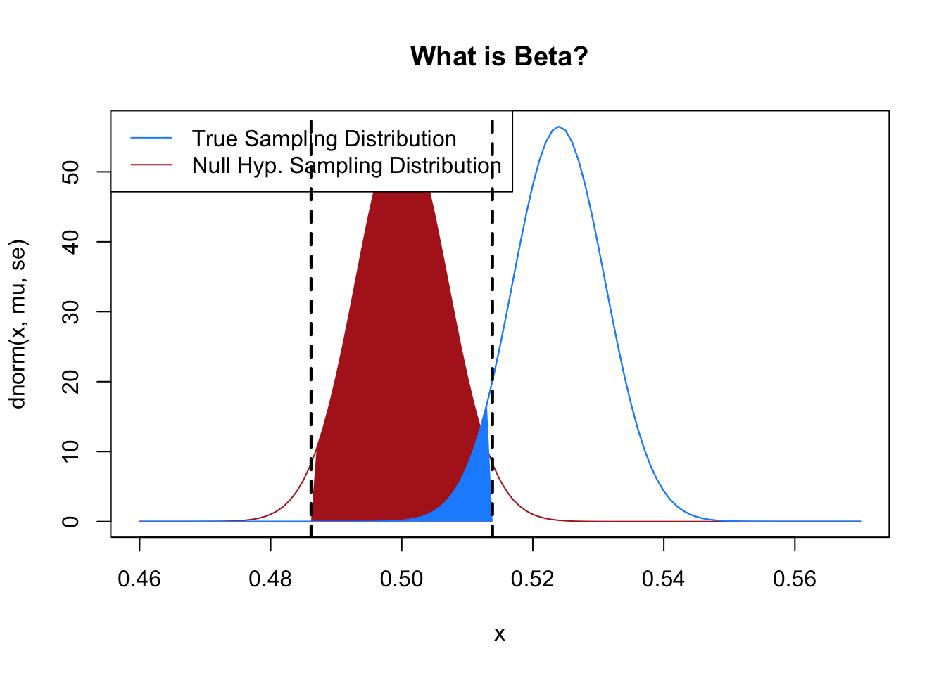
Here is what we are going to ask to determine \(\beta\): what is the area under the blue curve that corresponds to the shaded red area?
plot(x, dnorm(x, mu, se), type="l", col="dodgerblue", main="What is Beta?")points(x, dnorm(x, no, se), type="l", col="firebrick")normal.shader(.46, .56, no, se, qnorm(alpha/2, no, se, lower.tail=T ),qnorm(alpha/2, no, se, lower.tail=F ), between=T, col="firebrick")points(x, dnorm(x, mu, se), type="l", col="dodgerblue")legend("topleft", c("True Sampling Distribution", "Null Hyp. Sampling Distribution"), lty=c(1,1), col=c("dodgerblue", "firebrick"))normal.shader(.46, .56, mu, se, qnorm(alpha/2, no, se, lower.tail=T ),qnorm(alpha/2, no, se, lower.tail=F ), between=T, col="dodgerblue")
What is this region? This blue region are the means that will get produced by the true sampling distribution that we will fail to reject the null hypothesis for. In other words, these are the false negatives! Again: these are the means that will be produced by the truth where we will not get a statistically significant results, even though the truth is that the Democrat is winning over 52% of the vote.
What proportion of the blue curve is made up of the blue shaded region?
plot(x, dnorm(x, mu, se), type="l", col="dodgerblue", main="What is Beta?")points(x, dnorm(x, no, se), type="l", col="firebrick")normal.shader(.46, .56, no, se, qnorm(alpha/2, no, se, lower.tail=T ),qnorm(alpha/2, no, se, lower.tail=F ), between=T, col="firebrick")points(x, dnorm(x, mu, se), type="l", col="dodgerblue")legend("topleft", c("True Sampling Distribution", "Null Hyp. Sampling Distribution"), lty=c(1,1), col=c("dodgerblue", "firebrick"))normal.shader(.46, .56, mu, se, qnorm(alpha/2, no, se, lower.tail=T ),qnorm(alpha/2, no, se, lower.tail=F ), between=T, col="dodgerblue")
#Use the null distribution to determine the rejection boundslower.bound <-qnorm(alpha/2, no, se, lower.tail=T )upper.bound <-qnorm(alpha/2, no, se, lower.tail=F )#Now use the *true* sampling distribution to determine the probabilitypnorm(upper.bound, mu, se) -pnorm(lower.bound, mu, se)
[1] 0.309763
About 31%! Same as what we found through simulation! (Well, close, there is some rounding happening).
Put another way: 31% of the means that are produced by the true sampling distribution will lead us to fail to reject the null hypothesis. Our false-negative rate (\(\beta\)) is 31%.
Now that’s probably too high of a number for us to be comfortable. While we do prefer false negatives to false positives (it’s really bad to say something is there when it’s not), we want to be able to confirm that a race is not tied way more than 69% of the time. When we have a beta this high we describe our data as “under-powered”.
So, what can we do to reduce the false negativity rate?
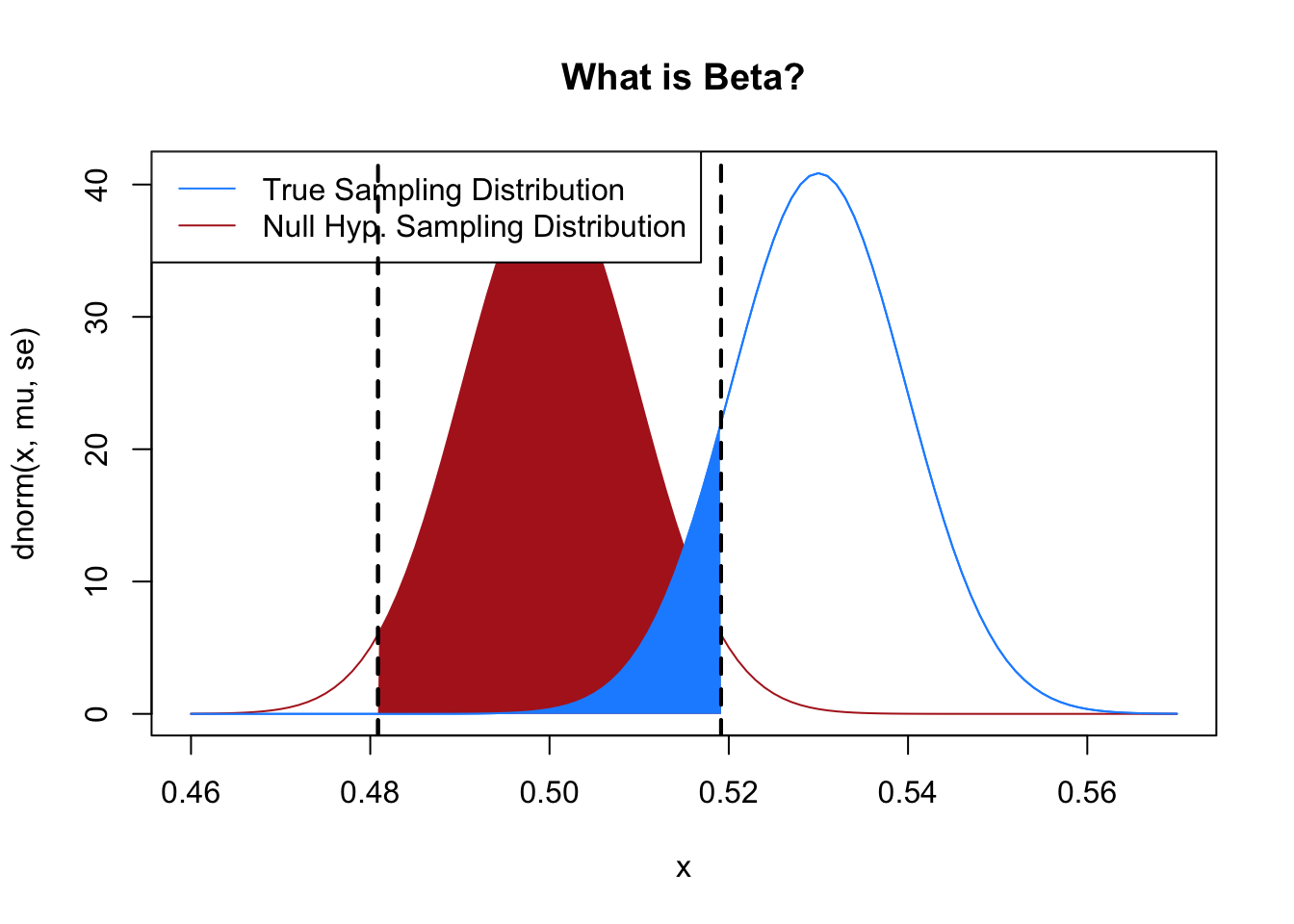
Looking at our charts, the first (and stupidest) thing we can do is to have the truth be further away from the null hypothesis:
n <-2613mu <- .53se <-sqrt((mu*(1-mu))/n)no <- .5alpha <- .05plot(x, dnorm(x, mu, se), type="l", col="dodgerblue", main="What is Beta?")points(x, dnorm(x, no, se), type="l", col="firebrick")normal.shader(.46, .56, no, se, qnorm(alpha/2, no, se, lower.tail=T ),qnorm(alpha/2, no, se, lower.tail=F ), between=T, col="firebrick")points(x, dnorm(x, mu, se), type="l", col="dodgerblue")legend("topleft", c("True Sampling Distribution", "Null Hyp. Sampling Distribution"), lty=c(1,1), col=c("dodgerblue", "firebrick"))normal.shader(.46, .56, mu, se, qnorm(alpha/2, no, se, lower.tail=T ),qnorm(alpha/2, no, se, lower.tail=F ), between=T, col="dodgerblue")
#Use the null distribution to determine the rejection boundslower.bound <-qnorm(alpha/2, no, se, lower.tail=T )upper.bound <-qnorm(alpha/2, no, se, lower.tail=F )#Now use the *true* sampling distribution to determine the probabilitypnorm(upper.bound, mu, se) -pnorm(lower.bound, mu, se)
[1] 0.1329351
The two distributions are the same shape as above, but now the “truth” is that Kelly is going to win 53% of the vote. Because this is simply further away from the null then we are much less likely to get a false negative (the blue region is much smaller). Taken to the extreme: if everyone was going to vote for Kelly there obviously would be no chance of getting a false negative! This is “stupid” because we can’t control what the truth is!
Given that the truth is fixed, we can also think about changing other parameters to lower our false negative rate.
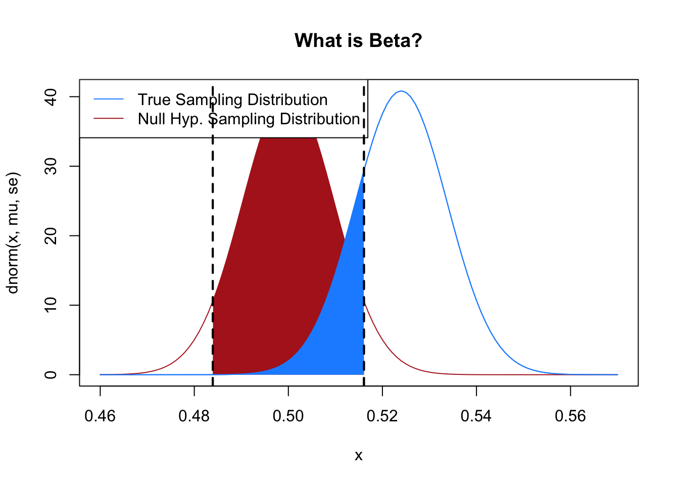
The first thing that we can do is to raise \(\alpha\) the false positivity rate. If we are ok with getting more false positives, we will have less false negatives:
n <-2613mu <- .524se <-sqrt((mu*(1-mu))/n)no <- .5alpha <- .1plot(x, dnorm(x, mu, se), type="l", col="dodgerblue", main="What is Beta?")points(x, dnorm(x, no, se), type="l", col="firebrick")normal.shader(.46, .56, no, se, qnorm(alpha/2, no, se, lower.tail=T ),qnorm(alpha/2, no, se, lower.tail=F ), between=T, col="firebrick")points(x, dnorm(x, mu, se), type="l", col="dodgerblue")legend("topleft", c("True Sampling Distribution", "Null Hyp. Sampling Distribution"), lty=c(1,1), col=c("dodgerblue", "firebrick"))normal.shader(.46, .56, mu, se, qnorm(alpha/2, no, se, lower.tail=T ),qnorm(alpha/2, no, se, lower.tail=F ), between=T, col="dodgerblue")
#Use the null distribution to determine the rejection boundslower.bound <-qnorm(alpha/2, no, se, lower.tail=T )upper.bound <-qnorm(alpha/2, no, se, lower.tail=F )#Now use the *true* sampling distribution to determine the probabilitypnorm(upper.bound, mu, se) -pnorm(lower.bound, mu, se)
[1] 0.2084848
The area between the two lines is now somewhat smaller, and as such the probability that a mean from the red area is produced in that zone is smaller. We see that this drops the false negative rate to 20%. (Generally speaking we don’t want to make this trade-off! False positives are way worse than false negatives. We would much rather say a drug doesn’t work when it does, than say a drug does work when it doesn’t.)
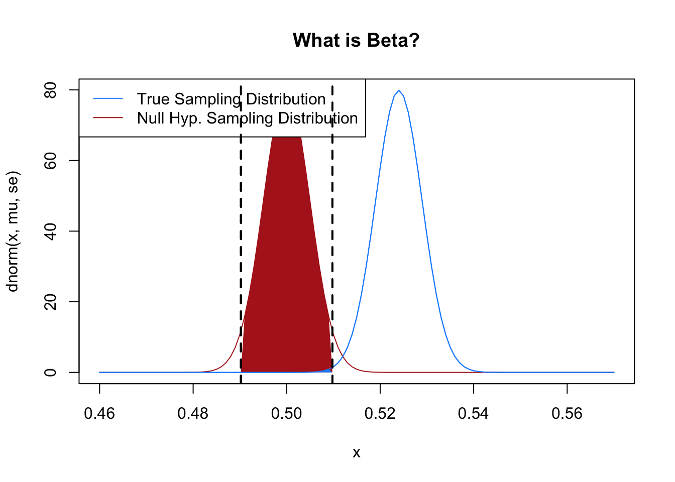
The other thing that we can do is to reduce the width of the sampling distributions. Then, for a given level of alpha and a given difference between the truth and the null hypothesis there will be less overlap between the two distributions.
The easiest way to do this is to increase the sample size. Let’s increase the sample size to 5000 people:
n <-5000mu <- .524se <-sqrt((mu*(1-mu))/n)no <- .5alpha <- .05plot(x, dnorm(x, mu, se), type="l", col="dodgerblue", main="What is Beta?")points(x, dnorm(x, no, se), type="l", col="firebrick")normal.shader(.46, .56, no, se, qnorm(alpha/2, no, se, lower.tail=T ),qnorm(alpha/2, no, se, lower.tail=F ), between=T, col="firebrick")points(x, dnorm(x, mu, se), type="l", col="dodgerblue")legend("topleft", c("True Sampling Distribution", "Null Hyp. Sampling Distribution"), lty=c(1,1), col=c("dodgerblue", "firebrick"))normal.shader(.46, .56, mu, se, qnorm(alpha/2, no, se, lower.tail=T ),qnorm(alpha/2, no, se, lower.tail=F ), between=T, col="dodgerblue")
#Use the null distribution to determine the rejection boundslower.bound <-qnorm(alpha/2, no, se, lower.tail=T )upper.bound <-qnorm(alpha/2, no, se, lower.tail=F )#Now use the *true* sampling distribution to determine the probabilitypnorm(upper.bound, mu, se) -pnorm(lower.bound, mu, se)
[1] 0.07520771
Or to 10000 people:
n <-10000mu <- .524se <-sqrt((mu*(1-mu))/n)no <- .5alpha <- .05plot(x, dnorm(x, mu, se), type="l", col="dodgerblue", main="What is Beta?")points(x, dnorm(x, no, se), type="l", col="firebrick")normal.shader(.46, .56, no, se, qnorm(alpha/2, no, se, lower.tail=T ),qnorm(alpha/2, no, se, lower.tail=F ), between=T, col="firebrick")points(x, dnorm(x, mu, se), type="l", col="dodgerblue")legend("topleft", c("True Sampling Distribution", "Null Hyp. Sampling Distribution"), lty=c(1,1), col=c("dodgerblue", "firebrick"))normal.shader(.46, .56, mu, se, qnorm(alpha/2, no, se, lower.tail=T ),qnorm(alpha/2, no, se, lower.tail=F ), between=T, col="dodgerblue")
#Use the null distribution to determine the rejection boundslower.bound <-qnorm(alpha/2, no, se, lower.tail=T )upper.bound <-qnorm(alpha/2, no, se, lower.tail=F )#Now use the *true* sampling distribution to determine the probabilitypnorm(upper.bound, mu, se) -pnorm(lower.bound, mu, se)
[1] 0.002216565
The false negativity rate drops off substantially.
Given that the width of the sampling distribution is given by \(s/\sqrt{n}\) clearly we can either increase \(n\) or decrease \(s\) to make the sampling distribution smaller. In the case where we are sampling a bernoulli it’s very difficult to make \(s\) smaller, but it might be in other cases. For example a common survey question we ask is “Feeling Thermometers” where we ask people to rate how warmly they feel about a politician/group where 0 is cold and 100 is warm. As it turns out people are really bad at answering these questions and they have a lot of random variation. All things being equal, that high variance question is going to lead to a higher \(\beta\).
When we are performing research we often don’t think in terms of \(\beta\), but instead consider \(1-\beta\), which we call “statistical power”. If \(\beta\) is the probability of failing to reject the null hypothesis when we should, then power is the probability of rejecting the null hypothesis when we should. Put in other words, it’s our ability to say that something is there when something is in fact there.
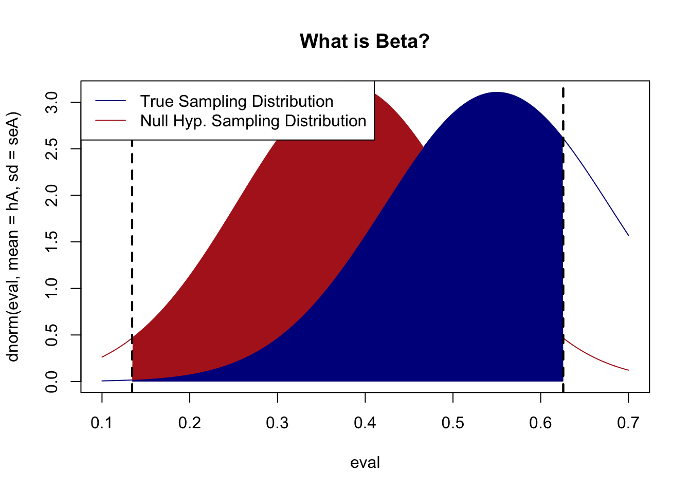
Here’s an absurd example: Biden’s highest approval rating was 55%. Let’s say a survey firm completes a random survey of 15 people, generates an approval rating for Biden, but claims that they can’t conclude whether or not Biden is more popular than Trump was when he left office with an approval of 38%.
Let’s use the technique above to map out the true and null hypotheses for this firms test:
#Inputn <-15hA <- .55hO <- .38alpha <- .05#SE of alternativesd <-sqrt(hA*(1-hA))seA <- sd/sqrt(n)#SE of Nullsd <-sqrt(hO*(1-hO))seO <- sd/sqrt(n)#Calculate rejection zone for alphaz.score <-qnorm(alpha/2)*-1bounds <-c(hO+z.score*seO, hO-z.score*seO)eval <-seq(.1,.7,.0001)plot(eval, dnorm(eval, mean=hA, sd=seA), type="l", col="darkblue", main="What is Beta?")legend("topleft","True Sampling Distribution", lty=1, col="darkblue")points(eval, dnorm(eval, mean=hO, sd=seO), type="l", col="firebrick")normal.shader(.1,.7, hO, seO, bounds[2], bounds[1], between=T, col="firebrick")normal.shader(.1,.7, hA, seA, bounds[2], bounds[1], between=T, col="darkblue")legend("topleft",c("True Sampling Distribution","Null Hyp. Sampling Distribution") , lty=c(1,1), col=c("darkblue", "firebrick"))
With 15 people we have an enormously wide zone where we will fail to reject the null hypothesis. A wide band that is necessary to ensure our 5% false positive rate. We need extraordinary evidence to claim that a sample mean is different from 38% when we only have 15 people. Accordingly, we get a huge number of false negatives! Indeed, it’s more likely than not we will get a false negative.
Next week when we get to difference in means tests we will similarly be able to calculate the minimum detectable effect size given the \(n\) of an experiment, for example. An extraordinarily common critique of experiments is that authors failed to run a power analysis and, given the effect size that is plausible and their \(n\), they simply lacked the statistical power to find anything!
Similarly common in experiments is what we saw above: authors may say: we ran an experiment and found nothing, so we conclude that nothing is there. But a lot of times power analysis will reveal that a 20 or 30% false negativity rate is expected. You can’t claim that nothing is happening when you get a result of “nothing” 30% of the time!
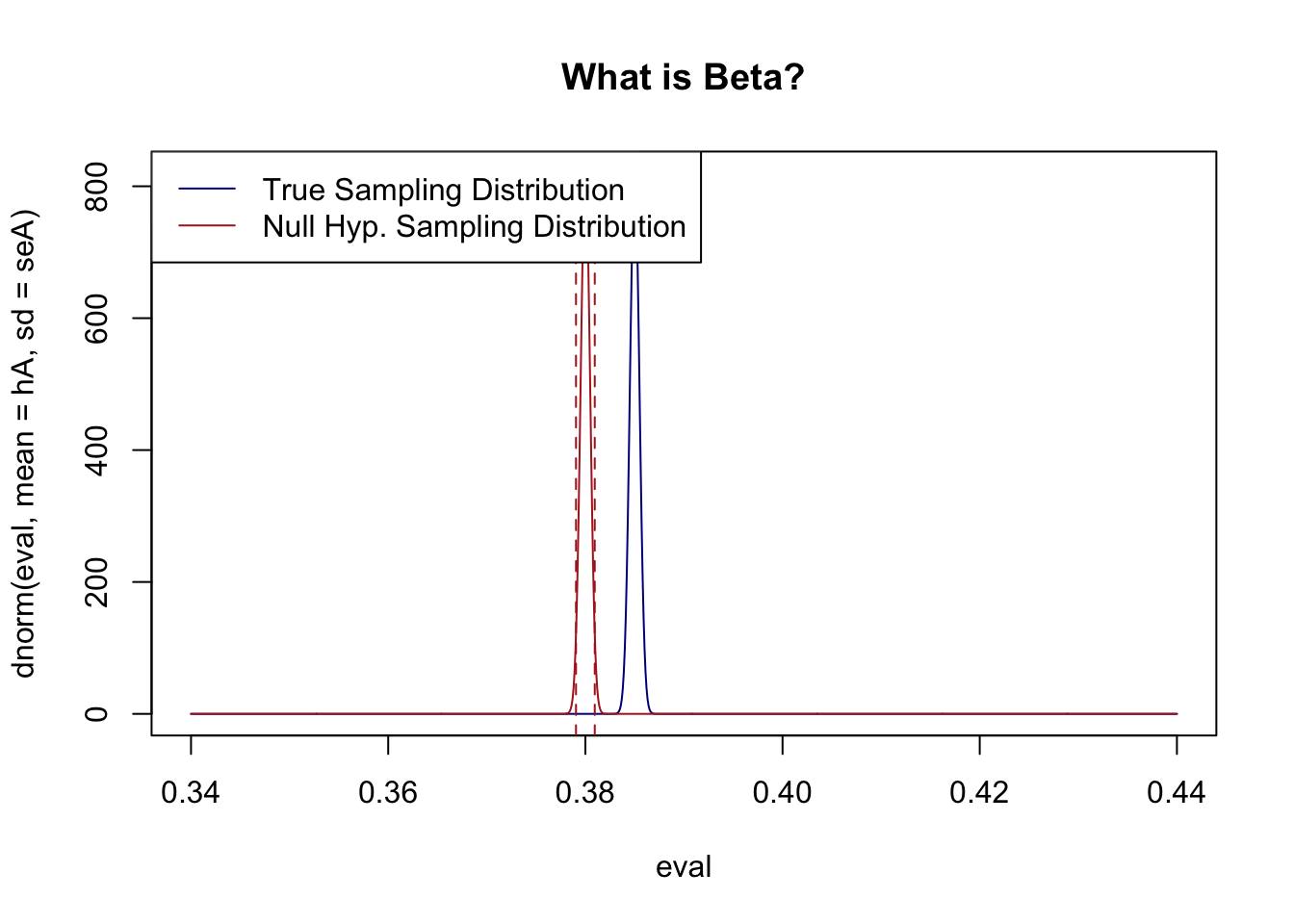
Can you have too much power? Not really, but the results of too much power can be somewhat misleading. Let’s say the true proportion of people who support Joe Biden is 38.5%, and a firm runs a poll with 1 million people in it. They get a result and conclude that Joe Biden’s support is significantly different than Donald Trump’s low point of 38%. What would that look like:
It’s extraordinarily unlikely to get a false negative when you have an \(n\) that big, and as such very small differences from the null can be said to be “statistically significant”. But here is where we get into the art rather than the science of statistics, just because something is statistically significant doesn’t mean that it is substantively significant. I don’t think that anyone would claim that an approval rating of 38.5% is substantively different than an approval rating of 38%. You can get a very large sample and conclude that something is statistically significant, but that says nothing about the relative magnitude or importance of that effect.
My other favorite example of this is meat cancer. And by favorite I mean a disaster of science communication. Whole industries were launched, careers made, and documentaries written by the fact that the WHO labeled red meat a “Group 1 Carcinogen”, the same group that “arsenic, asbestos, and tobacco belong to”.
What was happening here? Is red meat as damaging to you as smoking? No! Not even close.
What happened was that there was a large accumulation of studies that, in total, showed that red meat had a small effect on the rates of colon cancer. The WHO’s “Group 1” is not a measure of how severe a carcinogen is, but is a measure of statistical significance. Enough studies had been done that there was sufficient evidence to overturn the null hypothesis that meat did not affect the rate of cancer.
Because people generally don’t think like this, people assumed what the WHO meant was that bacon was just as harmful as smoking.
The meat cancer scare was helped along by some truly weird choices by the epidemiologists about how to communicate the risk. All the headlines stated that “Eating 50g of processed meat a day increases the risk of colon cancer by 18%” A reasonable person would think that, if the baseline rate of colon cancer is 3%, then eating 50g of processed meat a day would lead to a rate of colon cancer of 3+18=21%. But that’s not at all what they were saying, they were saying that if the baseline rate of colon cancer was 3%, then eating 50g of processed meat a day would lead to a rate of colon cancer of 3*1.18=3.54%. The 18% was a “relative risk” calculation, not a change in percentage points. That’s a lot less dramatic!
Let’s compare that to another “Group 1” carcinogen. A lifelong non-smoker has roughly a 0.5% chance of developing lung cancer, or about 1 in 200. A lifelong smoker has roughly a 15% chance, or about 1 in 7. That is about 30 times the risk, a relative increase of nearly 3000%. Compare that to the “18%” relative increase in colon cancer from eating 50g of processed meat a day. Smoking isn’t 18% worse than not smoking, it’s 3000% worse.
So if anyone tells you that eating meat is as dangerous as smoking, you now know they are a clown.
That being said we should probably all cut back on our red and processed meat consumption :).
If everyone misinterprets what you said as a scientist, it’s not their fault, it’s your fault.
9.2 The Bootstrap
So far we have learned how the central limit theorem gives us an analytic strategy for generating a sampling distribution for a mean. That is, we have been provided a formula: \(s/\sqrt{n}\) and knowledge that the sampling distribution is normal/\(t\) distributed which has allowed us to do hypothesis testing, make confidence intervals, and calculate statistical power.
When we get to difference of means and regression we will see there are other formulas for calculating standard errors for other quantities we care about, and similar guarantees about the normality of sampling distributions. However, before we get there we are going to introduce one additional, completely parallel, way to derive the standard error: the bootstrap.
9.2.1 What’s the standard error of a correlation?
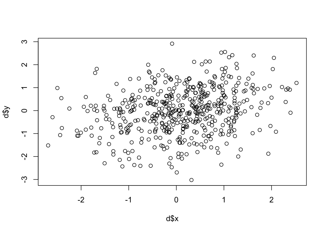
Correlation, which we develop fully in the next chapter, is a statistic that measures how strongly two variables move together. R computes it with cor(x, y) and it returns a single number between -1 and 1. We use correlation here as our motivating example because it’s a statistic with no known analytic formula for the standard error — and that’s exactly the situation the bootstrap is built for.
A correlation always ranges between -1 (perfect negative correlation) through 0 (no relationship) to 1 (perfect correlation).
One thing to note about the correlation function (I’ll bring this up a couple of times so you remember) is that it won’t give you anything back if there are missing values in either of the vectors:
z <- d$xz[5] <-NAcor(z, d$y)
[1] NA
Our general answer to how to deal with these things is to use na.rm=T, but that’s not what we do with a correlation. Because there are a few different ways that NA could be dealt with for a correlation, here we need to specify the method by which we want R to deal with NAs. The safe thing to use is:
cor(z, d$y, use="pairwise.complete")
[1] 0.2596632
That’s really great, but given what we have learned so far in this class about samples and population, what else would we like to know about this correlation coefficient?
Well we know that this sample of data is only one of an infinite number of samples we could get. We know that there is one “true” correlation between these two variables in the population, and we would like to make an inference about what that might be.
As with everything: we want to perform a hypothesis test, so we want a sampling distribution.
So let’s dig into the correlation function to find a standard error:
names(correlation)
NULL
Uh-oh! It doesn’t give us one!
And if we go to the textbook there is no mention of a standard error or sampling distribution for a correlation coefficient either…
Well then what are we going to do??
We are going to use a method that can give you a sampling distribution for anything you calculate, the bootstrap.
Why is it called the bootstrap? The phrase “picking yourself up by your bootstraps” originally referred to doing something impossible. You can’t actually do it. Similarly, the bootstrap statistical method allows you to generate a sampling distribution for anything based off of a single sample, even in cases where there is no known equation for the standard error. This seems impossible!
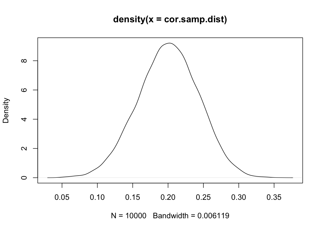
Before we get to the method (which is actually extremely easy), let’s generate the true sampling distribution for this correlation coefficient. In this case we can do so because we generated these data. So let’s repeatedly re-generate these data and calculate the correlation a large number of times so that we can determine the true sampling distribution:
The sampling distribution is approximately normally distributed and has a standard deviation of .04. The standard deviation of the sampling distribution is the standard error, and this one is .04. Even if there is no way to calculate a standard error it always exists for everything we can calculate in our dataset.
But pretend that we are not god and all we have is our original dataset, d. How can we recreate the actual sampling distribution using information wholly contained within our one sample (and no equation like we have for a sample mean)?
Here is the key insight to the bootstrap: because our sample of data is assumed to be an iid sample of the population, a random sample of our sample is a new sample.
To put it in more reasonable terms: we have seen already that any given sample is a shadow, or is suggested by, the population. That’s true for the distribution of one variable, but is also true for the relationships between variables (or anything else). The range of possibilities of the population is already in our data, so what we want to do is to generate new samples to explore the range of possibilities that might occur if we truly re-sampled a large number of times.
The way that we are going to actually do this is to repeatedly generate new datasets of the same length as our original by sampling with replacement from our original dataset. Here is one such new sample:
#Original Correlationcor(d$x, d$y)
[1] 0.2569832
#subset d by a random sample of row numbers the same length as our original datset, with replacementbs.samp <- d[sample(1:nrow(d), replace=T),]#Bootstrap correlationcor(bs.samp$x, bs.samp$y)
[1] 0.2310803
#Not the same!
Why is it important that we sample with replacement. Well if we sample without replacement we will just select the rows of the old dataset one at a time until we have selected all of them. In the end we will be left with an exact re-creation of our old dataset in a new order:
Having repeated entries is key to creating variance that generates different samples every time you generate a new bootstrap sample.
That is one new sample. Much like we do when we know the population and repeatedly sample to generate a sampling distribution, now we are going to sample many bootstrap samples, and in each one calculate our correlation:
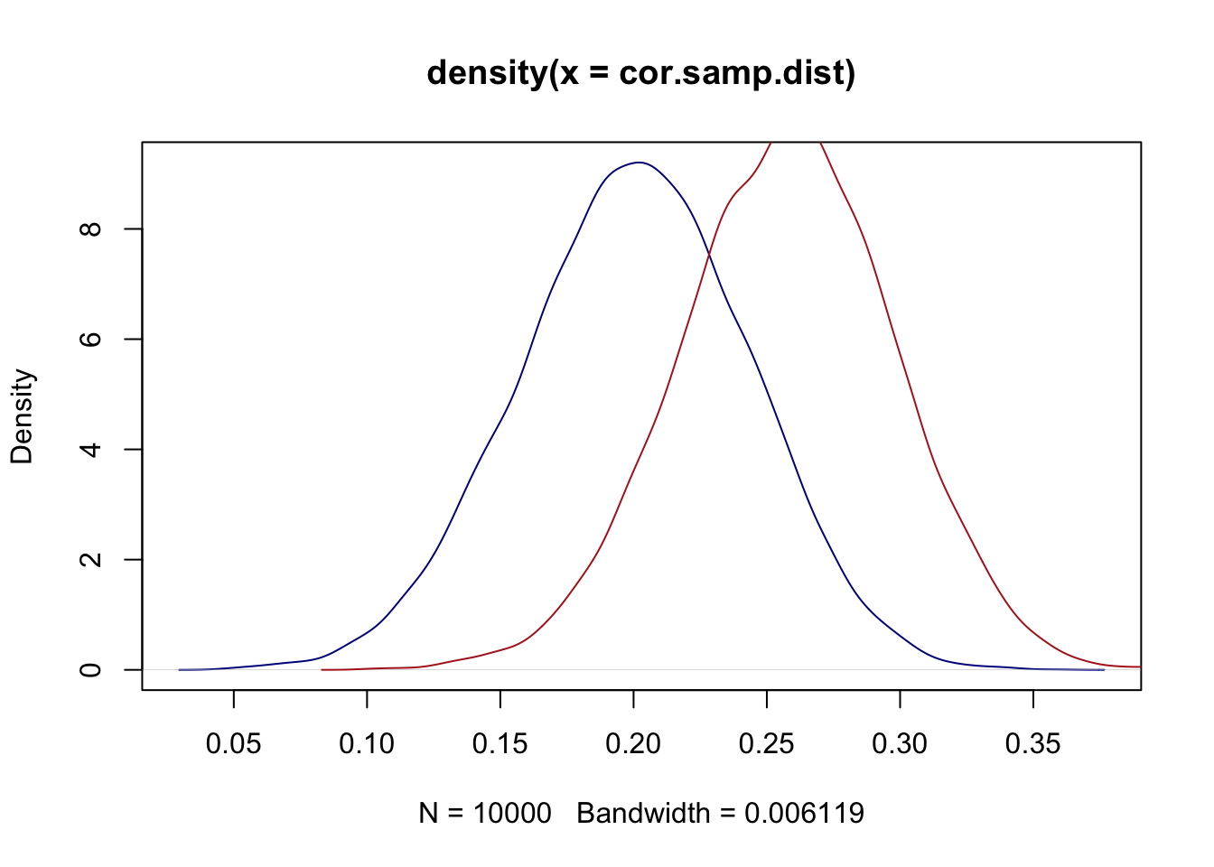
We generated 10,000 new bootstrap samples and have 10,000 new correlations from those samples. What does the density of them look like relative to the true sampling distribution?
Well, they aren’t centered in the same spot, but that’s expected. The blue true sampling distribution is centered on the true population value (.2). The red bootstrap sampling distribution will always be centered on whatever the correlation was in our sample (.25).
But we don’t really care about where a sampling distribution is centered, we care about its shape. More specifically, we care about its standard deviation (the standard error):
sd(cor.samp.dist)
[1] 0.0428987
sd(bs.samp.dist)
[1] 0.04045926
And we see that these are identical.
What does that mean: even without knowing the population (which we never actually do), we can repeatedly re-sample our own data and calculate our correlation (or, as we will see, anything else we’ve calculated in our sample) and generate a sampling distribution.
What can we do with our bootstrap sampling distribution?
Usually what people do is to use the bootstrap estimates to form a 95% confidence interval. We can determine this empirically by using the quantile function
quantile(bs.samp.dist, .025)
     2.5%
0.1764792
quantile(bs.samp.dist, .975)
    97.5%
0.3348584
If we are willing to assume that the sampling distribution is normally distributed (it is), we can also use the standard error to perform a hypothesis test under a null hypothesis:
That was the method, but let’s go further and prove to ourselves that the bootstrap really is doing what we claim by running it on a case where we already know the true sampling distribution.
Let’s generate one sample of data from a known normal distribution:
From this one sample we can estimate a sampling distribution of this sample mean. To do so we need to calculate a standard error:
se.calc <-sd(prime.sample)/sqrt(1000)
Now this sampling distribution is technically\(t\) distributed, but we have 1000 observations here so the t distribution will have converged on the normal distribution.
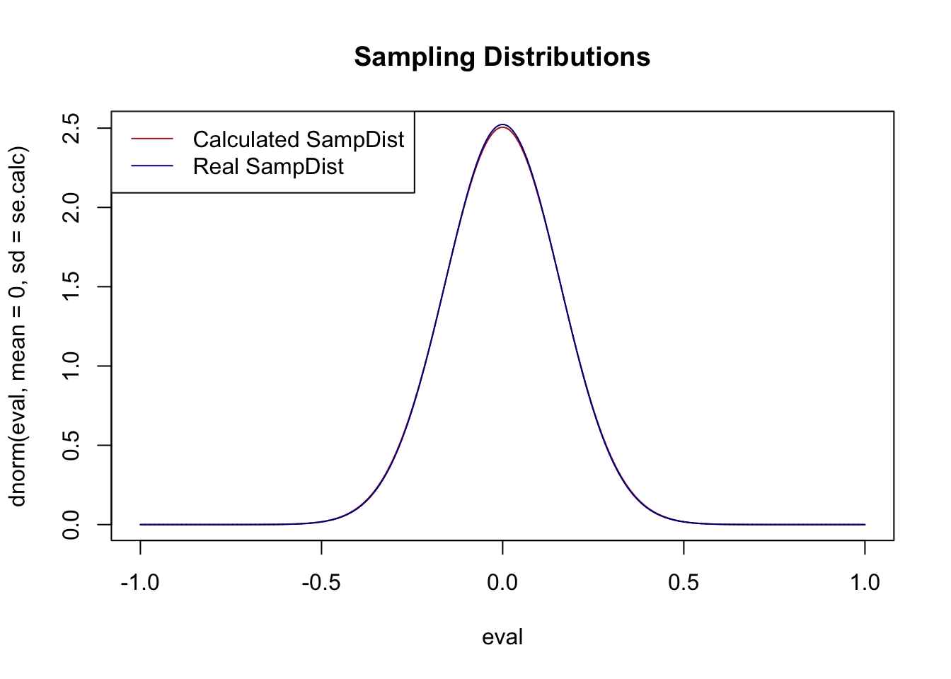
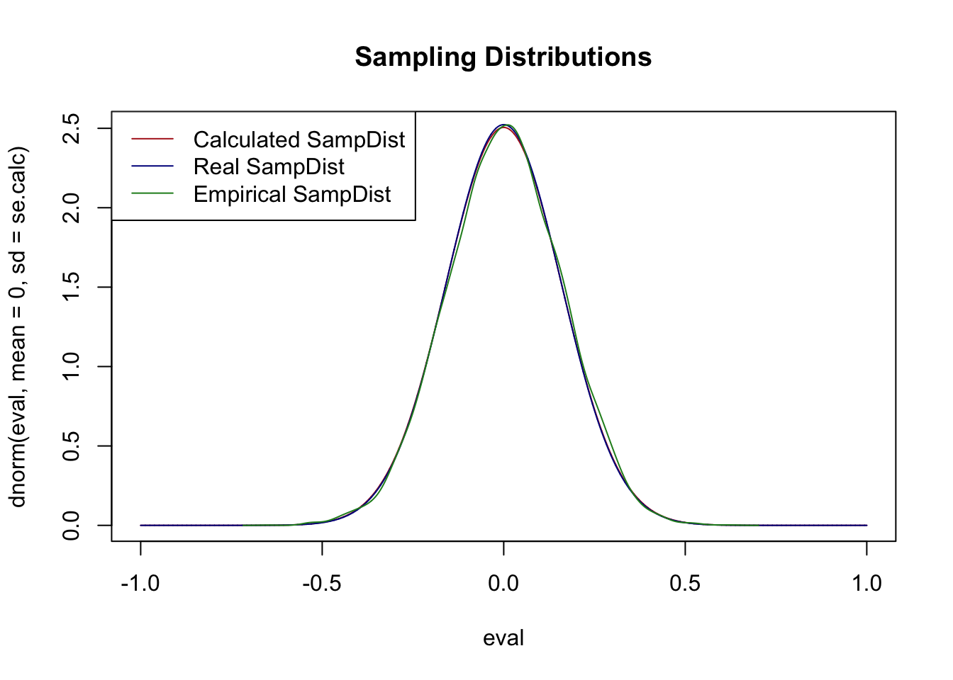
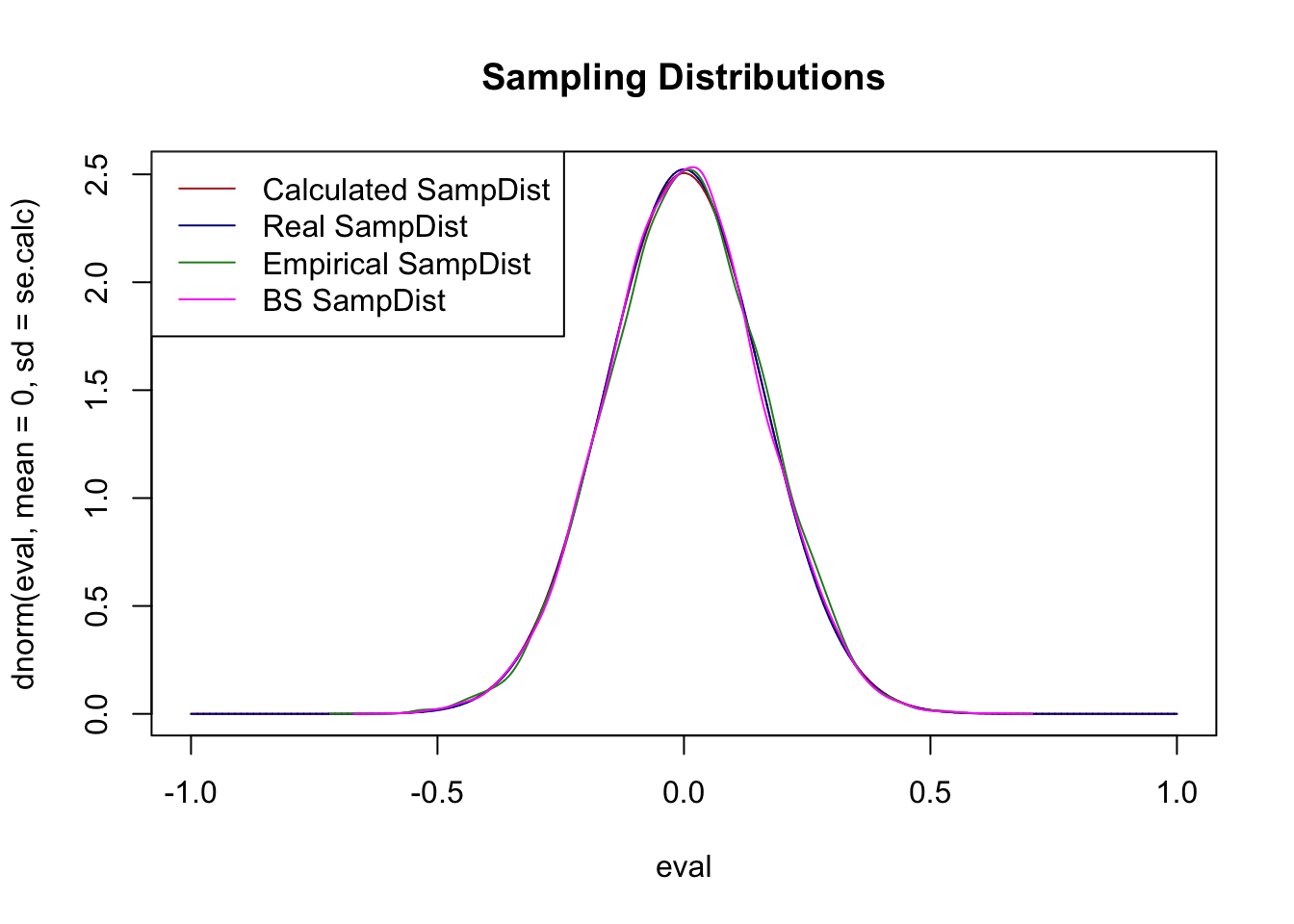
So here is this calculated sampling distribution, centered on 0 (though it doesn’t really matter where we center it):
As we have seen they are approximately the exact same shape. This is what was guaranteed to us by the Central Limit Theorem.
Now, again, because we know the true population we could also repeatedly sample from this population, calculating a mean in each sample, and that should also give us exactly the same sampling distribution.
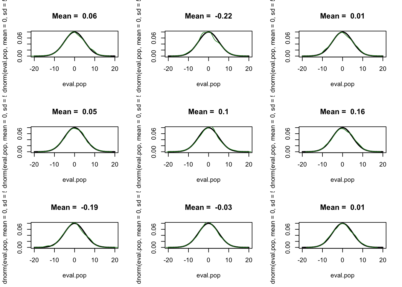
To produce the green sampling distribution we repeatedly sampled from our population, getting a slightly different sample of 1000 each time, and calculated the mean in each, and the resulting distribution is the sampling distribution. For example here are 9 samples of data compared against the population:
They are all approximately the same, but with a little bit of variation. That “little bit of variation” causes the variation in the mean that generates a sampling distribution.
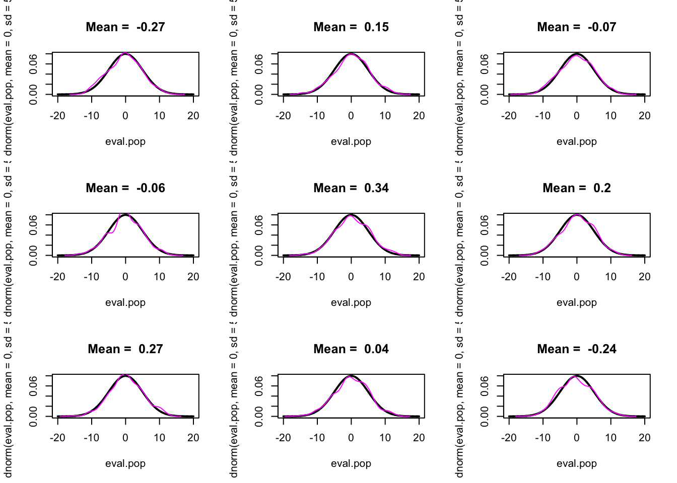
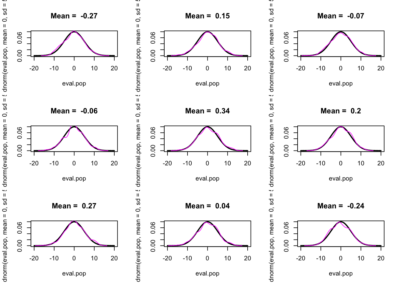
The claim of the bootstrap is that we can do exactly the same thing by re-sampling from our existing data with replacement:
To compare to the other sampling distributions I’m also going to center this distribution on 0, by subtracting the mean from all values (this is only necessary for visualization, this isn’t a usual step in the bootstrap process):
9.2.3 Four ways to calculate a sampling distribution
Pulling this all together, we now have four ways to calculate a sampling distribution:
You know the population and you calculate a standard error using the features of the population. (Impossible in real world).
You know the population and repeatedly sample and calculate the statistic in each. (Impossible in real world).
You use features of your sample to calculate a standard error using an equation that has been previously worked out by someone. (Requires there to be an equation worked out by someone).
Generate bootstrap samples and calculate the statistic in each. (Always works.)
So in the real world the options for calculating a standard error/sampling distribution are (3) and (4). If (3) is available to us we always prefer it, but if not, option (4) is available.
9.2.4 Real world example of the bootstrap
Here is some data from the American National Election Study, which is the premier academic study of elections.
I’m going to look at how people voted in the democratic primary, classifying candidates into centrist and progressives:
#5 and 6 are Sanders and Warrenanes$vote.centrist.dem[anes$V201021 %in%c(1,2,3,4)] <-1anes$vote.centrist.dem[anes$V201021 %in%c(5,6)] <-0table(anes$vote.centrist.dem)
   0    1
 731 1695
And I want to know if ideological self placement predicts that:
#1 is very liberal and 7 is very conservative.anes$ideology <- anes$V201200anes$ideology[anes$ideology %in%c(-9,-8,99)] <-NAtable(anes$ideology)
There is a small correlation between self reported ideology and voting for a centrist candidate in the democratic primary.
Based on research by Hakeem Jefferson, it might be that the relationship between ideology and vote choice among Black Americans may be different than White Americans. Specifically, Jefferson has found that the cultural context around “liberal” and “conservative” is extraordinarily different for Black Americans such that they are effectively answering a different question than white Americans.
So let’s look at the correlation among white and among Black Americans separately.
Ok but…. We know that every time we take a new sample we are going to get a slightly different answer. And while the ANES overall is pretty big it only has 700 or so Black Americans, not all of whom voted in the democratic primary. So there theoretically would be a lot of variation in that difference in correlations of .14 if we sampled a large number of times. So we want to perform a hypothesis test of some sort to determine if we can reject the null hypothesis that these two correlations are actually equal to one another in the population.
Looking at our 4 ways of calculating standard errors/sampling distributions above, what can we do to calculate a sampling distribution? Well this is real data so we don’t know the population, which rules out 1 and 2. Do we have a formula to calculate the standard error on the difference between two correlations? No! We don’t even have a formula for one correlation, let alone the difference.
So we have no choice but to use the bootstrap.
What we want to do is to sample rows of our data set with replacement to create “new” datasets. In each we will calculate the difference in the correlations between white and Black Americans.
To substantially reduce the computing power needed for this, I’m going to reduce the dataset down to just the three variables we need, and only keep observations with non-NA data for all three variables.
bs.cor.delta <-rep(NA,10000)for(i in1:10000){#Generate the bootstrap dataset bs.data <- boot.data[sample(1:nrow(boot.data), nrow(boot.data), replace=T),]#Calculate the same estimate as I calculated in the prime dataset, saving the result each time. bs.cor.delta[i] <-cor(bs.data$ideology[bs.data$white.v.black==1],bs.data$vote.centrist.dem[bs.data$white.v.black==1],use="pairwise.complete") -cor(bs.data$ideology[bs.data$white.v.black==0],bs.data$vote.centrist.dem[bs.data$white.v.black==0], use="pairwise.complete")}
Ok! That gave us a sampling distribution for the difference between these two correlations. What can we do with this?
We can use this empirical distribution to generate a confidence interval. We can literally look at the two values which define the range that contains 95% of bootstrap estimates.
#Our original estimatecor.delta
[1] 0.1371952
#CIquantile(bs.cor.delta, .025)
      2.5%
0.01662887
quantile(bs.cor.delta, .975)
    97.5%
0.2654626
Given that the confidence interval does not overlap 0 we can conclude that there is a lower than 5% probability of seeing a difference in correlation this extreme if the truth was that the two correlations were equal.
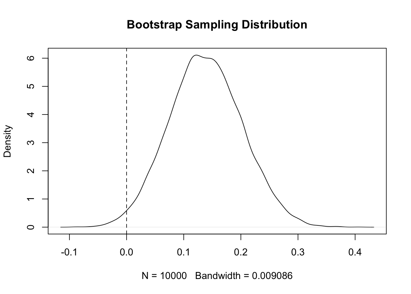
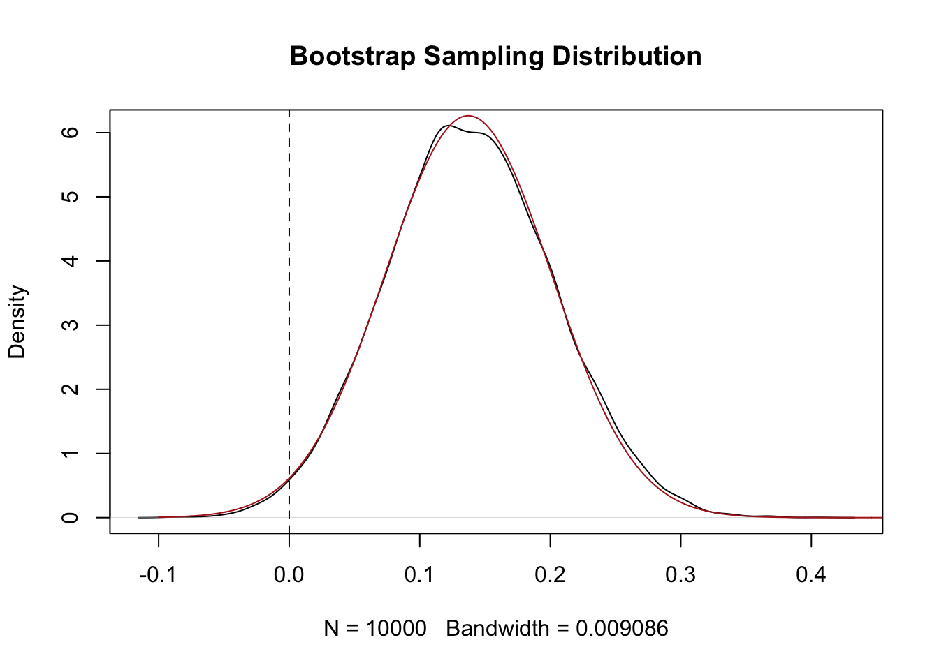
We can also use the standard deviation of these bootstrap samples as a standard error:
se <-sd(bs.cor.delta)#For my own sanity, make sure that the sample distribution is normally distributed:eval <-seq(-.1, .5, .0001)plot(density(bs.cor.delta), main="Bootstrap Sampling Distribution")points(eval, dnorm(eval, mean=cor.delta, sd=se), col="firebrick", type="l")abline(v=0, lty=2)
#For null of 0, how many SEs is our test statistic away?z.score <- (cor.delta-0)/se#Evalualte under the standard normalpnorm(z.score, lower.tail=F)*2
[1] 0.03125029
There is approximately a 3% chance of seeing something as extreme as a difference of .137 if the true difference in correlations was 0.
Cool! That’s genuinely a new thing I didn’t know that we discovered using these data and the bootstrap!
9.3 Coming Next
Power gives us the vocabulary to reason about what a hypothesis test can and cannot detect at a given sample size. The bootstrap gives us a computational way to build a sampling distribution around any statistic we compute in a sample. Both tools generalize the inferential logic we developed for the sample mean to a much wider set of quantities. Next chapter we introduce covariance and correlation proper — the statistics we’ve been using here as a motivating example — and then in the chapter after that we finally get to regression, the single most useful tool in the applied data scientist’s kit.