#Calculate t score for alpha=.05
t <- qt(.05,df=7)*-1

#SE
se <- 2/sqrt(8)

#Confidence interval
c(4-t*se,4+t*se)
[1] 2.660331 5.339669📄 Download the R code from this chapter
📝 Download the class handout for this chapter
We saw in the last chapter that if we have a sample of data and do not know the population (which we usually do not), then we can still estimate a sampling distribution by subbing in the sample variance.
Specifically we claimed that:
\[ \frac{\bar{X_n}-E[X]}{s/\sqrt{n}} \sim t_{n-1} \]
The sampling distribution of the sampling mean is \(t\) distributed with \(n-1\) degrees of freedom.
We were able to use that information to generate a confidence interval around a sample mean using this formula:
\[CI(\alpha) = [\bar{X_n}-t_{\alpha/2}*SE,\bar{X_n}+t_{\alpha/2}*SE]\]
Where \(\alpha\) is the inverse proportion of our confidence level.
So if I had a sample of \(n=8\) with \(\bar{x}=4\) and \(s=2\), then the 90% confidence interval would be:
#Calculate t score for alpha=.05
t <- qt(.05,df=7)*-1
#SE
se <- 2/sqrt(8)
#Confidence interval
c(4-t*se,4+t*se)[1] 2.660331 5.339669There is a 90% chance the true population parameter is between these two values. OR 90% of similarly constructed confidence intervals will contain the true population parameter.
When we have a sample and know nothing about the population it shifts the types of questions we want to ask. In previous classes we have asked questions like: if the truth is X and we take a sample of size \(n\) what is likely to happen? When we don’t know the truth, instead we have to ask questions like: what is plausible or likely to be true? We now have one method to determine this: confidence intervals. A confidence interval gives us a range which contains the truth with some probability (If we are being loose with the definition).
But this doesn’t quite look like the type of probability questions we asked during the build up to sampling. For those types of questions we asked things like: if President’s are being pulled from a population where 10% are left handed, what are the odds of seeing the number of left handed presidents we actually see? In these types of questions we posit some truth about the world (10% of people are left handed; this election race is tied; Mahomes will complete 75% of his passes) and then determine if our data supports that proposition. To answer these sorts of questions we have to turn to more formal hypothesis testing.
Let’s return to the example of me in October 2022 trying to predict what will happen in the election using polls. In hindsight we know the true level of support for candidates that would generate these polls, but I didn’t at the time.
Here is a (fake) poll of 1000 people in Pennsylvania, where 1 is someone who supports the Democratic candidate and 0 is someone who supports the Republican candidate.
set.seed(19102)
pa.poll <- rbinom(1000,1, .525)
In the real world the information I would have would have the sample mean and the sample variance/standard deviation:
mean(pa.poll)[1] 0.53var(pa.poll)[1] 0.2493493sd(pa.poll)[1] 0.4993489Now we have learned how to put a 95% confidence interval around this value
qt(.025, df=999)[1] -1.962341se <- sd(pa.poll)/sqrt(1000)
#Confidence Interval
c(mean(pa.poll)-1.96*se ,mean(pa.poll)+1.96*se)[1] 0.49905 0.56095So there is a 95% chance the true level of support for Fetterman is between 49.9% and 56.1%. Not particularly re-assuring.
That’s helpful for public consumption, but what if Kornacki comes to me and says “Hey Marc, I know your poll has Fetterman ahead, but can you actually say with certainty that Fetterman is going to win? Could the race be tied instead?” (Kornacki does not actually talk to me).
How can we answer this question?
What, right now, do we know about the sampling distribution of the proportion of voters who support Fetterman? Do we know where it is centered? Nope. Definitely not. We have one sample mean out of many possible. We feel like the truth is probably in the 50% range, but can’t say much more than that.
Do we know how wide the sampling distribution is? Yes! We definitely do.
The CLT says that the sampling distribution will be \(\bar{X_n} \sim N(\mu=E[X], \sigma^2=V[X]/n)\). We don’t know \(E[X]\), but we have seen that the sample variance of X is a reasonable stand-in for \(V[X]\). Technically when we use the sample variance the sampling distribution is t distributed, but we also know that with sufficiently large samples the t distribution is equal to the standard normal. So in this case I’m pretty confident in saying that the sampling distribution of Fetterman support is \(\bar{X_n} \sim N(\mu=E[X], \sigma^2=.249/1000)\).
Ok, so we know that what the width of this normal distribution is, why does that help us?
It helps us because we can make an inference via contradiction. Let’s think about the question that Kornacki asked us: can we rule out that the race is tied in favor of the idea that Fetterman is winning? In other words, if the race was tied, would it be particularly special or crazy to get this result? If that’s the question we want to answer, we can posit: if the truth was 50%, would it be special to get a mean of 53%? If we deem that it is crazy or special than we can reject the idea that the race is tied.
So, let’s posit that the sampling distribution of the sample mean – the random variable that produces means every time we take a sample of 1000 – is \(\bar{X_n} \sim N(\mu=.5, \sigma^2=.249/1000)\). We have used the sample variance and the \(n\) to work out \(\sigma^2\), and we are positing that it is centered on .5 or 50%.
eval <- seq(.45,.55, .0001)
plot(eval, dnorm(eval, mean=.5, sd=sqrt(.249/1000)), type="l",
     main="Sampling Distribution of Fetterman Support: Tied Race")
abline(v=.5,lty=2)
abline(v=mean(pa.poll), lty=2, col="firebrick")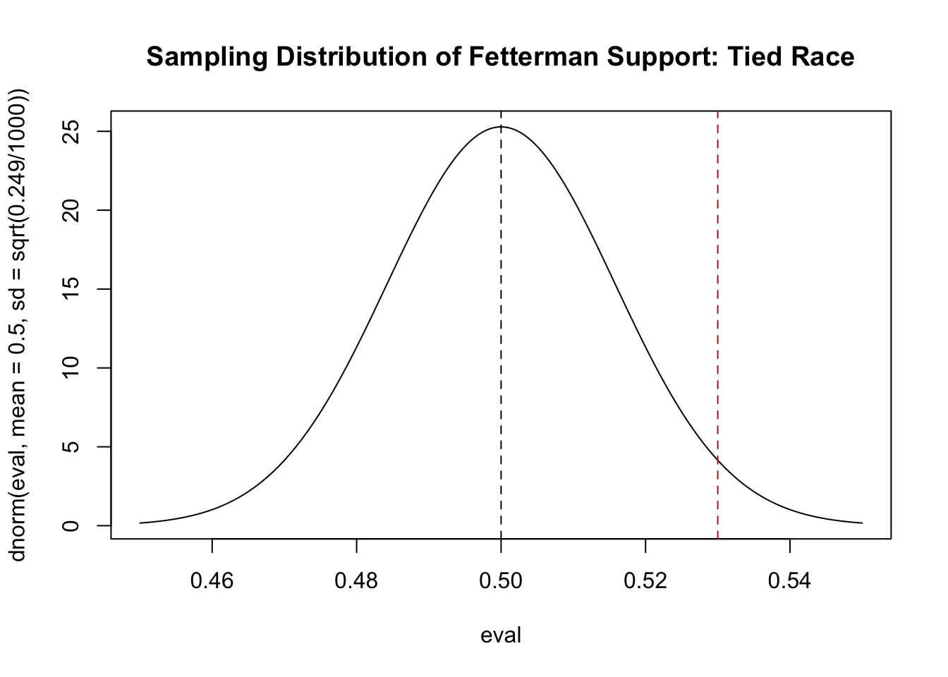
If the race was tied we believe that this would be the distribution that produces means. If this is the case, what is the probability that we get exactly 53% as the result? Trick question! It’s 0. Instead, we are going to ask: what is the probability we get something as extreme of more extreme than 53%? In other words, what is the probability to the right of the red line, our sample mean?
source("https://raw.githubusercontent.com/marctrussler/IIS-Data/main/NormalShader.R")

eval <- seq(.45,.55, .0001)
plot(eval, dnorm(eval, mean=.5, sd=sqrt(.249/1000)), type="l",
     main="Sampling Distribution of Fetterman Support: Tied Race")
abline(v=.5,lty=2)
abline(v=mean(pa.poll), lty=2, col="firebrick")
normal.shader(.45,.55,.5,sqrt(.249/1000), .53, greater = T, color = "firebrick")
pnorm(mean(pa.poll), mean=.5, sd=sqrt(.249/1000), lower.tail = F)[1] 0.02863969Around 2.86%, so pretty low! The data that we have – plus our information about the CLT and how the sampling distribution will look – contradicts the idea that the truth is 50%. In other words: if the truth is that the race is tied, 2.86% of means will be equal to or greater than what we got in our sample.
We can prove that this is true via simulation. Let me draw 10000 sample means from the sampling distribution we have posited (\(\bar{X_n} \sim N(\mu=.5, \sigma^2=.249/1000)\)):
results <- rnorm(10000, mean = .5, sd = sqrt(.249/1000))
mean(results>.53)
[1] 0.0281We get the same result via simulation.
But let’s be a bit more principled about this: let’s say that we will reject the idea that the race is tied for the idea that Fetterman is leading if there is less than 5% chance of seeing something as extreme or more extreme than what we get in our sample.
In other words: we would reject the idea the race is tied for the idea that Fetterman is leading if the sample mean is in the blue region:
#What value puts 5% in the right tail?
qnorm(.05, .5,sqrt(.249/1000), lower.tail=F)
[1] 0.5259554eval <- seq(.40,.60, .0001)
plot(eval, dnorm(eval, mean=.5, sd=sqrt(.249/1000)), type="l",
main="Sampling Distribution of Fetterman Support: Tied Race", xlab="Support",
ylab="Density")
abline(v=.5,lty=2)
normal.shader(.4,.6, .5,sqrt(.249/1000), .526, greater=T, color="dodgerblue" )
abline(v=mean(pa.poll), lty=3, col="firebrick")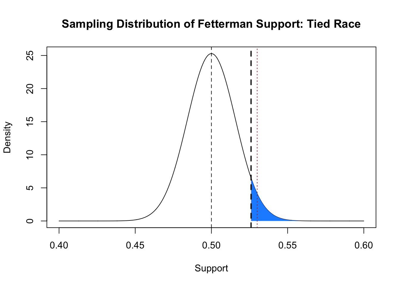
To reiterate this, what we are setting up is a zone where, if the truth was that the race was tied and this distribution was generating means, there is less than a 5% chance that a mean would be produced that was to the right of that blue line.
In this particular case we would reject the idea that the race is tied, because the sample mean is greater than the blue line, meaning there is a less than 5% chance that this mean would be produced if the truth was that the race was tied. Importantly: remember that we know the truth here and the race is not tied, Fetterman is going to win this race! So, in this case we have made the correct inference about the population.
OK: we now have a method for a single sample to determine the relatively likelihood of a certain population value being true given the mean we actually get in our sample.
We call the 5% level here \(\alpha\) (yes, it’s the same \(\alpha\) that we use in confidence intervals, which will get to shortly), which is the probability of mistakenly concluding that Fetterman is leading if the race is actually tied. This is a false positive: we think there is something there when there actually is not.
In the case so far we were interested in finding out if the race was tied or if Fetterman was leading. Another more conservative possibility is to consider whether or not the race is tied, and be agnostic about who is leading the race.
In this case we can consider our original sampling distribution, again centered around 50% (the tie). Again, we want to set up a zone where there is a 5% we will see something that extreme if the truth is 50%. Because now we are agnostic about who is winning the race, we need to put this in both tails. And because we want for this to represent a zone that has, in total, a 5% chance of occurring, we will put 2.5% in each tail.
eval <- seq(.45,.55, .0001)
plot(eval, dnorm(eval, mean=.5, sd=sqrt(.249/1000)), type="l",
     main="Sampling Distribution of Fetterman Support: Tied Race")
abline(v=.5,lty=2)
normal.shader(.45,.55, .5,sqrt(.249/1000),qnorm(.025, mean=.5, sd=sqrt(.249/1000)), col="dodgerblue"  )
normal.shader(.45,.55, .5,sqrt(.249/1000),qnorm(.025, mean=.5, sd=sqrt(.249/1000), lower.tail=F), col="dodgerblue", greater=T)
abline(v=mean(pa.poll), lty=2, col="firebrick")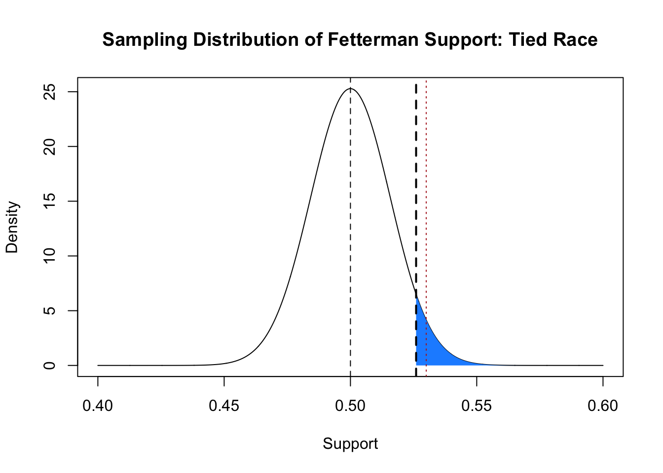
We have specifically set a zone where, if the race is tied, then there is a 5% chance of drawing a mean. If our mean is within that zone, then there is less than a 5% chance of it occurring by chance under the null hypothesis.
In this case our mean actually lies outside of this zone. As such, we cannot reject the idea that the race is tied — a sampling distribution centered around a tie would produce a mean at least this extreme at a rate that is greater than 5%. Put into regular language: we cannot rule out with our stated level of confidence that the race is tied.
Unsurprisingly, given the way that we set up these tests and the fact that our sample mean of 53% didn’t change, this test (what we will call a two-tailed test) is more conservative. It’s harder for any given mean to be in the rejection zone for a two tailed test.
To recap: because we can draw the shape of the sampling distribution given the information contained in one sample, we can ask the question: if \(E[X]\) was 50% ( and really we could put any value in here), what is the probability of getting the result that we did? Is that probability less than 5%? If so, we are happy with the possibility of a false positive, and will reject the idea that the race is tied.
The above should have given you the basic intuition for a hypothesis test. Now we will formalize the steps of a hypothesis test.
Here are the steps, which we will go through one at a time. These are the same steps that are in your textbook.
The null hypothesis is the thing that we are looking to contradict with our test. Above, our null hypothesis was that the race was tied (proportion voting Fetterman was .5). But the null hypothesis can be anything. For example we could be sampling incomes and may want to know if our sample has an income that is significantly different from the mean income in the United States. In that case the mean income of the United States would be our null hypothesis. We specify the null hypothesis as \(H_0\). In the Fetterman case above we would specify the null hypothesis as:
\(H_0: P(Fetterman)=.5\)
When we get to the alternative hypothesis we have our first decision to make. Above we looked at two different things: first we were testing whether the race was tied against whether Fetterman was leading. In that case we would set our alternative hypothesis to be that Fetterman’s support is greater than the null hypothesis:
\(H_a: P(Fetterman)>.5\)
In this case we only reject the null hypothesis if we have evidence that the truth is greater than the null hypothesis. We call this a “one-tailed test”.
The second thing we tested was whether the race was tied or not. Here we are agnostic about whether our sample mean is extremely above or below the null hypothesis. We would specify this alternative hypothesis as:
\(H_a: P(Fetterman) \neq .5\)
We call this a “two-tailed test”.
The test statistic is simply the thing we are hypothesis testing. In this case it is the sample mean: 53%. The \(\alpha\), as we discussed, is the probability of a false positive we are comfortable with. This is the false positive rate because by random chance 5% of the sample means will be in this zone if the null hypothesis is true. This \(\alpha\) can be anything, but 5% is a pretty standard number.
To calculate the sampling distribution all we need to know is the standard error. We calculated this above for our sample, but note here that nothing about these steps refer to the sample mean specifically: anything with a known sampling distribution can make use of these steps!
This step is slightly different than what we did above, but uses the exact same logic. What we want to calculate is the probability of getting something as extreme or more extreme than our test statistic if the null hypothesis is true.
The important thing here is that the calculation of the p-value changes based on whether we are doing a one-tailed or two-tailed test.
For a one tail test the p-value is the area in the tail more extreme than our test statistic in the direction of the test.
Above we were testing the alternative hypothesis that Fetterman’s support was greater than .5:
eval <- seq(.40,.60, .0001)
plot(eval, dnorm(eval, mean=.5, sd=sqrt(.249/1000)), type="l",
     main="Sampling Distribution of Fetterman Support: Tied Race", xlab="Support",
     ylab="Density")
abline(v=.5,lty=2)
normal.shader(.4,.6, .5, sqrt(.249/1000), .53, greater=T, col="firebrick")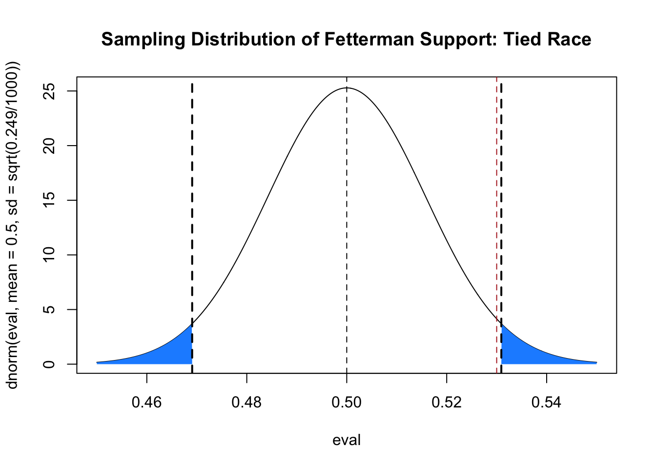
Here the p value would be:
pnorm(mean(pa.poll), mean=.5, sd=sqrt(.249/1000), lower.tail=F)[1] 0.02863969The probability of seeing a result this extreme if the null was true is 2.86%.
If we doing a two-tailed test we have to account that we are agnostic about whether the truth might be greater or less than the null. Because of this, we test to see the probability of getting a value as extreme or more extreme in both directions. Visually, we test to see the total probability of getting something in the tails to the left or right of our test statistic, and our test statistic flipped to the other side of the mean:
eval <- seq(.40,.60, .0001)
plot(eval, dnorm(eval, mean=.5, sd=sqrt(.249/1000)), type="l",
     main="Sampling Distribution of Fetterman Support: Tied Race", xlab="Support",
     ylab="Density")
abline(v=.5,lty=2)
normal.shader(.4,.6, .5, sqrt(.249/1000), .53, greater=T, col="firebrick")
#Need to look at area to the left of .47, which is our sample mean flipped to the
#other side of the null hypothesis:
normal.shader(.4,.6, .5, sqrt(.249/1000), .47, greater=F, col="firebrick")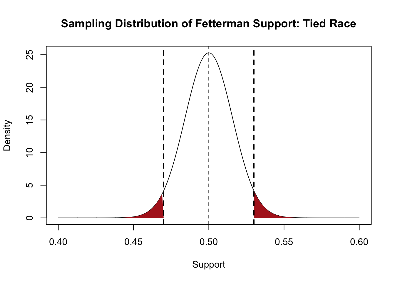
So adding up the probability in each of those tails:
pnorm(mean(pa.poll), mean=.5, sd=sqrt(.249/1000), lower.tail=F) + pnorm(.5 - (mean(pa.poll)-.5), mean=.5, sd=sqrt(.249/1000), lower.tail=T)[1] 0.05727939There is a 5.7% chance of seeing a result this extreme or more extreme if the null is true.
Note, however, that we didn’t really need to calculate that second pnorm. The normal distribution is symmetrical around the mean, so the probability to the right of 53% is exactly equal to the probability to the left of 47%. So we can do:
pnorm(mean(pa.poll), mean=.5, sd=sqrt(.249/1000), lower.tail=F)*2[1] 0.05727939Said shorter: the two-tailed p-value is the one-tailed p-value doubled.
Reject the null hypothesis if the p-value is less than or equal to \(\alpha\). Here we have set \(\alpha\) to be .05.
Therefore if we are doing a one tailed test we would reject the null hypothesis that the race is tied for the alternative hypothesis that Fetterman is leading.
However if we were doing a two-tailed test we would fail to reject the null hypothesis that the race is tied.
Notice that I did not say: we accept the null hypothesis. We are making no sort of probability statement about how likely if the race being tied is the likely outcome. We are simply saying that we do not have the evidence to overturn that idea. As we will see below: with certain hypothesis tests the probability we fail to reject the null hypothesis is alarmingly high, such that doing so doesn’t really provide us that much evidence of where the true value might be.
Before we do another example: what is the relationship between a hypothesis test and confidence intervals?
I mentioned above that our value for \(\alpha\), what we want the false positive rate to be, is the same \(\alpha\) that we used when constructing confidence intervals. As it turns out, if we construct a confidence interval with \(\alpha=.05\) and that confidence interval does not contain the null hypothesis, then a hypothesis test with \(\alpha=.05\) will also reject the null hypothesis.
So to continue our example:
#Construct a 95\% confidence interval
mean(pa.poll)
[1] 0.53t.value <- qt(.025, df=999)*-1
ci <- c(mean(pa.poll)-t.value*sqrt(.249/1000), mean(pa.poll)+t.value*sqrt(.249/1000) )
library(dplyr)
between(.5,ci[1], ci[2] )[1] TRUE#Null is within the CI
#Hypothesis test:
p <- pnorm(mean(pa.poll), mean=.5, sd=sqrt(.249/1000), lower.tail=F)*2
p>.05[1] TRUELet’s do it a bunch of times to make sure:
Note a critical difference in the calculation of the p-value here. We are calculating 2*pnorm(abs(xbar - .5)/se, lower.tail=F). The xbar can be above or below the mean. If we just did pnorm(xbar - .5, sd=sd, lower.tail=T) we would get the right answer only when xbar was less than .5. To avoid making an if statement that changes which tail to look at, instead we look at the absolute deviation from the null hypothesis and divide by the standard error to get a z value which works no matter which side xbar is of the null.
reject.null.ci <- rep(NA, 10000)
reject.null.hyp <- rep(NA, 10000)

for(i in 1:10000){
  samp <- rbinom(1000, 1, .525)
  xbar <- mean(samp)
  se <- sd(samp)/sqrt(1000)

#ci
  ci <- c(xbar-t.value*se, xbar+t.value*se)
  reject.null.ci[i] <- between(.5, ci[1], ci[2])
#hypothesis
#Use the absolute deviation from the null so the formula works whether
#xbar happens to fall above or below .5.
  p <- 2*pnorm(abs(xbar - .5)/se, lower.tail=F)
  reject.null.hyp[i] <- p>.05
}

table(reject.null.ci, reject.null.hyp)
reject.null.hyp
reject.null.ci FALSE TRUE
FALSE 3641 0
TRUE 0 6359#Same!Here is some data for the final 2 weeks of our poll in Arizona in 2022:
library(rio)
sm.az <- import("https://github.com/marctrussler/IIS-Data/raw/main/AZFinalWeeks.csv")
head(sm.az)
V1 id weight week bi.week state county.fips
1 1 118158025617 0.03165892 43 22 AZ 4013
2 2 118157557679 0.89310665 43 22 AZ NA
3 3 114153878749 1.06902117 43 22 AZ NA
4 4 118159457343 0.07919169 43 22 AZ 25027
5 5 118157881702 2.06085504 43 22 AZ NA
6 6 118158946302 3.62068552 43 22 AZ 36047
senate.topline governor.topline biden.approval presvote2020
1 Democrat Democrat Somewhat approve dem
2 <NA> <NA> Somewhat approve dem
3 <NA> <NA> Somewhat disapprove dnv/other
4 <NA> <NA> Somewhat disapprove dnv/other
5 Other/Would not Vote Republican Somewhat approve dnv/other
6 Other/Would not Vote Democrat <NA> dnv/other
pid ideology most.important.problem abortion.policy age race
1 Democrat Moderate Inflation <NA> 37 black
2 Democrat Conservative Crime and safety <NA> 24 asian
3 Republican Conservative Inflation <NA> 46 hispanic
4 Independent Moderate Inflation <NA> 23 black
5 Democrat Liberal Abortion <NA> 28 black
6 Republican Moderate <NA> <NA> 77 white
gender hispanic education
1 male FALSE Post graduate degree
2 male TRUE Associate's degree
3 male TRUE College graduate
4 female FALSE Some college
5 female FALSE Post graduate degree
6 male FALSE High school or G.E.D.Let’s similarly try to determine the truth about the senate race in this state. First let’s characterize the race in terms of the two-party vote for Democrat Mark Kelly (who actually won 52.4% of the two party vote):
table(sm.az$senate.topline)
            Democrat Other/Would not Vote           Republican
1368 349 1245 sm.az$DemSenateVote <- NA
sm.az$DemSenateVote[sm.az$senate.topline=="Democrat"]<- 1
sm.az$DemSenateVote[sm.az$senate.topline=="Republican"]<- 0
mean(sm.az$DemSenateVote,na.rm=T)[1] 0.5235362table(sm.az$DemSenateVote)
   0    1
1245 1368 sum(table(sm.az$DemSenateVote))[1] 2613Now as it turns out this poll is almost miraculously close to the truth (this is un-weighted so this is truly just a happy coincidence). But at the time I wouldn’t have known that.
Again, in this situation I have a poll that is telling me that Kelly is leading, but I know that if I took another poll of 2613 people I would get a slightly different answer every time. If I take into account how much randomness there is around sample means, would it be odd to get a sample mean of 52.4% if the race was tied?
Let’s go through the formal steps of the hypothesis test.
The “default” for all polling and social science is to do a two-tailed test. Why? Because we like that it’s more conservative (more to come on that). So let’s set up a null and alternative hypothesis for a two-tailed test.
\[ \begin{aligned} H_o: P(Kelly)=.5\\ H_a: P(Kelly)\neq.5 \end{aligned} \]
Our test statistic is the sample mean:
mean(sm.az$DemSenateVote,na.rm=T)[1] 0.5235362And we will go with the standard \(\alpha=.05\).
We believe that this sample mean comes from a sampling distribution that is t distributed with 2612 degrees of freedom. In this case because the \(n\) is sufficiently large, this distribution will be well approximated by the normal distribution. As such the sampling distribution will look like:
s <- sd(sm.az$DemSenateVote,na.rm=T)

eval <- seq(.40,.60, .0001)
plot(eval, dnorm(eval, mean=.5, sd=s/sqrt(2613)), type="l",
     main="Sampling Distribution of Kelly Support: Tied Race", xlab="Support",
     ylab="Density")
abline(v=.5,lty=2)
normal.shader(.4,.6, .5, s/sqrt(2613), .5 - (.524-.5), greater=F, color="firebrick")
normal.shader(.4,.6, .5, s/sqrt(2613), .524, greater=T, color="firebrick")
Now we feel like we can use the normal distribution here because our n is sufficiently large. The area of the red areas in the graph are:
2*pnorm(abs(.524 - .5)/(s/sqrt(2613)), lower.tail=F)[1] 0.01405348But to be fully correct we need to use the t-distribution. The t-distribution is like the standard normal in that it is a reference distribution. It tells us our answer in standard error units that we need to convert back and forth.
How many standard errors is our mean away from the null hypothesis:
t <- (.524-.5)/(s/sqrt(2613))Evaluate that number in the t-distribution with 2612 degrees of freedom:
2*pt(abs(t), df=2612, lower.tail=F)[1] 0.01411817Same answer in this case!
We reject the null hypothesis that the race is tied.
Let’s do another example of a hypothesis test with some real data:
Here again is some real data for the final 2 weeks of our poll in Arizona:
library(rio)
sm.az <- import("https://github.com/marctrussler/IIS-Data/raw/main/AZFinalWeeks.csv")
head(sm.az)
V1 id weight week bi.week state county.fips
1 1 118158025617 0.03165892 43 22 AZ 4013
2 2 118157557679 0.89310665 43 22 AZ NA
3 3 114153878749 1.06902117 43 22 AZ NA
4 4 118159457343 0.07919169 43 22 AZ 25027
5 5 118157881702 2.06085504 43 22 AZ NA
6 6 118158946302 3.62068552 43 22 AZ 36047
senate.topline governor.topline biden.approval presvote2020
1 Democrat Democrat Somewhat approve dem
2 <NA> <NA> Somewhat approve dem
3 <NA> <NA> Somewhat disapprove dnv/other
4 <NA> <NA> Somewhat disapprove dnv/other
5 Other/Would not Vote Republican Somewhat approve dnv/other
6 Other/Would not Vote Democrat <NA> dnv/other
pid ideology most.important.problem abortion.policy age race
1 Democrat Moderate Inflation <NA> 37 black
2 Democrat Conservative Crime and safety <NA> 24 asian
3 Republican Conservative Inflation <NA> 46 hispanic
4 Independent Moderate Inflation <NA> 23 black
5 Democrat Liberal Abortion <NA> 28 black
6 Republican Moderate <NA> <NA> 77 white
gender hispanic education
1 male FALSE Post graduate degree
2 male TRUE Associate's degree
3 male TRUE College graduate
4 female FALSE Some college
5 female FALSE Post graduate degree
6 male FALSE High school or G.E.D.This time, let’s examine approval for Joe Biden in the Arizona electorate.
First, let’s create a variable that describes if someone approves of Joe Biden, or not.
table(sm.az$biden.approval)
   Somewhat approve Somewhat disapprove    Strongly approve Strongly disapprove
665 287 623 1449 sm.az$approve.biden[sm.az$biden.approval %in% c("Strongly approve","Somewhat approve")] <- 1
sm.az$approve.biden[sm.az$biden.approval %in% c("Strongly disapprove","Somewhat disapprove")] <- 0
table(sm.az$biden.approval, sm.az$approve.biden)
                         0    1
  Somewhat approve       0  665
  Somewhat disapprove  287    0
  Strongly approve       0  623
  Strongly disapprove 1449    0
#
mean(sm.az$approve.biden, na.rm=T)[1] 0.4259259sd(sm.az$approve.biden,na.rm=T)[1] 0.4945644sum(table(sm.az$approve.biden))[1] 30243024 people answered this question. Of that sample, 42.6% of them stated that they approved of Biden (at least somewhat).
Again, 50% might be the relevant value for a null hypothesis here because we may want to know if Arizonans are ambivalent towards the President, or not. But to show that a null hypothesis can be anything, we could also test whether Biden’s approval rating is significantly different than Trump’s approval rating at the end of his term (38%).
Let’s go through the steps of testing this.
\[ \begin{aligned} H_o: P(Approve.Biden)=.38\\ H_a: P(Approve.Biden)\neq.38 \end{aligned} \]
Our test statistic is the sample mean:
mean(sm.az$approve.biden,na.rm=T)[1] 0.4259259We will stick with \(\alpha=.05\).
The sampling distribution is \(\frac{\bar{X_n}-E[X]}{s/\sqrt{n}} \sim t_{n-1}\)
The standard error is the standard deviation of the sampling distribution:
se <- sd(sm.az$approve.biden,na.rm=T)/sqrt(3024)First, how many standard errors from the null is our test statistic:
t.score <- (mean(sm.az$approve.biden,na.rm=T)- .38)/seEvaluate the amount in the tail of the t distribution with 3023 degrees of freedom \(\pm\) that amount:
2*pt(abs(t.score), df=3023, lower.tail=F)[1] 3.484672e-07Now this is a very, very low p-value. How should we report it? We could say that it is .0003%. That’s fine! Could we round down to 0? No! Never! A P value can never be zero! We are measuring the area under a curve and that curve asymptotically approaches 0 but never hits it, so a p-value can never be precisely zero. My preference for very low p-values is to simply report them as “less than 1%”
We reject the null hypothesis that Biden’s approval rating is equal to Trump’s last recorded approval rating. There is a less than a 1% chance of observing something as extreme as Biden’s 42% approval rating if the truth was that his approval rating was 38%.
Now I think it is important to know the steps of this process and what is happening under the hood because, honestly, it’s not that complicated.
We could write a function to take a sample, input a null hypothesis, calculate the standard error, look up the right probability bounds using pt and output a p-value…. But if that’s so easy to do, someone’s probably already done it.
And yeah: t.test(). By default it tests the null hypothesis that the population mean is 0 and reports a two-tailed p-value:
#Default is null=0
t.test(sm.az$approve.biden)
    One Sample t-test

data:  sm.az$approve.biden
t = 47.359, df = 3023, p-value < 2.2e-16
alternative hypothesis: true mean is not equal to 0
95 percent confidence interval:
 0.4082918 0.4435601
sample estimates:
mean of x
0.4259259
To test against our actual null of .38, we pass mu = .38:
t.test(sm.az$approve.biden, mu=.38)
    One Sample t-test

data:  sm.az$approve.biden
t = 5.1065, df = 3023, p-value = 3.485e-07
alternative hypothesis: true mean is not equal to 0.38
95 percent confidence interval:
 0.4082918 0.4435601
sample estimates:
mean of x
0.4259259
Notice a few things in the output:
t = ...) is exactly the standardized \((\bar{X}-\mu_0)/(s/\sqrt{n})\) we computed by hand.t.test() defaults to a two-tailed test. For a one-tailed test, pass alternative = "greater" or alternative = "less":
#One-tailed: Biden's approval is *greater than* .38
t.test(sm.az$approve.biden, mu=.38, alternative="greater")
    One Sample t-test

data:  sm.az$approve.biden
t = 5.1065, df = 3023, p-value = 1.742e-07
alternative hypothesis: true mean is greater than 0.38
95 percent confidence interval:
 0.4111283       Inf
sample estimates:
mean of x
0.4259259
It’s important to understand what’s going on underneath the surface (particularly to understand statistical power, next week), but t.test() is what you’ll actually reach for in practice.
There are 4 possibilities when we run a hypothesis test:
Let’s think about the possible outcomes of a hypothesis test.
Over the course of the end of this chapter and the start of the next we will deal with all of these possibilities. The next chapter on Power is going to look at false negatives and true positives.
Before that, I want to think a little bit more about our false positive rate, \(\alpha\).
This is the value that we control most directly because we explicitly choose it when setting up our hypothesis tests.
To think about this more, let’s set up a data generating process where there truly is nothing going on. Here is a DGP creating 1000 survey respondents in a truly tied race, where a score of 1 indicates voting for the Democrat.
set.seed(19104)
samp <- rbinom(1000,1, prob=.5)
Let’s hypothesis test this sample:
\[ \begin{align} H_o &: P(Dem)=.5\\ H_a &: P(Dem)\neq .5 \end{align} \]
mean(samp)[1] 0.523The standard error here is:
se <- sd(samp)/sqrt(1000)And using the normal as an approximation we can visualize this. In this case I’m also going to show where the 5% false positive region is on this sampling distribution. This is the region where this sampling distribution will produce means and we will reject the null hypothesis.
eval <- seq(.40,.60, .0001)
rejection.region <- qnorm(.025, mean=.5, sd=se, lower.tail=F)

plot(eval, dnorm(eval, mean=.5, sd=se), type="l",
     main="Sampling Distribution under Null Hypothesis", xlab="Support",
     ylab="Density")
abline(v=.5,lty=2)
normal.shader(.4,.6, .5, se , rejection.region, greater=T, color="firebrick")
normal.shader(.4,.6, .5, se,.5 - (rejection.region-.5) , greater=F, color="firebrick")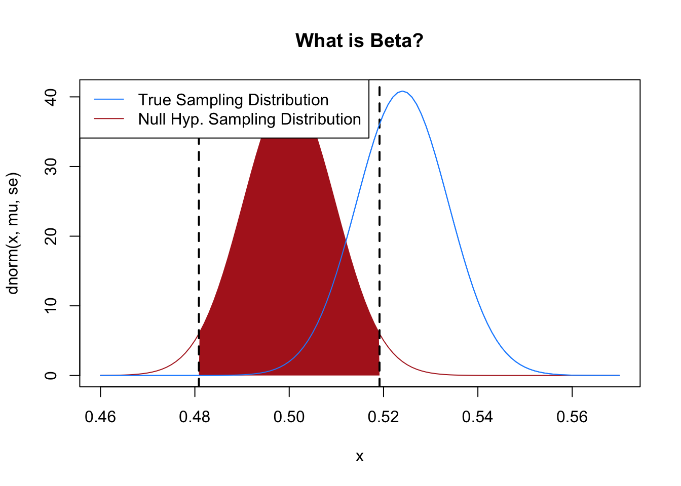
Our p-value here is:
#Use the absolute deviation from the null so we get the right two-tailed
#p-value regardless of which side of .5 our sample mean fell on.
2*pnorm(abs(mean(samp) - .5)/se, lower.tail=F)
[1] 0.1455417Just over 14%. So in this case we (correctly) fail to reject the null hypothesis that this race is tied.
But it’s really critical to remember that the false positive rate does exactly what it says it is going to do. Under this setup 5% of the time we will reject the null hypothesis when we should not.
We can prove this via simulation:
p <- NA
for(i in 1:10000){
samp <- rbinom(1000,1, prob=.5)
#Shortcut with the t.test function:
p[i] <- t.test(samp, mu=.5)$p.value
}

mean(p<.05)
[1] 0.0542When we set a 5% false positive rate we get…. 5% false positives.
If we set a 10% false positive rate then we get:
p <- NA
for(i in 1:10000){
samp <- rbinom(1000,1, prob=.5)
#Shortcut with the t.test function:
p[i] <- t.test(samp, mu=.5)$p.value
}

mean(p<.1)
[1] 0.0975Around 10% false positives.
OK, so that’s kind of stupid. But where this becomes important is when we are thinking about multiple comparisons.
If we were uncomfortable with a 5% false positive rate then we could just set it lower and the problem would be done with, right?
The larger issue is when we are doing multiple hypothesis tests at the same time. If we are doing a single hypothesis test then the probability of a false positive is 5%. But if we are doing two hypothesis tests, the probability that either of them will return a false positive is higher than that.
We can think about this as a coin that comes up heads 5% of the time.
What is the probability of at least one head if you flip a coin that comes up heads 5% of the time twice?
#We want to know the probability of getting at least one head
#Which is 1 minus the probability of getting no heads
1-dbinom(0, 1, .05)
[1] 0.051-dbinom(0, 2, .05)[1] 0.0975Just under a 10% probability of getting a false positive if you are testing two hypotheses with an \(\alpha=.05\).
How does this scale as you test more and more hypotheses:
plot(1:100, 1-dbinom(0, 1:100, .05), type="l", pch=16,
     main="Multiple Comparisons",
     xlab="Number of Hypothesis Tests",
     ylab = "Probability of at least one false positive")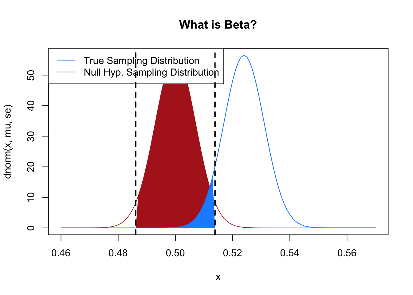
If you are testing 10 hypotheses, each with a 5% chance of a false positive, then there is a nearly 50% chance you will get at least one false positive.
If you are testing over 80 hypotheses you are nearly certain to get at least one false positive.
This sort of logic is a large component of the replication crisis in science. the replication crisis was a broad movement to attempt to re-do key experiments in many fields (most prominently psychology and medicine) to determine the degree to which results were robust. The “crisis” part should give away the ending. For example, findings in psychology:
Of 97 original studies with significant effects, 36% replicated successfully (p value below 0.05), with effect sizes averaging half the original magnitude. Among non-replications, 25% directly contradicted the original while 49% were inconclusive due to underpowered designs.
All of these papers had “statistically significant” findings that had a a less than 5% of being true by chance. If that is true, why do a third of them turn out to be noise?
The problem, as we just saw above, is that this 5% applies to testing a single hypothesis. The problem with a lot of papers is what we are seeing is the one statistically significant hypothesis out of the many non-statistically significant hypotheses that were either not displayed or not tested at all. It seems like this problem would be minimized by there not being that many hypotheses to be tested, keeping things in the reasonable range of the above graph. But when you start thinking about a modern research study the number of choices to be made at each stage (each multiplied against the choices you could make in other spots), it’s actually not hard to see how you could have a number of hypotheses that almost guarantee a false positive.
Andrew Gelman is one of the leading critics of fields well known for “p-hacking” (though, he rejects that term). For example, here he is talking about all the possible hypothesis tests that could be completed on a study that purported to show college students having ESP:
The paper included nine different experiments and many statistically significant results. Unfortunately . . . these experiments had multiple degrees of freedom that allowed Bem to keep looking until he could find what he was searching for. In his first experiment, in which 100 students participated in visualizations of images, he found a statistically significant result for erotic pictures but not for nonerotic pictures. But consider all the other possible comparisons: If the subjects had identified all images at a rate statistically significantly higher than chance, that certainly would have been reported. Or what if performance had been higher for the nonerotic pictures? One could easily argue that the erotic images were distracting and only the nonerotic images were a good test of the phenomenon. Or what if participants had performed statistically significantly better in the second half of the trial than in the first half? That would be evidence of learning. Or if they performed better on the first half? Evidence of fatigue. Bem reports, “There were no significant sex differences in the present experiment.” If there had been (for example, if men had performed better with erotic images and women with romantic but nonerotic images), this certainly could have been presented as convincing evidence. And so on.
It’s worth noting that there is an extremely uncharitable version of this story and a slightly more charitable version.
The extremely uncharitable version is that unscrupulous researchers simply mine their data for the set of measures, comparisons, interactions, and tests that happen to present a significant result. This is what is traditionally thought of as “p-hacking”. This definitely was happening, and is almost guaranteed to produce a false positive.
The slightly more charitable version of the false-positive story is what Gelman calls the “garden of forking paths”. In this version of the story, researchers naively go into data analysis without much of a plan, and make defensible choices in all of the above things. But because those choices are based on the data (and stopping depends on finding a significant result), the outcome is largely the same. The choices all feel correct, and researchers don’t feel like they are mining the data, but because choices are made that help lead to statistical significance, this is still p-hacking.
What can be done about this? There is a very technical answer and a more research based answer.
The very technical answer, that isn’t actually widely applicable, is to make a Bonferroni Correction to your hypothesis test. This is very simple to implement: instead of using the .05 threshold for statistical significance, you use \(.05/m\), where \(m\) is the number of comparisons you are making.
So for example we can generate 100 fair coin flips 10 times, each time testing the null hypothesis that it’s a fair coin (which it is) and seeing whether p is less than .05
m <- 10
coin <- c(0,1)
any.sig <- NA

for(j in 1:1000){
  sig <- NA
  for(i in 1:m){
    flips <- sample(coin, 100, replace=T)
    sig[i] <- t.test(flips, mu=.5)$p.value <.05
  }
  any.sig[j] <- any(sig)
}
mean(any.sig)
[1] 0.45842% of the time at least one of the 10 sequences of flips produces a false positive.
But if we instead divide the p-value we are looking for by \(m=10\):
m <- 10
coin <- c(0,1)
any.sig <- NA

for(j in 1:1000){
  sig <- NA
  for(i in 1:m){
    flips <- sample(coin, 100, replace=T)
    sig[i] <- t.test(flips, mu=.5)$p.value <(.05/m)
  }
  any.sig[j] <- any(sig)
}
mean(any.sig)
[1] 0.076The number of false positives drops to (about) the expected level of 5%!
A Bonferroni correction can be helpful if there is a situation where you are inevitably testing a bunch of hypotheses and know you want to make a correction. (Say if you have 10 measures of a certain outcome variable that you are testing the same hypothesis on). But oftentimes you can’t actually calculate all of the possibilities for your data analysis. (The different ways to cut a continuous variable are infinite, the number of different statistical tests are many, the different ways you can combine your variables into a scale are numerous…).
The more design-based way of dealing with multiple comparisons and the possibility of false positives is pre-registration. This is becoming the dominant norm in much of science now, and consists of planning out your data analysis and hypothesis tests before you collect your data. This means you are “locked in” to a certain set of decisions that are not being driven by the data, and hypothesis tests follow the “normal” rules we have discussed above.
Another thing that we can be worried about are false negatives – this is the situation where we fail to reject the null hypothesis when we should. In something like a drug trial, the false negative would be saying a drug doesn’t work when it does. This problem is not as bad as a false positive (again, with the drug example we would rather falsely claim that a drug doesn’t work then to falsely claim that it does work), however it is also a potentially much larger problem.
To set up what we are going to talk about in the next chapter on power, how often do we get false negatives? We know that we will get false positives (reject the null when we shouldn’t) 5% of the time on a single test. That’s what we set up on purpose! But how does that translate into a false negative rate?
Resurrecting the example above of the Arizona primary: given that the true percentage of Kelly’s vote is 52.4%, let’s simulate many polls of 2613 people, perform a hypothesis test on each, and determine what proportion of those tests are false negatives: where we fail to reject the null of 50%.
set.seed(19104)
false.negative <- rep(NA,10000)

n <- 2613
alpha <- .05

for(i in 1:10000){
samp <- rbinom(n,1, .524)
s <- sd(samp)
xbar <- mean(samp)
se <- s/sqrt(n)
t.val <- (xbar-.5)/se
#Two-tailed p-value using the absolute t so this works whether xbar landed
#above or below .5.
p <- 2*pt(abs(t.val), df=n-1, lower.tail=F)
false.negative[i] <- p>=alpha
}
mean(false.negative)
[1] 0.321532% of the time we get a false negative! That’s a lot! Way higher than 5%. We call this value \(\beta\). We take up \(\beta\) and the concept of statistical power in the next chapter, but for right now: thinking about the sampling distribution under the null hypothesis, what might affect the size of \(\beta\)?
We now have the machinery for a full hypothesis test: choose a null, compute the test statistic under that null, evaluate the tail area, and decide whether to reject. The next chapter picks up two natural extensions of this framework. First, power — the flip-side of \(\alpha\) that tells us when a study can and cannot detect a real effect. Second, the bootstrap — a computational tool for building sampling distributions around any statistic we compute in a sample, not just the mean.