#install.packages("AER")
library(AER)12 Multivariate Regression
📄 Download the R code from this chapter
📝 Download the class handout for this chapter
One of the key features of OLS regression is that we can consider and control for multiple variables in the same model. In this chapter we discuss how to think about that, theoretically and practically.
12.1 Regression with more than one independent variable
First, let’s install and load the “AER” package, which has some interesting built in data. We are just using this package for the data, it’s not a necessary package for regression or anything.
The AER package has some built in data on California schools
data("CASchools")

head(CASchools)
district school county grades students teachers
1 75119 Sunol Glen Unified Alameda KK-08 195 10.90
2 61499 Manzanita Elementary Butte KK-08 240 11.15
3 61549 Thermalito Union Elementary Butte KK-08 1550 82.90
4 61457 Golden Feather Union Elementary Butte KK-08 243 14.00
5 61523 Palermo Union Elementary Butte KK-08 1335 71.50
6 62042 Burrel Union Elementary Fresno KK-08 137 6.40
calworks lunch computer expenditure income english read math
1 0.5102 2.0408 67 6384.911 22.690001 0.000000 691.6 690.0
2 15.4167 47.9167 101 5099.381 9.824000 4.583333 660.5 661.9
3 55.0323 76.3226 169 5501.955 8.978000 30.000002 636.3 650.9
4 36.4754 77.0492 85 7101.831 8.978000 0.000000 651.9 643.5
5 33.1086 78.4270 171 5235.988 9.080333 13.857677 641.8 639.9
6 12.3188 86.9565 25 5580.147 10.415000 12.408759 605.7 605.4Let’s set out a research question for these data. I want to know if the student to teacher ratio in a classroom is associated with better test scores. Specifically, as the student to teacher ratio increases, test scores should decrease.
The null hypothesis of this relationship is that student to teacher ratio has 0 association with test scores
Let’s first create two variables that capture these concepts.
STR will be the student to teacher ratio:
CASchools$STR <- CASchools$students/CASchools$teachers
summary(CASchools$STR)
Min. 1st Qu. Median Mean 3rd Qu. Max.
14.00 18.58 19.72 19.64 20.87 25.80 And the test scores will be the simple average of the reading and math test scores:
CASchools$score <- (CASchools$read + CASchools$math)/2
summary(CASchools$score)
Min. 1st Qu. Median Mean 3rd Qu. Max.
605.6 640.0 654.5 654.2 666.7 706.8 To make my life easier I’m going to save a version of this dataset with a shorter name
dat <- CASchoolsOk, so first, what do these data look like?
plot(dat$STR, dat$score, xlab="Student:Teacher Ratio", ylab="Test Score", pch=16)
Well, these look much messier than the fake data we used in the last chapter, which is about right. Even still, there does seem to be a generally negative relationship here, though it’s not a slam dunk, and could be due to random chance.
Let’s use our new tool of regression to describe the relationship we are seeing here.
m <- lm(score ~ STR, data=dat)
summary(m)
Call:
lm(formula = score ~ STR, data = dat)

Residuals:
    Min      1Q  Median      3Q     Max
-47.727 -14.251   0.483  12.822  48.540

Coefficients:
            Estimate Std. Error t value Pr(>|t|)
(Intercept) 698.9329     9.4675  73.825  < 2e-16 ***
STR          -2.2798     0.4798  -4.751 2.78e-06 ***
---
Signif. codes:  0 '***' 0.001 '**' 0.01 '*' 0.05 '.' 0.1 ' ' 1

Residual standard error: 18.58 on 418 degrees of freedom
Multiple R-squared:  0.05124,   Adjusted R-squared:  0.04897
F-statistic: 22.58 on 1 and 418 DF, p-value: 2.783e-06plot(dat$STR, dat$score, xlab="Student:Teacher Ratio", ylab="Test Score", pch=16)
abline(lm(dat$score ~ dat$STR), lwd=2, col="firebrick")
The coefficient on STR is negative. As always, we interpret this as: a one unit change in x leads to a -2.3 change in y. When STR increases by one unit, test scores decrease by 2.3 units, approximately.
To put this into real language: a one unit change in STR means one additional student for every teacher. So: a classroom with one additional student for every teacher, is associated with a 2.3 point decline in test scores on average.
Looking at the hypothesis test for this, the probability of obtaining a relationship this extreme if the truth was that there was no association between STR and test scores approaches zero. We reject the null hypothesis here.
The intercept is always the average value of y when x equals 0. So when STR is zero, the average test score is 698.
But this is where we have to be smarter than the regression. When STR is zero that means that there are no students for every teacher. Again: mechanically regression needs to have this number. That doesn’t mean that it’s a helpful thing to know.
12.2 Omitted variable bias
You’ve heard the phrase: correlation does not equal causation. It’s true, though it’s a bit of an absolutist and lazy way to look at things. (Indeed, this phrase, alongside “lies, damn lies, and statistics” are often wielded by people who don’t know anything as a way to say “Can’t trust those scientists these days!”) As you learn more about statistics and causal inference in future classes you will learn about times when correlation does equal causation. For right now, what we can think about doing with multiple regression is ruling out other plausible reasons for why these two variables might be correlated.
In trying to figure out if we have captured the real relationship between these two variables, we want to think about possible common causes. We are interested in variables that cause both a high student to teacher ratio and low test scores. In other words, might it be the case that some third, unseen, variable is driving this relationship?
There are some classic absurd omitted variable bias examples: There is a negative association between the number of firemen at a fire and property damage. It would be a mistake to conclude that firemen cause property damage. The truth is that both are driven by the severity of the fire. There is a positive association between ice cream sales and violent crime. It would be a mistake to conclude that Mr. Softee trucks cause people to be violent. (Though every time I’m buying my daughter an ice cream I think about what it would take for me to turn on the other Dads). In reality both of these things are driven by higher temperatures.
In the case we are dealing with here, a potential explanation for why a school might have a high student to teacher ratio and lower test scores might be because it is a school with a high number of children who speak English as a second language. Schools with a high number of children who speak English as a second language may be more likely to be in areas with a poor tax base and therefore less money to hire teachers. Standardized tests have been found to not capture the innate intelligence of those who do not speak English as their primary language.
We can draw this proposed structure as a causal diagram. English is a common cause of both the student-teacher ratio and test scores:
In our original data, we have a variable that captures the percent of the school who has English as a second language. To start let’s create a simple dummy variable that is equal to 1 if a school is above the median for ESL children, and 0 for schools that are below the median.
dat$high.esl <-NA
dat$high.esl[dat$english>=median(dat$english)]<- 1
dat$high.esl[dat$english<median(dat$english)]<- 0Let’s visualize what this looks like
Here is our original data and regression line, where we are treating all the schools the same.
Within all these black dots, some are schools with a high number of ESL children, some are schools with a low number of ESL children.
plot(dat$STR, dat$score, xlab="Student:Teacher Ratio", ylab="Test Score", pch=16)
abline(lm(dat$score ~ dat$STR), lwd=2, col="firebrick")
What if we reveal which points belong to which ESL group? How might we think differently about the relationship?
plot(dat$STR, dat$score, xlab="Student:Teacher Ratio", ylab="Test Score", pch=16, type="n")
points(dat$STR[dat$high.esl==0], dat$score[dat$high.esl==0], pch=16, col="darkblue")
points(dat$STR[dat$high.esl==1], dat$score[dat$high.esl==1], pch=16, col="firebrick")
legend("topright", c("Low ESL", "High ESL"), pch=c(16,16), col=c("darkblue", "firebrick"))
Just using the naked eye, there does seem to be a large number of schools which have both a high number of children who have English as a second language and also have lower test scores.
Here is what we want to do: Taking into account that there are two different types of schools, can we summarize what the relationship between STR and test scores are?
Mechanically, this is what regression is going to do: Choose a slope line for STR and TWO intercepts, one for each type of school, such that the sum of the squared residuals is minimized.
Visualizing this, it looks like this:
plot(dat$STR, dat$score, xlab="Student:Teacher Ratio", ylab="Test Score", pch=16, type="n")
points(dat$STR[dat$high.esl==0], dat$score[dat$high.esl==0], pch=16, col="darkblue")
points(dat$STR[dat$high.esl==1], dat$score[dat$high.esl==1], pch=16, col="firebrick")
abline(a=691.32, b=-1.3963, col="darkblue", lwd=3)
abline(a=691.32-19.49, b=-1.3963, col="firebrick", lwd=3)
legend("topright", c("Low ESL", "High ESL"), pch=c(16,16), col=c("darkblue", "firebrick"))
Now we are allowing each type of school to have its own intercept, and choosing a single slope that best fits the data with that limitation.
Let’s compare this new slope to what we had before.
plot(dat$STR, dat$score, xlab="Student:Teacher Ratio", ylab="Test Score", pch=16, type="n", xlim=c())
points(dat$STR[dat$high.esl==0], dat$score[dat$high.esl==0], pch=16, col="darkblue")
points(dat$STR[dat$high.esl==1], dat$score[dat$high.esl==1], pch=16, col="firebrick")
abline(a=691.32, b=-1.3963, col="darkblue", lwd=3)
abline(a=691.32-19.49, b=-1.3963, col="firebrick", lwd=3)
abline(lm(dat$score ~ dat$STR), lwd=3)
legend("topright", c("Low ESL", "High ESL"), pch=c(16,16), col=c("darkblue", "firebrick"))
abline(v=0, lty=2)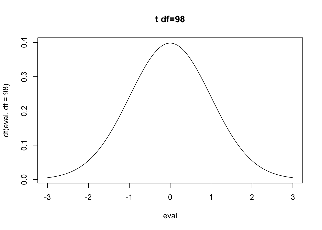
It’s much shallower. Why? The relationship between STR and test scores was driven, in part, by the fact that schools with high numbers of ESL children have both a high STR and low test scores. Once we take into account that fact (by focusing on the relationship within school types) the association between STR and test scores is much lower.
What does this look like in a regression equation?
m <- lm(score ~ STR + high.esl, data=dat)
summary(m)
Call:
lm(formula = score ~ STR + high.esl, data = dat)
Residuals:
Min 1Q Median 3Q Max
-37.857 -10.853 -0.626 10.198 43.834
Coefficients:
Estimate Std. Error t value Pr(>|t|)
(Intercept) 691.3267 8.1315 85.019 < 2e-16 ***
STR -1.3963 0.4171 -3.348 0.000889 ***
high.esl -19.4911 1.5763 -12.365 < 2e-16 ***
---
Signif. codes: 0 '***' 0.001 '**' 0.01 '*' 0.05 '.' 0.1 ' ' 1
Residual standard error: 15.91 on 417 degrees of freedom
Multiple R-squared: 0.3058, Adjusted R-squared: 0.3025
F-statistic: 91.84 on 2 and 417 DF, p-value: < 2.2e-16Helpfully, we are going to read these coefficients in the same way as we did with univariate regression. Each variable still represents how a one unit change in that independent variable is associated with a change in the dependent variable equal to its coefficient. The major difference is that now these numbers are the effect of this variable holding the other variable constant. Another way to think of this is: accounting for the effect of the other variable, what’s the effect of this variable?
So for STR, holding constant whether a school has a high number of ESL students or not, the effect of an additional student for every teacher is to reduce test scores by 1.4 points. Again, we can think of this as the effect within school types. It is shallower because some of the association between STR and Test scores is the common influence of ESL students.
The other variable high.esl is an indicator, which makes interpretation easier. Just as before a “one unit change” for an indicator variable is just changing categories, here from a low to a high ESL school.
Holding constant the student teacher ratio, schools with an above average number of children who have English as their second language perform nearly 20 points worse than schools with a below average number of children who have English as their second language.
What about the intercept? For uni-variate regression we learned that the intercept is the average value of y when x is 0. Helpfully, the same thing applies here, with the caveat that now the intercept is the average value of y variable when all variables are equal to zero. In this case, the intercept is the average test scores when STR is zero (not real) and when high.esl is equal to zero.
This will be true in all regressions going forward: the intercept is the average value of y when all variables are equal to zero.
What then, is the average test scores when STR is equal to zero in high esl schools? It would be 691-19.49! Indeed, when we look at the graph we’ve made, 19.49 is precisely the gap between the red and blue lines.
You may be questioning: why did we run the regression to have an intercept for both groups and a common slope? Why not let the slope vary across the two groups?
First: that’s not really the question we are asking here. We want to know the effect of STR on test scores while taking into account the independent effect of ESL. Letting the slopes vary is a second order question: does STR have a different effect on test scores in the two different types of schools.
Second: we can actually accomplish this, though it is significantly more complicated because we have to multiply or interact the two variables:
\[ test.scores = \alpha + \beta_1*STR + \beta_2*ESL + \beta_3*STR*ESL \]
Models of this type are covered in the Interaction and Prediction chapter, and require a bit of calculus to untangle.
12.3 Multiple continuous variables.
To do the above multiple regression we simplified the english variable – which gives the percent of students who have English as a second language – to a binary (0,1) variable. But what if we want to use it in its original, continuous, form? We think that “controlling” for this variable should have a similar effect on the relationship between STR and test scores as controlling for the high.esl variable we created above. Schools with a high percentage of ESL students are likely to have higher STR and lower test scores.
But now, thinking about our original scatterplot, we can’t easily classify these dots into “high” and “low” as we did before
plot(dat$STR, dat$score, xlab="Student:Teacher Ratio", ylab="Test Score", pch=16)
abline(lm(dat$score ~ dat$STR), lwd=2, col="firebrick")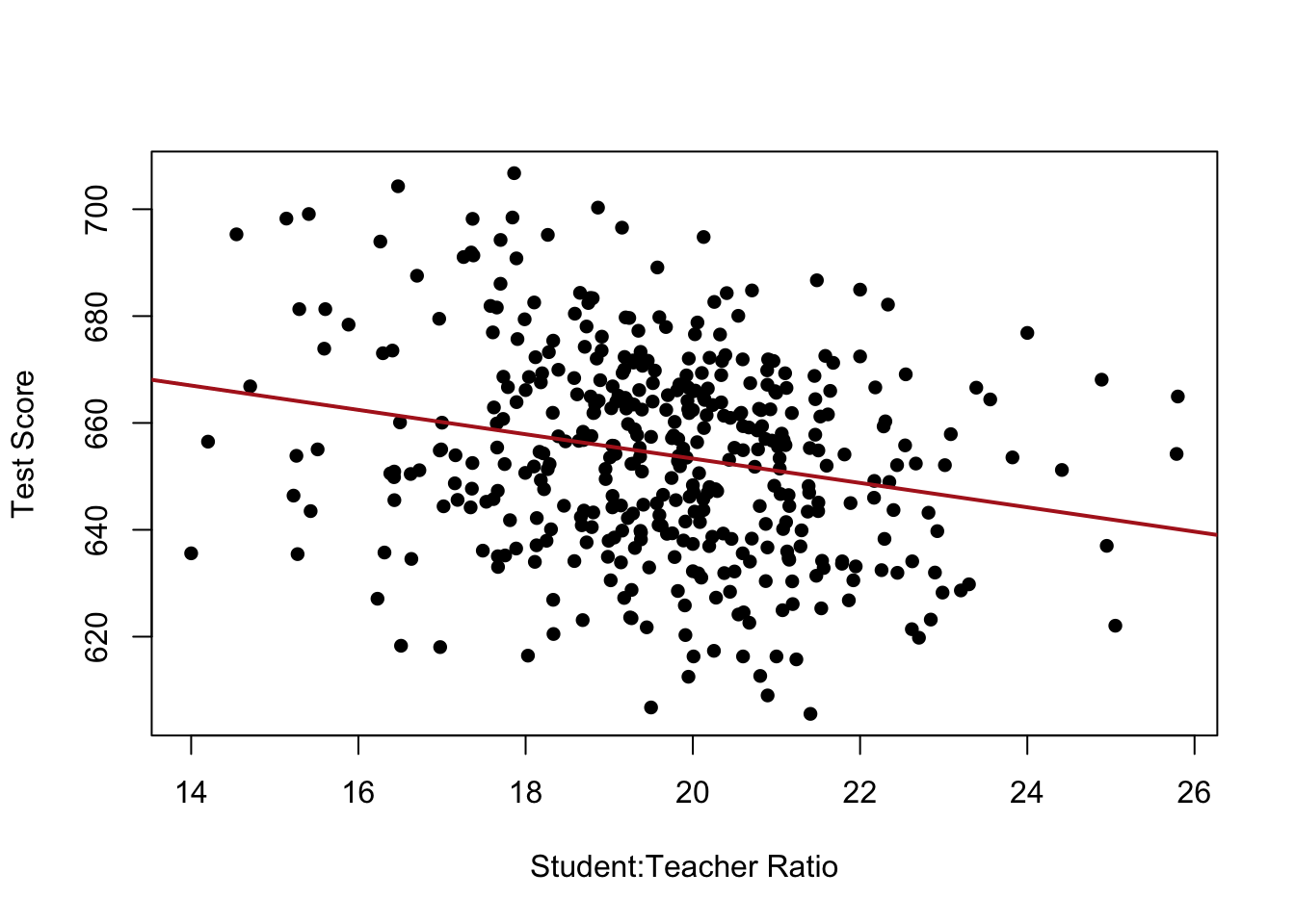
Indeed, now we have to think about there being a whole other dimension to these data now. Think about each of the dots in the above plot having different depths along a third dimension like this:
plot(dat$english, dat$score, xlab="% ESL Students", ylab="Test Score", pch=16)
abline(lm(dat$score ~ dat$english), lwd=2, col="firebrick")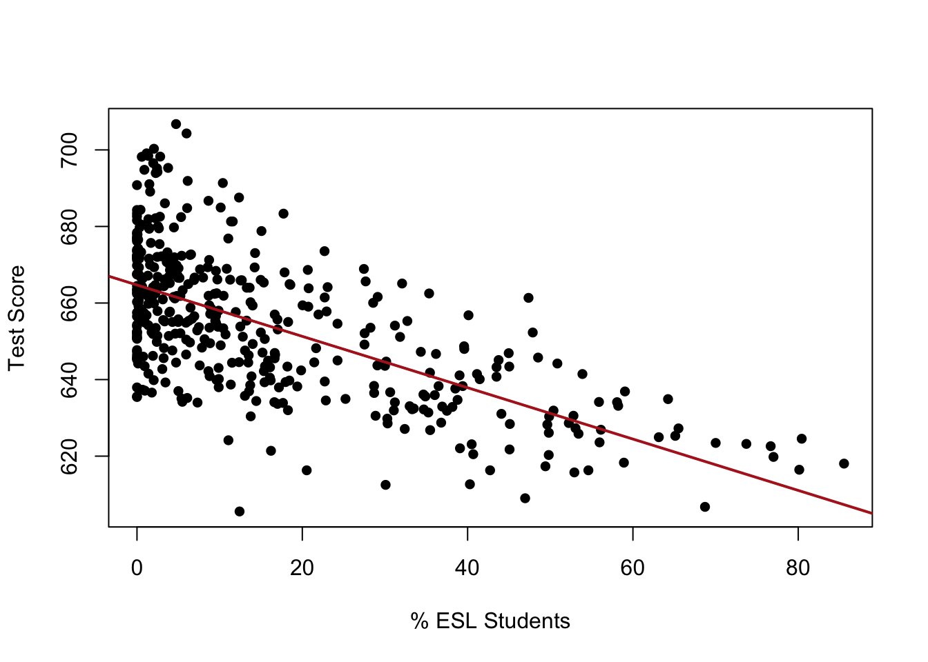
This is, unfortunately, where we leave the realm of easy-to-visualize regression.
If we want we can use plotly to think of this two variable case as a 3d plot:
library(plotly)
fig <- plot_ly(dat, x = ~STR, y = ~english, z = ~score)
fig <- fig %>% add_markers()
fig
This lecture is genuinely the only time I actually do this though. It’s a little helpful to think about it in this particular case, where we can very clearly visualize that the job of regression is to now fit a plane into these data by choosing an intercept and two slopes such that the distance from the plane to all of the points vertically is minimized:
#Fit the two-predictor model
m <- lm(score ~ STR + english, data=dat)

#Grid over the two predictors, and the fitted score at each grid point.
#plotly indexes the z matrix as [y, x], so rows = english (y), columns = STR (x).
str.axis <- seq(min(dat$STR),     max(dat$STR),     length.out = 25)
eng.axis <- seq(min(dat$english), max(dat$english), length.out = 25)
plane <- outer(eng.axis, str.axis,
               function(eng, str) predict(m, newdata = data.frame(english = eng, STR = str)))

#The same scatter as before, with the fitted plane laid over it
fig <- plot_ly(dat, x = ~STR, y = ~english, z = ~score,
               type = "scatter3d", mode = "markers", marker = list(size = 3))
fig <- fig %>% add_surface(x = str.axis, y = eng.axis, z = plane,
                           opacity = 0.6, showscale = FALSE, inherit = FALSE)
fig
There is no way to position that plane vertically or in terms of tilt that leads to a smaller vertical distance between it and each of the points. So in the same way: multiple regression minimizes the sum of squared residuals, but now in multi-dimensional space. (In reality it uses matrix algebra to do this).
While this is a mildly helpful exercise (and one that I do not need you to replicate at any point), if we add just one more variable then this becomes impossible to do because then we would be fitting a 3d cube into a 4 dimensional tesseract(?) space1.
At this point, just thinking about this through the regression output is much more helpful.
m <- lm(score ~ STR + english, data=dat)
summary(m)
Call:
lm(formula = score ~ STR + english, data = dat)

Residuals:
    Min      1Q  Median      3Q     Max
-48.845 -10.240  -0.308   9.815  43.461

Coefficients:
             Estimate Std. Error t value Pr(>|t|)
(Intercept) 686.03224    7.41131  92.566  < 2e-16 ***
STR          -1.10130    0.38028  -2.896  0.00398 **
english      -0.64978    0.03934 -16.516  < 2e-16 ***
---
Signif. codes:  0 '***' 0.001 '**' 0.01 '*' 0.05 '.' 0.1 ' ' 1

Residual standard error: 14.46 on 417 degrees of freedom
Multiple R-squared:  0.4264,    Adjusted R-squared:  0.4237
F-statistic:   155 on 2 and 417 DF,  p-value: < 2.2e-16
Again, what we are seeing here is the association between each of these variables and the dependent variable while holding constant the other.
The helpful thing here is that no matter how many variables we add, and no matter how those variables are measured, we always interpret these models in the exact same way.
The intercept is the average value of y when all variables are equal to 0. So the average test score in a school with no students and all English speakers is 686 (still not helpful).
Each coefficient is the effect of a one-unit shift in that variable holding constant the other.
Holding constant the impact of the percent of students who have English as a second language, the impact of one additional student per teacher is to reduce test scores by 1.1 points.
Holding constant the impact of the student to teacher ratio, the impact of an additional 1% of students having English as a second language is to reduce test scores by .65 points.
12.3.1 What “holding constant” is actually doing
In the first multivariate regression where we made the binary High.ESL variable “holding constant” was very clear: we were restricting the effect of STR on test scores to operate only within school types, such that school type’s influence on test scores was held constant.
When we move to continuous variables the meaning is a bit harder to understand. We can go through a small theoretical process to try to understand it a bit better. To be clear: everything in this section is being done to try to get to the intuition of multiple regression. None of it is necessary to actually “do” regression.
Here is the coefficient we are trying to reproduce:
m.full <- lm(score ~ STR + english, data=dat)
coef(m.full)["STR"]
STR
-1.101296 To try to understand where this comes from we can rebuild that coefficient through a series of bivariate relationships.
First, we can run the bivariate regression of STR on english (the continuous %ESL variable) and record the residual values: the vertical distances from the line to each of the points. We can think of this as the variation in STR that is not explained by the %ESL.
plot(dat$english, dat$STR, xlab = "% ESL", ylab = "STR")
abline(lm(STR ~ english, data=dat))
str.resid <- resid(lm(STR ~ english, data=dat))Then we can do the same for the test score: regress it on english and keep the residuals. This is the part of score that english does not explain.
plot(dat$english, dat$score, xlab = "% ESL", ylab = "Test Scores")
abline(lm(score ~ english, data=dat))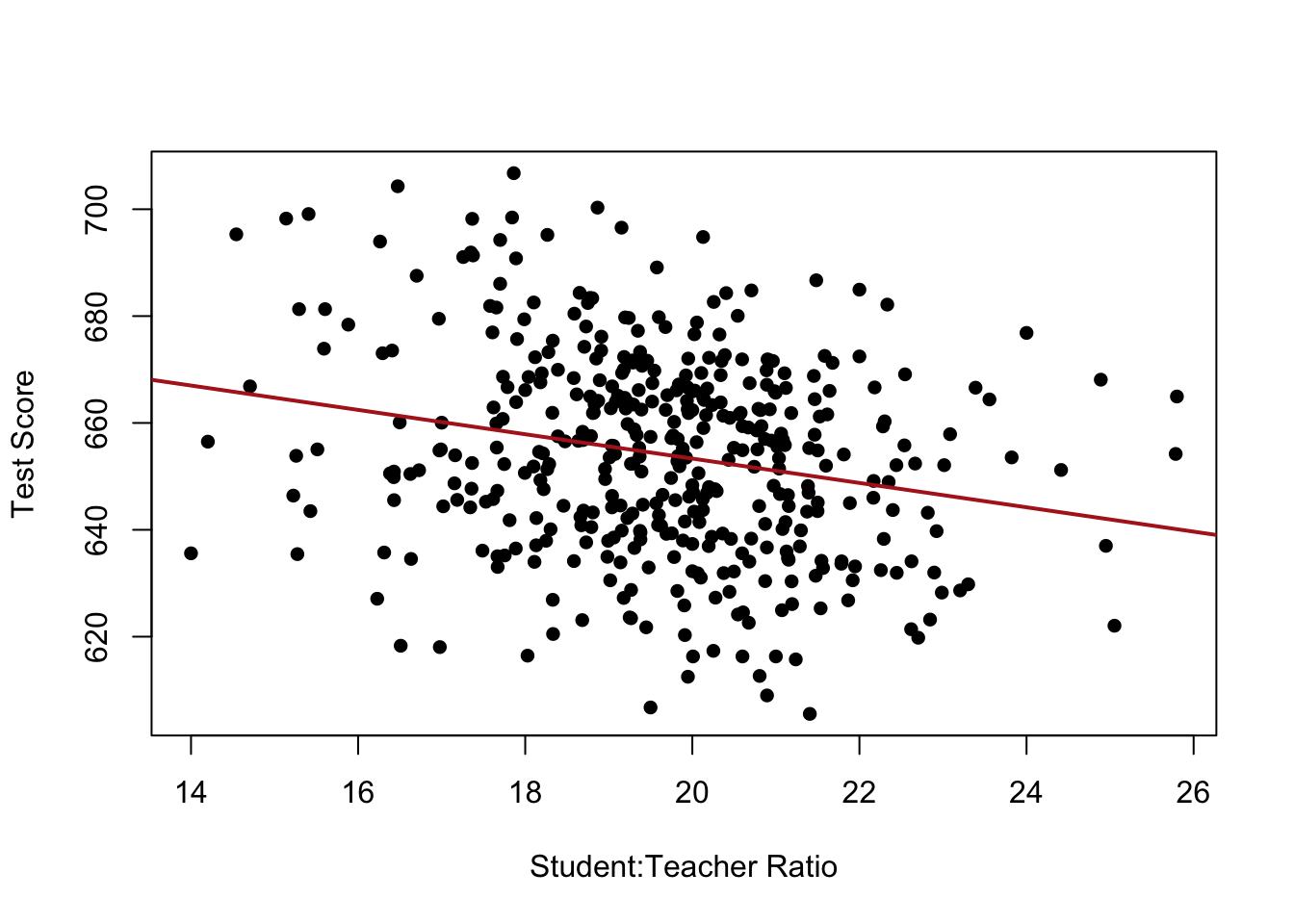
score.resid <- resid(lm(score ~ english, data=dat))Now what we have is the variation of STR that is not explained by %ESL, and the variation in test scores that is not explained by ESL:
plot(str.resid, score.resid, xlab = "Variation in STR not explained by %ESL",
     ylab = "Variation in Test Scores not explained by %ESL",
     main = "Added Variable Plot" )
abline(lm(score.resid ~ str.resid))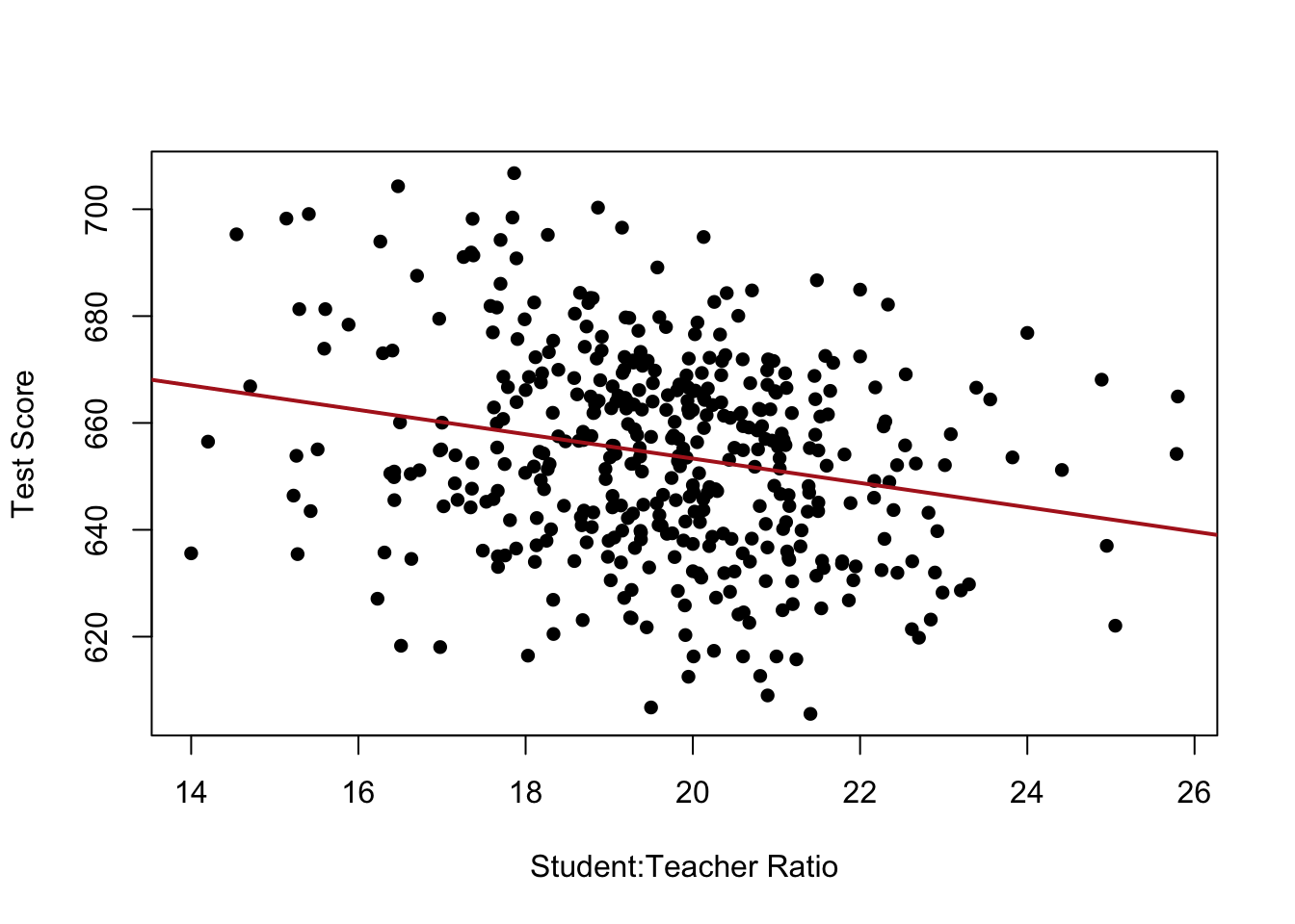
If we recover the slope of that regression line:
coef(lm(score.resid ~ str.resid))[2]str.resid
-1.101296 This slope is exactly the STR coefficient from the full model.
In this way we can see that “controlling for %ESL” means stripping the %ESL-related variation out of both variables, and then looking at the relationship in what is left.
Again: the steps I have given you to interpret regression will continue to work (even as we scale up the number of variables in the next section) so you don’t really need to further understand what is happening when we are “controlling”, but this should give you a bit more intuition into it.
12.4 Many variables
While visualization becomes harder/impossible with additional variables, the logic of interpreting regression coefficients is infinitely scalable. The coefficients will always be the impact of a one-unit change in the variable on the dependent variable, holding the other variables constant. The intercept is always the average value of y when all variables equal to 0.
So if we want to assess the impact of STR while controlling for % of students getting subsidized lunch as well as the income:
m <- lm(score ~ STR + english + lunch + income, data=dat)
summary(m)
Call:
lm(formula = score ~ STR + english + lunch + income, data = dat)

Residuals:
     Min       1Q   Median       3Q      Max
-30.7085  -4.9977  -0.2014   4.8411  28.7000

Coefficients:
             Estimate Std. Error t value Pr(>|t|)
(Intercept) 675.60821    5.30886 127.261  < 2e-16 ***
STR          -0.56039    0.22861  -2.451   0.0146 *
english      -0.19433    0.03138  -6.193 1.42e-09 ***
lunch        -0.39637    0.02741 -14.461  < 2e-16 ***
income        0.67498    0.08333   8.100 6.19e-15 ***
---
Signif. codes:  0 '***' 0.001 '**' 0.01 '*' 0.05 '.' 0.1 ' ' 1

Residual standard error: 8.448 on 415 degrees of freedom
Multiple R-squared:  0.8053,    Adjusted R-squared:  0.8034
F-statistic: 429.1 on 4 and 415 DF,  p-value: < 2.2e-16
Note that regression does not care about the order of variables on the “right hand” side of the equation because it is just addition:
m <- lm(score ~english + income + STR +  lunch, data=dat)
summary(m)
Call:
lm(formula = score ~ english + income + STR + lunch, data = dat)

Residuals:
     Min       1Q   Median       3Q      Max
-30.7085  -4.9977  -0.2014   4.8411  28.7000

Coefficients:
             Estimate Std. Error t value Pr(>|t|)
(Intercept) 675.60821    5.30886 127.261  < 2e-16 ***
english      -0.19433    0.03138  -6.193 1.42e-09 ***
income        0.67498    0.08333   8.100 6.19e-15 ***
STR          -0.56039    0.22861  -2.451   0.0146 *
lunch        -0.39637    0.02741 -14.461  < 2e-16 ***
---
Signif. codes:  0 '***' 0.001 '**' 0.01 '*' 0.05 '.' 0.1 ' ' 1

Residual standard error: 8.448 on 415 degrees of freedom
Multiple R-squared:  0.8053,    Adjusted R-squared:  0.8034
F-statistic: 429.1 on 4 and 415 DF,  p-value: < 2.2e-16
Now each of these variables represents how a one-unit shift in that variable influences test scores, holding the other variables constant. I am not going to write these all out, but you should be able to say them out loud by now!
The intercept of this model is the average value of y when all of the predictor variables are equal to zero. This becomes an increasingly absurd number! The average test score in a school with all english speaking students, 0 income, no students, and no students getting a subsidized lunch is 675. Ok!
12.4.1 Statistical and Substantive Significance
Notably, each of these variables is “statistically significant”: we are confident that the effect is not zero in the population. Does that mean that each of these variables is equally important in determining test scores? I see that the “p-value” on STR is larger than for the other variables, does that mean it has a less important impact?
This is where we go from judging “statistical” significance to “substantive” significance.
The first pitfall is that we cannot judge how substantively significant something is based on its statistical significance. Do not do this! Statistical significance has lots of inputs which makes it completely unsuitable for judging how “important” something is. Indeed, I would encourage you to think of statistical significance as a simple “yes” or “no” and nothing more.
If we can’t use p-values to judge how substantively important something is can we use the size of coefficients? Well that’s problematic too! Remember that a regression coefficient is simply the impact of a one unit change of x on y, but “one unit” for a variable is different from “one unit” for another.
Consider the role of income in our results right now. The coefficient is .67, which indicates that for every one unit change in that variable test scores increase by .67 points. What is “one unit” for this variable?
summary(dat$income) Min. 1st Qu. Median Mean 3rd Qu. Max.
5.335 10.639 13.728 15.317 17.629 55.328 Now using my judgement this is almost certainly average income measured in thousands of dollars. We can rely on the documentation for data to tell us, but you also just have to look at the data and make an assessment. Use your judgement.
OK, so this is measured in thousands of dollars. What if, instead, we convert this to be in dollars?
dat$income2 <- dat$income*1000And re-run our regression:
m <- lm(score ~english + income2 + STR +  lunch, data=dat)
summary(m)
Call:
lm(formula = score ~ english + income2 + STR + lunch, data = dat)

Residuals:
     Min       1Q   Median       3Q      Max
-30.7085  -4.9977  -0.2014   4.8411  28.7000

Coefficients:
              Estimate Std. Error t value Pr(>|t|)
(Intercept)  6.756e+02  5.309e+00 127.261  < 2e-16 ***
english     -1.943e-01  3.138e-02  -6.193 1.42e-09 ***
income2      6.750e-04  8.333e-05   8.100 6.19e-15 ***
STR         -5.604e-01  2.286e-01  -2.451   0.0146 *
lunch       -3.964e-01  2.741e-02 -14.461  < 2e-16 ***
---
Signif. codes:  0 '***' 0.001 '**' 0.01 '*' 0.05 '.' 0.1 ' ' 1

Residual standard error: 8.448 on 415 degrees of freedom
Multiple R-squared:  0.8053,    Adjusted R-squared:  0.8034
F-statistic: 429.1 on 4 and 415 DF,  p-value: < 2.2e-16
First: notice that none of the other coefficients changed their values. Second: now the coefficient for income is .00067. Is income suddenly 1000 times less important because now we are expressing it differently? No! This is the exact same relationship, but now “one unit” means something different: the impact of one dollar instead of the impact of 1000 dollars.
Generalizing across all the variables, because these are all different things measured on different scales we can’t rely on certain coefficients being larger than others to indicate which is more important.
One good way to understand the relative impact of variables is to determine how a one standard-deviation shift in each of the variables affects the dependent variable. This allows a like-to-like comparison based on the amount each variable varies.
m <- lm(score ~english + income + STR +  lunch, data=dat)
summary(m)
Call:
lm(formula = score ~ english + income + STR + lunch, data = dat)

Residuals:
     Min       1Q   Median       3Q      Max
-30.7085  -4.9977  -0.2014   4.8411  28.7000

Coefficients:
             Estimate Std. Error t value Pr(>|t|)
(Intercept) 675.60821    5.30886 127.261  < 2e-16 ***
english      -0.19433    0.03138  -6.193 1.42e-09 ***
income        0.67498    0.08333   8.100 6.19e-15 ***
STR          -0.56039    0.22861  -2.451   0.0146 *
lunch        -0.39637    0.02741 -14.461  < 2e-16 ***
---
Signif. codes:  0 '***' 0.001 '**' 0.01 '*' 0.05 '.' 0.1 ' ' 1

Residual standard error: 8.448 on 415 degrees of freedom
Multiple R-squared:  0.8053,    Adjusted R-squared:  0.8034
F-statistic: 429.1 on 4 and 415 DF,  p-value: < 2.2e-16
For STR the standard deviation is:
sd(dat$STR)[1] 1.891812The coefficient in the model is -.56, which indicates a one-unit shift. To find a standard deviation shift:
-.56*1.89[1] -1.0584If we want to do this in a slightly more systematic way we can standardize our variables before we put them into the model. To standardize a variable we subtract off the mean and divide by the standard deviation. By definition this will lead to variables that all have mean zero (remember this) and have a standard deviation of 1 (remember this).
library(tidyverse)
stdrz <- function(x){
  (x-mean(x,na.rm=T))/sd(x,na.rm=T)
}

dat |>
  mutate(across(c(english, income, STR, lunch), stdrz)) -> dat

#All independent variables mean=0 sd=1
mean(dat$lunch)
[1] 1.700062e-15sd(dat$lunch)[1] 1Now let’s run the regression:
m <- lm(score ~english + income + STR +  lunch, data=dat)
summary(m)
Call:
lm(formula = score ~ english + income + STR + lunch, data = dat)

Residuals:
     Min       1Q   Median       3Q      Max
-30.7085  -4.9977  -0.2014   4.8411  28.7000

Coefficients:
            Estimate Std. Error  t value Pr(>|t|)
(Intercept) 654.1565     0.4122 1586.963  < 2e-16 ***
english      -3.5535     0.5738   -6.193 1.42e-09 ***
income        4.8774     0.6021    8.100 6.19e-15 ***
STR          -1.0602     0.4325   -2.451   0.0146 *
lunch       -10.7508     0.7434  -14.461  < 2e-16 ***
---
Signif. codes:  0 '***' 0.001 '**' 0.01 '*' 0.05 '.' 0.1 ' ' 1

Residual standard error: 8.448 on 415 degrees of freedom
Multiple R-squared:  0.8053,    Adjusted R-squared:  0.8034
F-statistic: 429.1 on 4 and 415 DF,  p-value: < 2.2e-16
OK so let’s interpret this regression with the new scale of these variables in mind.
Each coefficient represents how a one unit shift in that variable influences test scores. But now one unit for each of these variables is equal to a standard deviation! They are now all on the same scale and we can directly compare them. So we can see that a standard deviation shift in the percent of students receiving a free lunch leads to a nearly 11 point drop in test scores. Much more impactful than a standard deviation shift in the student-teacher ratio, which is around a 1 point drop. Overall it feels like the material condition of the students is more impactful here (though I am not an economist or education specialist!)
Let’s notice one other, extremely cool, part of standardizing the variables going into a regression. We have watched as the intercept has become an increasingly useless number as it started to represent the average test scores of a school that cannot possibly exist (no students, 0 income etc.)
But remember: when we standardize the variables it makes all of their means 0. That means that the intercept now is the average value of y when all of the variables are at their means. That is actually an extremely helpful number to know! The average test scores for a school with the average level of ESL kids, income, free lunch, and STR is 654.
12.5 What variables to add?
It’s important to note that this is just enough information to get yourself in trouble. Specifying a regression is hard, theoretical, work. There are some big pitfalls to be aware of.
Primarily: more variables isn’t necessarily better! Indeed, adding certain types of variables can actually make your estimates worse. Regression can be tricky, and I wouldn’t go out applying this to all sorts of things without learning more about the theory.
I want to cover three potential pitfalls: two having to do with bias, and one having to do with variance.
12.5.1 Post Treatment Bias
Imagine we had a dataset that had whether people smoked or not, whether they got pneumonia in the hospital or not, and whether they died.
set.seed(19104)
n <- 100000
smoke     <- rbinom(n, 1, 0.3)                    #30% of people smoke
pneumonia <- rbinom(n, 1, 0.05 + 0.30*smoke)      #smoking raises pneumonia risk: 5% -> 35%
die       <- rbinom(n, 1, 0.05 + 0.50*pneumonia)  #pneumonia raises death risk; smoking has no direct effect
We are trying to estimate the effect of smoking on death so we estimate:
lm(die ~ smoke)
Call:
lm(formula = die ~ smoke)

Coefficients:
(Intercept)        smoke
    0.07438      0.15026
These are both binary variables so being a smoker raises the probability of death by 15 percentage points.
But being careful (and over-eager) scientists, we see that pneumonia is in the dataset so we decide to add it to the regression:
lm(die ~ smoke + pneumonia)
Call:
lm(formula = die ~ smoke + pneumonia)

Coefficients:
(Intercept)        smoke    pneumonia
  4.959e-02   -4.191e-05    4.967e-01
In this model pneumonia is now positive and significant, indicating that having pneumonia (in the hospital) raises your probability of death by 50 percentage points. However, in this model the effect of smoking is now 0.
So should we conclude that smoking has no “real” effect on death because it doesn’t survive the inclusion of control of variables?
No! This is probably the most common mistake made in regression: controlling on a post-treatment variable.
In this (made up, slightly absurd) example, the effect of smoking entirely runs through pneumonia. In other words: the way that smokers die in this model is by getting pneumonia. Within the people who have pneumonia smoking has no extra explanatory power, making it look harmless.
With omitted variable bias we want to control for things that cause both our independent and dependent variable. As we saw above for the school example omitted variables have this pattern of causal influence:
For post-treatment bias we want to avoid controlling for anything that is caused by our independent variable and in turn causes the dependent variable. Carefully note the direction of these arrows compared to above!
Another example is looking at the effects of gender on wages controlling for length of parental leave. Gender is a cause of longer parental leave, and longer parental leave is a cause of lower wages. Looking within levels of parental leave we will find a smaller impact of gender on wages, but this is because we are controlling away (one of) the reasons why women get paid lower wages!
This all being said, there is a specific form of regression analysis, mediation analysis that conditions on post-treatment bias intentionally to try to determine the relative strengths of different pathways. This is beyond the scope of this class, and you shouldn’t do it unless you are doing it on purpose!
12.5.2 The opposite mistake: controlling for a collider
A collider is a common effect of two variables. Controlling for a collider does the reverse of controlling for a confounder: instead of removing a spurious relationship, it creates one.
To be an actor (I don’t know anything about acting) you have to be some combination of good looking and talented. Let’s suppose that being a talented actor is completely unrelated to being good looking (Wallace Shawn). But you have to have some combination of talent and looks to actually make it: very good looking bad actors can make it, and very good acting uggos can make it.
set.seed(19104)
n <- 5000
talent <- rnorm(n)
looks  <- rnorm(n)
actor <- (talent + looks) > 1
So if we look at the relationship between being talented and good looking:
cor(talent,looks)[1] -0.01233266lm(talent ~ looks)
Call:
lm(formula = talent ~ looks)

Coefficients:
(Intercept)        looks
    0.01145     -0.01216
We find a 0 correlation and an extremely small regression coefficient. Basically just noise.
However if we condition this relationship on being an actor:
lm(talent ~ looks + actor)
Call:
lm(formula = talent ~ looks + actor)

Coefficients:
(Intercept)        looks    actorTRUE
    -0.3807      -0.3662       1.6101
Suddenly there is a negative relationship between looks and talent!
The way we can think about this is, looking within actors there is a negative correlation between looks and talent:
cor(talent[actor==1], looks[actor==1])[1] -0.6555909The actors who aren’t good-looking got there on talent, and the ones who can’t act got there on looks. Selecting on “is a working actor” — a variable caused by both traits — manufactures a correlation that isn’t really there.
From a regression perspective we can think about this as conditioning on a collider, a variable that is caused by both our main independent variable and the dependent variable:
Controlling for a collider induces a false relationship between your X and Y variables.
Another example of this might be that there is little, or maybe a slightly positive, relationship between GRE scores and research ability in graduate school. However, to get admitted to a PhD program you have to have a combination of both of those things, and there will be a significant number of people who have low GRE scores and good research ability; and some with low research ability but high GRE scores. Because of this, if you look at the relationship between GRE scores and research ability conditional on acceptance to a PhD program you will find a negative relationship.
While conditioning on a collider variable is always wrong, the more general term for this phenomenon where variables get a spurious correlation because of a selection mechanism (height and scoring are negatively correlated in the NBA!) is Berkson’s Paradox.
To sum up our set:
- Confounder (common cause of x and y): control for it.
- Mediator (on the path from x to y): don’t control unless you mean to — that’s post-treatment bias.
- Collider (common effect of x and y): never control for it — it invents a relationship.
12.5.3 Inflated Standard Errors from Multi-collinearity
Even if we identify a confounding variable (or at least are convinced that it’s not post-treatment or a collider), then we still have to consider the potential effect of adding an additional variable on the standard error of our initial estimates.
Where we get into trouble is adding a control variable that is highly correlated with any of the existing variables in your data. When a control variable is highly correlated you introduce multi-collinearity, which will increase the width of your sampling distribution. Again: this has nothing to do with the coefficient, but with the standard error.
Let’s simulate this. We have two predictors x1 and x2, and we are going to vary the degree to which they are correlated with one another. Our primary interest is the coefficient on x1 which we will set to be 2. In this simulation we are going to record the average estimate of the coefficient as well as the spread of the estimates (i.e. the standard deviation of the sampling distribution, which is the standard error).
library(MASS)
set.seed(19104)

n <- 200
rhos <- seq(0, 0.95, 0.05)          #correlations between x1 and x2 to test
mean.b1 <- rep(NA, length(rhos))
se.b1   <- rep(NA, length(rhos))

for(j in 1:length(rhos)){
  Sigma <- rbind(c(1, rhos[j]), c(rhos[j], 1))
  b1 <- rep(NA, 500)
  for(i in 1:500){
    X <- mvrnorm(n, mu=c(0,0), Sigma=Sigma)
    y <- 2*X[,1] + 2*X[,2] + rnorm(n, 0, 1)   #true coefficient on x1 is 2
    b1[i] <- coef(lm(y ~ X[,1] + X[,2]))[2]
  }
  mean.b1[j] <- mean(b1)            #average estimate of beta1
  se.b1[j]   <- sd(b1)             #spread of estimates = the standard error
}
Here is the value of the coefficient at each level of correlation between x1 and x2. There is no effect on the value of the coefficient on x1. Again: this doesn’t have to do anything with bias! No matter the correlation we are correctly specifying the regression so we return the right estimate.
plot(rhos, mean.b1, ylim=c(0,4),
     xlab="Correlation between x1 and x2", ylab="Mean estimate of beta1")
abline(h=2, lty=2)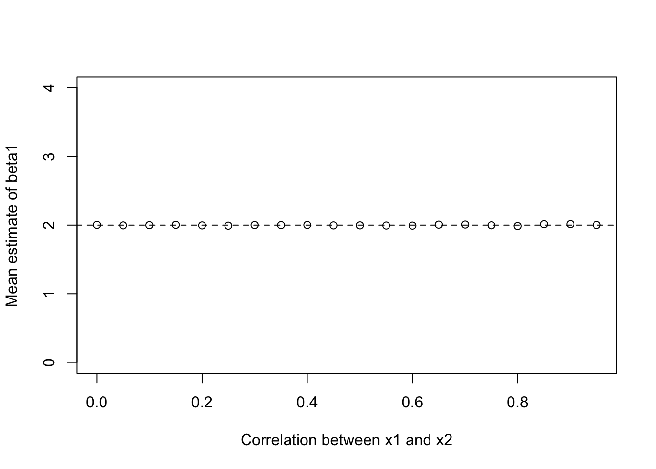
But look what our standard error on the coefficient for x1 does as we add an increasingly correlated covariate.
plot(rhos, se.b1, type="b",
     xlab="Correlation between x1 and x2", ylab="Standard error of beta1")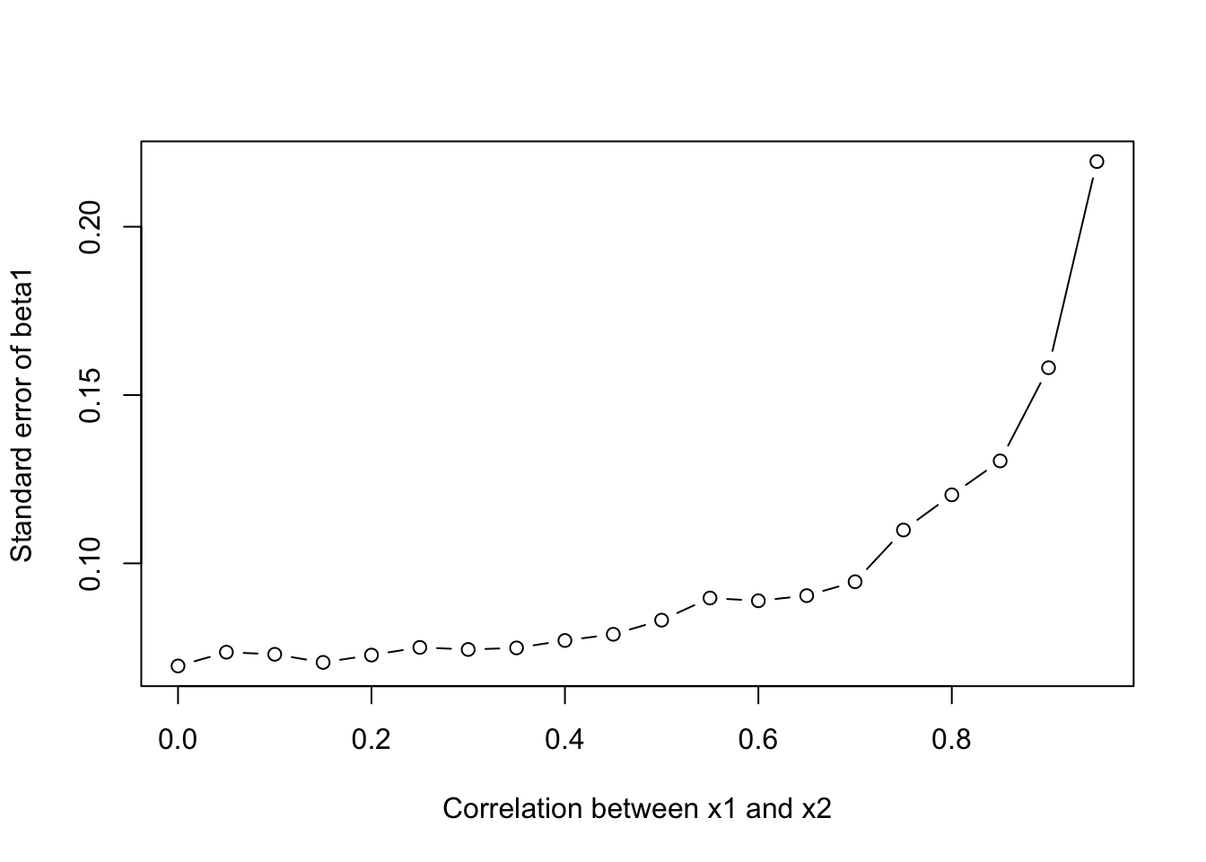
The standard error goes from about 0.07 when the predictors are uncorrelated to about 0.22 when they are correlated at 0.95. When x1 and x2 move together the data cannot cleanly separate their effects so each coefficient is estimated less precisely.
12.6 Regression with categorical variables.
Let’s load in data from the American Community Survey about various features of US counties:
acs <- rio::import("https://github.com/marctrussler/IIS-Data/raw/main/ACSCountyData.csv", trust=T)I want to know how population density relates to transit ridership in the US. The variable population.density is the number of people per square mile in these counties and percent.transit.commute is exactly what it sounds like. At a baseline, what is the correlation between these things?
cor(acs$population.density, acs$percent.transit.commute, use="pairwise.complete")[1] 0.8230231Very high!
Having population density is great, but what if instead of this very continuous measure we simply had a classification of whether a county was rural urban or suburban, split in this way:
acs$density[acs$population.density<50] <- 1
acs$density[acs$population.density>=50 & acs$population.density<1000] <- 2
acs$density[acs$population.density>=1000] <- 3

table(acs$density)
   1    2    3
1689 1304  149
How would we find the effect of this three-category population density variable on the percent of people commuting by transit?
First, let’s take a look at this relationship:
plot(acs$density, acs$percent.transit.commute)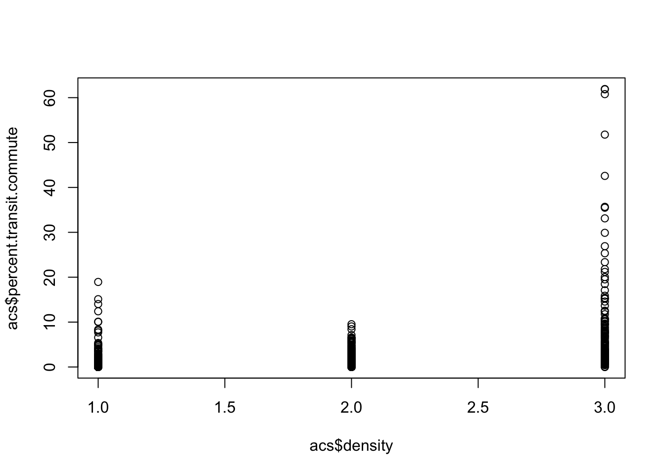
It’s pretty hard to determine what’s going on here, but it looks positive to me…
A slightly better way to visualize would be:
boxplot(acs$percent.transit.commute ~ acs$density)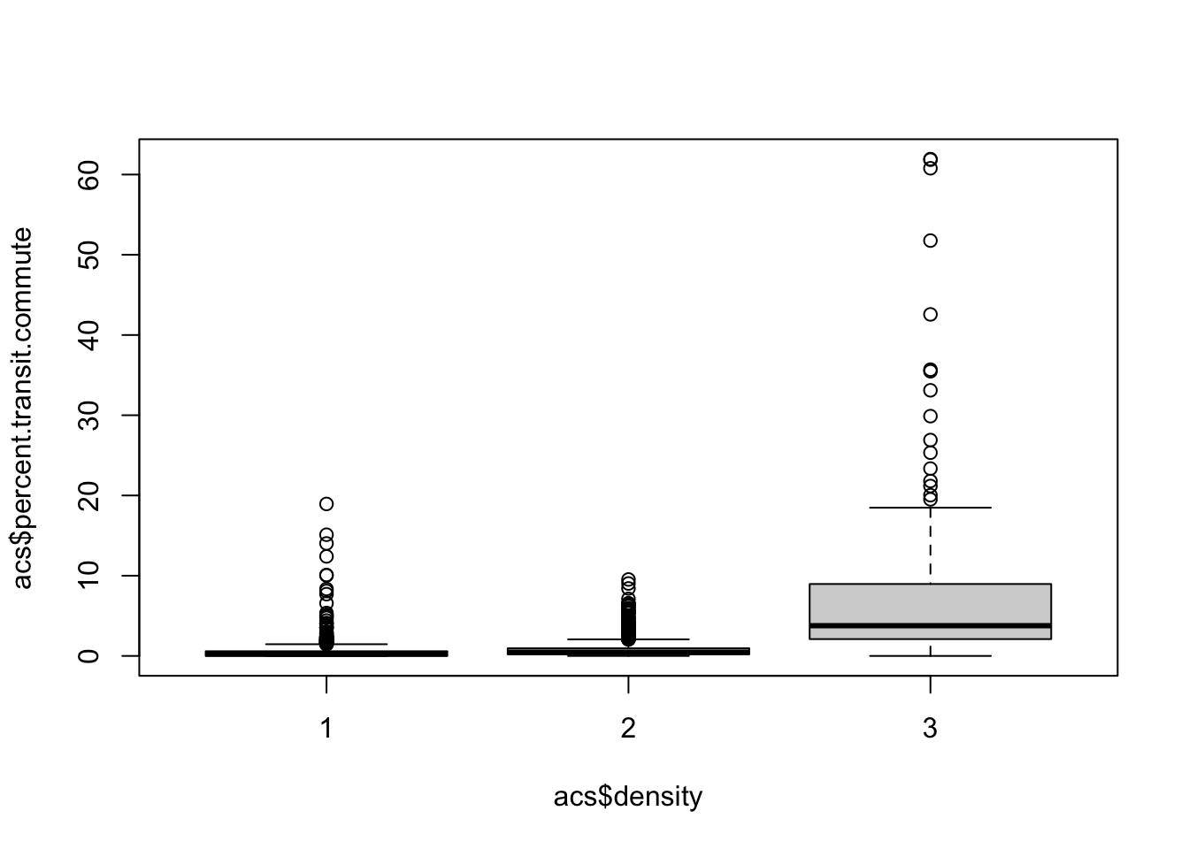
boxplot(acs$percent.transit.commute ~ acs$density, outline=F)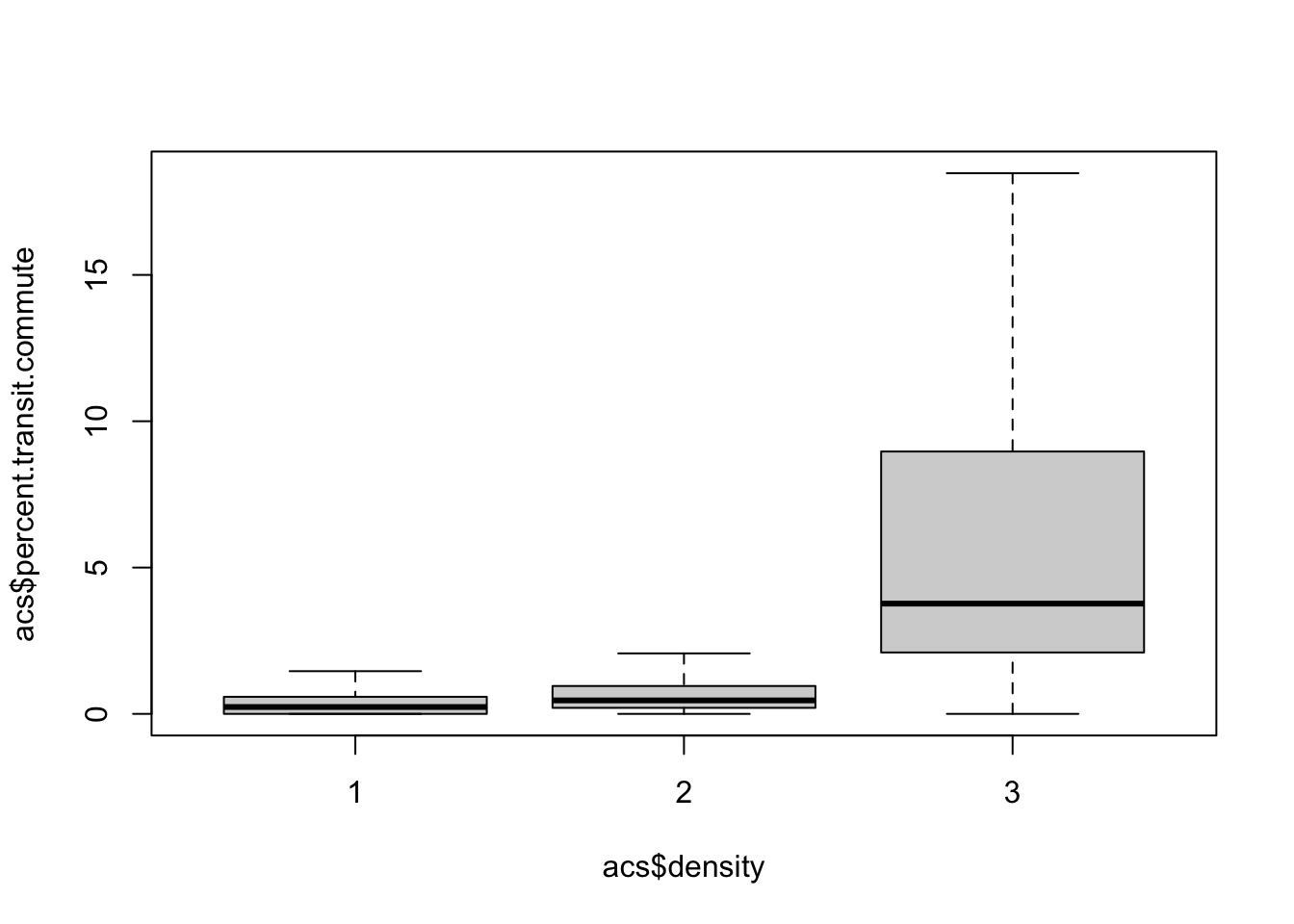
Can we summarize this with a regression?
Yes! Regression only needs numeric inputs, so this will totally work fine mechanically.
m <- lm(percent.transit.commute ~ density, data=acs)
summary(m)
Call:
lm(formula = percent.transit.commute ~ density, data = acs)

Residuals:
   Min     1Q Median     3Q    Max
-3.606 -1.296 -0.083  0.307 58.319

Coefficients:
            Estimate Std. Error t value Pr(>|t|)
(Intercept) -1.67845    0.14583  -11.51   <2e-16 ***
density      1.76132    0.09001   19.57   <2e-16 ***
---
Signif. codes:  0 '***' 0.001 '**' 0.01 '*' 0.05 '.' 0.1 ' ' 1

Residual standard error: 2.962 on 3139 degrees of freedom
  (1 observation deleted due to missingness)
Multiple R-squared:  0.1087,    Adjusted R-squared:  0.1084
F-statistic: 382.9 on 1 and 3139 DF,  p-value: < 2.2e-16
But we have to be careful about how we interpret this. The coefficient on density is 1.76. Every one unit increase in density leads to an additional 1.76 percentage point of the population commuting by transit. What is 1 unit for this variable? It is moving from rural to suburban, or from suburban to urban.
So what is the effect of moving from rural to urban? \(1.76+1.76=3.52\).
What does the intercept represent here? We know the intercept is the average value of percent.transit.commute when all variables are 0. What does that mean here? It’s gibberish! density can’t take on the value of 0 so this is not a helpful number.
Are we happy with this regression? Let’s look at the scatterplot:
plot(acs$density, acs$percent.transit.commute, xlim=c(0,4))
abline(m, col="firebrick", lwd=2)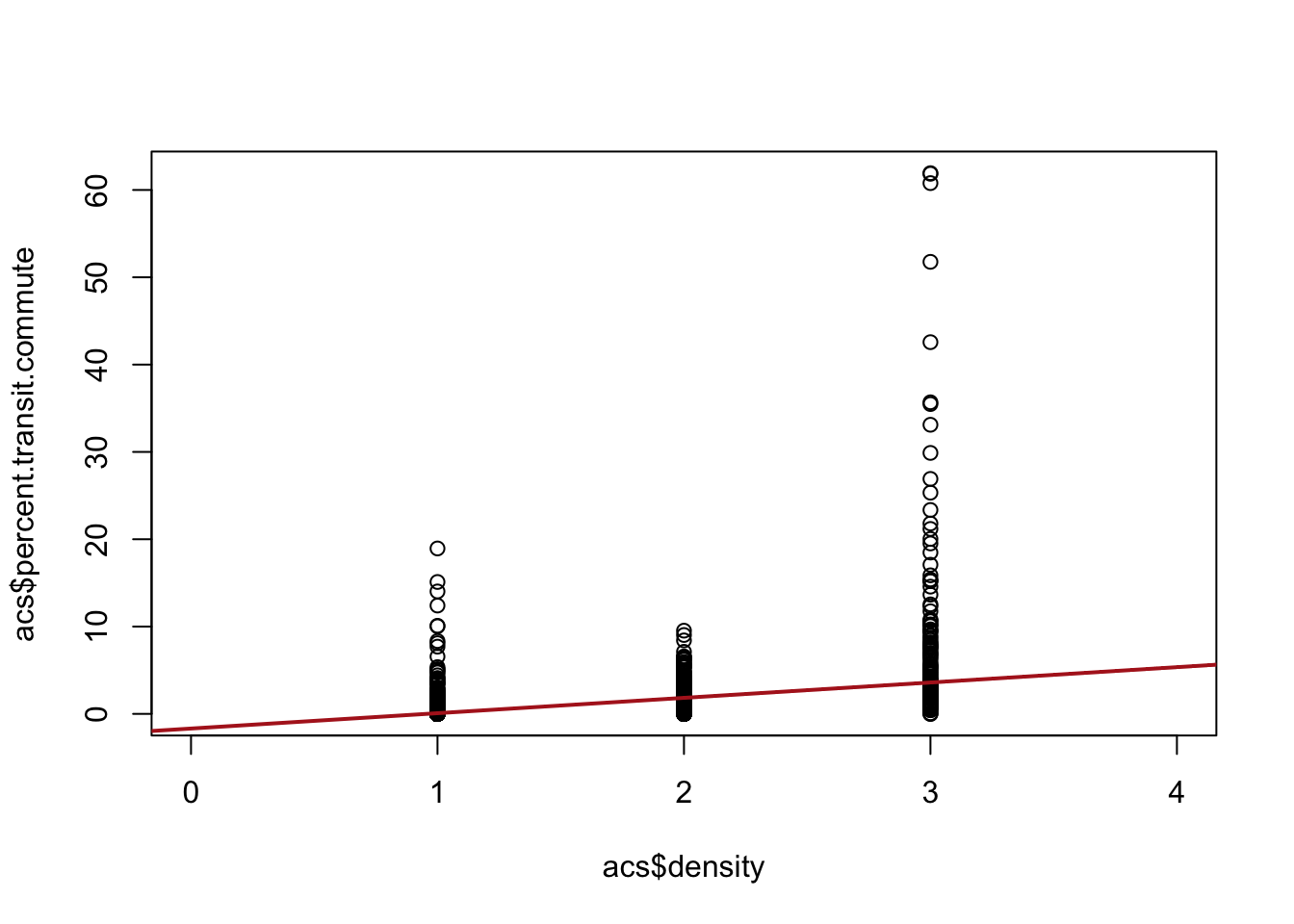
If we are willing to assume that the jumps from one level (rural to suburban, suburban to urban) are all equal then this regression is fine. We just treat the variable as-if it was a continuous variable. But in this case this doesn’t seem to be the case. Here the jump from suburban to urban matters a lot more and we are smoothing over it in a way that is problematic. We need a method that allows us to understand those two jumps are of different sizes.
To further motivate what we are about to show, this sort of logic would completely break down if we wanted to use an un-ordered categorical variable in a regression. Below we will try to “control” for census region. That’s not a numeric variable that we can just throw into a regression model and make some assumptions about.
12.6.1 Adding categorical variables as factor variables
Instead of consider our Urban/Suburban/Rural variable as a continuous numeric variable, we instead are going to create three dummy variables, one for each of the categories:
table(acs$density)
   1    2    3
1689 1304 149 acs$rural <- acs$density==1
acs$suburban <- acs$density==2
acs$urban <- acs$density==3Now we are going to include all three of these variables in the regression:
m <- lm(percent.transit.commute ~ rural + suburban + urban, data=acs)
summary(m)
Call:
lm(formula = percent.transit.commute ~ rural + suburban + urban,
    data = acs)

Residuals:
   Min     1Q Median     3Q    Max
-8.150 -0.484 -0.298  0.116 53.774

Coefficients: (1 not defined because of singularities)
             Estimate Std. Error t value Pr(>|t|)
(Intercept)    8.1501     0.2207   36.92   <2e-16 ***
ruralTRUE     -7.6661     0.2303  -33.29   <2e-16 ***
suburbanTRUE  -7.3445     0.2330  -31.52   <2e-16 ***
urbanTRUE          NA         NA      NA       NA
---
Signif. codes:  0 '***' 0.001 '**' 0.01 '*' 0.05 '.' 0.1 ' ' 1

Residual standard error: 2.695 on 3138 degrees of freedom
  (1 observation deleted due to missingness)
Multiple R-squared:  0.2626,    Adjusted R-squared:  0.2622
F-statistic: 558.9 on 2 and 3138 DF,  p-value: < 2.2e-16
Ok well, we got an output, but we only got a coefficient for two of the three categories. Did we make a mistake?
Let’s think about these three variables together. Here are the first six rows of these three variables.
head(acs[c("rural","suburban","urban")]) rural suburban urban
1 FALSE TRUE FALSE
2 TRUE FALSE FALSE
3 TRUE FALSE FALSE
4 FALSE TRUE FALSE
5 FALSE TRUE FALSE
6 TRUE FALSE FALSEThese three variables are (purposively!) mutually exclusive and exhaustive. You have to be in exactly one of these categories, you cannot be in more than one, and you cannot be in zero.
The last part gives us the best clue of what happened in our regression. Remember, what does the intercept always represent? The intercept is the average value of y when all the explanatory variables are equal to 0. What does it mean for all of these variables to be equal to zero (FALSE). They can’t be. That’s impossible. If all three of these variable are included then we could not identify an intercept.
So R necessarily drops one of the variables. We can have R do this for us, or we can decide to do it ourselves:
m <- lm(percent.transit.commute ~ rural +suburban, data=acs)
summary(m)
Call:
lm(formula = percent.transit.commute ~ rural + suburban, data = acs)

Residuals:
   Min     1Q Median     3Q    Max
-8.150 -0.484 -0.298  0.116 53.774

Coefficients:
             Estimate Std. Error t value Pr(>|t|)
(Intercept)    8.1501     0.2207   36.92   <2e-16 ***
ruralTRUE     -7.6661     0.2303  -33.29   <2e-16 ***
suburbanTRUE  -7.3445     0.2330  -31.52   <2e-16 ***
---
Signif. codes:  0 '***' 0.001 '**' 0.01 '*' 0.05 '.' 0.1 ' ' 1

Residual standard error: 2.695 on 3138 degrees of freedom
  (1 observation deleted due to missingness)
Multiple R-squared:  0.2626,    Adjusted R-squared:  0.2622
F-statistic: 558.9 on 2 and 3138 DF,  p-value: < 2.2e-16
Ok, so now we have no NA, but are no longer considering urban counties? Let’s think through what this regression is telling us.
The intercept is the average value of y when all variables are equal to 0. What does it mean for rural and suburban to both be equal to 0? That’s an urban county! The intercept here is the average value of \(y\) for urban counties:
mean(acs$percent.transit.commute[acs$urban], na.rm=T)[1] 8.150127What, then, do the coefficients represent? They are how a one unit change in that variable relates to a change in y.
What does it mean for rural to go from 0 to 1? That is just turning on that indicator, meaning going from not a rural county to a rural county reduces the percent transit commute by about 7.5 points. But reduces it from what?
We can think this through via the regression equation:
\[ percent.transit.commute = 8.15 - 7.66*Rural - 7.34*Suburban \]
If we want to think about our predicted level of transit commuting for a rural place, that is just when rural is equal to 1. When rural is equal to 1, suburban must be equal to 0 (you can’t be both!). So therefore the predicted level of transit commuting in rural places is:
8.15-7.66[1] 0.49about half a percent.
Indeed, because there are no other variables in the model right now, this is actually just the mean level in that place:
mean(acs$percent.transit.commute[acs$rural],na.rm=T)[1] 0.4840288And the coefficient on rural is just the difference in the mean level in urban (the intercept) and rural places:
mean(acs$percent.transit.commute[acs$rural],na.rm=T) - mean(acs$percent.transit.commute[acs$urban],na.rm=T)[1] -7.666099So these dummy variables are just recovering the differences in means between these categories. That means that if we change what the omitted/intercept category is, the numbers will change but the inter-relationships will be identical:
m <- lm(percent.transit.commute ~ urban + suburban, data=acs)
summary(m)
Call:
lm(formula = percent.transit.commute ~ urban + suburban, data = acs)

Residuals:
   Min     1Q Median     3Q    Max
-8.150 -0.484 -0.298  0.116 53.774

Coefficients:
             Estimate Std. Error t value Pr(>|t|)
(Intercept)   0.48403    0.06558   7.380 2.01e-13 ***
urbanTRUE     7.66610    0.23028  33.290  < 2e-16 ***
suburbanTRUE  0.32160    0.09934   3.237  0.00122 **
---
Signif. codes:  0 '***' 0.001 '**' 0.01 '*' 0.05 '.' 0.1 ' ' 1

Residual standard error: 2.695 on 3138 degrees of freedom
  (1 observation deleted due to missingness)
Multiple R-squared:  0.2626,    Adjusted R-squared:  0.2622
F-statistic: 558.9 on 2 and 3138 DF,  p-value: < 2.2e-16
The coefficient on urban is the inverse of what it was above because the omitted/reference category is now rural. The coefficient on suburban is now different (much smaller) because this is now the difference in means between suburban and rural counties (instead of suburban and urban counties).
Compared to above where we forced the rural/suburban/urban classification into a continuous variable with 3 equal sized jumps, this is a much more flexible model where we are better able to see that urban counties are the significant outlier.
12.6.2 Categorical variables as factor variables
Consider we want to run a regression where the dependent variable is median income and the independent variable is the percent of individuals commuting by public transit
m1 <- lm(median.income ~ percent.transit.commute, data=acs)
summary(m1)
Call:
lm(formula = median.income ~ percent.transit.commute, data = acs)

Residuals:
   Min     1Q Median     3Q    Max
-88643  -8532  -1280   6198  80684

Coefficients:
                        Estimate Std. Error t value Pr(>|t|)
(Intercept)             50350.26     245.41  205.17   <2e-16 ***
percent.transit.commute  1256.54      74.68   16.83   <2e-16 ***
---
Signif. codes:  0 '***' 0.001 '**' 0.01 '*' 0.05 '.' 0.1 ' ' 1

Residual standard error: 13130 on 3139 degrees of freedom
  (1 observation deleted due to missingness)
Multiple R-squared:  0.08273,   Adjusted R-squared:  0.08244
F-statistic: 283.1 on 1 and 3139 DF, p-value: < 2.2e-16plot(acs$percent.transit.commute, acs$median.income)
abline(lm(median.income ~ percent.transit.commute, data=acs), lwd=2, col="firebrick")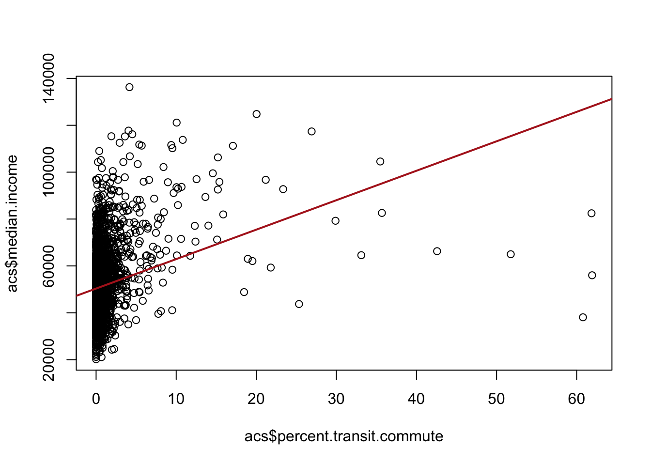
We find that there is a positive relationship, the higher percentage of a county that commutes by transit, the higher the median income of that county.
However, we might think that one reason that county may both have a higher percentage of transit commutes in it and have a higher median income is because of the region it is in. For example, places in the north-east have a well developed transit system and also are generally more well off. Alternatively, the south has poorly developed mass transit and also has several regions which have deep poverty. So it might not be that that transit commuting is related to wealth. Instead we’re just picking up the differences between regions.
So we’d like to “control” for region here. But region is not a numeric variable! It has no order. It would make no sense to do Northeast=1, South=2….
Our solution again is to convert census region into a series of dummy/indicator variables. Above, we did that by literally creating a bunch of indicators, but there is an easier way: creating a factor variable.
acs$census.region <- as.factor(acs$census.region)When something is a factor variable and we put it in a regression, R will automatically do the work to turn it into dummies:
m <- lm(median.income ~ percent.transit.commute + census.region, data=acs)
summary(m)
Call:
lm(formula = median.income ~ percent.transit.commute + census.region,
    data = acs)

Residuals:
   Min     1Q Median     3Q    Max
-83579  -7773  -1899   5279  85257

Coefficients:
                        Estimate Std. Error t value Pr(>|t|)
(Intercept)             52845.43     390.56 135.308  < 2e-16 ***
percent.transit.commute  1050.00      74.53  14.089  < 2e-16 ***
census.regionnortheast   4995.19     971.66   5.141  2.9e-07 ***
census.regionsouth      -6208.27     511.96 -12.126  < 2e-16 ***
census.regionwest        1215.72     713.84   1.703   0.0887 .
---
Signif. codes:  0 '***' 0.001 '**' 0.01 '*' 0.05 '.' 0.1 ' ' 1

Residual standard error: 12600 on 3136 degrees of freedom
  (1 observation deleted due to missingness)
Multiple R-squared:  0.1558,    Adjusted R-squared:  0.1547
F-statistic: 144.6 on 4 and 3136 DF,  p-value: < 2.2e-16
R will automatically choose the reference category for you in this case. We can use the relevel() command to force R to consider one of the categories to be the reference
acs$census.region <- relevel(acs$census.region, ref="northeast")


m <- lm(median.income ~ percent.transit.commute + census.region, data=acs)
summary(m)
Call:
lm(formula = median.income ~ percent.transit.commute + census.region,
    data = acs)

Residuals:
   Min     1Q Median     3Q    Max
-83579  -7773  -1899   5279  85257

Coefficients:
                         Estimate Std. Error t value Pr(>|t|)
(Intercept)              57840.62     904.67  63.936  < 2e-16 ***
percent.transit.commute   1050.00      74.53  14.089  < 2e-16 ***
census.regionmidwest     -4995.19     971.66  -5.141  2.9e-07 ***
census.regionsouth      -11203.47     950.65 -11.785  < 2e-16 ***
census.regionwest        -3779.47    1058.92  -3.569 0.000363 ***
---
Signif. codes:  0 '***' 0.001 '**' 0.01 '*' 0.05 '.' 0.1 ' ' 1

Residual standard error: 12600 on 3136 degrees of freedom
  (1 observation deleted due to missingness)
Multiple R-squared:  0.1558,    Adjusted R-squared:  0.1547
F-statistic: 144.6 on 4 and 3136 DF,  p-value: < 2.2e-16
12.7 Tying it all together
We covered a lot of ground in this chapter, so I want to leave you with the two ideas that matter most.
The interpretation never changes.No matter how many variables you add, and no matter whether they are continuous, binary, or a set of dummies standing in for a category, every coefficient means the same thing: how a one-unit change in that variable is associated with the dependent variable, holding all of the other variables constant. And the intercept is always the average value of y when every variable is equal to zero. If you can say those two sentences out loud for a model – and be specific about what “one unit” and “zero” mean for each variable – then you can interpret it.
The hard part is not interpretation, it’s specification. Deciding which variables belong in the model is the genuinely difficult, theoretical work, and more variables is not better. We saw three traps. Controlling for a confounder – a common cause of both x and y – is exactly what we want, and it removes omitted variable bias. Controlling for a mediator – something on the causal path from x to y – throws away the very effect we are trying to measure, which is post-treatment bias. And controlling for a collider – a common effect of x and y – manufactures a relationship that isn’t really there. On top of all that, adding a variable that is highly correlated with your predictor of interest doesn’t bias anything, but it inflates your standard errors and makes your estimate less precise.
The mechanical skills in this chapter are the easy part, and R will happily run any regression you ask it to. The judgment about what to put on the right-hand side is what separates a convincing analysis from a misleading one.
My knowledge of what happens after 3 dimensions is almost entirely based on a half remembered version from being read A Wrinkle in Time as a child and could probably use some updating↩︎