Midterm Answer Key
16.7 Instructions:
This is an in-class open-book test. You have 1 hour to complete the exam.
The test is open book. You can use any material you wish, including this textbook, your problem sets, the problem set answer keys, and your own notes. You can Google things – though you are almost certainly better off just using the class notes.
As with the problem sets, you will be graded on your comprehension of the material in this specific course.
You may not use Chat-GPT or any other AI tool to answer the questions. Violating this policy will result in a score of 0 for the midterm and an immediate referral to the Center for Community Standards & Accountability to decide further appropriate disciplinary action.
Your exam submission will be identical to how you’ve submitted problem sets. You will submit a .rmd file and a knitted html.
The exam will be graded anonymously. Please put your student number on the exam only.
Good luck!
We are going to work with county data that has information about COVID-19 case counts and political data.
You can load the data in here:
dat <- rio::import("https://github.com/marctrussler/IDS-Data/raw/refs/heads/main/PSCI1800MidtermData1.Rds",
                   trust=T)
1. How many counties are in these data? How many rows are in these data? Based on that information, and by looking at the dataset, what is the unit of analysis of these data?
head(dat)
#>   county.fips    county.name state.abbr census.region
#> 1        1001 Autauga County         AL         south
#> 2        1001 Autauga County         AL         south
#> 3        1003 Baldwin County         AL         south
#> 4        1003 Baldwin County         AL         south
#> 5        1005 Barbour County         AL         south
#> 6        1005 Barbour County         AL         south
#>   population year dem.perc cases      area
#> 1      55200 2016    23.77 18961  594.4438
#> 2      55200 2020    27.02 18961  594.4438
#> 3     208107 2016    19.39 67496 1589.7936
#> 4     208107 2020    22.41 67496 1589.7936
#> 5      25782 2016    46.53  7027  885.0019
#> 6      25782 2020    45.79  7027  885.0019
nrow(dat)
#> [1] 6160There are 6160 rows in the data and 3080 unique counties in the data. This is because each county is in the data twice, one for each election year. As such, the unit of analysis of these data is “county-year”.
I am using the county FIPS codes to identify the counties because, as I discussed in class and you saw in PS2, these are the unique identifying codes for counties. I would not want to use county names because there are lots of Jefferson Counties (and many other repeats).
head(cbind(dat$state.abbr[dat$county.name=="Jefferson County"], dat$county.name[dat$county.name=="Jefferson County"]),10)
#>       [,1] [,2]
#>  [1,] "AL" "Jefferson County"
#>  [2,] "AL" "Jefferson County"
#>  [3,] "AR" "Jefferson County"
#>  [4,] "AR" "Jefferson County"
#>  [5,] "CO" "Jefferson County"
#>  [6,] "CO" "Jefferson County"
#>  [7,] "FL" "Jefferson County"
#>  [8,] "FL" "Jefferson County"
#>  [9,] "GA" "Jefferson County"
#> [10,] "GA" "Jefferson County"
2. Un-comment and edit the code below to reshape the data so that the unit of analysis is county. Two new variables will be created in the process. (You do not need to edit the names_prefix option, which I’ve added so that we get the same sensible variable names to work with going forward )
library(tidyr)
dat <- pivot_wider(dat,
                   names_from = "year",
                   values_from = "dem.perc",
                   names_prefix = "dem.perc.")
head(dat)
#> # A tibble: 6 × 9
#>   county.fips county.name    state.abbr census.region
#>         <int> <chr>          <chr>      <chr>
#> 1        1001 Autauga County AL         south
#> 2        1003 Baldwin County AL         south
#> 3        1005 Barbour County AL         south
#> 4        1007 Bibb County    AL         south
#> 5        1009 Blount County  AL         south
#> 6        1011 Bullock County AL         south
#> # ℹ 5 more variables: population <int>, cases <int>,
#> # area <dbl>, dem.perc.2016 <dbl>, dem.perc.2020 <dbl>If you are not able to successfully complete this step, use this code to load in a re-shaped version of the data so you can continue with the problem set
dat <- rio::import(file ="https://github.com/marctrussler/IDS-Data/raw/refs/heads/main/PSCI1800MidtermData2.Rds",
                   trust=T)
3. What is the correlation between population and cases? Generate a new variable called cases.per.1000 that is the number of COVID cases for every 1000 residents of a county. What is the correlation between population and the new variable? What do you conclude from these two correlations? Were larger counties harder hit by COVID?
cor(dat$population, dat$cases)
#> [1] 0.9843319
dat$cases.per.1000 <- dat$cases/(dat$population/1000)
#Also fine:
dat$cases.per.1000 <- dat$cases/dat$population*1000
cor(dat$population, dat$cases.per.1000)
#> [1] 0.03188664
The correlation between county population and the raw number of COVID cases is nearly perfect, while the correlation between county population and the cases per 1000 residents is near zero. It makes sense that the first correlation is strong: of course LA county will have a lot more COVID cases, it’s got way more people! By making a COVID “per capita” variable we can determine if larger counties had more COVID relative to their size. The second correlation shows that they largely did not have higher COVID rates.
4. Plot the relationship between population on the x axis and cases.per.1000 on the y axis using the provided code. There is a clear outlier in this data. Identify this outlier and remove it from the data. Check your work by re-plotting the data with this row removed.
#plot(?????, ???????,
#     xlab="Population Density",
#     ylab = "Cases/1000",
#     main="County Level Population Density and COVID per capita")
plot(dat$population, dat$cases.per.1000,
     xlab="Population",
     ylab = "Cases/1000",
     main="County Level Population and COVID per capita")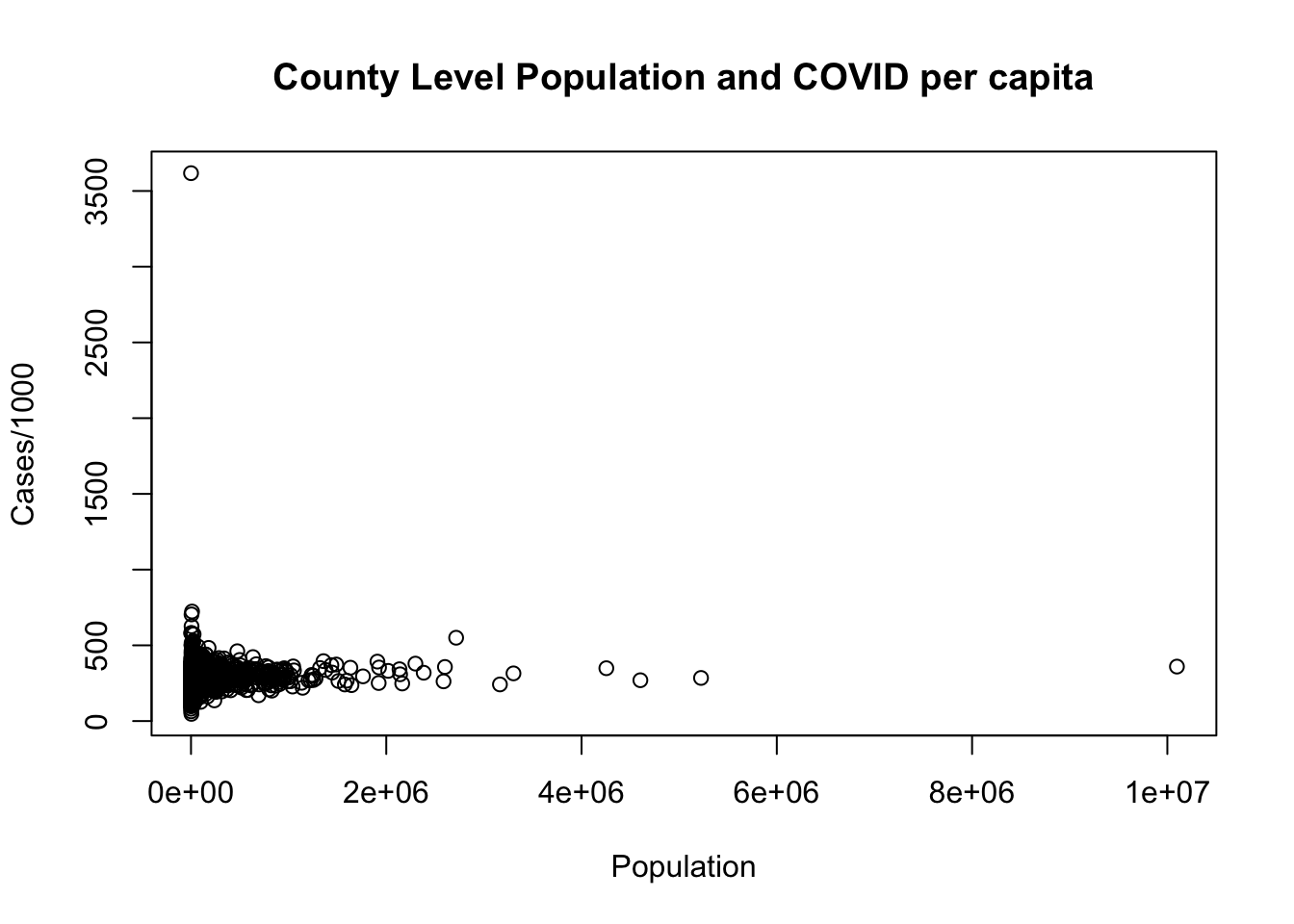
#Find out which row has a cases per 1000 over 1000
which(dat$cases.per.1000>1000)
#> [1] 2641
dat[2641,]
#>      county.fips   county.name state.abbr census.region
#> 2641       48301 Loving County         TX         south
#>      population cases     area dem.perc.2016 dem.perc.2020
#> 2641        102   369 668.8178          6.15          6.06
#>      cases.per.1000
#> 2641       3617.647
#It's Loving County, Texas, which is very small.
#We will remove that row and replot:
dat <- dat[-2641,]

plot(dat$population, dat$cases.per.1000,
     xlab="Population",
     ylab = "Cases/100",
     main="County Level Population and COVID per capita")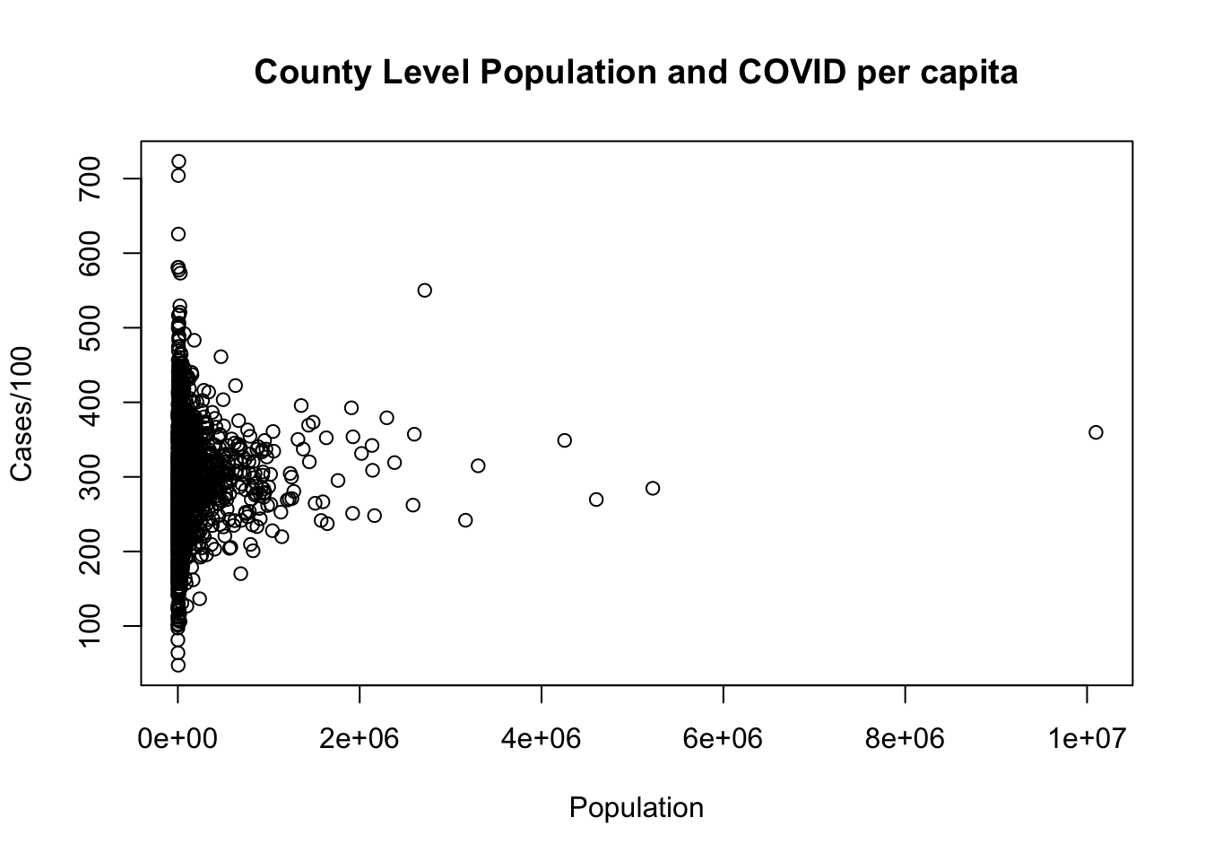
This question, in retrospect, was mildly ambiguous because you might identify the high population county as the “outlier”. In short: if that’s what you identified as the outlier we didn’t take off any points. That being said, the reason that the high cases point would generally be considered an outlier is because it off the “trend-line”. If we plot a regression line (which we will learn about in a few weeks), LA county is extreme, but part of the same relationship, while Loving county is not.
plot(dat$population, dat$cases.per.1000,
     xlab="Population",
     ylab = "Cases/100",
     main="County Level Population and COVID per capita")
abline(lm(dat$cases.per.1000 ~ dat$population))
5. Of the counties won by Joe Biden in 2020, what proportion had a cases.per.1000 that was greater than the nationwide median of cases.per.1000? Of the counties won by Donald Trump, what proportion had a cases.per.1000 that was greater than the nationwide median of cases.per.1000?
#Was any county exactly 50/50?
which(dat$dem.perc.2020==50)
#> integer(0)
#No

#Find the proportion of cases.per.1000 among counties won by Biden that are greater than the overall median:
mean(dat$cases.per.1000[dat$dem.perc.2020>50]>median(dat$cases.per.1000))
#> [1] 0.4108216
#Same, for counties won by Trump:
mean(dat$cases.per.1000[dat$dem.perc.2020<50]>median(dat$cases.per.1000))
#> [1] 0.5170543
Of the counties won by Biden, around 41% had COVID case numbers greater than the country median of 294 cases/1000 residents. For the counties won by Trump, around 51% had COVID case numbers greater than the country median.
This was sneakily the hardest question on the exam! Think through the above code carefully in terms of how I am creating the right denominator (just the counties where Biden was over 50) and the right numerator (of those counties, which ones had a value above the median?). These questions are much easier if you think about making a boolean variable that indicates the thing you are looking for.
It was fine if you did something like this, though this is much more confusing code.
nrow(dat[dat$dem.perc.2020>50 & dat$cases.per.1000>median(dat$cases.per.1000),])/nrow(dat[dat$dem.perc.2020>50,])
#> [1] 0.4108216
I think, also, that this may give wrong results if there were any NA values (which there are not in this data set).
6. What is the correlation between the democratic percent of the vote in 2020 and the number of COVID cases per 1000 people in each county? Does this correlation vary by state? For each state, calculate the correlation between these two variables. Plot the distribution of these correlations.
cor(dat$cases.per.1000, dat$dem.perc.2020)
#> [1] -0.01421609
states <- unique(dat$state.abbr)
result <- rep(NA, length(states))

for(i in 1:length(states)){
result[i] <-   cor(dat$cases.per.1000[dat$state.abbr==states[i]], dat$dem.perc.2020[dat$state.abbr==states[i]])
}

plot(density(result), main="Statewide Correlations of COVID Cases and 2020 Election Results")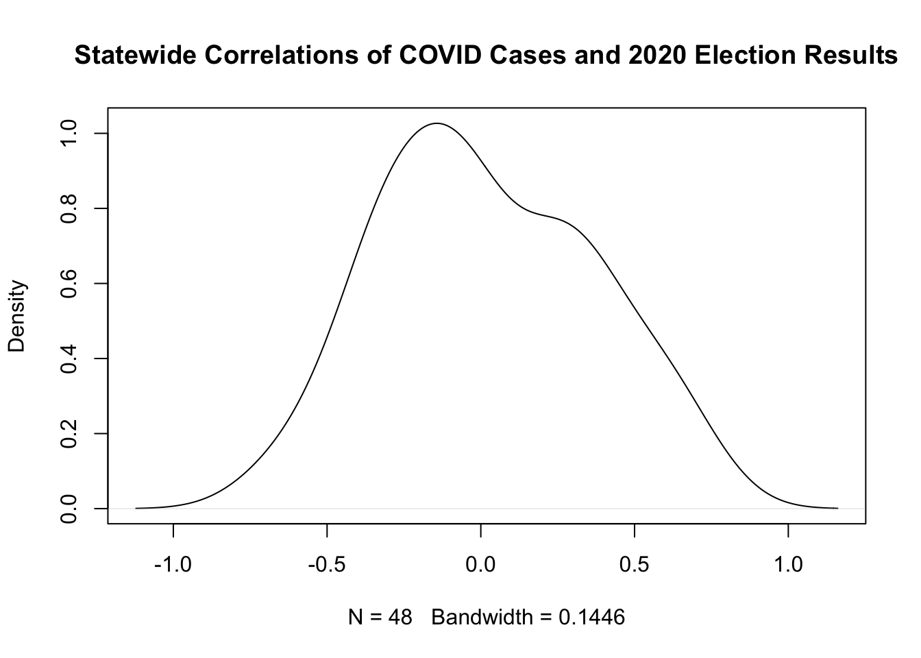
Lot’s more practice on loops on PS3!
7.(Bonus) Modify your code from (6) to also calculate the average democratic percent of the vote in each state in 2020, and then visualize the relationship between this new variable and the state-by-state correlation calculated in (6). Describe what you see.
states <- unique(dat$state.abbr)
result <- rep(NA, length(states))
avg.dem.perc <- rep(NA, length(states))

for(i in 1:length(states)){
result[i] <-   cor(dat$cases.per.1000[dat$state.abbr==states[i]], dat$dem.perc.2020[dat$state.abbr==states[i]])
avg.dem.perc[i] <- mean(dat$dem.perc.2020[dat$state.abbr==states[i]])
}


plot(avg.dem.perc, result, type="n",
     main = "Avg. State Dem Percent and Cor(COVID,Dem.Percent)",
     xlab = "Avg. Dem Percent",
     ylab = "Cor(COVID,DemPercent)")
text(avg.dem.perc, result, labels = states)
abline(h=0, lty=2)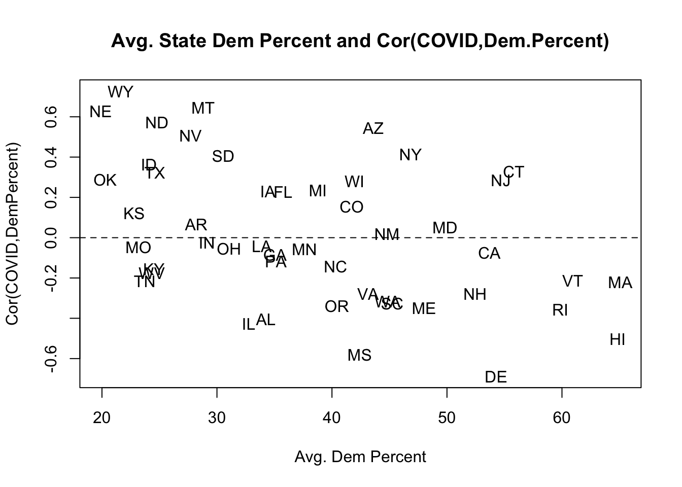
The correlation between per-capita COVID and the democratic percent of the vote in a state is quite variable. It can be as high as .6 – indicating that the more democratic a county the higher the COVID rate – or as low as -.6 – indicating that the more democratic a county the lower the COVID rate. Interestingly, it seems to be that this correlation becomes more negative in bluer states. That is: in the red states the more Democratic areas had more COVID, and in the blue states the more Republican areas had more COVID.