Problem Set 1 Answers
For this problem set you will hand in a .Rmd file and a knitted html output. There is a .Rmd template file on the assignment page on Canvas you can use to write your answers.
Please make life easy on us by using comments to clearly delineate questions and sub-questions.
Comments are not mandatory, but extra points will be given for code that clearly explains what is happening and gives descriptions of the results of the various tests and functions.
Reminder: Put only your student number on the assignments, as we will grade anonymously.
Collaboration on problem sets is permitted. Ultimately, however, the write-up and code that you turn in must be your own creation. You can discuss coding strategies or code debugging with your classmates, but you should not share code in any way. Please write the names of any students you worked with at the top of each problem set.
Note: As I mentioned in class a key skill with R is to use square brackets to access and subset of information. The purpose of this assignment is to get use to using the square brackets to index vectors and matrices with column and row numbers. That is what you are to do in all questions. If you use the $ operator to answer any of these questions you will not receive full credit.
Question 1
Below is a table of data on electric vehicle registrations and population for 5 US states. This data is from the US Census Bureau (https://www.census.gov/quickfacts/fact/table/NY,PA,CO,FL,WA/PST045222) and the Department of Energy’s Alternative Fuels Data Center (https://afdc.energy.gov/data)
(a) Using R, create three vectors: state, pop (which is the state population in millions) and electric.vehicles, which correspond to the data in this table.
| state | pop | electric.vehicles |
|---|---|---|
| 1 | 19.67 | 84670 |
| 2 | 12.97 | 47440 |
| 3 | 5.84 | 59910 |
| 4 | 22.25 | 167990 |
| 5 | 7.78 | 104050 |
state <- c(1, 2, 3, 4, 5)

pop <- c(19.67, 12.97, 5.84, 22.25, 7.78)

electric.vehicles <- c(84670, 47440, 59910, 167990, 104050)
(b) Create an object cars, which combines these three columns into a matrix.
cars <- cbind(state, pop, electric.vehicles)(c) Using built in R functions, report what the mean, median, max, and min is of the 2nd column of cars. In words: what do these numbers represent?
mean(cars[,2])
#> [1] 13.702
median(cars[,2])
#> [1] 12.97
max(cars[,2])
#> [1] 22.25
min(cars[,2])
#> [1] 5.84
The mean population in these 5 states was about 13.7 million, while the median number was 12.97 million. The state with the highest population had 22.25 million, and the state with the lowest had 5.84 million.
(d) Using built in R functions, report what the mean, median, max, and min is of the 2nd row of cars. In words: what do these numbers represent?
mean(cars[2,])
#> [1] 15818.32
median(cars[2,])
#> [1] 12.97
max(cars[2,])
#> [1] 47440
min(cars[2,])
#> [1] 2
These numbers don’t represent anything. We are looking here at the values for state pop and electric vehicles for the 2nd state. This is mixing information across three different variables, which is not how we do data analysis.
(e) Create a new vector, electric.vehicles.per.1000 that is the number of electric vehicles per 1000 people in the state. Add this vector to your matrix.
pop.thousand <- pop * 1000
electric.vehicles.per.1000 <- electric.vehicles/pop.thousand

cars <- cbind(cars, electric.vehicles.per.1000)
(f) Create a scatterplot with population on the x-axis, and vehicles.per.1000 on the y-axis. (Bonus, using the text() function, replace the “dots” with the state abbreviations. The states are: “NY”,“PA”,“CO”,“FL”, “WA”)
#Basic
plot(cars[, 2], cars[, 4], xlab="State Population (Millions)", ylab = ("Electric Vehicles per 1000 People"),
     main="Electric Vehicles by Population", pch=16)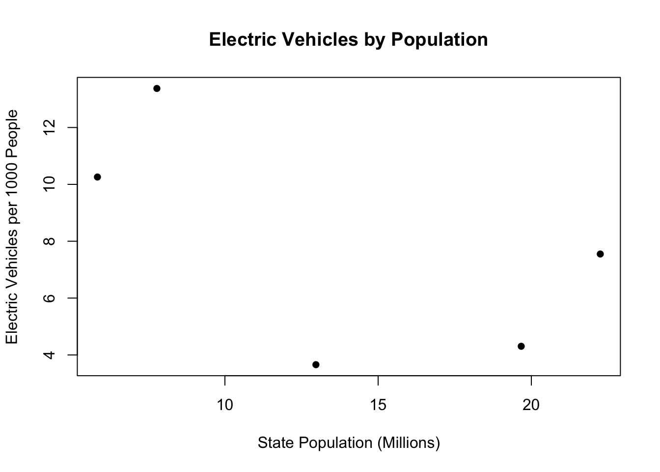
#With State Abbreviations
plot(cars[, 2], cars[, 4], xlab="State Population (Millions)", ylab = "Electric Vehicles per 1000 People",
     main="Electric Vehicles by Population", pch=16, type="n")
text(cars[, 2], cars[, 4], labels=c("NY","PA","CO","FL", "WA"))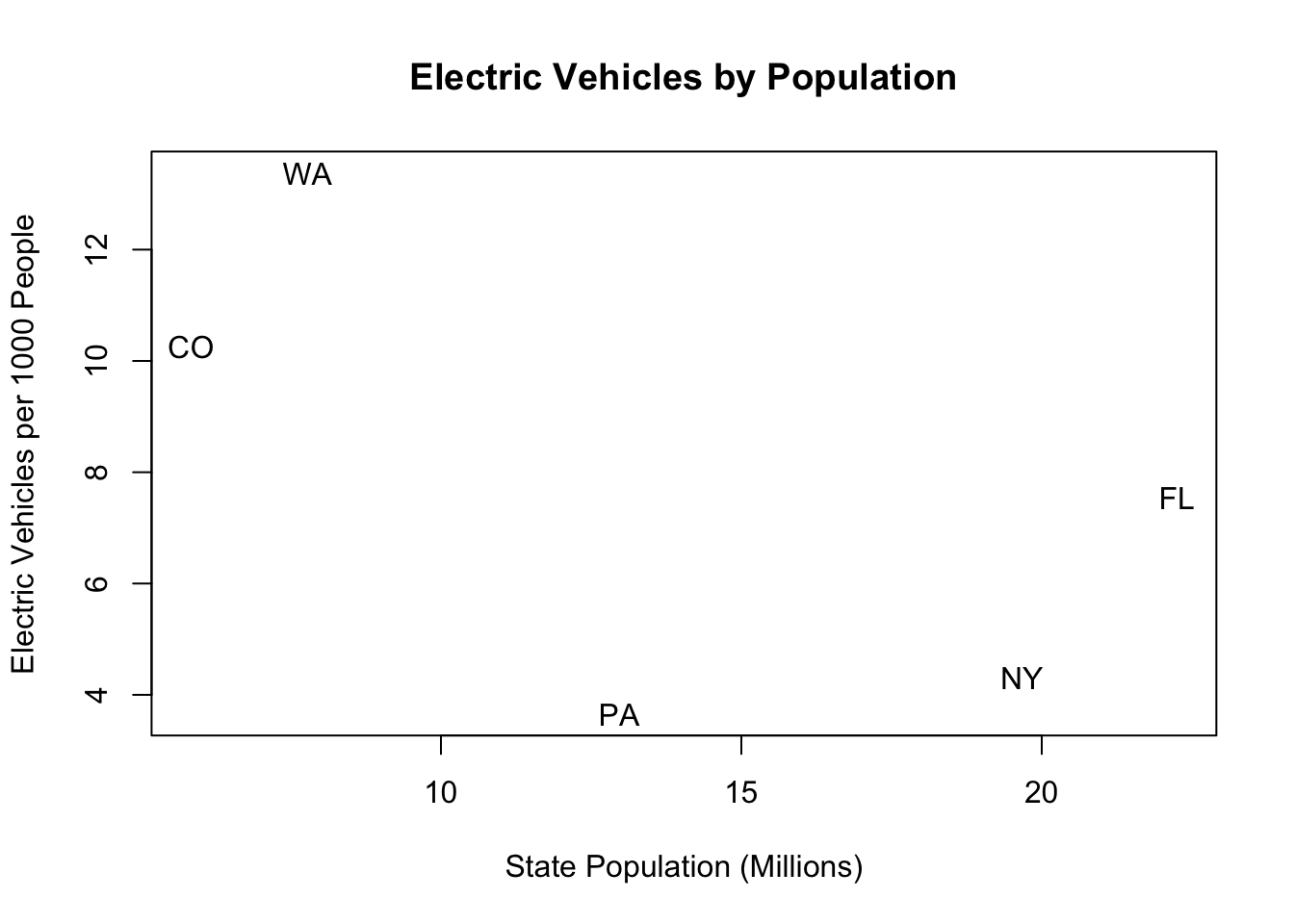
(g) What would you say about the relationship between the size of a state and the adoption of electric vehicles in these data? Are you confident that this relationship is true in the real world?
In these data there is a negative relationship between these two variables. In other words: the higher the state population the less electric cars per capita there are. This is such a small sample of data I am not confident this relationship is true in the real world. This could just be a really weird sample of 5 states, and if we looked at the whole population the relationship might go away. There is too much possible noise in a sample of 5 states to be confident that we are seeing any sort of signal.
Question 2
Run the following code to load the data frame soc.media into R:
library(rio)
soc.media <- import("https://github.com/marctrussler/IDS-Data/raw/main/PS1Data.Rds")
#> Warning: Missing `trust` will be set to FALSE by default
#> for RDS in 2.0.0.
(a) Use R to report the class of each variable in soc.media.
class(soc.media[,1])
#> [1] "numeric"
class(soc.media[,2])
#> [1] "character"
class(soc.media[,3])
#> [1] "numeric"
class(soc.media[,4])
#> [1] "character"
class(soc.media[,5])
#> [1] "logical"
(b) How many men spend 3 or more hours per day on social media? What is the preferred network of men who spend more than 3 hours per day on social media?
#How many rows are both M and time use over 3?
sum(soc.media[,2]=="M" & soc.media[,3]>=3)
#> [1] 5

#What are Men's preferred network?
table(soc.media[soc.media[,2]=="M" & soc.media[,3]>=3,4])
#>
#>  facebook instagram    tiktok   twitter
#>         1         1         1         2
5 men spend 3 or more hours on social media. 2 of the 5 men prefer Twitter, while 1 each prefer Facebook, Instagram, and TikTok. Overall, I would say Twitter is the most preferred, but it’s hardly a consensus.
(c) How many women over 45 say their favorite network is facebook or instagram?
sum(soc.media[,1]>45 & soc.media[,2]=="F" & (soc.media[,4]=="instagram" | soc.media[,4]=="facebook"))
#> [1] 2
Two women over 45 say their favorite network is Facebook or Instagram.
(d) Create and interpret scatterplot where age is on the x-axis and daily social media use is on the y-axis.
plot(soc.media[,1], soc.media[,3], pch=16, xlab="Age",
     ylab="Social Media Use (Hours)", col="black")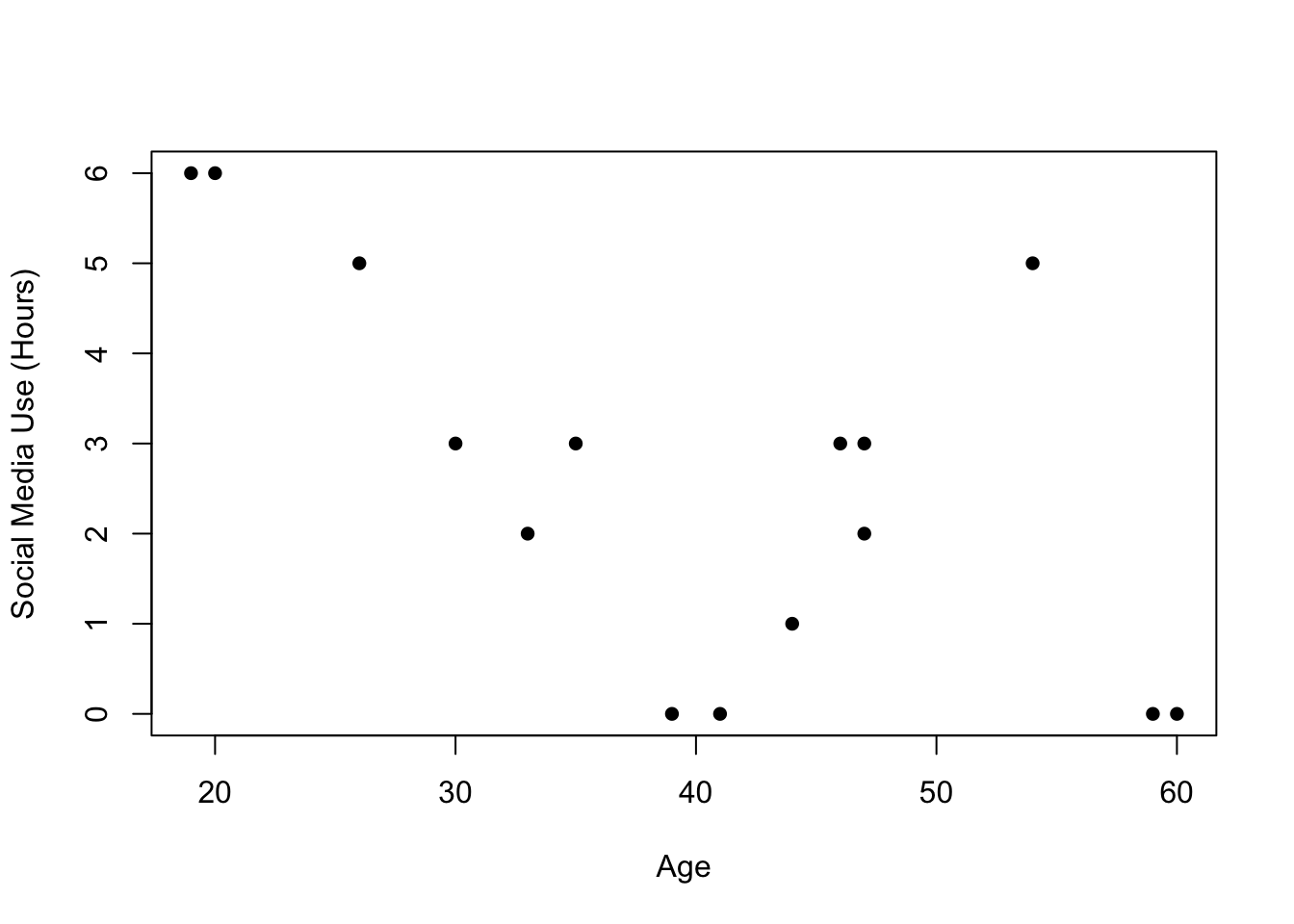
There seems to be a negative relationship betwene Age and Social Media Usage. That is, older people in the data seem to have a fewer number of social media hours, on average. That being said, there is not a lot of data here and i’m not confident that the apparent negative relationship isn’t just a consequence of a few data points.
(e) Using the variable much.time (which indicates whether the respondent thinks they spend too much time on social media, or not), alter the scatterplot created in (d) so that we can see the relationship between age and daily social media use separately for those who think they spend too much time on social media and those that do not.
plot(soc.media[soc.media[,5]==T,1], soc.media[soc.media[,5]==T,3], pch=16, xlab="Age",
     ylab="Social Media Use (Hours)", col="darkorange", ylim=c(0,7), xlim=c(15,70))
points(soc.media[soc.media[,5]==F,1], soc.media[soc.media[,5]==F,3], pch=16,
       col="dodgerblue")
legend("topright", c("Spends to much time on SM", "Doesn't spend Too much time on SM"),
       pch=c(16,16), col=c("darkorange","dodgerblue"))
Have to be careful of the scale in this question! If you plot one type of the data and don’t adjust the scale, some points from the other type won’t be visible.
Question 3
Pretend I run a monthly survey of Americans where I determine the proportion of Americans who approve of Joe Biden. Below is a table for two months (m) that gives the number of people in the survey (n), the proportion who support Biden (p), and the standard deviation of the amount of support for Biden (s).
| m | n | p | s |
|---|---|---|---|
| 1 | 10 | 0.56 | 0.25 |
| 2 | 10000 | 0.51 | 0.25 |
In which month are you most confident that the true level of support for Biden among all Americans is not 50%? You do not need a precise answer to this question, but you should do a couple of calculations to help you decide.
We can calculate the standard error for each of the months:
The standard error tells us how much we expect each sample of size n to vary from the true population proportion, on average. While month 1 has a proportion further away from 50%, the standard error suggests that each sample might vary from the population proportion by 8% on average (and sometimes much more than that). If that’s the case, it’s not unreasonable that we would get a result like 56% if the truth was 50%. In month 2 the sample proportion is much closer to 50, but the huge sample size means the standard error is much smaller. Here we only expect each sample to vary from the truth by about .2%. As such, it’s pretty unlikely that we would get 51% if the truth was 50%.
I am more confident in the second month that the true population amount of support for Biden is not 50%.