Problem Set 2 Answers
For this problem set you will hand in a .Rmd file and a knitted html output. There is a .Rmd template file on the assignment page on Canvas you can use to write your answers.
Please make life easy on us by using comments to clearly delineate questions and sub-questions.
Comments are not mandatory, but extra points will be given for code that clearly explains what is happening and gives descriptions of the results of the various tests and functions.
Reminder: Put only your student number on the assignments, as we will grade anonymously.
Collaboration on problem sets is permitted. Ultimately, however, the write-up and code that you turn in must be your own creation. You can discuss coding strategies or code debugging with your classmates, but you should not share code in any way. Please write the names of any students you worked with at the top of each problem set.
Question 1
Run the code below to load data on the 46 zip-codes in Philadelphia:
philly <- rio::import("https://github.com/marctrussler/IDS-Data/raw/main/PhillyZCTA.Rds")
#> Warning: Missing `trust` will be set to FALSE by default
#> for RDS in 2.0.0.
A small technical note. “Zip Codes” are not geographic areas, but rather lists of addresses maintained by the USPS. As such, it’s not really right to refer to, say, the 19125 zip code as an area. To address this, the Census department defines “Zip Code Tabulation Areas” (ZCTAs) which are geographic areas that roughly correspond to the list of addresses which define a zip code. I will refer to “Zip Codes” as geographic areas below, and you can too. Just know that it’s technically wrong!
For the curious, if you just type a zip-code (say 19125) into Google Maps it will outline where that zip code is located (in that case, Fishtown). You may want to use that to give some context to your answers below.
(a) We are going to consider the variable percent.rentals, which is the percent of occupied (non-vacant) housing units that are occupied by renters. Which zip code has the highest percent of housing occupied by renters and which zip code has the lowest percent of housing occupied by renters? For this question, and any questions below that ask you to identify information, you must write code to output your specific answers. (i.e. you can’t just use View() to sort the data and report the right zip).
which(philly$percent.rentals ==max(philly$percent.rentals))
#> [1] 5
philly$zip[5]
#> [1] "19107"

which(philly$percent.rentals ==min(philly$percent.rentals))
#> [1] 29
philly$zip[29]
#> [1] "19137"

#Could also simply do:
philly$zip[philly$percent.rentals ==max(philly$percent.rentals)]
#> [1] "19107"
The zip code with the most amount of renters in Philly is 19107 which is the Market East area. The zip code with the fewest amount of renters is 19137, which is Bridesburg in the far Northeast of the city.
(b) What is the median of percent.rentals? Try to find which zip code takes on this value (you will run into a problem, however). Diagnose what’s going on here, and try to determine which zip code(s) are in the middle of the distribution of percent.rentals.
median(philly$percent.rentals)
#> [1] 46.32
The median percent of households that are rentals is 46.32%. But when we try to find out what zip code that represents we get nothing:
philly$zip[philly$percent.rentals==median(philly$percent.rentals)]
#> character(0)
That is because we have an even number of zip codes. There mathematically cannot be a “middle” to an even number of entries. I’m going to find the absolute value of the differences from the median value for each case, and then consider the two zip codes that have the smallest distance from the median. This is not the only way to do this!
philly$median.distance <- abs(philly$percent.rentals - median(philly$percent.rentals))
philly$median.distance[order(philly$median.distance)[1:2]]
#> [1] 0.38 0.38
philly$percent.rentals[order(philly$median.distance)[1:2]]
#> [1] 45.94 46.70
philly$zip[order(philly$median.distance)[1:2]]
#> [1] "19124" "19146"
The zip codes 19124 (Juniata) and 19146 (Grad Hospital + Point Breeze) are the two “middle” zip codes for percent rental. Their two values are both .38 away from the median. As such, we can derive that the median for an even number of cases is the simple mean of the two middle cases.
(c) Generate a new variable high.rental which indicates whether half of housing units are rentals in a zip code, or not. How many of the zip codes are high rental zip codes?
philly$high.rental <- philly$percent.rentals >50
sum(philly$high.rental)
#> [1] 18
18 of the households are high rental households.
(d) Create a box plot that shows the distribution of percent.poverty (the percent of people over 18 in the zip code with an income below the poverty line) in the high and low rental zip codes. What do you see? If, instead, you make a scatter plot with percent.poverty on the y-axis and percent.rentals on the x-axis, do you reach the same conclusion?
boxplot(philly$percent.poverty ~ philly$high.rental,
        main="Poverty By Neighborhood Type",
        xlab="High Rental Neighborhood",
        ylab="Percent Living in Poverty")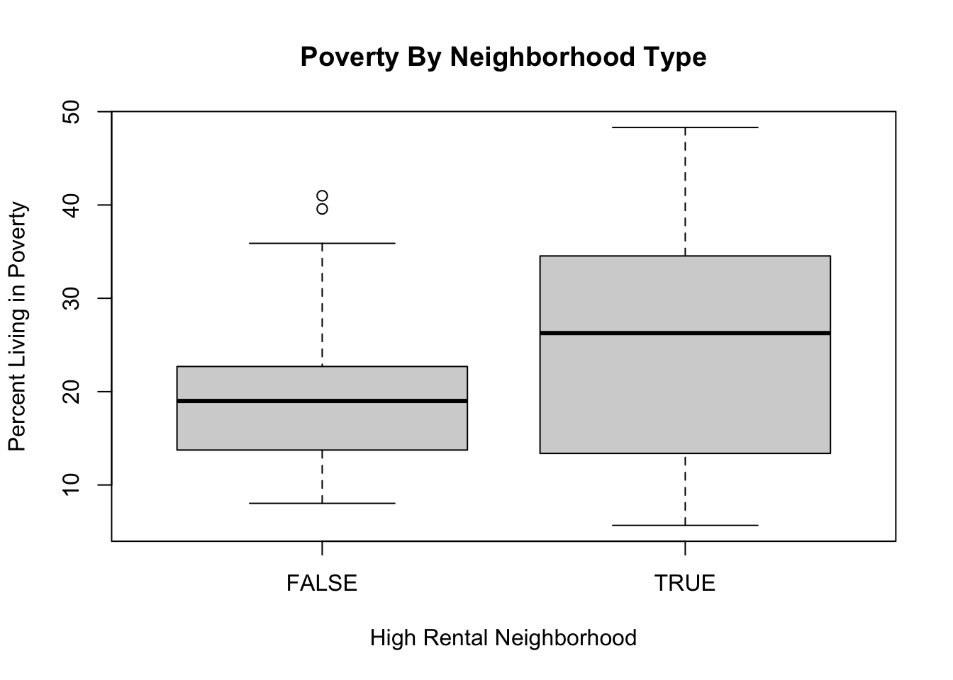
The median “high-rental” zip code has a higher percentage of people living in povery than the median “low-rental” zip code. As such, it seems like there is a positive relationship between these two things: neighborhoods with more rental properties are more likely to have people living in poverty. Having said that: there is much more variation in “high-rental” zip codes: there are zip codes with a lot of renters that have a lot of people living in poverty, but also a lot of zip codes with a lot of renters that have few people living in poverty.
plot(philly$percent.rentals, philly$percent.poverty,
     main="Relationship of Poverty and Rental Housing",
     xlab="Percent Rentals of all Housing Units",
     ylab="Percent Living in Poverty")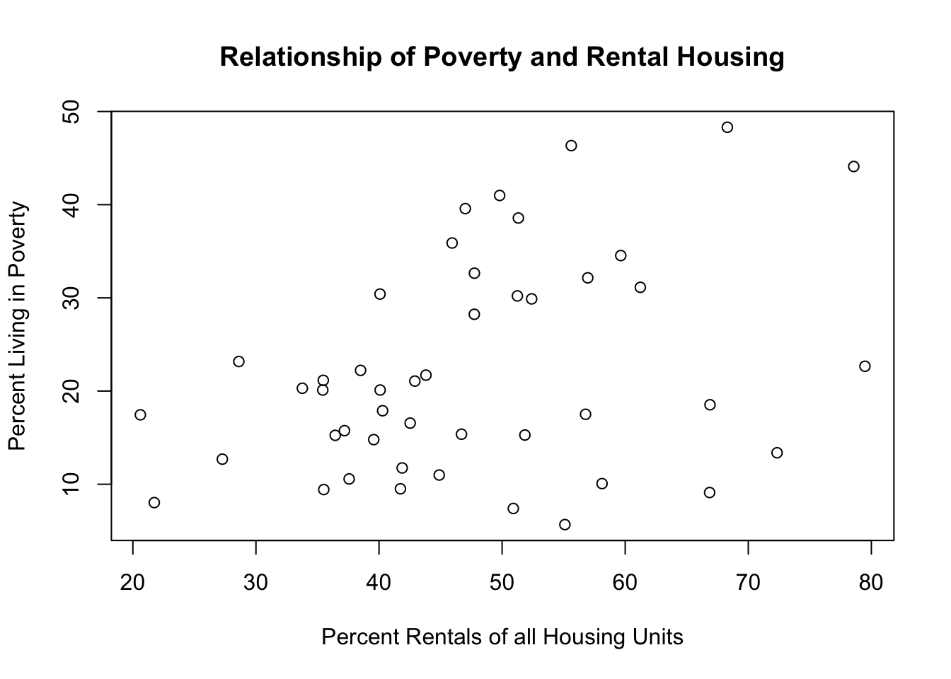
The scatterplot shows the same relationship, but better accentuates the high degree of heterogeneity in neighborhoods with a lot of rental housing. Zip codes with a low amount of rentals (on the left part of the graph) pretty much all have low amounts of poverty. But the zip codes with a high amount of rentals (on the right part of the graph) are a mixed bag. As such, I wouldn’t be confident in saying that there is a strong relationship between these two things.
Question 2
We are going to work with 2020 election results from the 67 counties in Philadelphia. The dataset you are loading in is not ready for analysis. We will work with this data in order to be able to use it to get some insights on the election. You only need written answers for (a) and (f). Only code is required for the other sub-parts.
pres <- rio::import("https://github.com/marctrussler/IDS-Data/raw/refs/heads/main/PS2Question2.Rds")
#> Warning: Missing `trust` will be set to FALSE by default
#> for RDS in 2.0.0.
(a) How many rows are there in the datasets? Does this match the unique number of counties? What is the unit of analysis of these data?
There are 67 counties but 201 rows. As such, the unit of analysis cannot be county.
I can quickly determine that \(201-67 = 3\), so there are three observations for each county. Looking at the data this is clearly because there is a row for each candidate in each county. Therefore the unit of analysis is county-candidate.
If we want to be super complete:
(b) Reshape the data such that the unit of analysis is county.
library(tidyr)
pres <- pivot_wider(pres,
                    names_from = "candidate",
                    values_from = "votes")
(c) The variable county.name has the state abbreviation appended onto the start of it. Use the seperate command to split these apart, and create a new variable called state.
(d) The variable fips.code is the 5-digit code the census assigns to each county. If you look, you will see that this column is currently of the “character” class. Figure out why that is before converting it to numeric using as.numeric(). Be careful! If you convert it without discovering the error I have put in you will delete data. For full points you must use code to find and correct the error (i.e. don’t just use View() to see if you can find the problem).
class(pres$fips.code)
#> [1] "character"
#All codes should be 5 digit, but one is 6 digit:
table(nchar(pres$fips.code))
#>
#>  5  6
#> 66  1
#Determine which row that is:
which(nchar(pres$fips.code)==6)
#> [1] 47
pres[47,]
#> # A tibble: 1 × 12
#>   fips.code state county.name     V1    V2    V3    V4    V5
#>   <chr>     <chr> <chr>        <dbl> <dbl> <dbl> <dbl> <dbl>
#> 1 42101a    PA    Philadelph… 11737.  41.2  42.3  16.1  28.6
#> # ℹ 4 more variables: V6 <dbl>, biden <int>, trump <int>,
#> #   other <int>
#Philadelphia has an "a" appended to its fips code
#Use gsub to remove
pres$fips.code <- gsub("a","",pres$fips.code)
#Convert to numeric
pres$fips.code <- as.numeric(pres$fips.code)
table(is.na(pres$fips.code))
#>
#> FALSE
#>    67
(e) The names of the demographic variables are uninformative right now. The variable descriptions are below. Rename the variables in the dataset using informative, consistent, and properly formatted variable names.
| current.labels | real.labels |
|---|---|
| V1 | Population Density |
| V2 | % white |
| V3 | % black |
| V4 | % less than high school |
| V5 | % with college degree |
| V6 | Unemployment Rate |
names(pres)[4:9] <- c("population.density","percent.white", "percent.black","percent.less.hs","percent.college","unemployment.rate")(f) Calculate the percent of the vote won by Biden, Trump, and Other candidates in each county. Use a scatterplot to display the relationship between the percent of the county who attended college and the percent Biden won in each county. Instead of points in your graph display each county name. To make things more readable, edit the county.name column to remove the redundant ” County” from each entry. (Do try to make your graph readable, though know that the labels are going to overlap, which is fine). Explain what you see in the graph.
#Generate biden percent
pres$biden.percent <- round(pres$biden/(pres$biden + pres$trump + pres$other)*100,2)
pres$trump.percent <- round(pres$trump/(pres$biden + pres$trump + pres$other)*100,2)
pres$other.percent <- round(pres$other/(pres$biden + pres$trump + pres$other)*100,2)

#Take out " County" from each county name
pres$county.name <- gsub(" County","",pres$county.name)

plot(pres$percent.college, pres$biden.percent,
     type="n", ylim = c(10,90), xlim= c(0,60),
     xlab = "Percent with College Degree",
     ylab = "Biden Vote Percent",
     main = "Education and Vote Choice in the 2020 Election")
text(pres$percent.college, pres$biden.percent, labels = pres$county.name)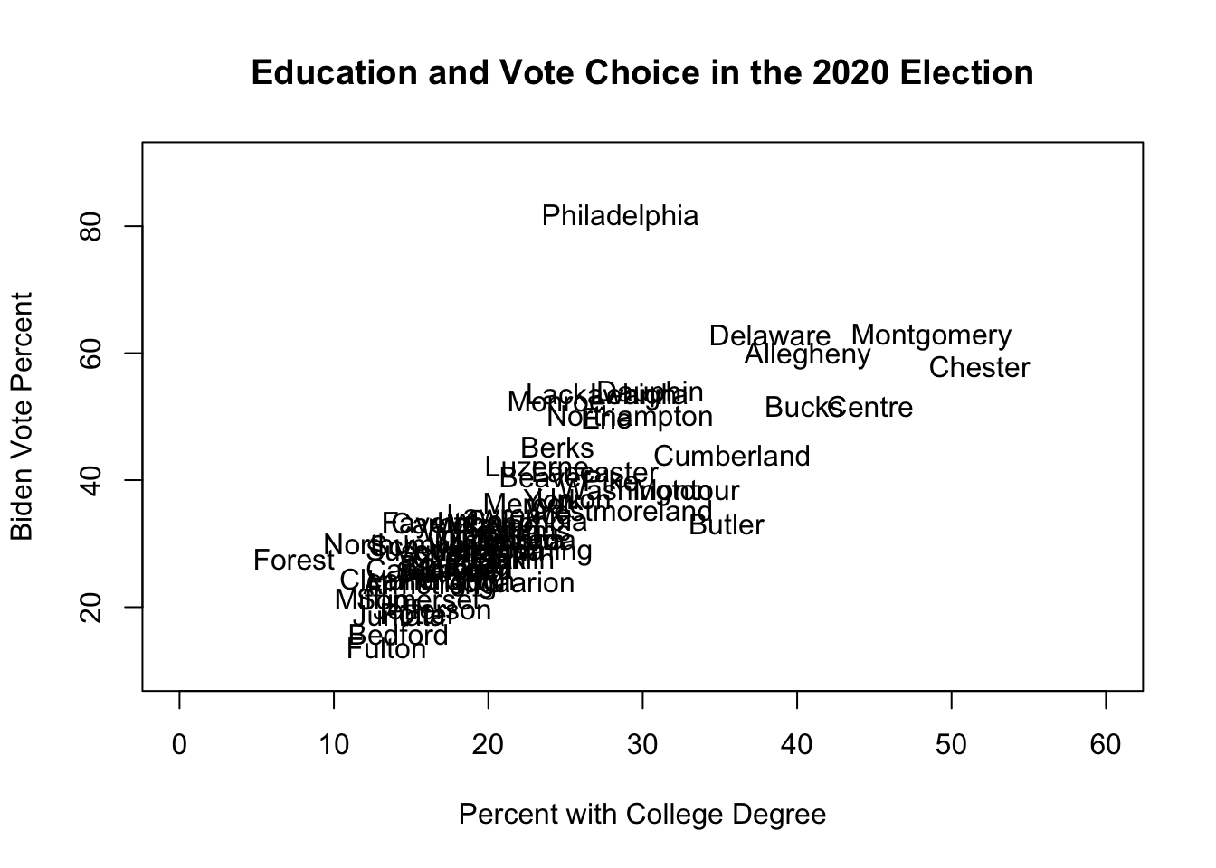
There is a clear, positive, relationship between the percent of people in a county with a college degree and the percent of votes that went to Biden in the 2020 election. In particular, there is a cluster of highly educated (mostly suburban) counties that also voted strongly for Biden. The one outlier to this relationship is Philadelphia: it is middle of the pack in terms of education, but is far-and-away the most Biden-voting county.
(g) I want to focus on the high-education counties (those with greater than 40% with a college degree) for a report. Specifically: I am going to display the following table. Using sub-setting and our re-shaping tools, recreate this table:
| candidate | Centre | Chester | Allegheny | Montgomery | Bucks |
|---|---|---|---|---|---|
| Biden | 51.69 | 57.99 | 59.61 | 62.63 | 51.66 |
| Trump | 46.94 | 40.88 | 39.23 | 36.35 | 47.29 |
| Other | 1.38 | 1.13 | 1.16 | 1.02 | 1.05 |
pres.he <- pres[pres$percent.college>40,]

pres.he <- pres.he[c("county.name","biden.percent", "trump.percent", "other.percent")]


tmp <- pivot_longer(pres.he,
             cols = "biden.percent":"other.percent",
             names_to = "candidate",
             values_to = "percent")


out <- pivot_wider(tmp,
            names_from = "county.name",
            values_from = "percent")
out$candidate <- c("Biden","Trump","Other")

kable(out)| candidate | Centre | Chester | Allegheny | Montgomery | Bucks |
|---|---|---|---|---|---|
| Biden | 51.69 | 57.99 | 59.61 | 62.63 | 51.66 |
| Trump | 46.94 | 40.88 | 39.23 | 36.35 | 47.29 |
| Other | 1.38 | 1.13 | 1.16 | 1.02 | 1.05 |