Problem Set 3 Answers
For this problem set you will hand in a .Rmd file and a knitted html output. There is a .Rmd template file on the assignment page on Canvas you can use to write your answers.
Please make life easy on us by using comments to clearly delineate questions and sub-questions.
Comments are not mandatory, but extra points will be given for code that clearly explains what is happening and gives descriptions of the results of the various tests and functions.
Reminder: Put only your student number on the assignments, as we will grade anonymously.
Collaboration on problem sets is permitted. Ultimately, however, the write-up and code that you turn in must be your own creation. You can discuss coding strategies or code debugging with your classmates, but you should not share code in any way. Please write the names of any students you worked with at the top of each problem set.
19.5 Question 1
In this question we will use loops to investigate trends in historical temperature data for every county in the United States. We will be using the data set “US County Temp History 1895-2019.Rdata”, which will load into your environment as county.dta.
county.dta <- rio::import("https://github.com/marctrussler/IDS-Data/raw/main/USTemp.Rds", trust=T)- To simplify things, subset the data to only include years greater or equal to 1980. What is the unit of analysis of this dataset?
cty <- county.dta[county.dta$year>=1980,]
head(cty)
#>    fips year state.fips county.fips    county.name region
#> 21 1001 1980          1         001 Autauga County  South
#> 22 1001 1981          1         001 Autauga County  South
#> 23 1001 1982          1         001 Autauga County  South
#> 24 1001 1983          1         001 Autauga County  South
#> 25 1001 1984          1         001 Autauga County  South
#> 26 1001 1985          1         001 Autauga County  South
#>    state.name     temp population subregion state.abb
#> 21    Alabama 63.20000      32259       ESC        AL
#> 22    Alabama 62.60833      31985       ESC        AL
#> 23    Alabama 64.30000      32036       ESC        AL
#> 24    Alabama 61.93333      32054       ESC        AL
#> 25    Alabama 63.71667      32134       ESC        AL
#> 26    Alabama 63.71667      32245       ESC        AL
#If we want to be fancy:
length(unique(paste(cty$fips, cty$year)))==nrow(cty)
#> [1] TRUE
The unit of observation of this dataset is county-years. Each row is the temperature data for a particular county in a particular year.
- For each county in the data set, calculate the mean temperature for all years (that is, what is the mean of all the rows in the dataset for the first county, the second county, etc.?) and visualize the result. Describe what you see in your figure.
Note: This loop might take a few seconds or a minute to run, dependent on your computer. Look for the red stop sign in the upper right-hand corner of your console for confirmation that the loop is in progress.
county <- unique(cty$fips)
avg.temp <- rep(NA, length(county))

for(i in 1:length(county)){
 avg.temp[i] <- mean(cty$temp[cty$fips==county[i]],na.rm=T)
}

#Many options here, but definitely want to show distribution in some way.
plot(density(avg.temp), main="Average Temperature of US Counties: 1980-2019",
        xlab="Temperature (Fahrenheit)")
abline(v=median(avg.temp), lty=2)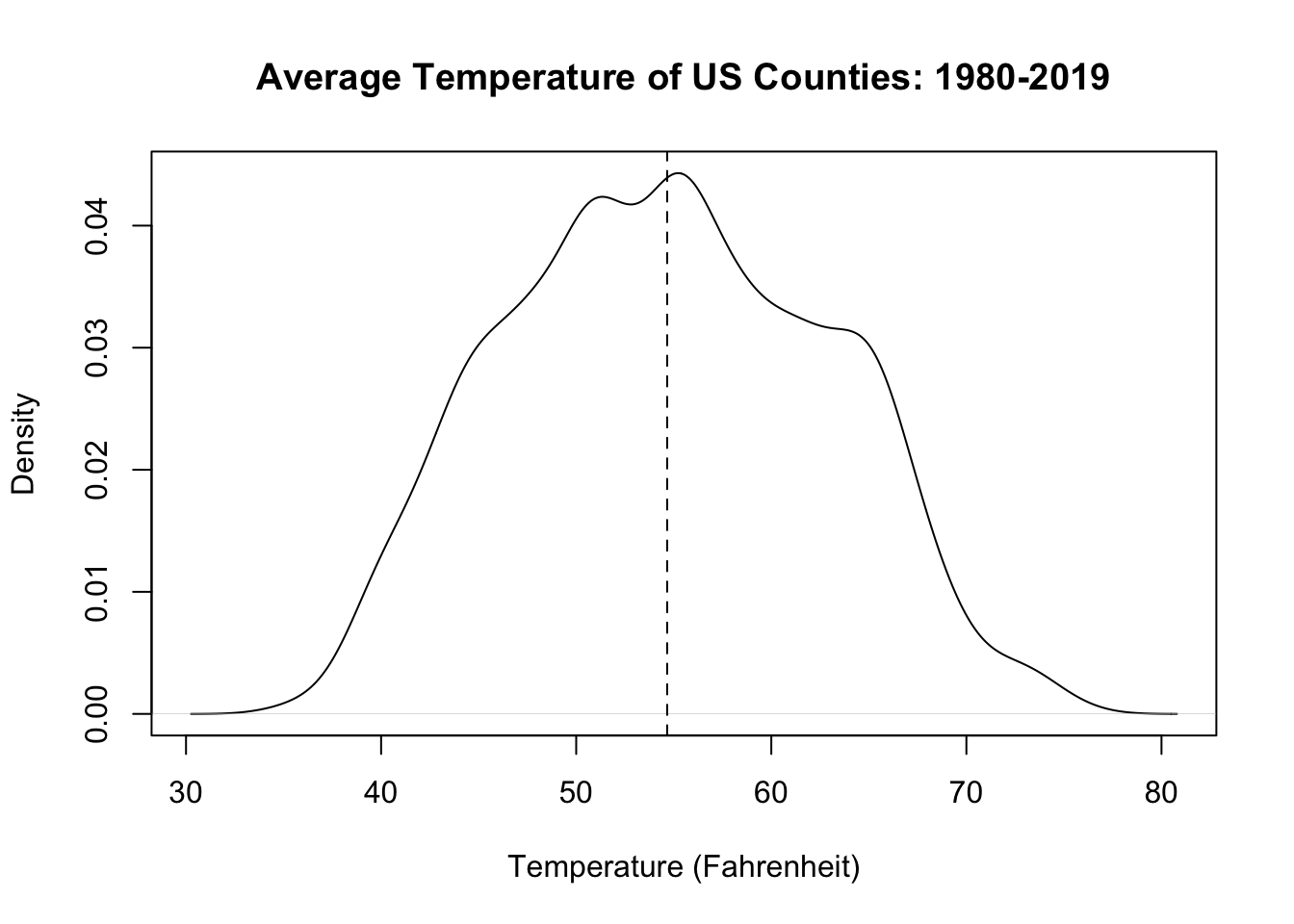
The average temperatures of US counties follows a relatively normal distribution. The median county has an average temperature around 55 degrees. The average temperature of counties gets lower and higher from that point at relatively smooth rates. The hottest counties have average temperatures slightly over 70 degrees, and the coldest counties have average temperatures slightly under 40 degrees.
- For each state in the data set, record the lowest and highest average annual temperature (that is, what is the max and min value for all the rows in the dataset for the first state, for the second state, etc.?). Which states had the most consistent average temperature over this period (i.e.have a small range between their highest and lowest values)? Which states were the least consistent? Can you organize a visualization of this information so it displays the states in order of consistency?
state <- unique(cty$state.abb)

max.min <- matrix(NA, nrow=length(state), ncol=2)

for(i in 1:length(state)){
max.min[i,1] <- max(cty$temp[cty$state.abb==state[i]],na.rm=T)
max.min[i,2] <- min(cty$temp[cty$state.abb==state[i]],na.rm=T)
}

range <- abs(max.min[,1]-max.min[,2])
state[range==min(range)]
#> [1] "DC"
range[range==min(range)]
#> [1] 4.316667
state[range==max(range)]
#> [1] "CA"
range[range==max(range)]
#> [1] 35.20833
The state with the smallest range in temperatures is the District of Columbia at 4 degrees (makes sense!), and the state with the largest range in temperatures in California at 35.2 degrees.
#Again, many ways to visualize.

#First way using bar plot

st <- cbind.data.frame(state,range)
st <- st[order(st$range),]

barplot(st$range, names.arg = st$state, cex.names = .4, las=2,
        main="Range of county temps within each state \n out of all counties (1980-2019)",
        ylab="Temp (F)",
        xlab="")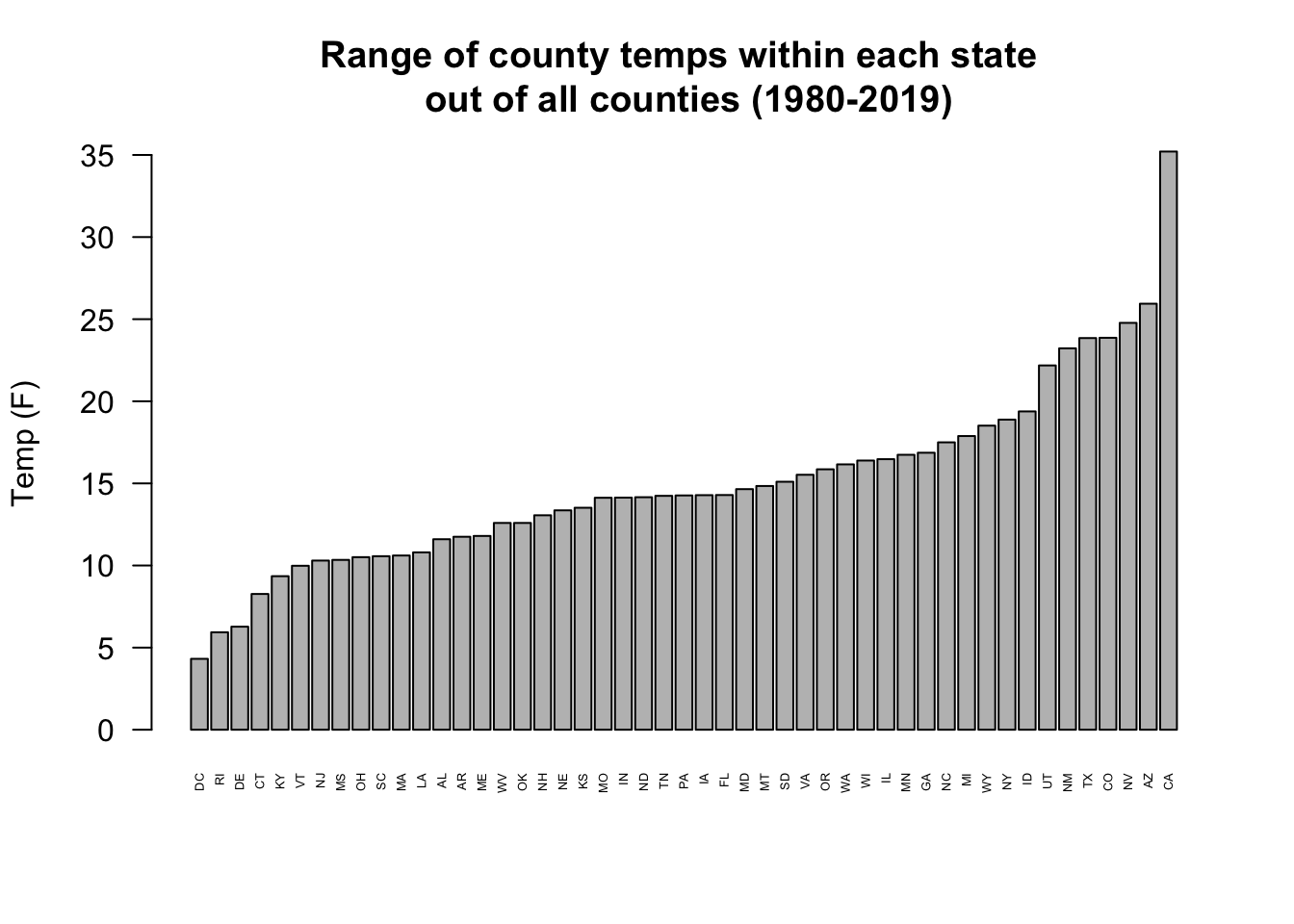
#Second way use segments

max.min <- max.min[order(range),]

plot(1:49, max.min[,1], col="firebrick", pch=16, ylim=c(30,90),
     axes=F, ylab="Temp (F)", xlab="",
     main="Range of county temps within each state \n out of all counties (1980-2019)")
points(1:49, max.min[,2], col="darkblue", pch=16)
segments(1:49, max.min[,1],1:49, max.min[,2])
axis(side=2)
axis(side=1, at=1:49, labels=st$state, las=2, cex.axis=.4)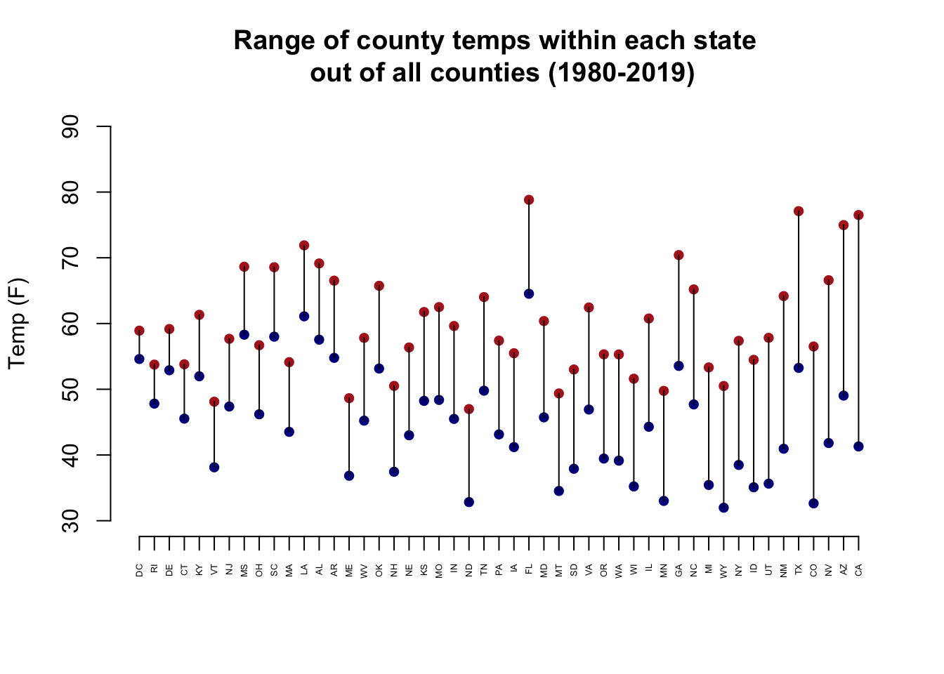
-
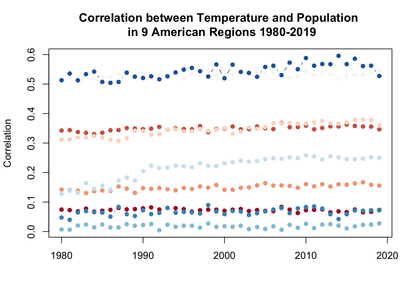
The US has 4 regions (Northeast, Midwest, South, and West), and within each region, there are several sub-regions. First, use the paste() command to create a variable that indicates each region and sub-region by combing the region variable with the sub-region variable. (ie. you should have a value that is “Northeast.MA”, etc) You should have 9 unique values for this new variable.
Investigate the degree to which the relationship between average temperature and population in counties has changed over time for each subregion. Using a double loop, determine the correlation between county temperature and county population within each subregion in each year. The result should be a matrix with 9 columns (one for each subregion) and 40 rows (one for each year). Note: Not every county has a population value for every year, so make sure to exclude NA’s from your correlation calculation
cty$sub <- paste(cty$region, cty$subregion, sep=".")
table(cty$sub)
#>
#>  Midwest.ENC  Midwest.WNC Northeast.MA Northeast.NE
#>        17480        24720         6000         2680
#>    South.ESC     South.SA    South.WSC       West.M
#>        14560        23470        18800        11220
#>       West.P
#>         5320

subregion <- unique(cty$sub)
year <- unique(cty$year)

result <- matrix(NA, ncol=9, nrow=40)

for(i in 1:length(year)){
  for(j in 1:length(subregion)){
   result[i,j] <- cor(cty$temp[cty$sub==subregion[j] & cty$year==year[i]],
                      cty$population[cty$sub==subregion[j] & cty$year==year[i]],
                      use="pairwise.complete")
  }
}
Bonus: visualize the results stored in the matrix from part d.
plot(c(1980,2019), c(min(result),max(result)), type="n",
     main="Correlation between Temperature and Population \n in 9 American Regions 1980-2019",
     xlab="", ylab="Correlation")
library(RColorBrewer)

colors <- brewer.pal(n = 9, name = "RdBu")
for(i in 1:9){
  points(1980:2019, result[,i], col=colors[i], type="b", pch=16)
}
19.6 Question 2
For this question we are going to work with data from Philadelphia. In spring of 2021 the progressive District Attorney of Philadelphia, Larry Krasner, was re-nominated by the Democratic party. This election was controversial as some in Philly blamed the rising crime rate on Krasner’s policies.
We are going to use data to investigate this election.
The following code loads in two data files.
electcontains the election results at the precinct level (where people go to vote). Philadelphia precincts are identified by their ward and division. There are 66 Wards in the city, and each of those Wards is split into multiple divisions. Each “ward-division” is an election precinct: “1-1” is the 1st ward, 1st division; “1-2” is the 1st ward 2nd division; “60-4” is the 60th ward 4th division etc.crimecontains data on every crime recorded in Philadelphia in 2019 and 2020.eventin this dataset gives the category of the crime committed. Included in these data is the ward-division in which the crime took place.
crime <- rio::import("https://github.com/marctrussler/IDS-Data/raw/main/PhillyCrimeData.Rds", trust=T)
elect <- rio::import("https://github.com/marctrussler/IDS-Data/raw/main/PhillyDAElection.Rds", trust=T)- Using the
crimedataset, determine the total number of crimes in each ward-division, as well as the number of homicides in each ward-division. The result of this question should be a dataset where the unit of analysis is ward-division with a variable for the number of overall crimes and a variable for the number of homicides.
crime$ward.division <- paste(crime$ward, crime$division, sep="-")
ward.division <- unique(crime$ward.division)
num.crimes <- rep(NA, length(ward.division))
num.homicide <- rep(NA, length(ward.division))
for(i in 1:length(ward.division)){
  num.crimes[i] <-sum(crime$ward.division==ward.division[i])
  num.homicide[i] <- sum(crime$ward.division==ward.division[i] & crime$event %in% c("Homicide - Criminal","Homicide - Gross Negligence","Homicide - Justifiable"))
}

crime.ward.division <- cbind.data.frame(ward.division, num.crimes, num.homicide)
head(crime.ward.division)
#>   ward.division num.crimes num.homicide
#> 1          54-8        174            0
#> 2          8-30        429            0
#> 3         40-40        857            0
#> 4           5-9        242            0
#> 5           7-8        206            2
#> 6 5-21 189 0- Merge this newly created dataset with the election results at the ward-division level. Did Krasner do better or worse in divisions with more crime? What about divisions that specifically have more homicides? There are lots of ways to answer this question, it’s up to you to apply what we have learned so far to choose what you feel is an appropriate analysis and visualization.
#Create ward-division variable in elect to merge on
elect$ward.division <- paste(elect$ward, elect$division, sep="-")
#merge
elect <- merge(elect, crime.ward.division, by="ward.division", all.x=T)
#Check if any NAs for crime variable:
table(is.na(elect$num.crimes))
#>
#> FALSE
#>  1686
Some analysis:
plot(elect$num.crimes, elect$pr21.krasner)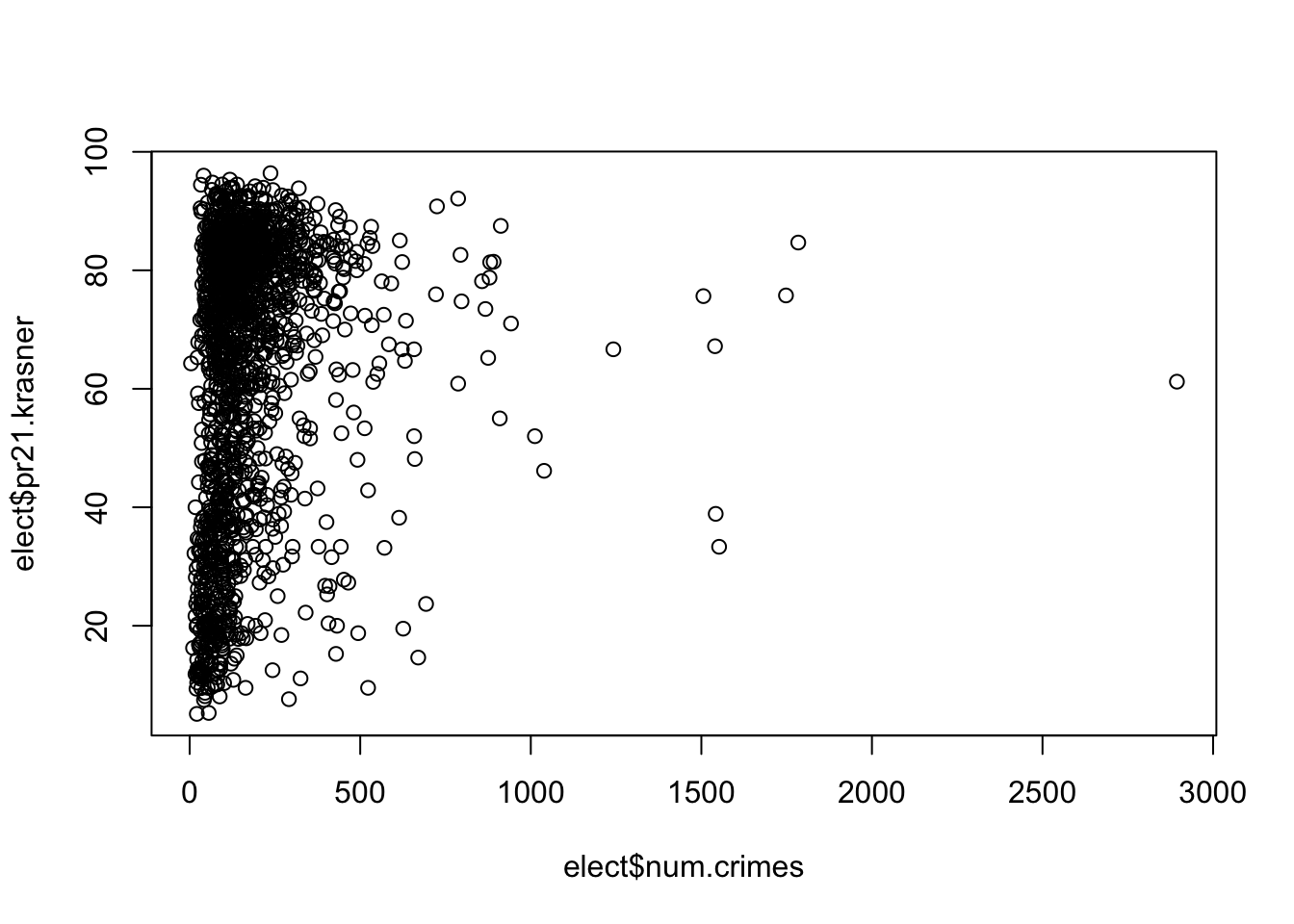
cor(elect$num.crimes, elect$pr21.krasner)
#> [1] 0.1493966
boxplot(elect$pr21.krasner ~ elect$num.homicide)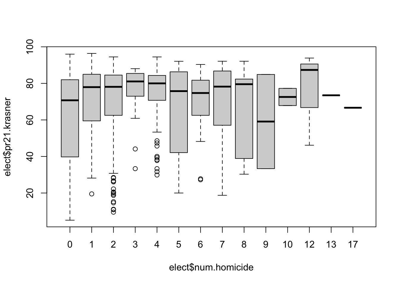
cor(elect$num.homicide, elect$pr21.krasner)
#> [1] 0.1488917