13 Writing and Visualizing
Updated for S2026? Yes.
13.1 Final Project
Here (reproduced from the syllabus) is information on your final projects in this course:
- The final paper of this course is to produce a short (less than 600 words) data-journalism style blog post that makes use of data. For this project you will find your own data and use it to produce between 1 and 3 figures or tables to support an argument suitable for a non-technical audience. This project brings together the two learning goals of this course: the technical ability to find, clean, and present data; as well as the ability to write about your findings in a clear and persuasive way. Accordingly, you will be graded on both the quality and rigorousness of your statistical findings, as well as the coding, presentation, and writing of the piece. To emphasize: a major component of this project and of your grade is determined by how you code and how you write your results up. 600 words is short for a final paper. As such, I would highly encourage you to start work on this early. Part of the goal of the problem sets is to have you think a lot about how to present statistics in an approachable and non-technical way. Many undergrads spend 95% of their time writing and 5% of their time editing. (In your working life post-undergrad these two percentages will be almost exactly flipped!) Given the amount of time and the light word count, my expectation is that you meet with the teaching team to talk about your research question relatively early, and spend the majority of the time editing your work, not writing.
I’ve made this format short and focused on purpose. I did this to force you into thinking about some fundamental things regarding writing that I think are important to work as a data scientist.
Learning how to write about and present data science work is at least as important as any R skills. None of this happens in a vacuum, and eventually you are going to have to email or show someone what you are doing. Even if you do very little formal “writing” or “presenting”, it’s important to internalize skills that will allow you to communicate findings effectively.
(Indeed, even if you do go on to write long articles or research papers, learning to write with brevity is a much more important skill than whatever it is you all learn when writing 10,000 word papers…)
13.2 The Pessimistic Writer
Much of this advice is based on William Zinnser’s “On Writing Well” and the pdf Writing Tips for PhD Students.
The fundamental orientation that I take for writing is that nobody cares.
This may come off as overly pessimistic, but thinking about the reader in this way helps me to re-frame the task that I am doing. Pretending that the reader cares about what I am doing would invite laziness: why think hard about being clear and interesting if our hypothetical ready will tolerate opaque and boring writing?
Here is what Zinnser says about readers:
Who is this elusive creature, the reader? The reader is someone with an attention span of about 30 seconds – a person assailed by many forces competing for attention…. The man or woman snoozing in a chair with a magazine or a book is a person who was being given too much unnecessary trouble by the writer.
I have found it fairly remarkable the degree to which you have to hold your reader’s hands and to provide them incentives to learn what it is that you are doing. This became abundantly clear when I started writing articles for peer review. I would get reviews back of my scholarly work that totally misunderstood what I was saying. While I was initially angry, on closer inspection it was clear that my writing was dense, and worse, it was dull. With the same content I focused on my writing and placed work in top journals.
So what are you going to do, now that you know that you have a lazy reader who doesn’t care about you?
13.2.1 Know what you are trying to say
If your reader isn’t paying attention then you better make it super clear what it is that you are trying to say.
Think about the best newspaper article or academic article that you have recently read: how would you describe it? Like, how many words would it take you to tell a friend about it? Ten? Twenty? If that’s what you remember from the best article you’ve read recently, we can only really expect our readers to similarly only remember ten or twenty words from the hundreds that we write.
If that’s the case, you better know what you want those ten words to be!
Another key quotes from Zinnser:
Writers must therefore constantly ask: what am I trying to say? Surprisingly often they don’t know. Then they must look at what they’ve written and ask: have I said it? Is it clear to someone encountering the subject for the first time? If it’s not, some fuzz has worked its way into the machinery. The clear writer is some-one clearheaded enough to see this stuff for what is is: fuzz.
Your foremost thought throughout writing anything is what the one sentence someone is going to remember is going to be. This includes both making this sentence clear within the first 3 or 4 sentences of your paper, and also constantly circling back to it throughout your piece. This flows directly from getting into the head-space of the reader asking “Why should I read this?”
The biggest impediment to working in this way is what I call a “And here’s another thing!” essay. In this type of writing the author is more interested in demonstrating all the things that they know rather than trying to make a single central point. The result is largely unreadable (and, indeed, no one will read it.)
Focusing on making a singular point and avoiding an info-dump essay leads to the next point…
13.2.2 The ordering of ideas is paramount
While you might know what your “one point” is, you can’t just copy and paste that 100 times to fill out your 1000 words. So what are you actually supposed to do to write an essay where people will walk away understand what you are trying to tell them?
Here’s what Zinnser has to say in two quotes:
Writing is not a special language owned by the English teacher. Writing is thinking on paper. Anyone who thinks clearly can write clearly, about anything at all… Writing, demystified, is just another way for scientists to transmit what they know.
Describing how a process works is valuable for two reasons. It forces you to make sure you know how it works. Then it forces you to take the reader through the same sequence of ideas and deductions that made the process clear to you… It’s just a matter of putting one sentence after another. The ‘after’, however, is crucial. Nowhere else must you work so hard to write sentences that form a linear sequence.
The way that we transmit our one idea to our readers is generated from spending a great deal of time thinking through the logical order in which information has to be presented to people in order for them to understand our point.
Elsewhere, Zinnser says “Clear writing is clear thinking”. And this is really the key: the process of writing can only really start when you have a clear sense of what you are trying to argue and what the sequence of ideas and deductions allow a reader to reach the right conclusion.
(While good writing can only really happen when you are thinking clearly about your topic, for many people the process of writing is how they think. That’s fine! Just know that if you “think through writing” you are going to have to do significant edits after the fact. Oftentimes for me that is just starting over again once I wrote enough to figure out what i’m actually trying to say.)
When it comes to sequencing we have to think about both the order of paragraphs in our essay and the order of sentences within those paragraphs.
The latter (order of sentences) is particularly important for science where you are trying to on-board the reader into relatively complicated things.
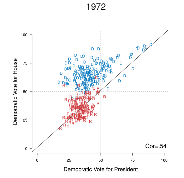
Consider this figure (which is from my dissertation). When looking at this figure I want to explain to my readers that this type of pattern is indicative of a “non-nationalized” election. How can I do that?
Here is what a bad job would look like
A lack of nationalization is shown in Figure 1. The correlation here is only .54, which is low. There are a lot of Democratic house members that are off the main diagonal, which indicates that they are elected from less nationalized districts. Republicans are largely the same. The correlation is much higher in other more recent years. Nationalization happens when the correlation is a lot higher. In the graph Democratic members are shown in blue and Republicans are shown in Red. The 2008 graph is the same, except that Democrats are elected in Democratic districts and Republicans are elected in Republican districts.
All of these sentences are true, but the order of them makes no sense. The reader (you) probably has no idea what i’m talking about. Why does this show a lack of nationalization? Why is the correlation important? How low is that correlation? What would be high?
Let’s do a better job:
Nationalization was not always present in US voting patterns, and the 1972 election was a particular low point. One way to visualize nationalization is to think about the relationship between how each district votes for president and how they vote for the House. Figure 1 displays, for the 1972 election , the Democratic vote for president in each district on the x-axis and the Democratic for the House in each district on the y-axis. If voters are nationalized and vote simply on the basis of partisanship, all points would be on the 45 degree line. But that’s not what we see in the data. Many House members are in the upper left quadrant: districts that voted to re-elect Republican Richard Nixon, while also returning their Democratic members to the house.
Thinking through what i’m doing here. First, I use an introductory sentence to tell the reader what they will learn in this pargraph: that 1972 is a really good counter-example to nationalization. Then I tell them how this graph will show a lack of nationalization (looking at the relationship between pres and house voting), telling them what is in the graph and what we would expect if voters were nationalized. The phrase “but that’s not whay we see” is KEY, this wakes the reader up and says “This is surprising!”. I then talk thgough the data using real proper nouns the reader can understand.
The sentences within a pargraph matter, and (maybe more so) the order of paragraphs matter.
This, more than anythign else, flows from clear thinking about your topic. In what order do I need to present things so that the reader understands? You accomplish this with correct ordering and proper signposting along the way to keep the reader on track.
Proper ordering is something that can be practiced and learned. One practice that I do is to do a “meta-outline” for articles that I am reading. I look at an article that I think does a good job and think about the purpose of each paragraph in the piece. What part of the argument does the paragraph convey? Does it introduce a new point? Is it a change in direction? A signpost? Does it give an example that helps the reader understand technical material to come later?
Let’s consider this NYT article on fertility.
I’m going to go through the first 5 paragraphs and think about what the purpose of each is:
Also, look how short these paragraphs are! Often one or two sentences! That’s fine. Undergrad students write paragraphs that are too long almost universally
Fertility in the United States has been declining since the Great Recession, and reached a new low last year, according to federal data released Thursday, causing some to fear a baby bust.
Quickly introduces the problem of decreasing fertility, which the reader should (might) care about.
But it’s not clear that will happen. Instead, there could be a lull, demographers say — a period of very low fertility that could eventually rebound.
Rebuts that fear with a potentially new fact pattern: a possible rebound.
That’s because of a drastic shift among American women who are now of childbearing age: They are waiting longer to have babies. They’ve become much less likely to have them in their teens or 20s — and much more likely to in their 30s or 40s.
Why might this new fact pattern emerge? Because women are delaying when they are having babies.
Demographers have a name for this kind of lull in fertility: a “postponement transition.” It happened in the 1990s in Europe, then rebounded somewhat as the younger women who delayed pregnancy eventually had children. It also happened in the United States in the 1970s, as more women pursued college and careers after the women’s movement. These women didn’t end up having fewer children; they just had them later.
The name of this new pattern is “postponment transition”, which has happend in other countries and in the US in the 1970s.
“It’s totally real that births are declining,” said Philip Cohen, a sociology professor at the University of Maryland. “It’s just not completely clear how much that will turn into overall population decline in the long run. The total number will come back up if people who are now 25 just wait until they’re 40.”
Gives a quote from a researcher that gives context to the finding, and drives home that the declining fertility rate is a temporary dip as we transition to a new pattern of when women have children.
What is the point in doing this?
First such an exercise can show us how pargraphs should be ordered to make logical sense. Notice that if I put these sentences in order they make sense:
Quickly introduces the problem of decrising fertility, which the reader should (might) care about. Rebuts that fear with a potentially new fact pattern: a possible rebound. Why might this new fact pattern emerge? Because women are delaying when they are having babies. The name of this new pattern is “postponment transition”, which has happend in other countries and in the US in the 1970s. Gives a quote from a researcher that gives context to the finding, and drives home that the declining fertility rate is a temporary dip as we transition to a new pattern of when women have children.
Like, this isn’t a good paragraph, but the order of these things makes sense. We learn about decreasing fertility, and then rebut that idea, and then teach why that rebuttal makes sense etc.
Down further you will find paragraphs that explicitly indicate an objection, or a change in direction. As above you can easily form the topics of those paragraphs into a “meta” narrative by connecting them with things like “But” and “Additionally…”. The key point is that all go together in a good order, and the thing that connects them is not “And here’s another thing”.
This type of outlining is very helpful for your own writing. Particularly if you already have things written in can force you to confront if things are in a reasonable order or not.
The other thing that I would encourage you to do is to plagiarize the structure of articles that you like.
I still do this often. I will find an academic article that is similar to what I want to write and that is well regarded. I will go through and think about what the purpose of each paragraph is and write my article in the same way. “Here is where they briefly discuss their findings.”; “Next they talk about a common objection and discuss why it doesn’t apply”; “After that they discuss how they measured a key variable” etc. To be clear: don’t plagiarize the content of an article, but you are free to plagiarize the structure.
One particularly helpful “meta-narrative” move for work in data is to hook the reader in with an example from your data.
One of my grad school mentors, Larry Bartels, would always try to remind us that every observation in a dataset is infinitely interesting on it’s own. For example, in the “Nationalization” figure above each of those points is a politician with a whole career and life! We can get “databrain” where we start seeing everything as numbers and forget that we can tell interesting stories about just one row.
So for example, before introducing the graph above I may write:
Voters in today’s politics are overwhelmingly driven by partisanship. Up and down the ballot, voters largely vote on the basis of national partisanship, not making distinctions based on the individual merits of candidates. But such distinctions were commonplace 40 years ago. Consider Democrat Chester E. Holified running in California’s 19th district in 1972. In that election, Holified’s constituents voted 60-40 to re-elect the Republican president, Richard Nixon. In 2020, such a clear preference for one party over the other would doom this incumbent. But Holifield didn’t just squeak out a win: he won 70% of his constituent’s support. Voters in California’s 19th district in 1972 were clearly applying different criteria to different offices – criteria that would allow them to overwhelmingly re-elect a Republican President and a Democratic member of the House.
The readers now have an actual human example of the overall phenomenon i’m describing, which will hook them in.
That’s not all, now that they understand a particular case, I can point them to the bigger phenomenon that represents:
Was Holified unique in his ability to outperform the Democratic candidate for President – George McGovern – in his district? Figure 1 displays, for the 1972 election , the Democratic vote for president in each district and the Democratic for the House in each district. If voters are nationalized and vote simply on the basis of partisanship, all points would be on the 45 degree line. But that’s not what we see in the data. Many House members – including Holifield, highlighted in red – are in the upper left quadrant: districts that voted to re-elect Republican Richard Nixon, while also returning their Democratic members to the house.
(I’m too lazy to go back to my thesis data and to highlight Holified, but you get how that would be helpful.)
13.2.3 Keep it Simple
The other key tip from Zinnser is to keep things simple:
Clutter is the disease of American writing. We are a society strangling in unnecessary words, circular constructions, pompous frills, and meaningless jargon…. The secret of good writing is to strip every sentence to its cleanest components.
(As a non-American let me assure you that clutter is not a purely American phenomenon.)
Avoiding unnecessary words is really important – particularly when writing about technical subjects. I really try my hardest to take out as many words as possible from my writing.
I was listening to a podcast where Mike Birbiglia was talking to John Mulaney about joke writing. They are talking about refining jokes and how, if they had a 60 word joke, they would write a 20 word version and see if it’s still funny. I think you have to do something similar with writing: if you have an introduction that is 400 words, can you try to write a 100 word version that still does the same thing?
I think this is particularly important when thinking about anything that comes before the “main” figure. When considering the lazy reader, getting to the point as fast as possible is paramount. I often ask: what is the minimum amount of words I need to put before the title and the first figure so that the reader understands and cares about that figure. (It’s usually not a lot, or way less than you would think.)
The other big part of this when it comes to statistics is avoiding jargon. Jargon plagues statistics. I try my hardest to explain things in regular, human, language. I would encourage you to do the same. Can you describe the results of a regression without using any of the jargon from regression? Can you explain the results of a statistics test without saying “standard error” or “p-value”. It’s good to try. When jargon is unavoidable you should, at the very least, explain what the jargon means.
13.2.4 Other Tips
There are couple of other little tips I think about when writing.
Never repeat yourself. A good sign of poor editing is if I see the exact same point being made in two places. So never repeat yourself.
Mostly everything I write is in the present tense.
Avoid adjectives: “
verysignificant”, “noteworthyresult”. Definitely avoid double adjectives “verynovel”. (I’m bad at this)Whenever I find myself typing “In other words…” it simply means I sub-conciously know I did a bad job of explaining the something the first time. Just go do it better the first time.
Saying “I” in an essay, or even academic article, is fine. That’s a weird high school rule.
The singular “they/their” in the place of his/her is now accepted practice. “The student was curious about their grade.”
13.3 Tips on Presenting
Oh buddy, you think your reader doesn’t care about you?
All advice above for lazy readers goes double for in-person presentations.
The presentations you will do in this class are short and informal, but you will frequently be called upon to do presentations both small and large in your academic and professional careers.
As with writing, the overall thesis here is: no one is paying attention. Seriously. No one is paying attention.
The sooner you start presenting with this in mind the better. Similar to writing, the goal of a presentation (at something like a conference) is for someone to remember your name, your topic, and to think that you are smart. That’s it. All I want is for people to come up to me and say, “Oh Marc, you presented on straight-ticket voting at AAPOR, right?”.
As above, to present well you need to know what your singular contribution is and to get to it ask quickly as possible.
As fast as possible. In Cochrane’s writing tips above he suggests starting presentations with “Here’s Figure 1”. I’ve never had the confidence to do that, but I try to put as little as possible before my main result.
First off: you should state your main finding and conclusion in the first 3 sentences of your presentation, even if people don’t fully understand it. Then think: what is the minimum amount of “Theory” and “Literature Review” you need to do so people understand your result. It is often zero.
Similarly, people rarely care about descriptive statistics. Sometimes people will preview the results in case they don’t have time to get to them which Cochrane calls a “self-fulfilling prophecy of time wasting”.
To get to and highlight your singular contribution you need to remember that most things don’t need to be in a presentation.
One common violation of this is that people think about presentations as Lab Reports: Here’s all the stuff I did! The audience doesn’t care about (and won’t remember) the process you took to get to the results, they just care about the results. Occasionally, your process is your contribution: say if you have a new measure or collected interesting data. That’s fine, but most of the time you want to skip over this stuff.
Another common violation of putting too much in a presentation is when people list through 6 different hypotheses they have. There is no way people are going to remember these things. Your presentation is an advertisement for people to learn more about your work or to read a longer paper that you have prepared. You don’t need everything, just the big main finding that hooks them in. The interested people will go and read about your other 5 hypotheses and alternative measures.
In general, like with writing you want to get to the main finding as quickly as possible, which means putting the minimum amount of material between the start of the presentation and the main finding. The material you do put will be a reflection of your clear understanding of your topic. Once you really understand something, you are ready to answer the question “What do people need to know to understand what I am trying to say and why it is important?”
When it comes to how to present your main finding you would be surprised at how simple you need to make things, even for relatively sophisticated audiences. It’s good to remember (even for your small presentations you have this semester) that nobody has thought as much about this thing as you. It’s really easy in that situation to think: “Surely this is too dumbed down. People are going to laugh at how simple this is.” In my experience this is almost never true and instead there have been many many times where I have no idea what people are trying to show me. (And lots of times where people had no idea what I was trying to show them.)
A good rule of thumb is to always start with the simplest possible view of your “main” relationship, even if that is not the most “complicated” version of what you do.
Here is the “main” relationship from my Science article about partisan responses to the COVID social distancing guidelines.
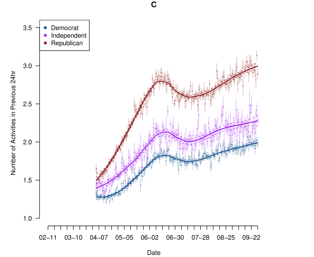
This graph is relatively simple, I’m just plotting the average number of activities each group did over time and then adding a “smooth” line to each. This is easy to understand and to explain. Now, in the paper I run much more complicated models that take into account all sorts of possible threats to inference. But the thing is all these results just confirm this simple result. There is no real reason to show people these complicated models because this simple, understandable, graph is enough. You can tell people: “Don’t worry! This result holds up when we do X,Y,Z.”
Another trick I do with my main results is to present the graph with no data first. Graphs are hard to understand! You need to think about what the two different axes are measuring, and if you are trying to do that while the presenter is talking about the result it’s often too much to process.
So for this figure, a key part of my work, I will present this empty figure first and say:
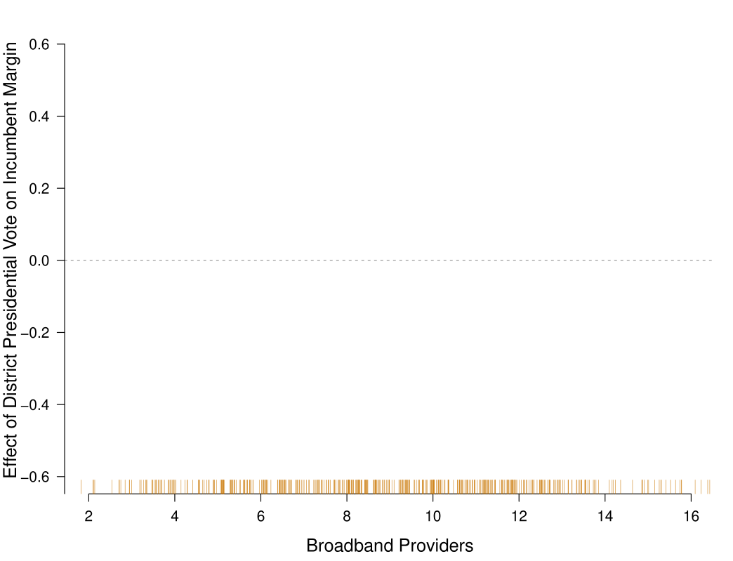
This graph shows the number of Broadband Providers on the x axis, and on the y-axis the effect voting for President has on voting for the House. In a world of political nationalization this effect will be positive and non-zero: as a district votes more Democratic (or Republican) for President they will also vote more Democratic (or Republican) in the house. Our expectation is that this relationship will become more positive as the number of Broadband Providers increases.
Then I reveal the data and say:
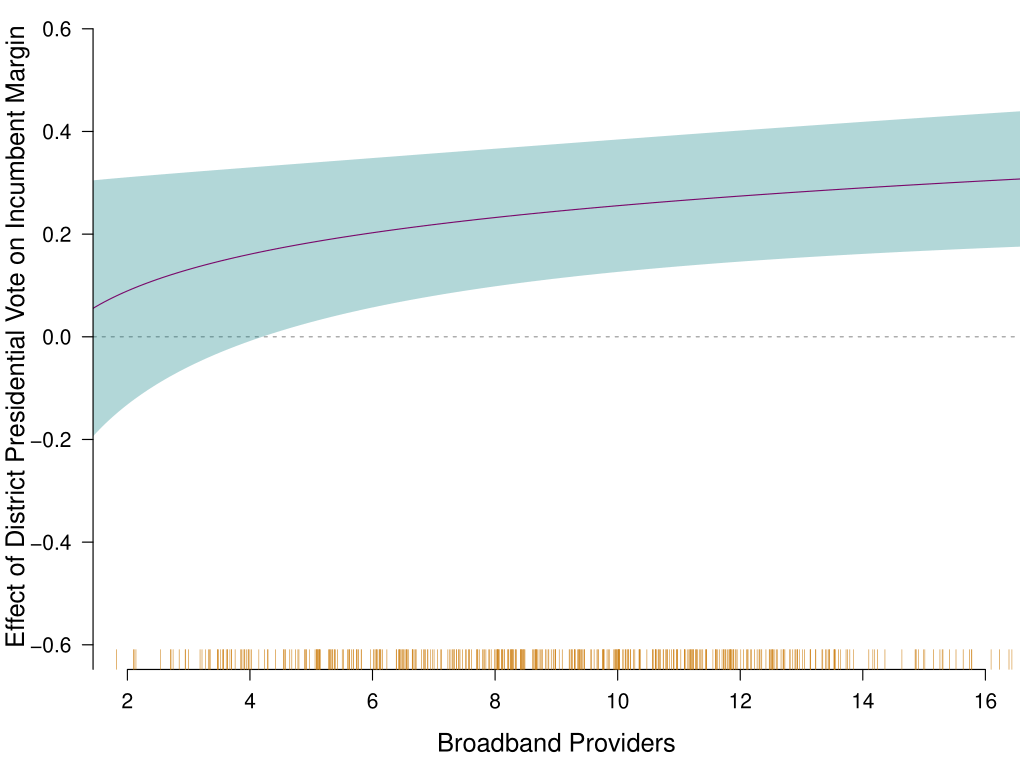
And that’s just what we see. At low levels of Broadband the effect of Presidential vote on House vote is close to zero, indicating that these things are operating independently. But as the number of broadband providers increases, the effect becomes more positive and distinguishable from zero.
This splits the presentation of the graph into two parts for the listener to digest in turn: (1) What this graph is designed to show; (2) what the results are. Number (2) will have the impact you want if you take your time on (1).
Some other minor tips for good presenting:
Keep slide words to a minimum. They should be visual aids for people who weren’t paying attention who want to re-engage, but most of the content should be coming from you.
Conditional on keeping slide words to a minimum you can have as many slides as you want. Rapid fire slides with images/text cues can help people stay engages so I don’t worry about stuff like “No more than 1 slide per minute”. Indeed, if you spend 1 full minute on a slide people will check out.
Speak confidently and directly while making eye contact with as many people as possible. If you find you are not a confident presenter I would (no lie) watch a lot of stand up comedy. Don’t try to be funny, but stand-ups are experts at choosing a cadence that engages people. And they don’t all do it the same way! Their personality, quirks, shyness, whatever… that all comes through; but they are all engaging their audiences. I want you to present like yourself, but to do so with purpose and confidence.
You don’t really have to answer questions. 95% of questions happen because people are bored and want to hear their own voices, so they don’t really care about the answers. That being said, you should really listen to questions. Don’t try to jump the gun and guess what the person will ask. If you listen to questions you will better be able to politician-pivot to the question you actually wanted to answer and have content for. Finally, if there is a really good and hard question you don’t know the answer to you can literally say, “Wow! That’s a really good question. I haven’t thought about it in that way. I’m going to have to think more about that. Thank you.”
And all of the above advice filters back to the “taking questions” thing, because the situation where you will face the hardest and most annoying questions is when you don’t communicate clearly what you are doing. Put in a more positive way: If you are confident about what you are doing and why you will get less inane questions.
13.4 Data Visualization with ggplot2
Up to this point we have been making plots with base R: plot(), points(), abline(), and so on. These tools are powerful. They are they are pretty much all I use in my own work. But a very large chunk of the R world uses a package called ggplot2 for visualization, and I would be doing you a disservice if I didn’t teach it to you. More importantly, ggplot2 plays extremely well with the tidyverse tools you learned in the last two chapters. The ability to take a dataset, manipulate it using the tidyverse commands and pipe it straight into a plot is a very robust way of doing things.
Before we get into ggplot2, let me share some general principles about good data visualization. These apply regardless of what tool you use.
13.4.1 Tips for Good Visualization
1. A graph should stand on its own. If someone sees your figure without any surrounding text, can they understand what it is showing? Make sure you have a clear title, labeled axes, and a legend if you are using color or shape to represent variables. The reader should never have to guess what they are looking at.
2. Choose the right graph for your data. The type of graph you use depends on the type of data you are graphing. You are going to use a different chart if you have one continuous variable, two continuous variables, a continuous variable and a categorical variable etc. This point is directly related to…
3. Draw it first. I pretty much always draw on paper what I want my visualization to be before I make it in R. (Or, at least, I think about in my head exactly what I want). It’s much easier to have the right visualization if you spend a bit of time thinking about what that is and what it will look like before you start throwing things into the plot or ggplot command.
4. Never use pie charts. I don’t really mean this literally (though, don’t use pie charts). What should be avoided are charts that make it hard for your reader to make comparisons. Pie charts ask the reader to compare angles and areas, which humans are bad at. If I show you two slices of a pie chart, one at 28% and one at 33%, you will have a very hard time telling them apart without labels. And labels would just make things redundant. If I show you two bars at those same values, the comparison is immediate (without labels). The same thing goes for stacked bar charts: it is very hard to compare segments that do not share a common baseline. You should always use grouped side-by-side (“dodged”, in ggplot parlance) bar charts.
5. Think in terms of dimensions. Every visual property of your plot (x position, y position, color, size, shape, facet panel) is a dimension that can represent a variable. Use each dimension to communicate one thing. Do not map the same variable to both the x-axis and the color. That is redundant and wastes a dimension you could use for something else.
6. Keep it simple. A graph that is trying to show seven things at once usually shows none of them well. Start with the simplest version of the relationship you want to display. You can always add complexity later if you need it.
13.4.2 Loading Our Data
library(tidyverse)

elect <- rio::import("https://github.com/marctrussler/IDS-Data/raw/main/VizData.Rds")
#> Warning: Missing `trust` will be set to FALSE by default
#> for RDS in 2.0.0.
head(elect)
#>   state district.id   plean.16   plean.20 pshift.16to20
#> 1    AK       AK001  -8.280316  -4.551938     3.7283773
#> 2    AL       AL002  -4.615244 -15.357825   -10.7425809
#> 3    AL       AL003 -17.023121 -17.571795    -0.5486738
#> 4    AL       AL005 -16.794313         NA            NA
#> 5    AL       AL006 -24.558236         NA            NA
#> 6    AR       AR001         NA         NA            NA
#>      pop pop.density       area p.bach unemployment.rate
#> 1 738516    1.293411 570983.198  29.23              7.40
#> 2 680575   67.098880  10142.867  22.47              7.04
#> 3 706705   93.683650   7543.526  21.68              6.93
#> 4 714145  194.176500   3677.813  31.84              5.79
#> 5 703715  168.707400   4171.215  36.08              4.74
#> 6 722915   37.420210  19318.839  16.42              6.52
#>   med.hh.inc adult.poverty.rate p.uninsured p.white
#> 1      76715               9.98       14.42   61.04
#> 2      46817              17.29       10.31   61.80
#> 3      46576              18.08        9.12   67.65
#> 4      55043              13.54        9.29   72.67
#> 5      65464               9.95        7.54   76.04
#> 6      40980              18.65        8.24   75.92
#>   p.nonwhite p.black p.amerindian p.asian p.hawaiian
#> 1      38.96    3.09        14.02    6.18       1.16
#> 2      38.20   31.11         0.37    1.11       0.01
#> 3      32.35   25.35         0.28    1.80       0.02
#> 4      27.33   17.34         0.61    1.65       0.07
#> 5      23.96   15.34         0.20    1.73       0.02
#> 6      24.08   17.46         0.32    0.50       0.06
#>   p.other.race p.multiracial p.hispanic highly.educated
#> 1         0.20          7.40       6.93               0
#> 2         0.12          1.92       3.55               0
#> 3         0.10          1.69       3.10               0
#> 4         0.18          2.39       5.09               1
#> 5         0.20          1.64       4.83               1
#> 6         0.10          2.28       3.34               0
#>   dem.win16 dem.win20 flip dem.2party.vote16
#> 1         0         0    0          41.71968
#> 2         0         0    0          45.38476
#> 3         0         0    0          32.97688
#> 4         0        NA   NA          33.20569
#> 5         0        NA   NA          25.44176
#> 6        NA        NA   NA                NA
#>   dem.2party.vote20 region
#> 1          45.44806   West
#> 2          34.64217  South
#> 3          32.42821  South
#> 4                NA  South
#> 5                NA  South
#> 6                NA  South
This data contains 2016 and 2020 election results at the Congressional District level along with demographic information from the 2019 ACS. Note that these results set as NA any uncontested districts (which is why there are so many NA).
-
plean.20: Partisan lean (Democratic two-party vote share minus 50). Positive = Democratic, negative = Republican. -
pshift.16to20: Partisan shift from 2016 to 2020. -
p.white: Percent White. -
highly.educated: Indicator for above-median share with a bachelor’s degree. -
region: Census region.
13.4.3 The Grammar of Graphics
The “gg” in ggplot2 stands for “grammar of graphics.” Every plot is built from three components:
- Data: What dataset are you plotting?
-
Aesthetics (
aes): Which variables map to which visual properties (x, y, color, size)? - Geoms: What shapes represent the data (points, lines, bars)?
In base R we are very explicit: draw points at these coordinates, put a line here, draw a regression line with this formula. ggplot will work a bit different: here is my data and here is the relationship I want to show, now add layers to show that relationship.
13.4.4 Basic ggplot Scatterplot
We want to see the relationship between percent White and partisan lean in 2020. With ggplot we are going to give it the dataframe first (you should already see how this will play well wiht tidyverse….), and then tell it the aesthetics of what we are doing. This simply means: what variables map to what visual properties? For a scatterplot we think about one variable mapping onto the x axis and one variable mapping onto the y-axis, so we will tell it that:
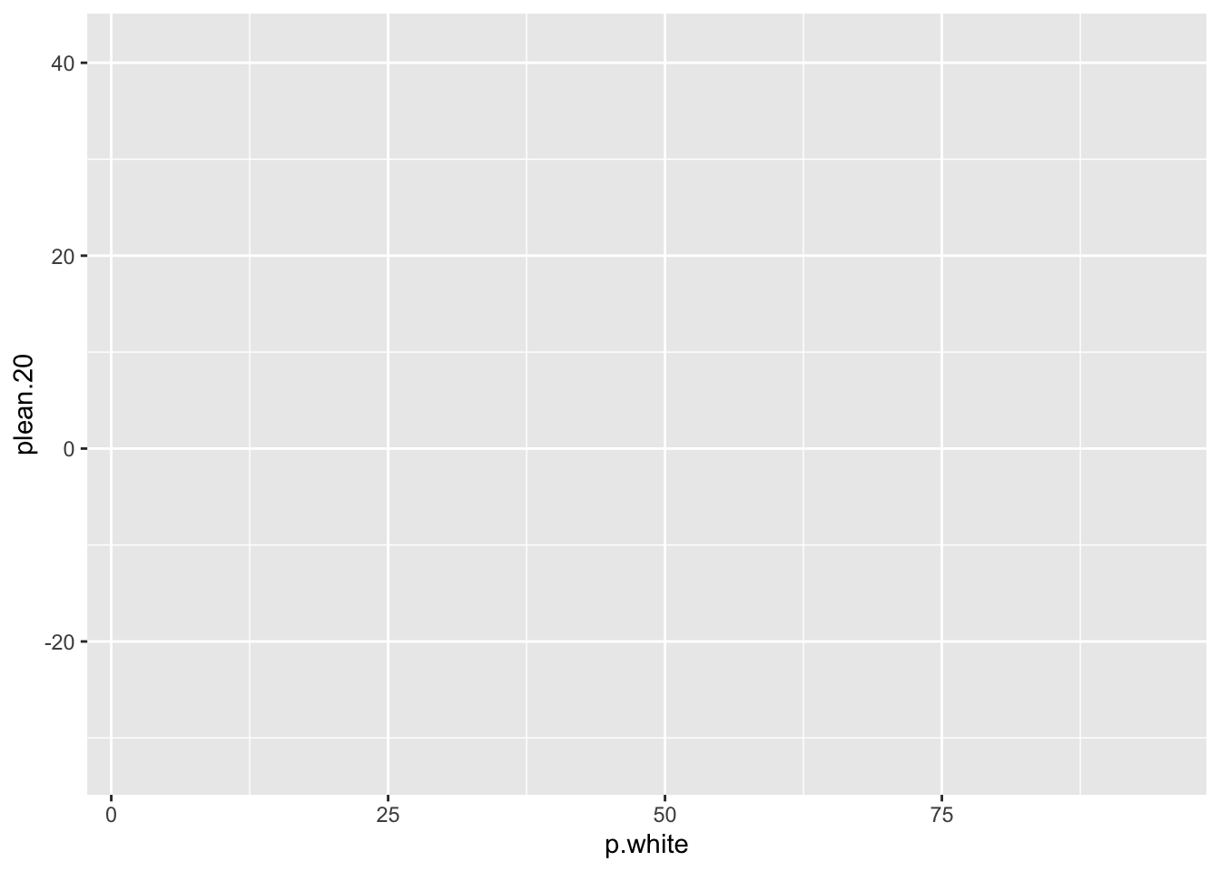
Ok we have done that and pressed go. We get a blank graph that seems like it’s right, but there is nothing on it. Here is where ggplot diverges. To actually get something onto the graph we now add a geom (a plot layer of actual data):
ggplot(elect, aes(x = p.white, y = plean.20)) +
  geom_point()
#> Warning: Removed 21 rows containing missing values or values outside
#> the scale range (`geom_point()`).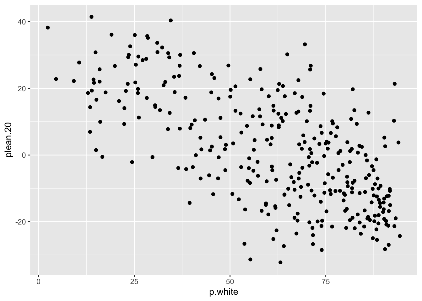
Notice that we add the layer with a + sign.
ggplot() takes a dataset and an aesthetic mapping. geom_point() says “draw a point for each row.” Three ingredients: data, aesthetics, geom.
If, intstead of points we want a smoothed representation of the data (what we call a loess line), we could do instead:
ggplot(elect, aes(x = p.white, y = plean.20)) +
  geom_smooth()
#> `geom_smooth()` using method = 'loess' and formula = 'y ~
#> x'
#> Warning: Removed 21 rows containing non-finite outside the scale
#> range (`stat_smooth()`).
And if we wanted both:
ggplot(elect, aes(x = p.white, y = plean.20)) +
  geom_point() +
  geom_smooth()
#> `geom_smooth()` using method = 'loess' and formula = 'y ~
#> x'
#> Warning: Removed 21 rows containing non-finite outside the scale
#> range (`stat_smooth()`).
#> Warning: Removed 21 rows containing missing values or values outside
#> the scale range (`geom_point()`).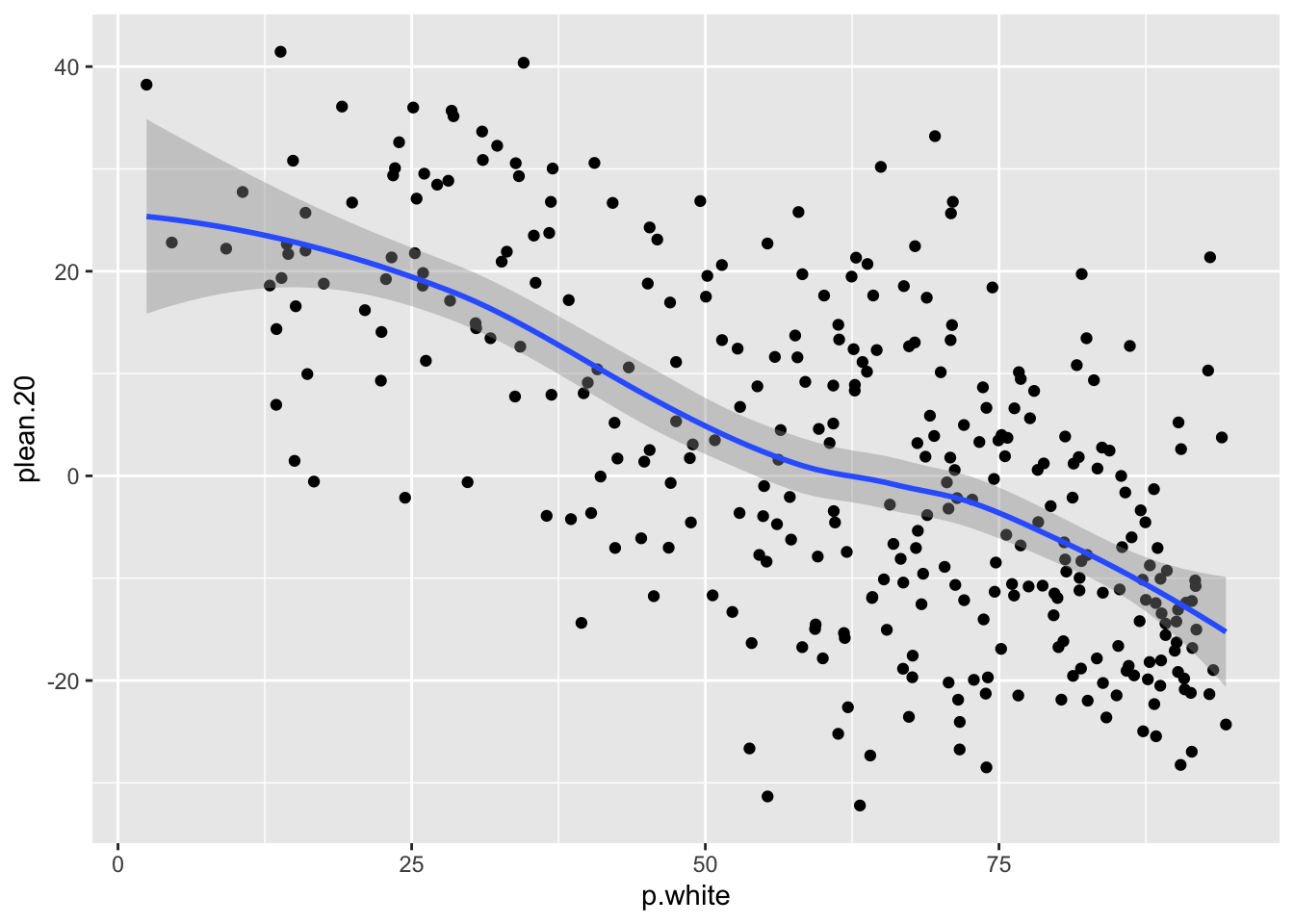
We have been getting warnings about removed rows because some districts have NA for plean.20 (uncontested races). We may wish to remove those districts before graphing if we want to not worry abotu this label. We could do:
elect |>
  filter(!is.na(plean.20)) -> elect.2

ggplot(elect.2, aes(x = p.white, y = plean.20)) +
  geom_point()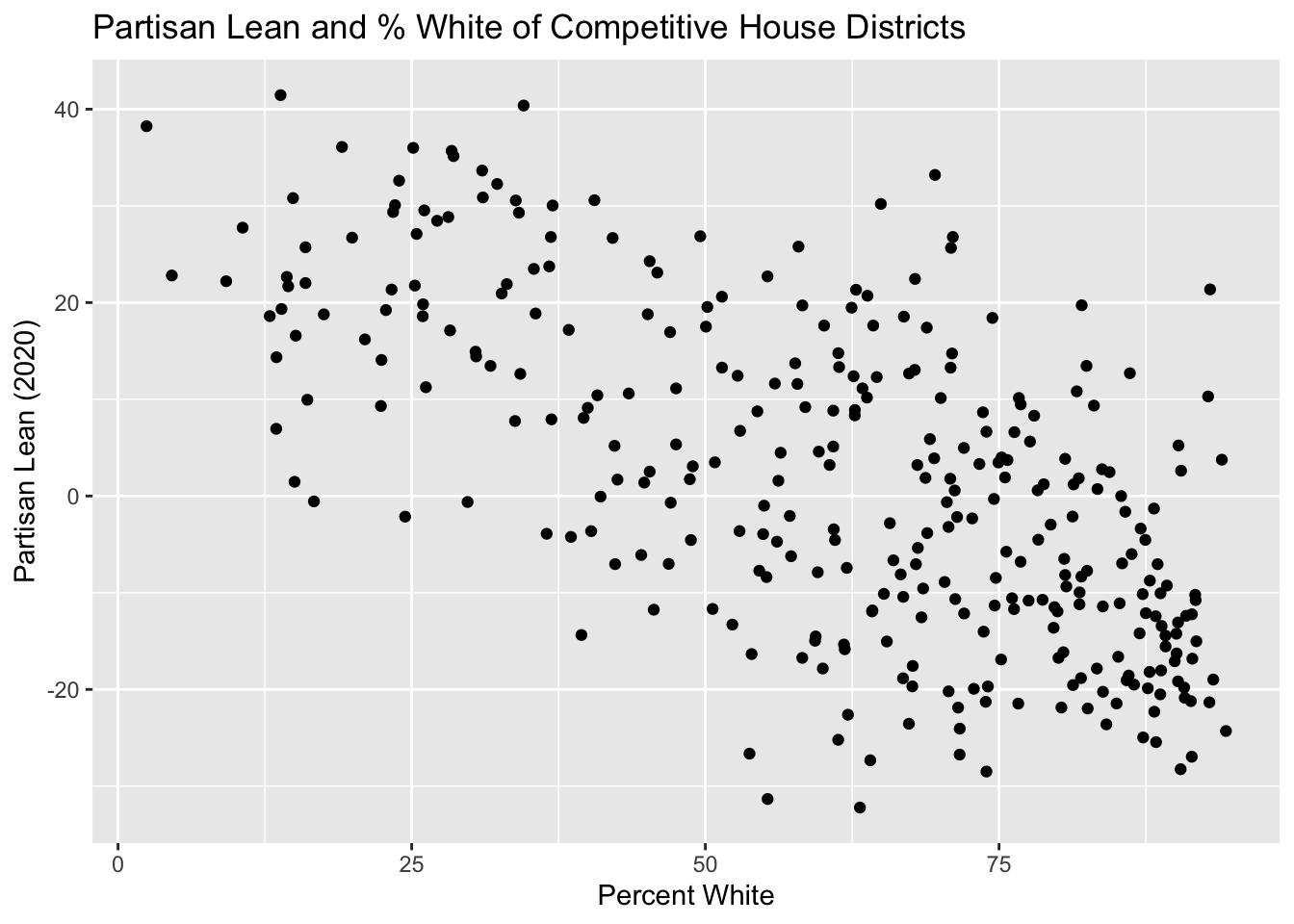
But now we are carrying around a whole other dataset, and I might forget which one is which. But given that ggplot() has as its first argument the full dataset (just like tidyverse) we can similarly pipe in a dataset right from tidyverse.
#Notive we don't specify the dataset in the ggplot command. It's just going to use the piped in dataset
elect |>
  filter(!is.na(plean.20)) |>
  ggplot(aes(x = p.white, y = plean.20)) +
  geom_point()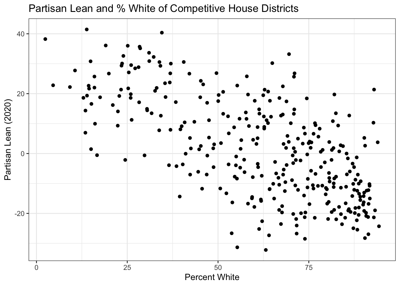
We started with elect, piped it into filter(), and piped that into ggplot(). Notice that once we are inside ggplot() we switch from |> to +. The pipe hands data from one operation to the next. The + adds layers to a plot.
Now let’s clean it up with labels and a theme:
elect |>
  filter(!is.na(plean.20)) |>
  ggplot(aes(x = p.white, y = plean.20)) +
  geom_point() +
  labs(x = "Percent White",
       y = "Partisan Lean (2020)",
       title = "Whiter Districts Lean More Republican") +
  theme_minimal()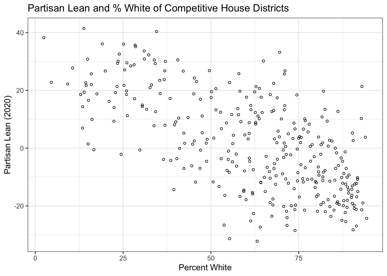
theme_minimal() my preference. Other options include theme_bw(), theme_classic(), and theme_light().
Like with base R plotting, I don’t expect you to memorize how to make labels and things like that. When you need to make a plot, look up an example that you like and copy the code.
13.4.5 Further Aesthetics
Beyond x and y, aesthetics can control color, size, shape, and alpha (transparency). Let’s color points by education level by adding that as an aesthetic.
elect |>
  filter(!is.na(plean.20)) |>
  ggplot(aes(x = p.white, y = plean.20,
             color = as.factor(highly.educated))) +
  geom_point() +
  scale_color_manual(values = c("firebrick", "dodgerblue"),
                     labels = c("Below Median", "Above Median")) +
  labs(x = "Percent White",
       y = "Partisan Lean (2020)",
       color = "Bachelor's Degree Rate",
       title = "Whiter Districts Lean More Republican") +
  theme_minimal()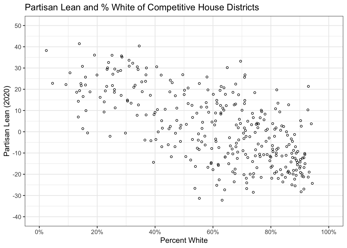
highly.educated is coded 0/1, so if we didn’t wrap it in as.factor() ggplot would treat it as continuous and gives you a gradient. scale_color_manual() lets you pick which colors and labels to use.
In the above graph I have made a data visualization error so that I have a place to tell it to you out loud. I have used red and blue to represent something that isn’t Republican and Democrat. If you are doing anything that is could be considered evenly remotely political do not use red and blue for anything except Rep and Dem. Conversely: if you are making a graph of Demcorats and Republicans, use blue and red!
There is one critical rule here. If an aesthetic goes inside aes(), it maps to a variable in the data. If it goes outside aes() (but still inside the geom), it applies uniformly to all points:
#Fixed color: goes outside aes()
elect |>
  filter(!is.na(plean.20)) |>
  ggplot(aes(x = p.white, y = plean.20)) +
  geom_point(color = "steelblue")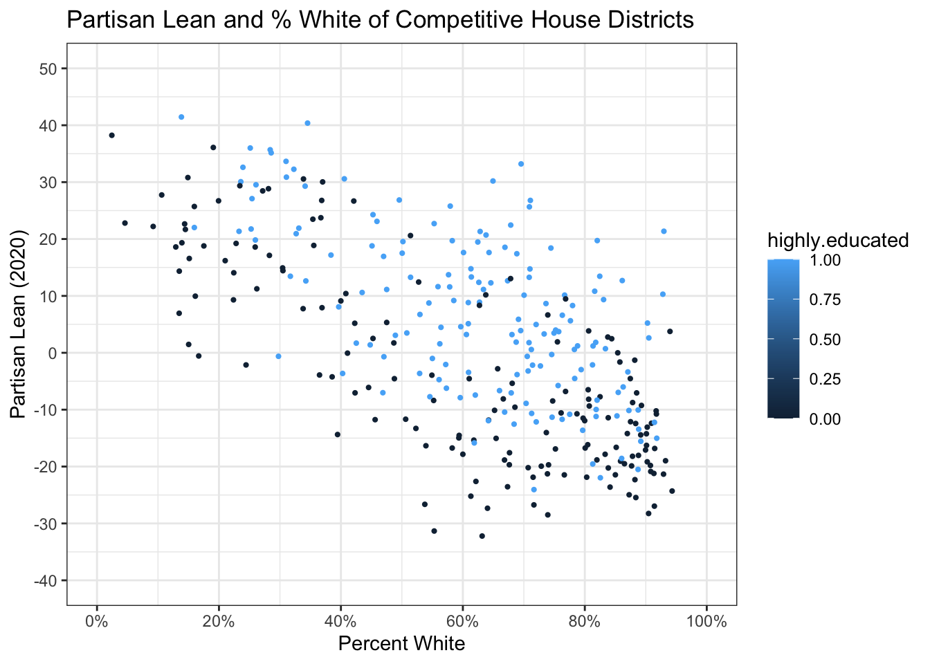
If you put color = "blue" inside aes(), ggplot will treat "blue" as a data value and assign it a color from the default palette. Which will not be blue. It will probably be salmon. So remember: data mapping inside aes(), fixed values outside.
#Wrong: trying to put a fixed color in the aes()
elect |>
  filter(!is.na(plean.20)) |>
  ggplot(aes(x = p.white, y = plean.20,color = "steelblue")) +
  geom_point()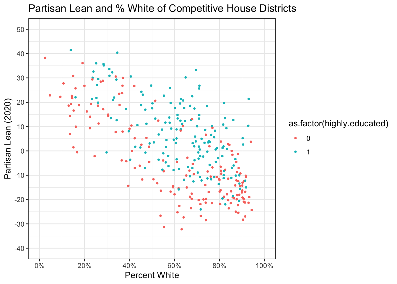
Aesthetics in the ggplot() call are inherited by every geom:
elect |>
  filter(!is.na(plean.20)) |>
  ggplot(aes(x = p.white, y = plean.20,
             color = as.factor(highly.educated))) +
  geom_point(alpha = 0.3) +
  geom_smooth(method = "lm") +
  scale_color_manual(values = c("firebrick", "dodgerblue"),
                     labels = c("Below Median", "Above Median")) +
  labs(x = "Percent White", y = "Partisan Lean (2020)",
       color = "Bachelor's Degree Rate") +
  theme_minimal()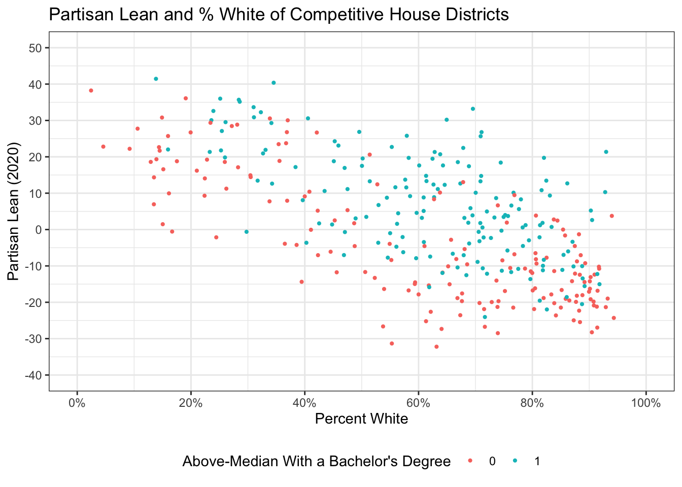
Because color is in the top-level aes(), both the points and the smooth lines split by education. If you only wanted the points colored, move color into geom_point(aes(...)).
You can also add reference lines. The order you add geoms is the order they are drawn, so put reference lines first if you want them underneath:
elect |>
  filter(!is.na(plean.20)) |>
  ggplot(aes(x = p.white, y = plean.20)) +
  geom_hline(yintercept = 0, linetype = "dashed", color = "grey50") +
  geom_point(alpha = 0.3) +
  geom_smooth(method = "lm", color = "firebrick") +
  labs(x = "Percent White", y = "Partisan Lean (2020)") +
  theme_minimal()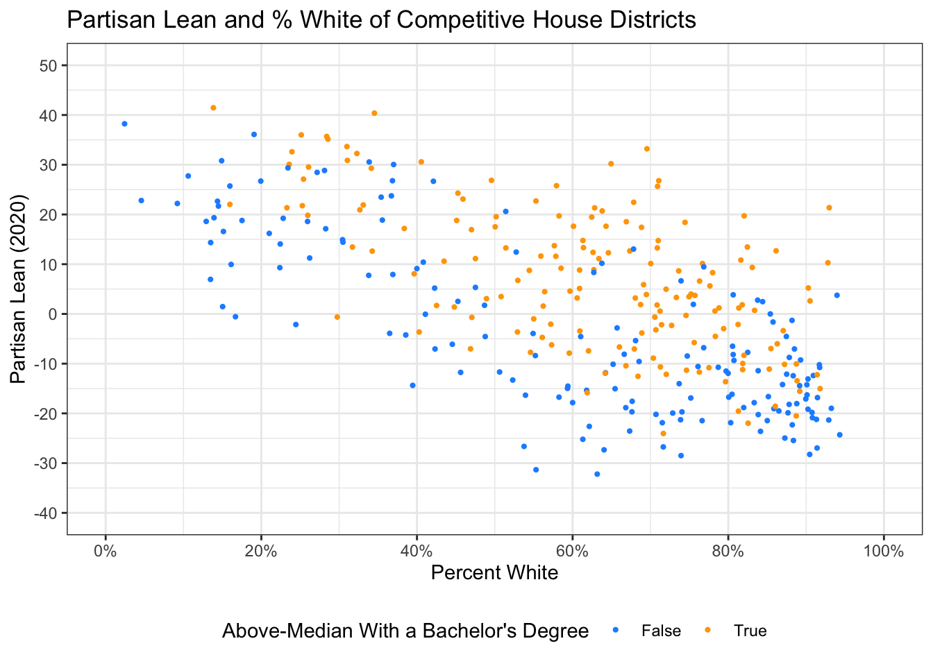
13.4.6 Facets: Small Multiples
Facets split your plot into panels by a categorical variable. For example, looking at the same relationship across census regions:
elect |>
  filter(!is.na(plean.20)) |>
  ggplot(aes(x = p.white, y = plean.20)) +
  geom_hline(yintercept = 0, linetype = "dashed", color = "grey50") +
  geom_point(alpha = 0.4) +
  geom_smooth(method = "lm", color = "firebrick", se = FALSE) +
  facet_wrap(~region) +
  labs(x = "Percent White", y = "Partisan Lean (2020)",
       title = "Partisan Lean by Racial Composition, by Region") +
  theme_minimal()
13.4.7 Visualizing Distributions
Histograms show the distribution of a single continuous variable:
elect |>
  filter(!is.na(plean.20)) |>
  ggplot(aes(x = plean.20)) +
  geom_histogram(binwidth = 5, fill = "steelblue", color = "white") +
  labs(x = "Partisan Lean (2020)", y = "Number of Districts") +
  theme_minimal()
This also shows the difference between color and fill for shapes with an interior (i.e. things that aren’t a point or a line). color controls the color of the outline of a shape while fill controls the inside of that shape.
Density plots are the smoothed version. They are great for comparing groups:
elect |>
  filter(!is.na(plean.20)) |>
  ggplot(aes(x = plean.20, fill = region)) +
  geom_density(alpha = 0.4) +
  labs(x = "Partisan Lean (2020)", fill = "Region") +
  theme_minimal()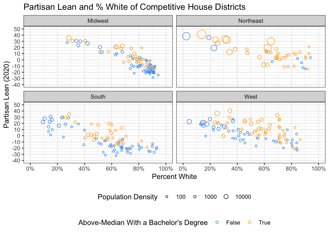
If we wanted that same graph with facets instead of different colors:
elect |>
  filter(!is.na(plean.20)) |>
  ggplot(aes(x = plean.20, fill=region)) +
  geom_density(alpha = 0.4) +
  facet_wrap(~region)+
  labs(x = "Partisan Lean (2020)", fill = "Region") +
  theme_minimal()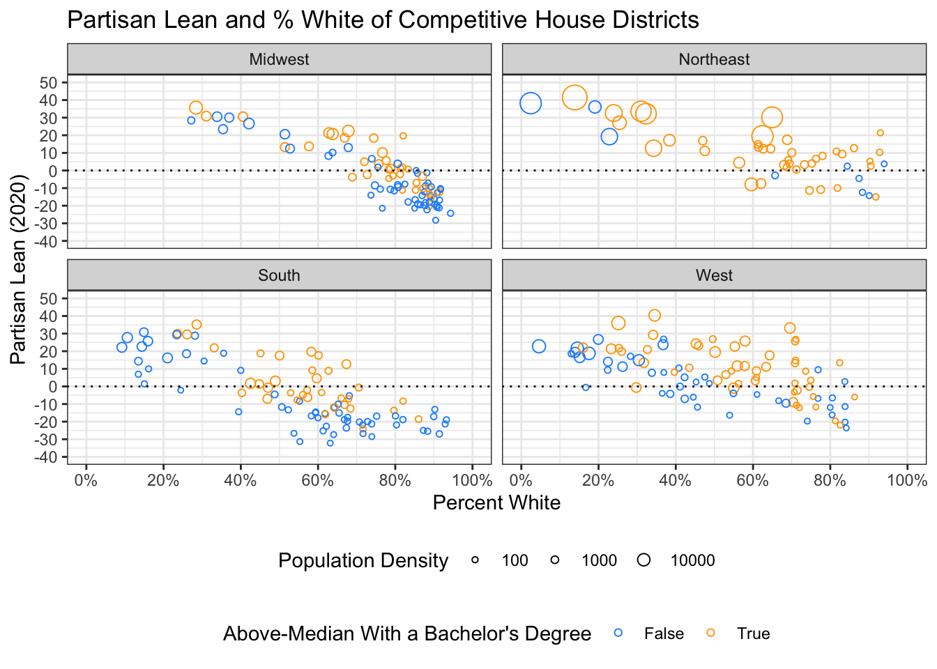
The legend here is now redundant. Don’t do this! If we want to suppress the legend:
elect |>
  filter(!is.na(plean.20)) |>
  ggplot(aes(x = plean.20, fill=region)) +
  geom_density(alpha = 0.4) +
  facet_wrap(~region)+
  labs(x = "Partisan Lean (2020)", fill = "Region") +
  theme_minimal()+
  theme(legend.position = "none")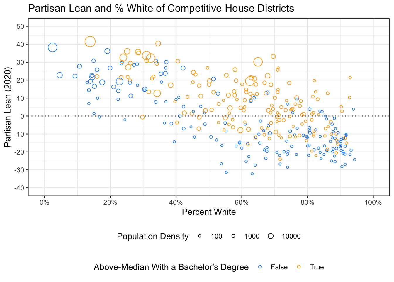
Boxplots compare distributions across groups:
elect |>
  filter(!is.na(plean.20)) |>
  ggplot(aes(x = region, y = plean.20, fill = region)) +
  geom_boxplot() +
  labs(x = "", y = "Partisan Lean (2020)") +
  theme_minimal() +
  theme(legend.position = "none")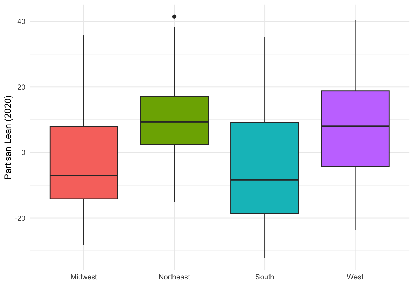
I again set legend.position = "none" because the x-axis labels already identify the groups.
13.4.8 Bar Plots and the Tidyverse Pipeline
Bar plots are where the dplyr-to-ggplot pipeline really shines. To get the average partisan lean by region:
elect |>
  filter(!is.na(plean.20)) |>
  group_by(region) |>
  summarize(mean.lean = mean(plean.20)) |>
  ggplot(aes(x = region, y = mean.lean)) +
  geom_col(fill = "steelblue") +
  labs(x = "", y = "Mean Partisan Lean (2020)") +
  theme_minimal()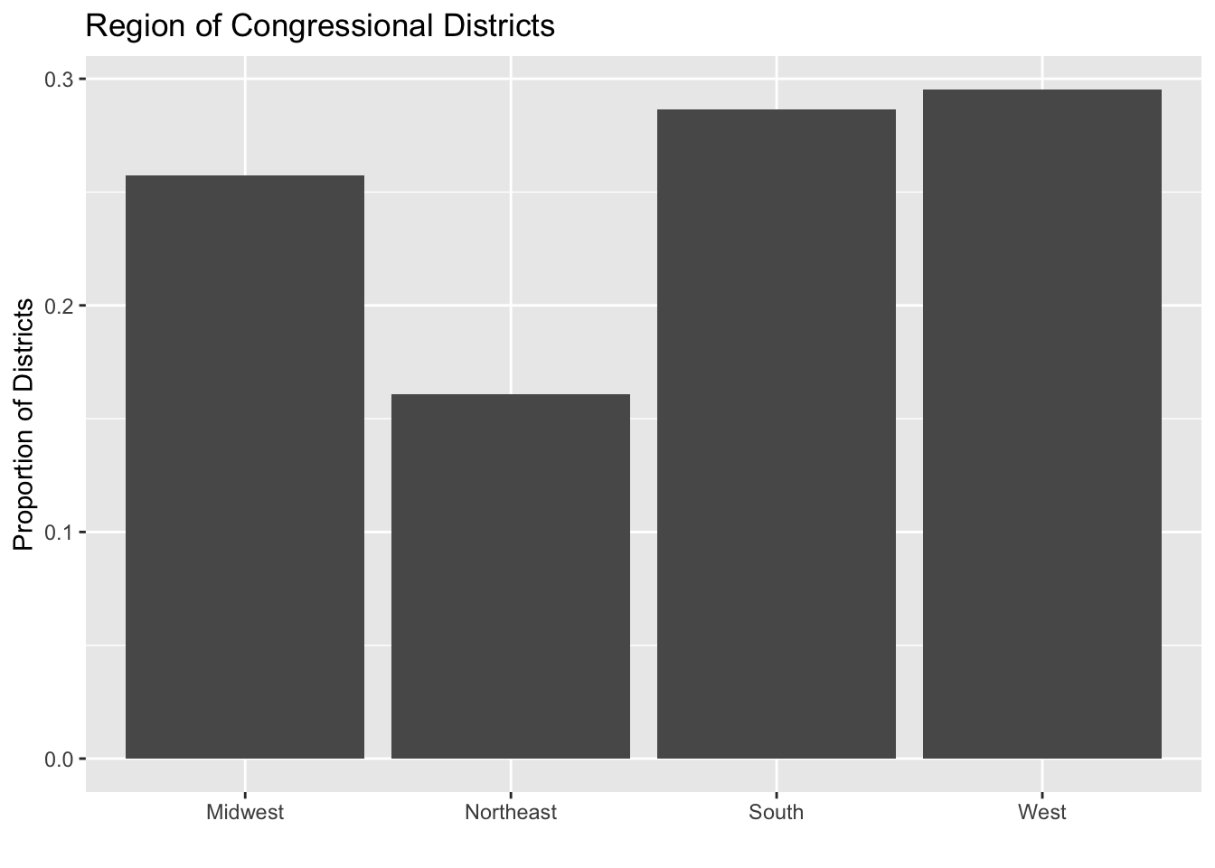
Now let’s do something more involved. Say we want the average partisan shift by region and education, with side-by-side bars:
elect |>
  filter(!is.na(pshift.16to20)) |>
  group_by(region, highly.educated) |>
  summarize(mean.shift = mean(pshift.16to20), .groups = "drop") |>
  ggplot(aes(x = region, y = mean.shift,
             fill = as.factor(highly.educated))) +
  geom_col(position = "dodge") +
  geom_hline(yintercept = 0, linetype = "dashed") +
  scale_fill_manual(values = c("firebrick", "dodgerblue"),
                    labels = c("Below Median", "Above Median")) +
  labs(x = "", y = "Mean Partisan Shift (2016 to 2020)",
       fill = "Bachelor's Degree Rate") +
  theme_minimal()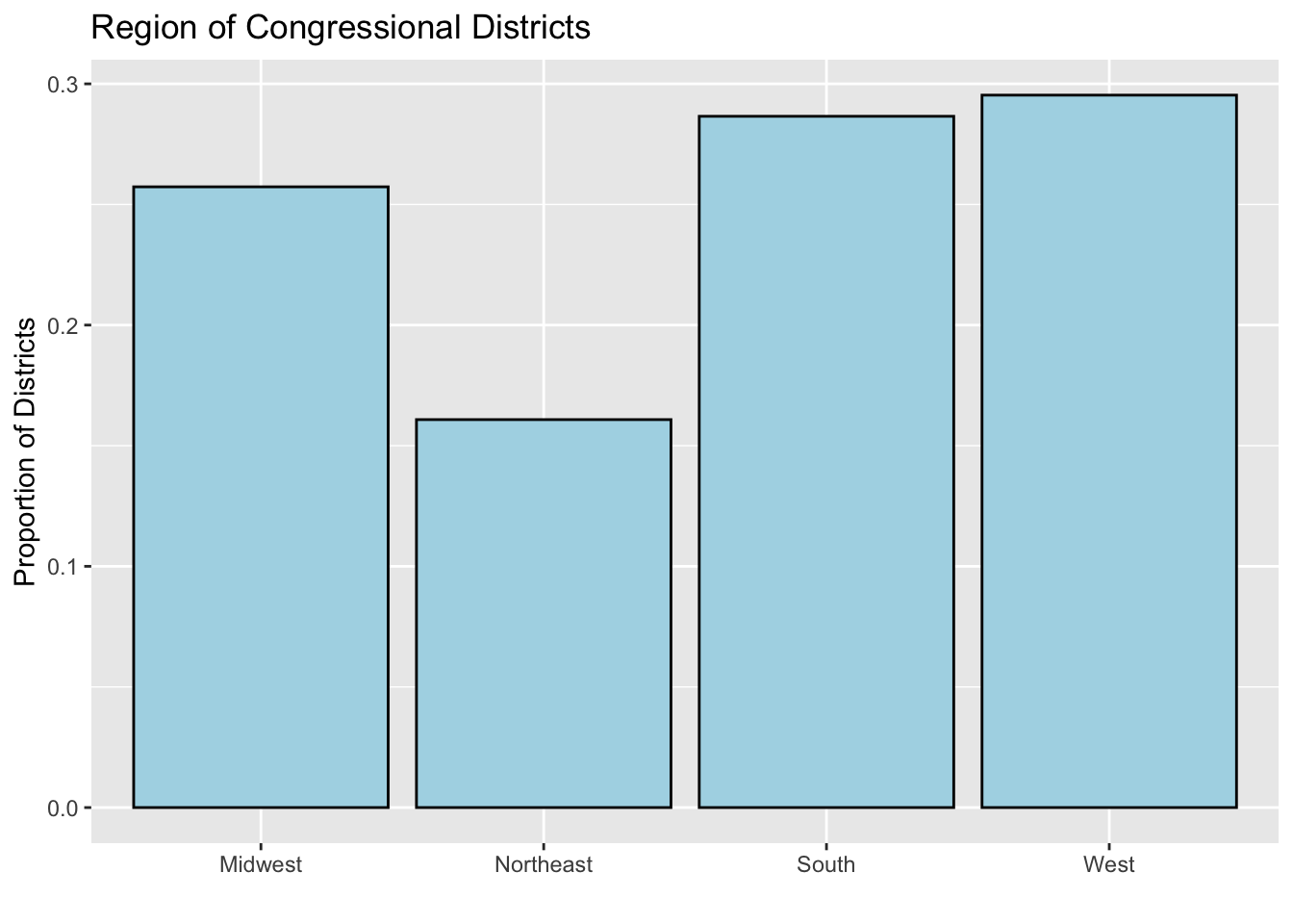
position = "dodge" puts the bars side-by-side instead of stacking them. This is exactly the kind of comparison I warned about above: if these were stacked bars (the default!), you would have a very hard time comparing the red segments across regions:
elect |>
  filter(!is.na(pshift.16to20)) |>
  group_by(region, highly.educated) |>
  summarize(mean.shift = mean(pshift.16to20), .groups = "drop") |>
  ggplot(aes(x = region, y = mean.shift,
             fill = as.factor(highly.educated))) +
  geom_col() +
  geom_hline(yintercept = 0, linetype = "dashed") +
  scale_fill_manual(values = c("firebrick", "dodgerblue"),
                    labels = c("Below Median", "Above Median")) +
  labs(x = "", y = "Mean Partisan Shift (2016 to 2020)",
       fill = "Bachelor's Degree Rate") +
  theme_minimal()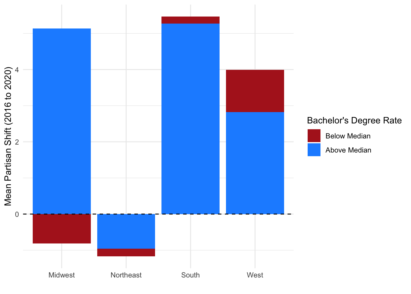
By default ggplot orders categorical variables alphabetically. To reorder bars by their value, use fct_reorder():
elect |>
  filter(!is.na(pshift.16to20)) |>
  group_by(region) |>
  summarize(mean.shift = mean(pshift.16to20)) |>
  ggplot(aes(x = fct_reorder(region, mean.shift), y = mean.shift)) +
  geom_col(fill = "steelblue") +
  labs(x = "", y = "Mean Partisan Shift (2016 to 2020)") +
  theme_minimal()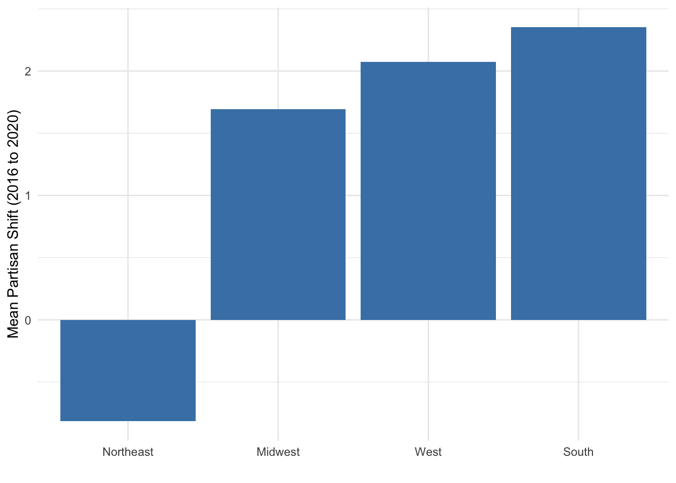
Now the bars go from smallest to largest, which is almost always easier to read than alphabetical order.
13.4.9 Saving Your Plots
You can save any ggplot as an object and then export it with ggsave():
my.plot <- elect |>
  filter(!is.na(plean.20)) |>
  ggplot(aes(x = p.white, y = plean.20)) +
  geom_point(alpha = 0.3) +
  labs(x = "Percent White", y = "Partisan Lean (2020)") +
  theme_minimal()

ggsave("my_figure.png", my.plot, width = 6, height = 4, units = "in")
If you do not pass a plot object, ggsave() saves the last plot you created. For your final papers in RMarkdown, plots in code chunks are embedded automatically, so you will not need ggsave() there. But it is useful for presentations and emails.